Н. Н. Боголюбов
Book: Bogolyubov, Handwriting Techniques
This is an experiment using chat.openai.com to translate Russian text to English. The prompt I'm using is: "I'm translating a Russian book that tells elementary-school teachers how to teach Russian handwriting to children. When I provide Russian text, please translate it to English. But leave individual letters in Russian."
STATUS: the initial translation is complete. Next I'll go through the book paragraph by paragraph, comparing the markup file and the html page to a pdf of the printed book. The items I'll be looking for are:
- missing text in the Russian text or the translation
- ascii characters in Russian text; cyrillic characters in English text
- font changes in the printed book to be implemented here: bold, italic, etc.
- typographical revision: consistent punctuation, curly quotes, en- and em-dashes
- spot checks of the translation quality
Note that in Russian typography, spaces are used around em-dashes but not en-dashes. Other details of Russian punctuation can be found here and in the links from that page.
N. N. Bogolyubov
МЕТОДИКА ЧИСТОПИСАНИЯ
HANDWRITING TECHNIQUES
УЧЕБНОЕ ПОСОБИЕ ДЛА ПЕДАГОГИЧЕСКИХ УЧИЛИШ
Training Manual for Pedagogical Schools
Издание второе, исправленноеи дополненное
Second edition, corrected and expanded
Утверждено Министерством просвещения РСФСР
Approved by the Ministry of Education of the RSFSR
Учпедгиз 1955
Uchpedgiz 1955
Учпедгиз was the State Publishing House of Student and Pedagogical Literature. It was responsible for developing and publishing educational materials, including textbooks and reference books, for the schools and universities of the Soviet Union. The institution was active during the years of the Soviet Union, from 1918 to 1991.
[9/10]Introduction[9/10]Chapter 1: Overview of Basic Guidelines for Teaching Writing in Primary School[4/10]Chapter 2: Program Requirements for Planning in the Soviet School[4/10]Chapter 3: Main Qualities of Writing[4/10]Chapter 4: Continuous Writing[4/10]Chapter 5: Hygiene and Technique of Writing[4/10]Chapter 6: Methods of Penmanship[4/10]Chapter 7: Writing with Chalk on the Board[4/10]Chapter 8: Handwriting in the Pre-alphabet Period[4/10]Chapter 9: Letter Writing During Literacy Training[4/10]Chapter 10: Handwriting Lessons in the First Grade, Second Semester[4/10]Chapter 11: Handwriting Lessons in the Second Grade[4/10]Chapter 12: Handwriting Lessons in the Third Grade[4/10]Chapter 13: Consolidation of Skills[4/10]Chapter 14: Correction of Bad Handwriting[3/10]Appendix: handwriting practice sheets, illustrating the content and order of classes in grades 1, 2, and 3[4/10]References[4/10]Footnotes
[9/10] Introduction
ВВЕДЕНИЕ
[X]initial translation from https://chat.openai.com[X]html formatting[X]translate and insert footnotes[X]translate and insert illustrations[X]check for missing text in the Russian text or the translation[X]check for ascii characters in Russian text; cyrillic characters in English text[X]check for font changes in the printed book to be implemented here: bold, italic, etc.[X]typographical revisions: consistent punctuation, curly quotes, en- and em-dashes[X]spot checks of the translation quality[ ]add links to web resources
Выработка у учащихся начальной школы навыка правильного, четкого, красивого письма, каллиграфического стиля — дело серьезное и кропотливое. Оно требует от учителя большого напряжения, знаний и проведения систематических упражнений.
Developing the skill of correct, clear, and beautiful handwriting with a calligraphic style among primary school students is a serious and painstaking matter. It requires a lot of effort, knowledge, and systematic exercises from the teacher.
Но все трудности в привитии этого навыка, в развитии у детей внимания и аккуратности должны быть преодолены ввиду большого значения письма. Письменная речь — одно из важнейших средств общения.
But all the difficulties in teaching this skill, in developing children’s attention and carefulness, must be overcome due to the great importance of writing. Written language is one of the most important means of communication.
И. В. Сталин в своем труде по языкознанию указывает, что без обмена мнениями, „…без языка, понятного для общества и общего для его членов, общество прекращает производство, распадается и перестаёт существовать, как общество. В этом смысле язык, будучи орудием общения, является вместе с тем орудием борьбы и развития общества“.1 „…появление письменности, зарождение государства, нуждавшегося для управления в более или менее упорядоченной переписке, развитие торговли, ещё более нуждавшейся в упорядоченной переписке, появление печатного станка, развитие литературы, — говорит И. В. Сталин, — всё это внесло большие изменения в развитие языка“.2
In his work on linguistics, I.V. Stalin points out that without exchanging opinions, “…without a language that is understandable to society and common to its members, society ceases to produce, disintegrates, and ceases to exist as a society. In this sense, the language, being a tool of communication, is also a tool of struggle and development of society.”1 “…the emergence of writing, the emergence of a state that needed for management a more or less orderly correspondence, the development of trade, which needed even more orderly correspondence, the appearance of the printing press, the development of literature,” says I.V. Stalin, “all this has brought about great changes in the development of language”.2
Имея столь важное значение в жизни народа, письмо тем самым приобретает такое же значение и для каждого отдельного человека. Правильный и красивый почерк облегчает чтение любого рукописного текста, способствует более легкому и широкому общению между людьми во всех областях общественной деятельности, вызывает естественное чувство удовлетворения как пишущего, так и читающего, создает предпосылки для более живой работы мысли.
Having such great importance in the life of the people, writing thereby acquires the same importance for every individual. Proper and beautiful handwriting facilitates reading of any handwritten text, promotes easier and wider communication between people in all areas of social activity, evokes a natural feeling of satisfaction for both the writer and the reader, and creates conditions for more lively thought work.
„Приучая школьников к аккуратному и точному выполнению письменных работ, выправляя их почерк, учитель воспитывает у учащихся уважение к своему труду, ответственное отношение к выполняемому заданию, привычку к чистоте и порядку“.3
“By teaching students to be neat and precise in their written work, correcting their handwriting, the teacher instills in them respect for their work, a sense of responsibility towards the task at hand, and a habit of cleanliness and orderliness.”3
Поэтому, обучая чистописанию, учитель должен постоянно стремиться к тому, чтобы привить учащимся знания и навыки правильного, разборчивого и скорого письма, ибо от их прочности будут зависеть, в известной мере, дальнейшие успехи в обучении каждого школьника.
Therefore, when teaching handwriting, the teacher should constantly strive to instill in the students the knowledge and skills of correct, legible and speedy writing, because on their strength will depend, to some extent, the further success of each student’s education.
ⅩⅨ съезд Коммунистической партии Советского Союза, открывший новые перспективы в деле дальнейшего подъема культурного уровня нашего народа, в своих директивах наметил новую ступень в деле развития народного образования: переход от семилетнего образования к всеобщему среднему образованию (десятилетка) и переход к всеобщему политехническому обучению.
The 19th Congress of the Communist Party of the Soviet Union, which opened up new prospects for further raising the cultural level of our people, outlined in its directives a new stage in the development of public education: the transition from seven–year education to universal secondary education (ten years) and the transition to universal polytechnic education.
Эти грандиозные задачи могут и должны быть разрешены при активной поддержке и самоотверженном труде всего учительства.
These grand tasks can and must be resolved with the active support and selfless work of the entire teaching profession.
В первую очередь должен быть решен вопрос о грамотности учащихся, а правильное и красивое письмо и является одним из необходимых и важных условий для развития навыков орфографии.
First of all, the issue of students’ literacy should be addressed, and correct and beautiful writing is one of the necessary and important conditions for developing spelling skills.
На значение чистописания болышое внимание обратил в свое время выдающийся русский педагог К. Д. Ушинский. Он указывал, что первоначальные навыки орфографии закладывает именно учитель чистописания. Эту же мысль развивают и современные советские педагоги. Так, методист С. П. Редозубов пишет: „Борясь за хороший почерк и хорошую тетрадь, мы, по существу, боремся за грамотность учащихся“.4
The significance of penmanship was given great attention by the outstanding Russian educator K.D. Ushinsky. He pointed out that the initial skills of correct spelling are laid down by the penmanship teacher. This same idea is developed by modern Soviet educators. For example, methodologist S.P. Redozubov writes: “By fighting for good handwriting and a good notebook, we are essentially fighting for the literacy of students.”4
В методическом письме Управления школ Министерства просвещения РСФСР о преподавании русского языка говорится: „Учащиеся, имеющие плохой почерк и слабые навыки чтения, делают ошибок на искажение слов больше, чем другие“.5
The methodical letter of the School Management of the Ministry of Education of the RSFSR on teaching Russian language states: “Students with poor handwriting and weak reading skills make more mistakes in distorting words than others.”5
Задача настоящего учебного пособия — помочь учителю начальной школы правильно и последовательно организовать обучение детей Ⅰ–Ⅲ классов чистописанию, показать не только все возможные методы и приемы выработки у учащихся правильного письма, но и определить условия, необходимые для развития красивого почерка.
The task of this educational manual is to help an elementary school teacher correctly and systematically organize the teaching of handwriting to children in grades 1–3, to show not only all possible methods and techniques for developing proper handwriting in students, but also to identify the conditions necessary for the development of beautiful handwriting.
Наряду с основными принципиальными установками теоретического характера, учитель должен быть посвящен также и во все подробности ведения урока чистописания. С этой целью при составлении пособия было использовано методическое наследство нашей школы, накопленное как в работах дореволюционных методистов — П. Е. Градобоева, И. Е. Евсеева, Ф. В. Грекова, В. С. Гербача, так и, в особенности, современных — Д. А. Писаревского, В. А. Саглина, Е. В. Гурьянова, М. Л. Закожурниковой, А. И. Воскресенской, Н. И. Ткаченко и др.
Along with the main theoretical principles, the teacher should also be dedicated to every detail of conducting a handwriting lesson. For this purpose, in the compilation of the manual, the methodological heritage of our school was used, accumulated both in the works of pre–revolutionary methodologists such as P.E. Gradoboyev, I.E. Evseev, F.V. Grekov, V.S. Gerbach, as well as, especially, contemporary ones such as D.A. Pisarevsky, V.A. Saglin, E.V. Guryanov, M.L. Zakozhurnikova, A.I. Voskresenskaya, N.I. Tkachenko and others.
[9/10] Chapter 1: Overview of Basic Guidelines for Teaching Writing in Primary School
ОБЗОР ОСНОВНЫХ РУКОВОДСТВ ПО ОБУЧЕНИЮ ПИСЬМУ В НАЧАЛЬНОЙ ШКОЛЕ
[X]initial translation from https://chat.openai.com[X]html formatting[X]translate and insert footnotes[X]translate and insert illustrations[X]check for missing text in the Russian text or the translation[X]check for ascii characters in Russian text; cyrillic characters in English text[X]check for font changes in the printed book to be implemented here: bold, italic, etc.[X]typographical revisions: consistent punctuation, curly quotes, en- and em-dashes[X]spot checks of the translation quality[ ]add links to web resources
Основоположник нашей педагогики К. Д. Ушинский считал, что „всякое толковое изложение на письме своих мыслей должно быть в то же время безукоризненным по правописанию и возможно чистым и красивым по чистописанию“.
The founder of our pedagogy, K.D. Ushinsky, believed that “any sensible written expression of one’s thoughts should at the same time be impeccable in spelling and as clean and beautiful as possible in penmanship.”
Великий педагог, ставя красоту письма в одну линию со смысловой и орфографической его сторонами, тем самым утверждал, что чистописание в немалой степени содействует правильному обучению ребенка.
The great pedagogue, equating the beauty of handwriting with its semantic and orthographic aspects, thereby affirmed that penmanship greatly aids the proper education of a child.
В выработке навыков письма у учащихся Ушинский придавал большое значение тактическому методу.
In developing handwriting skills in students, Ushinsky attached great importance to the tactical method.
Из современников К. Д. Ушинского, пролагавших новые пути в области чистописания, выделялся московский педагог–каллиграф П. Е. Градобоев. Ему принадлежит интересная работа „Руководство к чистописанию для родителей, воспитателей и воспитательниц, а также и для тех лиц, которые желали бы без помощи учителя исправить свой дурной почерк“, изданное в Москве в 1871 году.
Among K. D. Ushinsky's contemporaries, who paved new ways in the field of handwriting, the Moscow educator-calligrapher P. E. Gradoboev stood out. He authored an interesting work titled "Guide to Handwriting for Parents, Educators, and Governesses, as well as for those who would like to correct their bad handwriting without a teacher's assistance," published in Moscow in 1871.
П. Е. Градобоев был крупным специалистом каллиграфии. Особенно удивлял он своих современников тем, что мог одновременно обучать до 100 учащихся, вырабатывая у всех красивое, правильное письмо. П. Е. Градобоев создал свой особый шрифт, который и лег в основу прописей последующего времени.
P. E. Gradoboev was a prominent calligraphy specialist. He especially amazed his contemporaries by being able to simultaneously teach up to 100 students, cultivating beautiful, correct handwriting in all of them. P. E. Gradoboev created his own unique font, which became the foundation for handwriting guides in subsequent years.
Из школы П. Е. Градобоева вышло немало мастеров-преподавателей чистописания, из которых видное место в истории методики чистописания занял И. Е. Евсеев, автор „Методики обучения чистописанию“, вышедшей в 1913 г. седьмым изданием.
Many masters and teachers of penmanship emerged from P.E. Gradoboev’s school, among them I.E. Evseev, who held a prominent place in the history of penmanship methodology and authored the “Methodology of Teaching Penmanship,” which went into its seventh edition in 1913.
В этой работе дается обзор оснсвных методов чистописания; изложение правил посадки учеников, положения тетради, держания ручки; виды подготовительных упражнений; порядок письма букв и способы написания элементов, включая и применение тактирования. Кроме того, в нем даны русские прописи и образцы разнообразных рукописных шрифтов, которые, правда, в настоящее время мало или совсем не употребляются (ронд, фрактурный, готический, батард, панше).
This work provides an overview of the main methods of penmanship, descriptions of rules for students’ seating, notebook placement, and pen holding, types of preparatory exercises, the sequence of letter writing, and ways of writing elements, including the use of beat marking. In addition, it contains Russian writing exercises and samples of various manuscript fonts, which are currently little or not used at all (roundhand, blackletter, gothic, bâtarde, pancée).
Из дореволюционных методических руководств труд И. Е. Евсеева в наибольшей степени удовлетворяет требованиям, которые предъявляются в настоящее время к пособиям такого типа.
The pre–revolutionary methodological guide by I.E. Evseev meets the requirements that are currently applied to aids of this type to the greatest extent.
В книжке Ф. В. Грекова „Методика обучения письму“, вышедшей в Москве в 1911 г., особое внимание уделено гигиенической стороне урока письма. В ней излагаются требования к классному оборудованию: какими должны быть парты, доска, освещение, письменные принадлежности; дается целый ряд практических советов и указаний по методике чистописания. Кроме того, автор книги показывает трудности, которые стояли перед учителем чистописания в старой школе, вскрывает недостатки существовавших в то время программ.
In the book “Methodology of Teaching Writing” by F.V. Grekov, published in Moscow in 1911, special attention is given to the hygienic aspects of the handwriting lesson. It presents requirements for classroom equipment: what desks, board, lighting, and writing utensils should be like; it offers a number of practical tips and guidelines on the methodology of handwriting. In addition, the author shows the difficulties that faced the handwriting teacher in the old school, revealing the deficiencies in the programs that existed at that time.
В книге В. С. Гербача „Методическое руководство к обучению письму“, которая вышла в Петербурге в 1911 г., мы находим хорошо обоснованный порядок написания строчных и прописных букв с подробным указанием, под какой счет нужно писать каждую отдельную букву.
In V.S. Gerbach’s book “Methodological Guide to Teaching Writing,” published in St. Petersburg in 1911, we find a well–justified sequence of writing lowercase and uppercase letters, with a detailed indication of the count for each individual letter.
Но самое ценное, что было сделано В. С. Гербачом, — это составление прописей. Прописи содержат образцы письма строчных и прописных букв, цифр и надстрочных знаков. За образцами букв следовали слова и фразы, написанные сперва по косым, а потом по двум и одной линейке.
But the most valuable thing V.S. Gerbach did was to create handwriting practice sheets. The practice sheets contain examples of writing lowercase and uppercase letters, numbers, and superscript signs. After the letter samples, there were words and phrases written first in italics, then on two and one line.
Нужно отдать должное красивому виду букв, соединений и знаков, которые и до настоящего времени служат образцами для подражания. Правда, с того времени некоторые буквы подверглись изменению. Изменился и наклон букв. Вместо наклона в 55° теперь принято писать с наклоном в 65°. Но все же во многом тип наклонного письма сохранен и до сих пор в том виде, как он был установлен В. С. Гербачом.
Credit must be given to the beautiful appearance of the letters, connections, and signs, which still serve as models for imitation. It is true that since then, some letters have changed. The slant of the letters has also changed. Instead of a 55° slant, it is now customary to write with a 65° slant. But the type of slanted handwriting is still largely preserved in the form established by V.S. Gerbach.
Недостатком книги является неустойчивость взглядов автора на характер письма. Он считал одинаково приемлемыми как наклонное, так и прямое письмо.
A drawback of the book is the author’s instability in views on the nature of writing. He considered both slanted and upright writing to be equally acceptable.
Великая Октябрьская социалистическая революция произвела коренной переворот во всей системе воспитания и обучения детей. В советской школе обучение письму строится на научной основе, в свете задач подготовки и воспитания всесторонне развитых членов советского общества.
The Great October Socialist Revolution brought about a fundamental upheaval in the entire system of children’s education and upbringing. In Soviet schools, handwriting instruction is built on a scientific basis, in light of the tasks of preparing and educating well–rounded members of Soviet society.
В периодической печати и на учительских конференциях неоднократно проходили оживленные дискуссии по вопросам чистописания: о прямом и наклонном письме, о способах начертания отдельных букв, о каллиграфическом режиме, о применении генетического метода и т. п. Все это в немалой степени содействовало усовершенствованию методов преподавания и повышению качества навыков письма у учащихся.
In periodicals and at teacher conferences, lively discussions on handwriting issues were held repeatedly: about straight and slanted writing, about ways of drawing individual letters, about calligraphic mode, about the application of the genetic method, and so on. All this significantly contributed to the improvement of teaching methods and the enhancement of writing skills among students.
Из учебных пособий, вышедших после революции, следует отметить руководства, составленные Д. А. Писаревский и В. А. Саглиным, прописи А. И. Воскресенской и Н. И. Ткаченко, методические пособия Е. В. Гурьянова и М. К. Щербак.
Among the educational aids published after the revolution, we should note the guides compiled by D.A. Pisarevsky and V.A. Saglin, the handwriting practice sheets by A.I. Voskresenskaya and N.I. Tkachenko, and the methodological aids by E.V. Guryanova and M.K. Shcherbak.
Книга Д. А. Писаревского „Обучение письму“, изданная Учпедгизом в 1938 г., ценна тем, что в ней впервые были даны советскому учителю, хотя и не без ошибок, основные указания о правильной постановке чистописания в Ⅰ и Ⅱ классах начальной школы на основе обобщения предшествующего опыта и была раскрыта с достаточной ясностью теория безотрывного письма. Автор подробно останавливается на порядке изучения букв, способах их написания, разбирает состав каждой буквы, дает разные виды отклонений от нормы, указывает различные способы соединения букв.
D.A. Pisarevsky’s book “Teaching Writing,” published by Uchpedgiz in 1938, is valuable in that it was the first to provide Soviet teachers, albeit not without errors, with basic guidelines for the correct introduction of handwriting in the first and second grades of primary school based on a summary of previous experience. The theory of continuous writing was explained with sufficient clarity. The author delves into the order of studying letters, methods of writing them, analyzes the composition of each letter, gives different types of deviations from the norm, indicates different ways of connecting letters.
Несколько поверхностно автор излагает условия, обеспечивающие правильное красивое письмо.
The author superficially presents the conditions that ensure correct beautiful writing.
В руководстве „Обучение письму в начальной школе“, составленном В.А. Саглиным и выпущенном Учпедгизом в 1948 г., изложены цель, условия и методы обучения письму и чистописанию в Ⅰ, Ⅱ, Ⅲ, Ⅳ классах; даны указания об исправлении запущенных почерков, о подготовке к скорописи в средней школе и, наконец, о письме мелом на классной доске.
In the guide “Teaching Writing in Primary School,” compiled by V.A. Saglin and released by Uchpedgiz in 1948, the purpose, conditions, and methods of teaching writing and handwriting in grades 1, 2, 3 and 4 are set out; instructions are given on correcting neglected handwriting, on preparing for speed writing in secondary school and, finally, on writing with chalk on the classroom board.
Все разделы, особенно первый, изложены в книге обстоятельно, с учетом затруднений, которые могут испытывать дети в процессе работы. Очень ценен отсутствовавший в предшествующих руководствах раздел „Письмо мелом на классной доске“.
All sections, especially the first, are detailed in the book, taking into account the difficulties that children may experience in the process of work. The section “Writing with chalk on the classroom board,” which was absent in previous guides, is very valuable.
Кроме того, в книге имеется ряд мелких практических указаний, которые даются на основе многолетнего опыта ленинградских учителей. Но в руководстве имеется и ряд крупных недочетов, в частности, в вопросах постановки обучения чистописанию во Ⅱ и Ⅲ классах начальной школы.
In addition, the book contains a number of minor practical guidelines, given based on many years of experience of Leningrad teachers. But the guide also has a number of major shortcomings, particularly in the issues of setting up handwriting teaching in the second and third grades of primary school.
В пособиях Е. В. Гурьянова дается новый, научный подход к вопросам обучения письму на основе психо–физиологических исследований процесса письма.
E.V. Guryanov’s textbooks provide a new, scientific approach to teaching writing based on psycho–physiological research of the writing process.
Автор акцентирует внимание учителя на условиях, обеспечивающих выработку правильного письма, приводит целый ряд практических указаний, которые должны повысить эффективность упражнений в Ⅰ и Ⅱ классах.
The author emphasizes the conditions that ensure the development of correct writing, provides a number of practical guidelines that should enhance the effectiveness of exercises in the first and second grades.
Однако некоторое недоумение вызывают колебания Е. В. Гурьянова в вопросе о применении линейного метода. Нельзя согласиться с предложением автора об обучении чистописанию без косых линеек. Опыт обучения чистописанию без косых линеек, проведенный, например, А. И. Верре еще в 80–е годы ХХ в., дал сугубо отрицательные результаты.
However, E.V. Guryanov’s vacillation on the issue of using the linear method raises some perplexity. It is impossible to agree with the author’s proposal on teaching handwriting without slanting rulers. The experience of teaching handwriting without slanting rulers, conducted, for example, by A.I. Verre in the 1980s, gave purely negative results.
В ⅩⅩ в. мы снова наблюдаем борьбу за применение линейного метода обучения чистописанию. Противниками разлиновки тетрадей являлись прежде всего сторонники американского метода обучения грамоте и метода М. Монтессори.
In the 20th century, we once again observe a struggle for the application of the linear method of teaching handwriting. The opponents of notebook ruling were primarily supporters of the American method of literacy education and the method of M. Montessori.
К чему на практике приводило письмо без линеек, можно убедиться на результатах работы Ю. И. Фаусек, изложенных в книге „Обучение грамоте и развитие речи по системе Монтессори“.
What writing without rulers led to in practice can be seen from the results of Y.I. Fausek’s work, set out in the book “Teaching Literacy and Speech Development According to the Montessori System.”
Ю. И. Фаусек держалась ложного взгляда, что ребенок учится писать не в процессе письма, а в процессе целого ряда подготовительных упражнений. Она утверждала, что „разные дети (не учителя! — прим. автора) приступают к письму по–разному: одни после предварительных упражнений сразу начинают писать слова, другие короткое время сначала пишут буквы, а затем приступают к словам“. Такой „метод“ сводил к нулю роль учителя, исключал организованную, планомерную работу детей в процессе обучения письму и был категорически отвергнут советскими педагогами.
Y.I. Fausek held a false view that a child learns to write not in the process of writing, but through a whole series of preparatory exercises. She asserted that “different children (not teachers! — author’s note) approach writing differently: some start writing words immediately after preliminary exercises, others first write letters for a short time, then move on to words.” Such a “method” negated the role of the teacher, excluded organized, systematic work of children in the process of learning to write, and was categorically rejected by Soviet educators.
Основным методом обучения чистописанию в нашей советской школе является генетический метод. Этот метод ведущее, решающее место в деле обучения детей отводит учителю. В то же время он предполагает активную работу самих учащихся.
The main method of teaching handwriting in our Soviet school is the genetic method. This method assigns the leading, decisive place in the process of teaching children to the teacher. At the same time, it implies active work by the students themselves.
[4/10] Chapter 2: Program Requirements for Planning in the Soviet School
ПРОГРАММНЫЕ ТРЕБОВАНИЯ ПО ЧИСТОПИСАНИЮ В СОВЕТСКОЙ ШКОЛЕ
[X]initial translation from https://chat.openai.com[X]html formatting[X]translate and insert footnotes[X]translate and insert illustrations[ ]check for missing text in the Russian text or the translation[ ]check for ascii characters in Russian text; cyrillic characters in English text[ ]check for font changes in the printed book to be implemented here: bold, italic, etc.[ ]typographical revisions: consistent punctuation, curly quotes, en- and em-dashes[ ]spot checks of the translation quality[ ]add links to web resources
Успехи, достигнутые в деле обучения чистописанию за последние годы, без сомнения, очень велики. Однако нельзя сказать, чтобы все дети, оканчивающие школу, имели хороший почерк. Многое еще нужно сделать для того, чтобы добиться необходимого уровня каллиграфической культуры.
The successes achieved in teaching handwriting in recent years are undoubtedly very great. However, it cannot be said that all children graduating from school have good handwriting. Much still needs to be done to achieve the necessary level of calligraphic culture.
Государственный минимум этих требований определяется программой начальной школы по чистописанию.
The state minimum of these requirements is determined by the primary school program for handwriting.
По учебному плану 1954/55 гг. на чистописание отводится в Ⅰ классе по 2 часа еженедельно, что составляет 64 часа в год, а во Ⅱ и Ⅲ классах — 1 час в неделю.
According to the curriculum for 1954/55, 2 hours per week are allocated for handwriting in the first grade, which makes up 64 hours a year, and in the second and third grades — 1 hour per week.
Чтобы добиться наилучших результатов, учитель должен как можно эффективнее использовать каждый час.
To achieve the best results, the teacher should use each hour as effectively as possible.
Рассмотрим программные требования Министерства просвещения по чистописанию.
Let's consider the program requirements of the Ministry of Education for handwriting.
First Grade
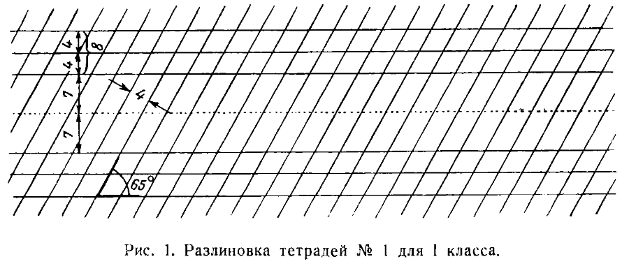
В первом полугодии проводится ознакомление детей с правильной посадкой, держанием карандаша, а затем и ручки. Дети также учатся пользоваться тетрадью в косую линейку (рис. 1), чернилами и промокательной бумагой.
In the first semester, children are introduced to the correct posture, how to hold a pencil, and then a pen. Children also learn how to use a notebook with slanted lines (fig. 1), ink, and blotting paper.
В букварный период ученики приобретают навыки необходимых движений пальцев, кисти и предплечья. Для этого они тренируются, выполняя подготовительные упражнения в виде наклонных, дугообразных и горизонтальных штрихов, овальных черт, проводимых справа налево и слева направо.
During the primer period, students acquire the skills of necessary finger, hand, and forearm movements. For this, they practice by performing preparatory exercises in the form of slanting, arc-shaped and horizontal strokes, oval lines, drawn from right to left and from left to right.
Параллельно с прохождением печатной азбуки в букварный период идет усвоение письма строчных и прописных букв, слов, коротких предложений, цифр и арифметических знаков.
Parallel to the passage of the printed alphabet in the primer period, students learn to write lowercase and uppercase letters, words, short sentences, numbers, and arithmetic signs.
Буквы изучаются не в генетическом порядке, т. е. не в порядке возрастающей трудности написания их, а по мере прохождения соответствующих звуков. Это диктуется необходимостью одновременного обучения чтению и письму.
Letters are studied not in the genetic order, that is, not in the order of increasing difficulty of writing them, but as the corresponding sounds are covered. This is dictated by the need for simultaneous teaching of reading and writing.
Во втором полугодии продолжается укрепление навыков посадки, правильного держания ручки, употребления чернил и промокательной бумаги, уменья сохранять положение тетради при письме. Одновременно повторяются подготовительные упражнения. Затем ученики последовательно изучают сперва строчные буквы, арабские цифры, а потом прописные буквы в генетическом порядке.
In the second semester, the reinforcement of the skills of posture, correct pen holding, use of ink and blotting paper, and the ability to maintain the position of the notebook while writing continue. At the same time, preparatory exercises are repeated. Then, students study lowercase letters, Arabic numerals, and then uppercase letters in the genetic order.
Основная задача первой ступени обучения чистописанию заключается в том, чтобы привить учащимся навыки в крупном отрывистом письме всех строчных, прописных букв и цифр с твердым усвоением правильного строения и способа их начертания.
The main task of the first stage of handwriting teaching is to teach students how to write lowercase, uppercase and numerical characters with firm grasp of their correct structure and the way they are written.
Second Grade
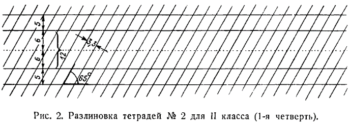
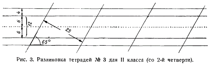
Чистописание на второй ступени обучения, т. е. во Ⅱ классе, преследует задачу обучения связному письму буквами средней величины сперва по сетке с частыми, а затем с редкими косыми линиями (рис. 2 и 3). Это обусловливает ускорение письма по крайней мере вдвое но сравнению с I классом.
Handwriting at the second stage of education, i.e., in the second grade, pursues the task of teaching connected writing of medium-sized letters first on a grid with frequent, then with rare slanting lines (fig. 2 and 3). This results in at least a doubling of the writing speed compared to the first grade.
Вместе с тем в письме вырабатывается новое качество — плавность, достигаемая, во-первых, безотрывностыо письма, во-вторых, его ритмичностью.
At the same time, a new quality is developed in writing - smoothness, which is achieved, first, by the continuity of the writing, and second, by its rhythm.
Ученик II класса овладевает сперва письмом букв меньшей высоты (5 мм) в тетради с частыми косыми линейками, а потом в тетради с редкими косыми линейками (с расстоянием в 25 мм между ними).
A second-grade student first masters writing smaller letters (5 mm) in a notebook with frequent slanting lines, and then in a notebook with rare slanting lines (with a distance of 25 mm between them).
Основная задача учителя чистописания во II классе, т. е. на второй ступени обучения, заключается в том, чтобы выработать у учащихся навыки правильного связывания букв, ускоренного, безотрывного и плавного письма слов при непременном соблюдении правил посадки, держания ручки и т. д.
The main task of the handwriting teacher in the second grade, i.e., at the second stage of education, is to develop the skills of correct letter connection, accelerated, uninterrupted, and smooth word writing in students, while necessarily observing the rules of posture, pen holding, etc.
Параллельно учитель должен устранять индивидуальные отклонения от нормы в почерках отдельных учеников специальными упражнениями в письме элементов, соединений букв, слов и предложений.
Alongside this, the teacher should eliminate individual deviations from the norm in the handwriting of individual students with special exercises in writing elements, letter combinations, words and sentences.
Впредь до усвоения навыка письма по двум линейкам в тетрадях № 3 на уроках чистописания учащиеся выполняют все письменные работы по русскому языку и ведут прочие записи в тетрадях № 2.
Until students have mastered the skill of writing along two lines in notebook No. 3, all written work in Russian language and other notes in handwriting lessons are performed in notebook No. 2.
Third Grade
В III классе закрепляются навыки правильной посадки, держания ручки, уменье сохранять правильное (наклонное) положение тетради и уменье пользоваться чернилами и промокательной бумагой.
In the third grade, the skills of correct posture, holding the pen, maintaining the correct (inclined) position of the notebook, and the ability to use ink and blotting paper are reinforced.
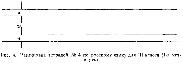
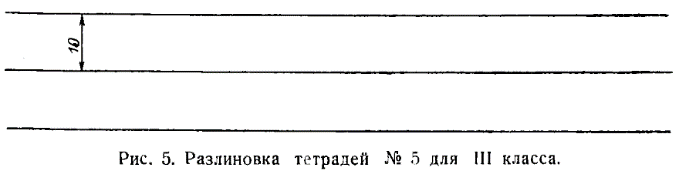
В III классе учитель развивает у учащихся навыки более ускоренного письма по одной линейке буквами уменьшенного размера (в 3 мм высоты) (рис. 5), т. е. закладывает навыки скорописи, закрепляя при этом навыки правильной посадки, держания ручки и т. д.
In the third grade, the teacher develops students' skills for faster writing on one line with smaller letters (3 mm in height) (Fig. 5), i.e., laying the foundation for shorthand skills, while reinforcing the skills of correct posture, holding a pen, etc.
[4/10] Chapter 3: Main Qualities of Writing
ОСНОВНЫЕ КАЧЕСТВА ПИСЬМА
[X]initial translation from https://chat.openai.com[X]html formatting[X]translate and insert footnotes[X]translate and insert illustrations[ ]check for missing text in the Russian text or the translation[ ]check for ascii characters in Russian text; cyrillic characters in English text[ ]check for font changes in the printed book to be implemented here: bold, italic, etc.[ ]typographical revisions: consistent punctuation, curly quotes, en- and em-dashes[ ]spot checks of the translation quality[ ]add links to web resources
Письмо учащихся, как и всех грамотных людей, должно быть правильным, красивым, разборчивым и скорым.
The handwriting of students, like that of all literate people, should be correct, beautiful, legible, and fast.
Образцы букв даются в программах начальной школы, в букварях и прописях.
Letter templates are provided in primary school programs, primers, and copybooks.
Характерной особенностью всех принятых в советской школе образцов букв является
простота их начертаний. Однако в практике письма встречается очень много
неправильностей, которые не следует допускать в письме учащихся. Например, часто
пишут букву т в виде
 или букву ж в виде
трех прямых черт, перечеркнутых по горизонтали
или букву ж в виде
трех прямых черт, перечеркнутых по горизонтали
 или
или
 в виде
перекрещивающихся черт
в виде
перекрещивающихся черт
 и т. д.
A distinctive feature of all the letter templates accepted in Soviet schools is
the simplicity of their design. However, in writing practice, there are many
inaccuracies that should not be allowed in students' handwriting. For example,
the letter т is often written like
or the letter ж is
depicted as three straight lines crossed horizontally
or
in the form of
intersecting lines
and so on.
Правильность и рациональность письма заключается в соблюдении тех норм, которые установлены Министерством просвещения, и тех приемов движений пальцев, кисти и предплечья, которые наиболее целесообразны при письме. С другой стороны, правильность и рациональность письма требуют того, чтобы пишущий не делал лишних движений, не допускал никаких завитков, которые не украшают букв, а лишь замедляют темп письма.
The correctness and rationality of handwriting lies in adhering to the norms established by the Ministry of Education, and those movements of the fingers, wrist, and forearm which are most suitable when writing. On the other hand, correct and rational writing requires the writer not to make unnecessary movements, not to make any squiggles that don't beautify the letters, but only slow down the pace of writing.
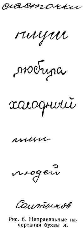
Недопустимо писать буквы л и м, начиная сверху, потому что при таком способе письма получается отрыв руки, т. е. замедляется написание буквы (примеры искажений см. рис. 6). Писать эти буквы нужно, начиная снизу, от точки, как это принято. Не нужно допускать подчеркивания буквы ш или проведения горизонтальной черты над буквами п, т и т. п.
It's unacceptable to write the Russian letters "л" and "м", starting from the top, because this manner of writing results in a break in the hand's movement, i.e., it slows down the writing of the letter (see fig. 6 for examples of distortions). These letters should be written starting from the bottom, from the point, as is customary. One should not underline the letter "ш" or draw a horizontal line above the letters "п", "т", etc.
В соответствии с требованием правильности и рациональности письма должны pсоблюдаться определенные способы соединения букв и приемы безотрывного письма.
According to the requirement of correctness and rationality, certain ways of connecting letters and techniques of continuous writing must be observed.
Поэтому учителю должны быть хорошо известны нормы письма, следуя которым, он обязан выработать у учащихся правильный и красивый почерк.
Therefore, the teacher must be well acquainted with the norms of writing, following which he is obliged to develop a correct and beautiful handwriting in students.
Каковы же эти нормы? Разберем их.
So what are these norms? Let's analyze them.
1. Правильным и красивым считается только наклонное письмо, при котором буквы пишутся под углом в 65°.
1. Oblique writing, in which letters are written at an angle of 65°, is considered correct and beautiful.
Наклонное письмо естественней, чем письмо прямое, так как соответствует лучшему, более спокойному положению руки, корпуса и головы.
Oblique writing is more natural than straight writing, as it corresponds to a better, more relaxed position of the hand, torso, and head.
Если, например, положить лист бумаги или тетрадь перед собой не наклонно, а прямо, и начать писать, то при движении предплечья слева направо, с сохранением в одном и том же положении локтя, строка неизменно будет устремляться кверху. Для того чтобы писать ее строго по линейке, приходится все время «укорачивать» кисть и предплечье. Длительное письмо при таком положении вызывает появление болезни — так называемого писчего спазма.
For example, if you put a sheet of paper or a notebook in front of you not obliquely, but straight, and start writing, then with the movement of the forearm from left to right, while keeping the elbow in the same position, the line will invariably be directed upwards. In order to write strictly along the line, you have to constantly "shorten" the brush and forearm. Prolonged writing in this position leads to the emergence of a disease - so-called writer's cramp.
При наклонном письме возможность писчего спазма исключается.
The possibility of writer's cramp is eliminated with oblique writing.
Только при наклонном письме сохраняется единообразный почерк, его разборчивость и ритмичность. Наклонное письмо наиболее пригодно для развития скорописи (И. Е. Евсеев).
Only with oblique writing is a uniform handwriting, its legibility, and rhythm maintained. Oblique writing is most suitable for the development of shorthand (I.E. Evseev).
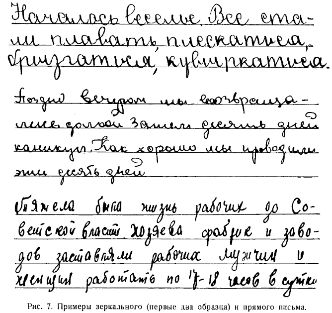
Прямое письмо нередко обращается в так называемое «зеркальное» письмо (с наклоном в левую сторону), которое имеет крайне неразборчивый и безобразный вид (рис. 7).
Straight writing often turns into so-called "mirror" writing (with a tilt to the left), which has an extremely illegible and ugly appearance (fig. 7).
В защиту прямого письма обычно выдвигалось то соображение, что оно требует нормальной посадки детей, следовательно, гигиеничнее, чем наклонное. Но это соображение нельзя признать правильным, потому что наклонность письма достигается не за счет посадки, а благодаря положению тетради.
In defense of straight writing, it is usually argued that it requires a normal posture of children, hence it's more hygienic than oblique writing. However, this consideration cannot be considered correct, because the inclination of writing is achieved not due to posture, but thanks to the position of the notebook.
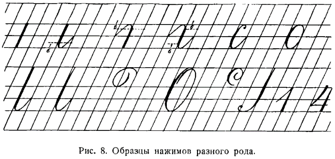
2. Правильное и красивое письмо обязательно должно иметь нажим, который придает ему ритмичность и разборчивость.
2. Correct and beautiful handwriting must necessarily have pressure, which gives it rhythm and legibility.
Нажим в письме учащихся вырабатывается путем применения правильных приемов и длительных упражнений. При движении пера вниз его кончики раздвигаются. Получается жирная черта. При движении пера кверху его кончики сближаются. Образуется тонкая волосная черта.6
Pressure in the handwriting of students is developed through the application of correct techniques and prolonged exercises. When the pen moves down, its tips diverge, creating a bold line. When the pen moves upwards, its tips come together, forming a thin hairline.
Среди многих пишущих, в том числе и детей, нередко создается ложное предубеждение против нажима, и они во избежание его начинают писать боком пера. Им кажется, что письмо без нажима чище, опрятнее. Но письмо, состоящее из густо переплетающихся, волосных, одинаковых черт, конечно, не может быть разборчивым, ритмичным, а следовательно, и красивым.
Among many writers, including children, a false prejudice against pressure is often created, and to avoid it, they start writing with the side of the pen. They seem to think that handwriting without pressure is cleaner and neater. However, writing consisting of densely intertwined, hair-like, identical lines cannot be clear, rhythmic, and therefore beautiful.
Очень важно также, чтобы дети писали не просто с нажимом, а соблюдали разные виды нажима, например, при письме прямой черты, прямой черты (палочки) с закруглением внизу, овалов и полуовалов, пламевидных черт (рис. 8).
It is also very important that children write not just with pressure, but observe different types of pressure, for example, when writing a straight line, a straight line (stick) with rounding at the bottom, ovals and semi-ovals, flame-like lines (fig. 8).
3. Строчные буквы должны быть одной высоты; заглавные тоже должны иметь определенную высоту и намного превосходить размеры строчных букв. Высота строчных букв на протяжении первых трех лет обучения постепенно изменяется. В I классе дети пишут буквы высотой в 8 мм, во II классе — в 5 мм и в III — в 3 мм.
3. Lowercase letters should be of the same height; uppercase letters should also have a certain height and greatly exceed the size of lowercase letters. The height of lowercase letters gradually changes over the first three years of education. In the first grade, children write letters 8mm high, in the second grade - 5mm, and in the third - 3mm.
В прежнее время наши каллиграфы, например, П. Е. Градобоев, держались взгляда, что заглавная буква может превосходить по высоте строчную в 3—4 раза. В настоящее время советские методисты стоят на той точке зрения, что заглавная буква в I классе при письме по косым линейкам ’ большого размера должна превосходить строчную в 2 раза, а начиная со II класса как при письме по двум линейкам, так и при письме по одной линейке — в 2,5 раза. Таким образом, при обычном письме (скорописи) высота заглавных букв составляет 7,5 мм.
In the past, our calligraphers, for example, P. E. Gradoboev, held the view that the capital letter can exceed the lowercase in height 3-4 times. Currently, Soviet methodologists hold the view that in the first grade when writing on slanted lines of a large size, the capital letter should exceed the lowercase by 2 times, and starting from the second grade both when writing on two lines and when writing on one line - by 2.5 times. Thus, in normal handwriting (speedwriting) the height of capital letters is 7.5mm.
Размеры букв при письме, как показывает педагогическая практика, играют большую роль. Например, при крупном почерке дети труднее усваивают орфографию, чем при почерке с буквами нормального размера. Повидимому, это происходит оттого, что детский глаз охватывает слово, написанное крупным почерком, с напряжением и, таким образом, плохо воспринимает орфограммы, подлежащие усвоению.
The sizes of the letters in writing, as pedagogical practice shows, play a big role. For example, children with large handwriting have more difficulty learning spelling than those with normal-sized letters. Apparently, this happens because the child's eye captures a word written in large handwriting with strain, and thus poorly perceives orthograms that need to be learned.
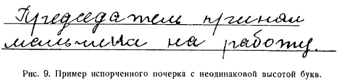
Почерк портится от неравномерной высоты букв или отдельных элементов. Однако для того чтобы письмо было красивым, необходимо соблюдать не только одинаковую высоту букв, но и правильное соотношение между высотой и шириной буквы.
Handwriting is spoiled by uneven heights of letters or individual elements. However, in order for the handwriting to be beautiful, it is necessary to observe not only the same height of the letters, but also the correct ratio between the height and width of the letter.
Нормальным следует считать такое соотношение, при котором длина основного элемента, например, овала или наклонной черты с нажимом и закруглением внизу, относится к его ширине, как 2:1. Отношение высоты к ширине буквы будет изменяться в зависимости от количества элементов букв.
A normal ratio should be such that the length of the main element, for example, an oval or a slanted line with pressure and rounding at the bottom, relates to its width as 2:1. The ratio of the height to the width of the letter will change depending on the number of letter elements.
4. Для соблюдения правильности и красоты почерка соединительные черты между буквами, а также тонкие волосные черты элементов пишутся с одинаковым наклоном.
4. To maintain the correctness and beauty of the handwriting, connecting lines between letters, as well as thin hairlines of elements are written with the same slant.
Правда, этот наклон несколько больше наклона основных элементов, а черты более отлоги, чем черты основных элементов, тем не менее однообразный наклон волосных черт придает всему почерку ровный и ритмичный характер.
Indeed, this slant is somewhat larger than the slant of the main elements, and the lines are more reclined than the lines of the main elements, however, the uniform slant of the hairlines gives the entire handwriting an even and rhythmic character.
5. Наконец, для соблюдения правильности и красоты почерка очень важно равномерно располагать буквы в слове и слова на строке. Все строки должны начинаться на одной вертикальной линии.
5. Finally, for the correctness and beauty of handwriting, it is very important to evenly arrange letters in a word and words on a line. All lines should start on one vertical line.
Поля обычно делаются шириной в 3 см.
Margins are usually made 3 cm wide.
Слова следует писать так, чтобы между ними были одинаковые промежутки, равные ширине рукописной буквы т.
Words should be written so that there are equal spaces between them, equal to the width of the handwritten letter 't'.
Буквы в слове должны размещаться с одинаковыми интервалами, которые при скорописи будут несколько шире основного элемента буквы, но совершенно равномерны. Это придает всему почерку строгую ритмичность, а следовательно, и красоту.
Letters in a word should be arranged at equal intervals, which in speedwriting will be slightly wider than the main element of the letter, but completely even. This gives the entire handwriting strict rhythmicity, and therefore, beauty.
Только в I классе, при письме по косым линейкам с клетками большого размера, расстояния между буквами будут равны одной клетке, т. е. ширине отдельного элемента буквы. Но уже со II класса в целях выработки плавности в письме следует интервалы удлинять. Этим обусловливается более свободное отношение к наклонным линиям, а затем и постепенный отход от них.
Only in the first grade, when writing on slanted grids with large cells, the distances between letters will be equal to one cell, that is, the width of a single letter element. But already from the second grade, in order to develop fluidity in writing, intervals should be lengthened. This leads to a more flexible approach to slanted lines and then a gradual move away from them.
Только при соблюдении всех пяти условий, а также при правильном начертании овалов, которые должны сохранять классическую эллиптическую форму, и при совершенной прямизне наклонных черт учитель может добиться у учащихся красивого письма.
Only by observing all five conditions, as well as correctly drawing ovals, which should maintain the classic elliptical shape, and perfectly straight slanted lines, can a teacher achieve beautiful handwriting from students.
Письмо должно быть скорым, но научить детей писать быстро — задача нелегкая. Нарастание темпа будет происходить постепенно, на протяжении всех трех лет обучения чистописанию. В I классе дети должны писать медленно, так как скорое письмо в самом начале обучения, до прочного усвоения начертаний букв, повлечет за собой искажение почерка. Да и в дальнейшем ускорять темп письма нужно с крайней осторожностью.
Writing should be fast, but teaching children to write quickly is not an easy task. The pace will increase gradually, over all three years of teaching penmanship. In the first grade, children should write slowly, because fast writing at the very beginning of education, before firmly mastering the outlines of letters, will lead to distortion of handwriting. And in the future, it is necessary to speed up the pace of writing with extreme caution.
Наиболее приемлемые нормы письма разработаны А.- И. Воскресенской. В I классе учащиеся в начале учебного года должны писать 4—5 букв в минуту; в конце года—10—12 букв. Во II классе в начале года скорость письма будет равняться 12— 15 буквам в минуту, а в конце — около 30 букв. В III классе учащиеся должны писать со скоростью 45—50 букв в минуту. В IV классе скорость письма должна равняться 50—65 буквам.
The most acceptable writing norms were developed by A.-I. Voskresenskaya. In the first grade, at the beginning of the academic year, students should write 4-5 letters per minute; at the end of the year, 10-12 letters. In the second grade, at the beginning of the year, the writing speed will be 12-15 letters per minute, and at the end, about 30 letters. In the third grade, students should write at a speed of 45-50 letters per minute. In the fourth grade, the writing speed should be 50-65 letters.
Письмо учеников должно быть разборчивым. Учителю никогда не следует забывать этого, так как все остальные качества письма утратят значительную долю своего положительного значения, если ученик будет писать неразборчиво.
The students' writing should be legible. The teacher should never forget this, because all other qualities of writing will lose a significant part of their positive value if the student writes illegibly.
Неразборчивость почерка обычно появляется у учащихся в результате недосмотра и неопытности учителя. Чаще всего неразборчивость почерка начинается с неправильного начертания букв, преждевременного перехода на скоропись, случайных индивидуальных отклонений в письме того или иного ребенка, не выправленных учителем своевременно.
Illegible handwriting usually appears in students as a result of oversight and inexperience of the teacher. Most often, illegible handwriting begins with incorrect drawing of letters, premature transition to speedwriting, random individual deviations in the writing of this or that child, not corrected by the teacher in time.
Наша графика резко отличается от графики зарубежных стран. Нашей графике письма совершенно чужды острые штрихи, характерные для готики в немецком письме; чужды и округлые формы английского рондо. Закругления в наших буквах, которые придают им красивый вид, не имеют ни острых углов, ни изломов.
Our graphics sharply differs from the graphics of foreign countries. Sharp strokes, characteristic of Gothic in German writing, are completely alien to our handwriting graphics; so are the round shapes of English rondo. The roundings in our letters, which give them a beautiful appearance, have neither sharp corners nor breaks.
Исходя из особенностей нашей графики, нельзя упрощать написания отдельных букв
при скорописи. Например, при написании буквы к нельзя ее изображать наподобие
латинского  ; букву л
— вроде латинского
; букву л
— вроде латинского  ;
букву з в виде
;
букву з в виде  ;
букву х — в виде .
Столь же противоречит простоте и рациональности нашего письма начертание буквы
;
букву х — в виде .
Столь же противоречит простоте и рациональности нашего письма начертание буквы
 в виде
 , требующее отрыва
руки. Советскому стилю письма также чужда вычурность, намеренная кудреватость
букв.
, требующее отрыва
руки. Советскому стилю письма также чужда вычурность, намеренная кудреватость
букв.
Based on the features of our graphics, you cannot simplify the writing of
individual letters in shorthand. For example, when writing the letter к, you
cannot depict it like the Latin
; the letter л —
like the Latin ; the
letter з in the form of
; the letter х — in
the form of
. Similarly, it
contradicts the simplicity and rationality of our writing to draw the letter
in the form of
, which requires
lifting the hand. Extravagance, intentional curliness of letters is also alien
to the Soviet style of writing.
[4/10] Chapter 4: Continuous Writing
БЕЗОТРЫВНОЕ ПИСЬМО
[X]initial translation from https://chat.openai.com[X]html formatting[X]translate and insert footnotes[X]translate and insert illustrations[ ]check for missing text in the Russian text or the translation[ ]check for ascii characters in Russian text; cyrillic characters in English text[ ]check for font changes in the printed book to be implemented here: bold, italic, etc.[ ]typographical revisions: consistent punctuation, curly quotes, en- and em-dashes[ ]spot checks of the translation quality[ ]add links to web resources
Нередко приходится наблюдать почерки, в которых имеется разрыв между буквами. Такое письмо по своему характеру близко к печатанию. Пишущий выписывает каждую букву в отдельности с ясно различимыми промежутками между ними.
One often observes handwriting in which there is a break between letters. Such writing in its nature is close to printing. The writer inscribes each letter separately with clearly distinguishable gaps between them.
Письмо это отличается четкостью, но оно лишено другого основного ценного качества — скорости. Появление таких почерков объясняется исключительно недосмотром учителей, которые не научили своих учеников писать буквы без отрыва пера от бумаги и правильно соединять их.
This type of writing is characterized by its clarity, but it lacks another fundamental valuable quality - speed. The emergence of such handwriting is due entirely to the oversight of teachers who have not taught their students to write letters without lifting the pen from the paper and to correctly connect them.
Люди с плохими почерками лишены возможности писать скоро, так как они не овладели ни знаниями, ни навыками письма.
People with poor handwriting lack the ability to write quickly because they have not mastered either the knowledge or the skills of writing.
Скорость письма достигается: 1) постепенным уменьшением размеров букв, т. е. сокращением линии движения пера; 2) применением рациональных соединений между буквами, обеспечивающих безотрывное письмо; 3) увеличением подвижности кисти, пальцев и предплечья; 4) применением упрощенных начертаний букв в отличие от начертаний каллиграфических.
Writing speed is achieved by: 1) gradually reducing the size of letters, i.e., shortening the line of pen movement; 2) applying rational connections between letters, ensuring continuous writing; 3) increasing the mobility of the wrist, fingers, and forearm; 4) applying simplified letter drafts, unlike calligraphic drafts.
Из перечисленных условий, обеспечивающих скоропись, главная роль принадлежит письму без отрыва пера от бумаги.
Among the conditions listed that ensure rapid writing, the main role belongs to writing without lifting the pen from the paper.
Безотрывное письмо появилось в нашей скорописи в начале XIX века.
Continuous writing appeared in our shorthand at the beginning of the 19th century.
В XVII и XVIII вв. грамотные русские люди применяли скоропись с обособленным начертанием каждой отдельной буквы, и применение безотрывного письма было в известной мере моментом рационализации письма. Оно входило в практику постепенно и незаметно, так что даже не отразилось в методиках обучения письму, составленных в дореволюционное время.
In the 17th and 18th centuries, literate Russian people used shorthand with the isolated representation of each individual letter, and the use of continuous writing was to a certain extent a moment of rationalization of writing. It entered practice gradually and unnoticeably, so much so that it was not even reflected in the methods of teaching handwriting, compiled in pre-revolutionary times.
В. С. Гербач совершенно обошел вопрос о безотрывном письме; высказывания И. Е. Евсеева и Ф. В. Грекова отличаются краткостью и неопределенностью.
V. S. Gerbach completely bypassed the issue of continuous writing; the statements of I. E. Evseev and F. V. Grekov are characterized by their brevity and uncertainty.
В советской методике вопрос о безотрывности письма был поставлен прежде всего Д. А. Писаревским, который наметил конкретные пути для развития безотрывности письма.
In the Soviet methodology, the issue of the continuity of writing was first raised by D. A. Pisarevsky, who outlined specific paths for the development of continuous writing.
Д. А. Писаревский держится той точки зрения, что безотрывное письмо должно начинаться уже в 1 классе в период обучения грамоте. Только первые 18 букв, по его мнению, пишутся с отрывом пера при письме каждого элемента. В дальнейшем дети пишут новые буквы безотрывно и постепенно приучаются писать без отрыва и ранее изученные буквы.
D. A. Pisarevsky holds the view that continuous writing should begin as early as the 1st grade during literacy training. Only the first 18 letters, in his opinion, are written with the pen lifted while writing each element. Subsequently, children write new letters continuously and gradually get used to writing previously learned letters without lifting the pen.
Являясь горячим сторонником безотрывного, скорого письма, Д. А. Писаревский в свое время утверждал, что «при работе над ускорением письма взятая ранее установка в отношении отрывности письма должна постепенно изменяться. Учитель должен показать детям, как соединять строчные буквы без отрыва. Из всех букв строчного письма только буквы б и э требуют обязательного отрыва — первая при соединении ее со следующей буквой, вторая — для проведения средней волнистой черточки. Все остальные буквы можно писать и соединять с другими без отрыва пера от бумаги».
Being an ardent supporter of continuous, fast writing, D. A. Pisarevsky once claimed that "when working to speed up writing, the previous setting regarding the discontinuity of writing should gradually change. The teacher must show the children how to connect lowercase letters without lifting the pen. Of all the letters of the lowercase writing, only the letters "б" and "э" require mandatory lifting - the first when connecting it with the next letter, the second - to draw the middle wavy line. All other letters can be written and connected with others without lifting the pen from the paper."
Касаясь обучения письму «грамотных» ребят, Д. А. Писаревский считал «обязательным с первых же шагов обучения письму приучать детей к правильному соединению букв между собою, к связному письму».
Regarding the teaching of writing to "literate" children, D. A. Pisarevsky considered it "mandatory from the very first steps of teaching writing to accustom children to the correct connection of letters with each other, to connected writing."
Решительное отстаивание безотрывности письма возникло в противовес американскому методу обучения грамоте, при котором дети учились не писать, а рисовать буквы, что приводило к порче почерков и к затрудненному письму.
Resolute defense of continuous writing arose in contrast to the American method of teaching literacy, where children learned not to write, but to draw letters, which led to the spoiling of handwriting and to difficult writing.
Исходя из теоретических высказываний и установившейся практики письма, вопрос о безотрывности письма необходимо расчленить на два: о безотрывном письме букв и о безотрывном письме слов.
Based on theoretical statements and established writing practices, the question of continuous writing should be divided into two: about the continuous writing of letters and about the continuous writing of words.
Уже в I классе следует требовать от учащихся безотрывного письма некоторых как одноэлементных, так и двухэлементных строчных букв.
Already in the 1st grade, students should be required to write some single-element and two-element lowercase letters without lifting the pen.
Без отрыва пера учащиеся I класса в первом полугодии пишут буквы II группы: л , ы; III группы: а , б , д , я; IV группы: е , ч , ь , в; V группы: з .
In the first semester, 1st grade students write group II letters: л, ы; group III: а, б, д, я; group IV: е, ч, ь, в; group V: з without lifting the pen.
Они также усваивают в словах безотрывные соединения букв: иг, ил, ум, уч, ьи, ои, ок, ою, ох, дя, юг, ия, яч, се, пе, ее, ов, че, ье, зл, ук, иж и других аналогичных сочетаний.
They also learn continuous connections of letters in words: иг, ил, ум, уч, ьи, ои, ок, ою, ох, дя, юг, ия, яч, се, пе, ее, ов, че, ье, зл, ук, иж and other similar combinations.
Во II классе дети усваивают безотрывное письмо строчных букв и, ш, п, т, у, м, ц, щ, н, ю, заглавных И, Ш, Ц, Щ, Ч, Л, М, Е, 3, Я, У, Д ; приобретают навыки безотрывного соединения букв, начинающихся сверху прямыми чертами или полуовалами, как, например, ип, up, ну, ущ, ящ, чт, кш.
In the 2nd grade, children learn to write the lowercase letters и, ш, п, т, у, м, ц, щ, н, ю, uppercase И, Ш, Ц, Щ, Ч, Л, М, Е, З, Я, У, Д without lifting the pen; they acquire the skills of continuous connection of letters, beginning from the top with straight lines or semicircles, such as ип, up, ну, ущ, ящ, чт, кш.
В III классе дети изучают способы безотрывного письма таких строчных букв, как р, ф, х, ж.
In the 3rd grade, children study ways of writing such lowercase letters as р, ф, х, ж without lifting the pen.
При изучении скорописи они знакомятся с приемами безотрывного соединения букв, начинающихся с удлиненных прямых и овалов — по, ор, аф, що, об, ба, са и др.
When studying shorthand, they become familiar with techniques for continuously connecting letters that begin with elongated straight lines and ovals - по, ор, аф, що, об, ба, са, etc.
Заглавные буквы, за исключением тех, безотрывное письмо которых усвоено во II классе, пишутся и при скорописи с отрывом пера между элементами.
Capital letters, except for those whose continuous writing is mastered in the 2nd grade, are written with the pen lifted between elements even in shorthand.
Попытку В. А. Саглина и некоторых других методистов писать их без отрыва нельзя считать удачной, так как этим не достигается почти никакой экономии времени. Между тем наносится явный ущерб простоте письма из-за вычурного начертания букв, нарушающего разборчивость почерка.
The attempt by V. A. Saglin and some other methodologists to write them without lifting the pen cannot be considered successful, as it achieves almost no time economy. Meanwhile, it clearly harms the simplicity of writing due to the elaborate lettering, which impairs the legibility of handwriting.
Без отрыва соединяются со следующими за ними буквами только те заглавные буквы, которые заканчиваются элементами с нижними закруглениями, как, например, И, С, Я, К и др.
Only those capital letters that end with elements with lower curves are connected without lifting the pen to the letters that follow them, such as И, С, Я, К, etc.
Остальные заглавные буквы соединяются со следующими за ними строчными буквами с отрывом пера.
The other capital letters are connected with the lowercase letters that follow them with the pen lifted.
[4/10] Chapter 5: Hygiene and Technique of Writing
ГИГИЕНА И ТЕХНИКА ПИСЬМА
[X]initial translation from https://chat.openai.com[X]html formatting[X]translate and insert footnotes[X]translate and insert illustrations[ ]check for missing text in the Russian text or the translation[ ]check for ascii characters in Russian text; cyrillic characters in English text[ ]check for font changes in the printed book to be implemented here: bold, italic, etc.[ ]typographical revisions: consistent punctuation, curly quotes, en- and em-dashes[ ]spot checks of the translation quality[ ]add links to web resources
Мы говорили о требованиях, которые предъявляются к письму учащихся. Но эти требования приведут к желательным результатам только при наличии надлежащих условий.
We talked about the requirements that are imposed on the students' handwriting. But these requirements will lead to the desired results only when the proper conditions are present.
Письмо представляет собою сложный психо-физиологический процесс, при котором движения рук контролируются и направляются движением глаз. Поэтому между глазами и рукой должно быть при письме правильное взаимодействие. Нарушение этих условий вызывает неправильную аккомодацию⁷ глаз, напряженность в движениях руки, отражается на здоровье пишущего и создает неизбежные затруднения в письме.
Writing is a complex psycho-physiological process in which hand movements are controlled and directed by eye movements. Therefore, there must be a correct interaction between the eyes and the hand during writing. Disruption of these conditions causes improper eye accommodation, tension in hand movements, impacts the health of the writer, and creates inevitable difficulties in writing.
Особенно вредными для здоровья учащихся являются низкий наклон головы, вызывающий близорукость, и неправильное положение корпуса пишущего, вызывающее искривление позвоночника — сколиоз. При неправильном положении корпуса, при его чрезмерном сгибании сдавливается грудная полость. Это затрудняет дыхание, создает предпосылки к заболеванию ребенка туберкулезом легких.
Particularly harmful to the health of students are a low tilt of the head, which can cause myopia, and incorrect body posture while writing, which can lead to spinal curvature - scoliosis. When the body is in an improper position, excessive bending compresses the chest cavity. This makes breathing difficult and predisposes the child to lung tuberculosis.
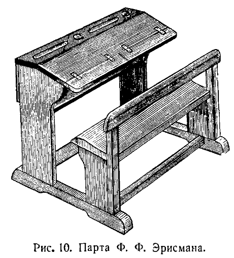
Правильная посадка при письме зависит прежде всего от устройства парты (рис. 10, 11), которая должна соответствовать росту школьника и обеспечивать ему возможность удерживать глаза на одинаковом расстоянии от всей поверхности тетради.
The correct sitting position during writing depends primarily on the design of the desk (fig. 10, 11), which should match the height of the student and provide them the opportunity to keep their eyes at an equal distance from the entire surface of the notebook.
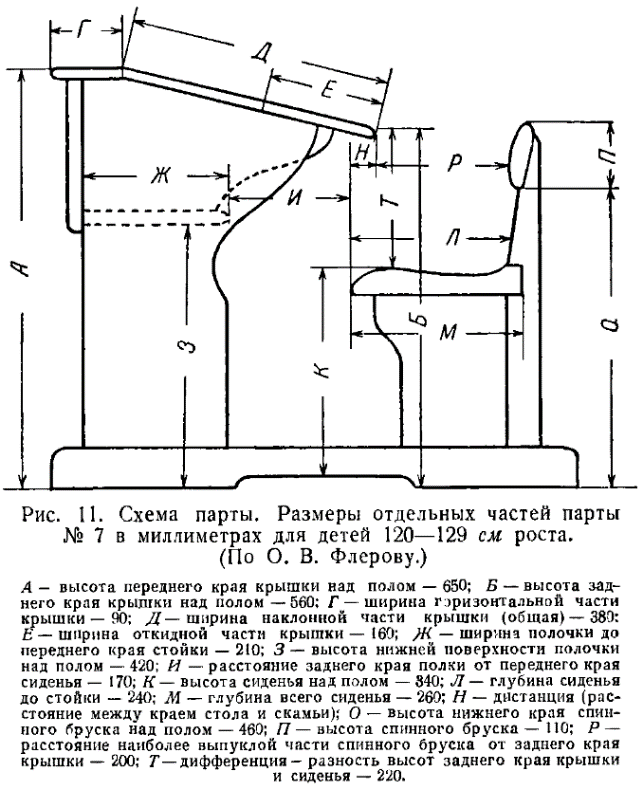
А – height of the front edge of the lid above the floor – 650; Б – height of the back edge of the lid above the floor – 560; Г – width of the horizontal part of the lid – 90; Д – width of the slanting part of the lid (total) – 380; Е – width of the folding part of the lid – 160; Ж – width of the shelf to the front edge of the rack – 210; З – height of the bottom surface of the shelf above the floor – 420; И – distance from the back edge of the shelf to the front edge of the seat – 170; К – height of the seat above the floor – 340; Л – depth of the seat to the rack – 240; М – total depth of the seat – 260; Н – distance (the space between the edge of the table and the bench); О – height of the bottom edge of the back bar above the floor – 460; П – height of the back bar – 110; Р – distance from the most protruding part of the back bar to the back edge of the lid – 200; Т – differential – difference in heights of the back edge of the lid and the seat – 220.
При определении размера парты необходимо учитывать ее высоту, расстояние по вертикальной линии между скамейкой и краем стола, обращенным к ученику, высоту скамейки и длину стола.
When determining the size of the desk, it is necessary to consider its height, the distance along the vertical line between the bench and the edge of the table facing the student, the height of the bench, and the length of the table.
Министерством просвещения разработана следующая таблица дифференциации парт применительно к росту учащихся:
The Ministry of Education has developed the following table for differentiating desks according to the height of students:
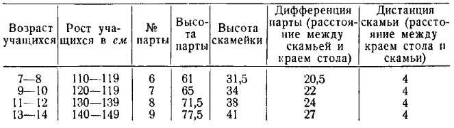
| Student age | Student height in cm | Desk no. | Desk height | Bench height | Desk differential (distance between the bench and the edge of the table) | Bench distance (distance between the edge of the table and the bench) |
|---|---|---|---|---|---|---|
| 7–8 | 110–119 | 6 | 61 | 31.5 | 20.5 | 4 |
| 9–10 | 120–129 | 7 | 65 | 34 | 22 | 4 |
| 11–12 | 130–139 | 8 | 71.5 | 38 | 24 | 4 |
| 13–14 | 140–149 | 9 | 77.5 | 41 | 27 | 4 |
Но одно дело предоставить ученику соответствующую его росту парту, другое, еще более важное и очень трудное дело — научить ребенка сидеть за нею.
But it's one thing to provide a desk that corresponds to the student's height, another, even more important and very difficult task is to teach the child to sit at it.
И учитель обязан сделать это, так как правильная посадка имеет большое гигиеническое и дидактическое значение.
And the teacher is obligated to do this, as the correct posture has great hygienic and didactic significance.
При правильной посадке пишущий обязан сидеть, прямо; грудь его не должна касаться края стола, так как это вызывает неправильное дыхание и заболевание легких.
With the correct posture, the one who is writing must sit straight; his chest should not touch the edge of the table, as this causes incorrect breathing and lung disease.
Оба плеча ученика должны быть на одинаковой высоте, в противном случае может развиться кривобокость (рис. 12).
Both shoulders of the student should be at the same height, otherwise scoliosis might develop (fig. 12).
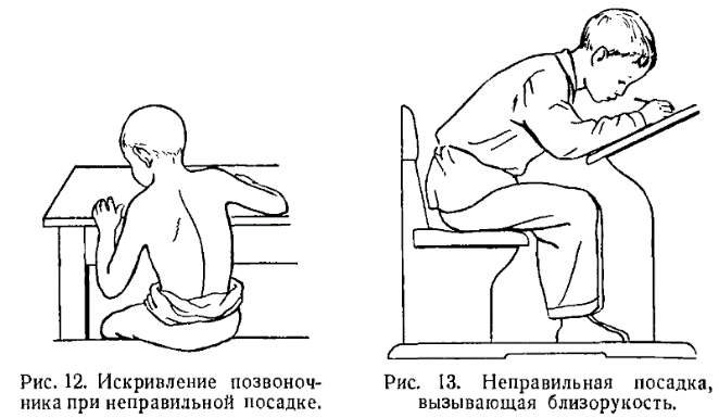
Fig. 12. Spinal curvature due to incorrect posture.
#+endtext
Fig. 13. Incorrect posture causing nearsightedness.
Голова пишущего должна быть несколько наклонена вперед, чтобы между глазами и линией строки сохранялось расстояние в 30 см (рис. 14). Не следует допускать, чтобы ученик склонял голову к правому или левому плечу или слишком низко наклонял ее к столу (рис. 13): он должен держать голову прямо; это предупреждает близорукость и помогает пишущему охватывать глазами всю строку и даже несколько строк сразу, обеспечивает развитие глазомера и применение зрительного контроля.
The head of the person writing should be slightly tilted forward so that a distance of 30 cm is maintained between the eyes and the line of text (fig. 14). One should not allow the student to tilt his head towards the right or left shoulder, or to bend it too low towards the table (fig. 13): he must keep his head straight; this prevents myopia and helps the writer to visually encompass the whole line, and even several lines at once, promoting the development of the visual control and the use of it.
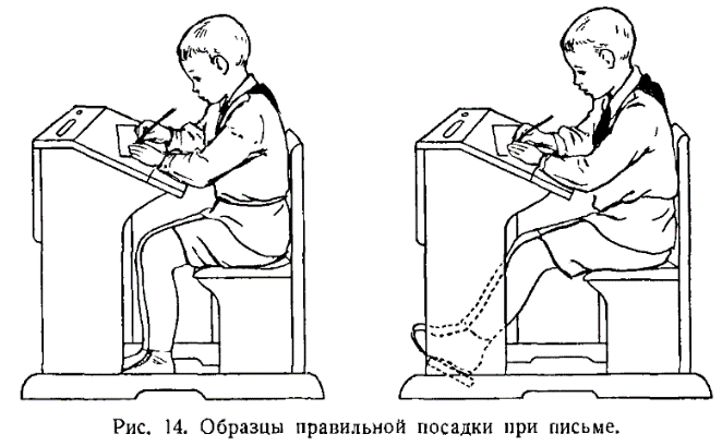
Ноги у детей, согнутые под прямым углом в коленях, ставятся всею ступнею на пол, чтобы придать полную устойчивость корпусу. Ступни не обязательно должны быть сдвинуты: левую ногу можно немного выдвинуть вперед. Ученик, не достающий ногами пола, может опираться о переднюю подставку обеими ногами.
Children's legs, bent at a right angle at the knees, are placed flat on the floor, providing full stability to the body. The feet do not necessarily have to be shifted: the left foot can be slightly extended forward. A student, whose feet do not reach the floor, can rest both feet on the front stand.
Руки пишущего должны лежать на столе так, чтобы локти немного выступали за край стола и находились на расстоянии 10 см от туловища, а оба предплечья лежали под прямым углом одно к другому (рис. 14).
The hands of the person writing should lie on the table so that the elbows slightly protrude over the edge of the table and are 10 cm away from the torso, and both forearms lie at right angles to each other (fig. 14).
Первое правило письма заключается в том, чтобы пишущая, т. е. правая, рука двигалась совершенно свободно. Кроме того, нужно, чтобы при письме не только сгибались и разгибались пальцы, не только производились вращательные и иные движения кисти, но чтобы постепенно, по мере заполнения строки, передвигалось вправо и предплечье.
The first rule of writing is that the writing, i.e. right, hand should move completely freely. In addition, when writing, it's necessary that not only the fingers flex and extend, not only the wrist performs rotating and other movements, but gradually, as the line is filled, the forearm also moves to the right.
Следует учитывать, что одновременно с поступательным движением вправо, от начала строки к концу, предплечье совершает и еще одно движение — медленное вращательное (пронационное). В результате этого движения ручка, при начале строки направленная своим верхним концом в плечо, будет постепенно к концу строки отклоняться влево и направляться в грудь (рис. 15).
It should be noted that simultaneously with the linear movement to the right, from the beginning of the line to the end, the forearm also performs another movement - a slow rotation (pronation). As a result of this movement, the pen, pointed with its top towards the shoulder at the beginning of the line, will gradually deviate to the left towards the end of the line and point towards the chest (fig. 15).
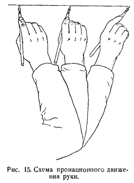
Итак, учитель чистописания должен не только строго контролировать посадку ученика, но и следить за тем, чтобы у него в процессе обучения развивались координация движений пальцев, кисти и предплечья, а также пронационные, т. е. такие движения, при которых ладонь поворачивается постепенно, по мере движения руки вправо, своей левой стороной книзу.
So, the penmanship teacher should not only strictly control the student's posture, but also ensure that coordination of finger, wrist and forearm movements develops in the process of learning, as well as pronation movements, i.e., those movements during which the palm gradually turns its left side down as the hand moves to the right.
Именно те дети пишут плавно и красиво, которые свободно передвигают во время письма предплечье, а не те, которые надавливают на него всем корпусом и от времени до времени напряженно поднимают предплечье над столом, чтобы передвинуть его вправо. «Большое мышечное напряжение, возникающее у детей после написания двух-трех знаков при неподвижном предплечье, вызывает в письме, вопреки желанию пишущего, искажения формы букв, наклона и нажима».
Those children who freely move their forearm while writing write smoothly and beautifully, not those who press on it with their whole body and tensely lift the forearm above the table from time to time to move it to the right. "The large muscular tension arising in children after writing two or three characters with a motionless forearm causes distortions in the shape of letters, slant, and pressure against the writer's will."
Важную роль при письме играет качество ручки и способ ее держания. Нельзя употреблять для письма слишком толстую или короткую ручку. Лучшей ручкой считается деревянная, без металлического наконечника, длиной в 15 см и толщиной в 8 мм.
The quality of the pen and the way it is held play an important role in writing. It is not recommended to use too thick or short pens for writing. The best pen is considered to be a wooden one, without a metal tip, 15 cm long and 8 mm thick.
Не следует допускать употребление учениками таких перьев, как рондо, «уточка» и других, имеющих тупые концы. Лучшими перьями являются № 86, 30, 36, 300 фабрики «Союз», а также № «, 270, 510; многими одобряются перья № 1.
Students should not be allowed to use such nibs as a rondó, "duck" and others with blunt tips. The best nibs are No. 86, 30, 36, 300 from the "Soyuz" factory, as well as No. 1, 270, 510; many approve of No. 1 nibs.
Эти перья имеют тонкий и острый конец и дают при движении кверху тонкие, волосные черты.
These nibs have a thin and sharp tip and produce thin, hair-like lines when moving upwards.
Важно также при письме, чтобы перо было прочно укреплено в ручке.
It is also important when writing that the nib is firmly fixed in the pen.
Ручка удерживается при письме тремя пальцами: большим, указательным и средним, а безымянный и мизинец, немного подогнутые к ладони, служат для опоры пишущей руки, которая будет тогда легко и свободно скользить по бумаге.
The pen is held when writing by three fingers: thumb, index and middle, while the ring and little fingers, slightly bent towards the palm, serve to support the writing hand, which will then easily and freely slide over the paper.
Очень важное значение имеет взаимное расположение трех пальцев, удерживающих ручку. Слева ручка удерживается внутренней частью ногтевой фаланги большого пальца, справа она прижата к первому суставу среднего пальца и к третьему суставу указательного пальца; сверху на ручку легко опускается указательный палец, который ни в коем случае не соприкасается с большим пальцем, но по сравнению с ним несколько выступает вперед. Все три пальца — большой, указательный и средний — должны быть в полусогнутом состоянии (рис. 16). Прогиб первого сустава указательного пальца ведет к перенапряжению мускулов, вызывает утомляемость, замедление письма или его искажение при попытке ускорить темп.
The mutual arrangement of the three fingers holding the pen is very important. On the left, the pen is held by the inner part of the nail phalanx of the thumb, on the right it is pressed against the first joint of the middle finger and the third joint of the index finger; from above, the index finger lightly drops onto the pen, which under no circumstances touches the thumb, but slightly protrudes forward in comparison with it. All three fingers - the thumb, index and middle - should be in a semi-bent state (fig. 16). Bending the first joint of the index finger leads to muscle strain, causes fatigue, slows down writing or distorts it when trying to speed up the pace.
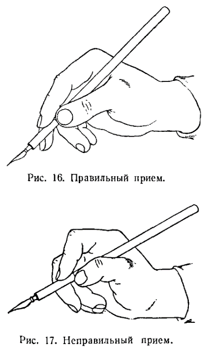
Пальцы, держащие ручку, как правило, находятся на расстоянии 1 см от пера. Перо ставится на лист бумаги так, чтобы желобок был обращен книзу, а «окошечко» пера кверху.
The fingers holding the pen are usually 1 cm away from the nib. The nib is placed on the sheet of paper so that the groove is facing down and the 'window' of the nib is facing up.
Тыльная часть руки должна быть обращена при письме кверху, а ладонь книзу. Нельзя прижимать к бумаге правый край ладони, так как это лишает руку подвижности и не дает возможности писать плавно.
The back of the hand should be facing upwards when writing, and the palm downwards. It is not recommended to press the right edge of the palm against the paper, as this deprives the hand of mobility and prevents smooth writing.
При правильном положении рук и правильном держании пера ручка своим свободным концом будет обращена в правое плечо, а по мере написания страницы конец ручки будет постепенно передвигаться в направлении к середине груди. По этому признаку учителю легко будет проверить, правильно ли держат ученики ручки, так как всякое отклонение конца ручки в сторону будет заметно даже при беглом взгляде.
With the correct hand position and correct holding of the pen, the free end of the pen will be pointed towards the right shoulder, and as the page is written, the end of the pen will gradually move towards the center of the chest. By this sign, the teacher will easily be able to check whether the students are holding the pens correctly, as any deviation of the pen's end to the side will be noticeable even at a glance.
Свободно или напряженно держит учащийся ручку можно узнать по указательному пальцу.
Whether a student is holding the pen freely or tensely can be determined by looking at the index finger.
Иногда учащийся так сильно его сгибает, что получается впечатление вывиха.
Sometimes the student bends it so much that it gives the impression of a dislocation.
Наиболее распространенными отступлениями от правил держания ручки являются следующие.
The most common deviations from the rules of holding the pen are as follows.
1. Сближение кончиков пальцев с большим напряжением их (рис. 17).
1. The fingertips converge with great tension (fig. 17).
2. Пальцы удерживают не ручку, а перо или находятся в непосредственной близости к перу. Это связывает движение руки и является причиной неровности, отсутствия плавности почерка и некрасивого начертания букв.
2. The fingers do not hold the pen, but the nib or are located close to the nib. This restricts the movement of the hand and is the cause of unevenness, lack of smoothness of handwriting and ugly lettering.
3. Иногда пальцы очень вытягиваются, и середина ручки соприкасается не с третьим суставом указательного пальца, как это необходимо, а бывает опущена в углубление кисти между большим и указательным пальцем (рис. 18). Это является одной из причин нечеткости почерка.
3. Sometimes the fingers stretch out a lot, and the middle of the pen comes into contact not with the third joint of the index finger, as it should, but is often lowered into the hollow of the hand between the thumb and the index finger (fig. 18). This is one of the causes of illegibility in handwriting.
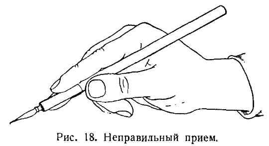
Учителя-практики выработали хороший прием подготовки детей к письму; он заключается в том, что дети по команде учителя ставят одновременно локти на край стола, сближая кончики пальцев под прямым углом. Потом опускают одновременно оба предплечья так, что локти легко соскальзывают с края стола и предплечья ложатся под прямым углом (рис. 19).
Practicing teachers have developed a good method of preparing children for writing; it consists in the children, at the teacher's command, simultaneously placing their elbows on the edge of the table, bringing their fingertips together at a right angle. Then they simultaneously lower both forearms so that the elbows slide easily off the edge of the table and the forearms lie at a right angle (fig. 19).
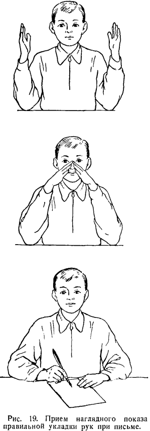
Правильное держание ручки обычно проверяется так: учитель предлагает учащимся поднимать и опускать до 6—7 раз подряд указательный палец. При правильном держании ручка, удерживаемая с боков большим и средним пальцами, не выпадает из рук ученика и остается в одном и том же положении (рис. 20).
The correct way to hold a pen is usually tested as follows: the teacher asks the student to raise and lower the index finger 6-7 times in a row. With the correct grip, the pen, held from the sides by the thumb and middle fingers, does not fall out of the student's hand and remains in the same position (fig. 20).
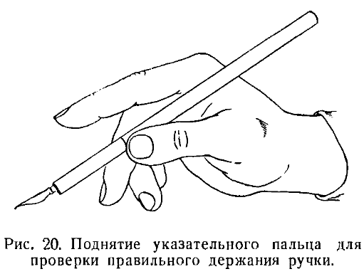
Следующим необходимым условием выработки красивого письма является правильное положение тетради.
The next necessary condition for developing beautiful handwriting is the correct position of the notebook.
Тетрадь во время письма должна лежать перед учеником наклонно, чтобы ее нижний край образовал с краем стола, обращенным к ученику, угол, равный 25°. При таком положении тетради ученик будет легко чертить наклонные линии, из которых состоят буквы. По мере заполнения строк ребенок подвигает тетрадь левой рукой кверху, без изменения угла наклона. Это помогает сохранять однообразный наклон на протяжении всей страницы.
During writing, the notebook should lie in front of the student at an angle, so that its lower edge forms an angle of 25° with the edge of the table facing the student. With this position of the notebook, the student will easily draw slanted lines, which make up the letters. As the lines are filled, the child moves the notebook up with his left hand, without changing the angle of inclination. This helps to maintain a uniform inclination throughout the entire page.
При переходе к следующей странице сохраняется тот же наклон тетради.
When moving to the next page, the same inclination of the notebook is maintained.
Ученик должен усвоить следующие правила положения тетради при письме: 1) правая рука пишет, левая придерживает тетрадь; 2) левый нижний угол страницы должен находиться против середины груди.
The student must learn the following rules for positioning the notebook when writing: 1) the right hand writes, the left hand holds the notebook; 2) the lower left corner of the page should be opposite the middle of the chest.
Необходимым условием предупреждения переутомления детей со всеми вытекающими из него отрицательными последствиями для их здоровья являются физкультминутки, которые проводятся 1—2 раза в течение урока чистописания.
A necessary condition to prevent overfatigue of children with all the resulting negative consequences for their health is the physical education minute, which is held 1-2 times during the handwriting lesson.
Физкультминутки состоят из 3—4 упражнений в виде свободных движений и проводятся организованно, под руководством учителя. Для выполнения упражнений ученики выходят из-за парт и становятся рядами.
Physical education minutes consist of 3-4 exercises in the form of free movements and are conducted in an organized manner, under the guidance of a teacher. To perform the exercises, students leave their desks and stand in rows.
В I классе могут быть взяты такие упражнения: 1) исходное положение — стоя, ноги на ширине плеч, руки вниз. Взмах рук в сторону и впереди тела; 2) при том же исходном положении наклон туловища влево, правая рука подводится подмышку, а левая как бы скользит по телу. То же в другую сторону; 3) при том же исходном положении — подняться на носки, руки — вперед, ладонями вниз; присесть на носках; встать на носки; перейти в исходное положение; 4) исходное положение — стоя на левой ноге, руки на поясе, правую ногу вытянуть в сторону; подскоки.
In the first grade, such exercises can be used: 1) initial position - standing, legs shoulder-width apart, hands down. Swing your arms to the side and in front of your body; 2) with the same initial position, tilt the torso to the left, the right hand is brought under the armpit, and the left hand seems to glide over the body. The same in the other direction; 3) with the same initial position - get up on your toes, hands - forward, palms down; sit down on your toes; stand on your toes; return to the initial position; 4) initial position - standing on the left leg, hands on the waist, extend the right leg to the side; jumps.
Сменять ногу после каждых четырех подскоков.
Change the leg after every four jumps.
Во II классе учителю можно рекомендовать следующие упражнения: 1) исходное положение — стоя, правая рука вперед, левая назад, пальцы сжаты в кулаки. Размахи руками попеременно; 2) исходное положение — стоя, ноги на ширине плеч, руки на поясе, поворот туловища влево и вправо попеременно; 3) исходное положение — стоя. Поворот туловища влево и вправо попеременно с хлопками в ладони над головой; 4) исходное положение — стоя, руки на поясе. Небольшие приседания на носках с разведением коленей.
In the second grade, the teacher can recommend the following exercises: 1) initial position - standing, right hand forward, left hand back, fingers clenched into fists. Alternating arm swings; 2) initial position - standing, feet shoulder-width apart, hands on the waist, alternating left and right torso turns; 3) initial position - standing. Alternating left and right torso turns with clapping above the head; 4) initial position - standing, hands on the waist. Small squats on the toes with knees spread apart.
В III классе, наряду с упражнениями, которые применялись во II классе, можно выполнять и такие упражнения: 1) исходное положение — стоя, руки в сторону, ладони книзу. Большие круги руками (в лицевой плоскости, движение рук начинается кверху); 2) то же, но начиная движение книзу; 3) исходное положение — стоя, ноги на ширину плеч, руки в сторону. Делать наклоны туловища вперед, доставая попеременно то левой рукой правый носок, то правой рукой левый носок.
In the third grade, in addition to the exercises used in the second grade, the following exercises can be performed: 1) initial position - standing, arms to the side, palms down. Big circles with the arms (in the frontal plane, the movement of the arms starts upwards); 2) the same, but starting the movement downwards; 3) initial position - standing, feet shoulder-width apart, arms to the side. Make forward torso bends, alternately reaching the right toe with the left hand, then the left toe with the right hand.
Выработка у учащихся твердых, устойчивых навыков посадки, держания ручки, движений руки, которые ученик сохранял бы на уроках чистописания и во время других письменных работ в классе и дома — вот первейшая задача учителя. Она решается повседневным кропотливым трудом и знанием индивидуальных особенностей каждого ученика.
The development of solid, stable habits of posture, holding a pen, hand movements, which the student would maintain during handwriting lessons and during other written work in class and at home - this is the primary task of the teacher. It is solved by everyday painstaking work and knowledge of the individual characteristics of each student.
[4/10] Chapter 6: Methods of Penmanship
МЕТОДЫ ЧИСТОПИСАНИЯ
[X]initial translation from https://chat.openai.com[X]html formatting[X]translate and insert footnotes[X]translate and insert illustrations[ ]check for missing text in the Russian text or the translation[ ]check for ascii characters in Russian text; cyrillic characters in English text[ ]check for font changes in the printed book to be implemented here: bold, italic, etc.[ ]typographical revisions: consistent punctuation, curly quotes, en- and em-dashes[ ]spot checks of the translation quality[ ]add links to web resources
Особенность чистописания как предмета заключается в том, что оно прививает навык письма на основе знаний и умений, последовательно развиваемых учителем у учащихся, и этот навык в процессе школьного обучения постепенно доводится до автоматизма.
The peculiarity of penmanship as a subject is that it instills the skill of writing based on knowledge and abilities, which are consistently developed by the teacher in students, and this skill is gradually brought to automation in the process of school education.
При обучении чистописанию применялись и применяются следующие методы: копировальный, линейный, генетический, тактический, или ритмический.
The following methods were and are used in teaching penmanship: copying, linear, genetic, tactile, or rhythmic.
Рассмотрим каждый из них в отдельности.
Let's consider each of them separately.
Копировальный, или стигмографический, метод. Он появился в XVIII в. Суть его заключается в том, что письмо проводилось по заготовленным, отпечатанным или писаным, прописям с буквами и словами, нанесенными на бумагу еле заметными линиями или пунктиром.
The copying, or stigmatographic, method. It appeared in the 18th century. Its essence lies in the fact that writing was conducted on prepared, printed or handwritten, copybooks with letters and words, applied to paper with barely noticeable lines or dotted lines.
Ученики, обводя пером с чернилами уже готовые буквы и слова, приучались таким путем правильно писать.
Students, tracing with a pen with ink already prepared letters and words, were thus accustomed to write correctly.
Этот метод широко применялся и в XIX в. Теперь он используется только в редких случаях, когда ученики не в силах усвоить начертания букв при обычном способе обучения. В таких случаях буквы и слова учитель пишет ученику в тетради карандашом, а тот обводит их чернилами.
This method was widely used in the 19th century. Now it is used only in rare cases, when students are unable to master the lettering with the usual method of teaching. In such cases, the teacher writes letters and words for the student in the notebook with a pencil, and he traces them with ink.
Линейный метод возник в начале XIX в. с введением разлинованных тетрадей. Он облегчил учащимся усвоение правильного написания букв установленного наклона и размера, правильного соединения элементов, развитие глазомера и плавности письма.
The linear method originated at the beginning of the 19th century with the introduction of lined notebooks. It facilitated students to master the correct spelling of letters of a set slope and size, the correct connection of elements, the development of eye measurement and smoothness of writing.
С развитием линейного метода появилось пять видов тетрадей: № 1 — с косыми линейками, с шириной строки в 8 мм и средней строчной линией; № 2 — с косыми линейками и шириной строки в 5 мм, без средней строчной линии; № 3 — с двумя линейками, с редкими косыми линиями на расстоянии 25 мм одна от другой; № 4 — с двумя линейками без косых или наклонных линий и, наконец, № 5 — по одной линейке (см. рис. 1—5, стр. 10, 11, 12).
With the development of the linear method, five types of notebooks appeared: No. 1 - with diagonal rulers, with a line width of 8 mm and a middle line; No. 2 - with diagonal rulers and a line width of 5 mm, without a middle line; No. 3 - with two rulers, with rare diagonal lines at a distance of 25 mm from each other; No. 4 - with two rulers without oblique or slanted lines and, finally, No. 5 - one ruler each (see fig. 1-5, p. 10, 11, 12).
В тетради № 1 имеются три горизонтальных линии: 1) верхняя линия строки; 2) средняя линия строки; 3) нижняя линия строки. Между верхней и нижней линией располагаются строчные буквы.
In notebook No. 1, there are three horizontal lines: 1) the top line of the line; 2) the middle line of the line; 3) the bottom line of the line. Lowercase letters are located between the top and bottom line.
Над верхней линией строки есть надстрочная линия, служащая границей для заглавных букв. Внизу — подстрочная линия, служащая границей для удлиненных прямых и петель, входящих в качестве элементов в строчные буквы.
Above the top line of the line is a superscript line, serving as the border for capital letters. Below is a subscript line, serving as the border for elongated straight lines and loops, which are included as elements in lowercase letters.
Поскольку одна и та же линия по отношению к одной строке является подстрочной, а к следующей — надстрочной, будет целесообразно, чтобы не -вызывать у детей недоумения, называть ее промежуточной; линии, пересекающие наискось строчные и промежуточные, называются наклонными.
Since the same line in relation to one line is subscript, and to the next - superscript, it would be advisable, in order not to cause confusion in children, to call it intermediate; the lines that cross diagonally the line and intermediate ones are called oblique.
Тетради № 1 применяются на 1-м году обучения. Необходимо добиться того, чтобы тетрадями такой разлиновки ученик пользовался не только на уроке чистописания, но и на прочих занятиях, связанных с письменными работами.
No. 1 notebooks are used in the first year of training. It is necessary to ensure that the student uses notebooks with such lining not only in the penmanship lesson, but also in other lessons related to written work.
В то же время не следует оставлять эти тетради в пользовании учеников на втором году обучения.
At the same time, these notebooks should not be left in use by students in the second year of study.
Применяя в первом классе тетради по косым линейкам № 1, учитель не должен допускать никаких отступлений от форм букв, изображенных в прописях.
When using notebooks with oblique rulers No. 1 in the first grade, the teacher should not allow any deviations from the forms of letters depicted in the copybooks.
Во II классе дети переходят на тетради № 2 с косой разлиновкой, с частыми наклонными линиями, с уменьшением ширины строки до 5 мм. Этот переход на буквы меньшего размера облегчает ученику последующее овладение скорописью с сохранением правильной формы букв.
In the II grade, children switch to notebooks No. 2 with oblique lining, with frequent oblique lines, with a decrease in the line width to 5 mm. This transition to smaller letters facilitates the student's subsequent mastery of shorthand while preserving the correct form of letters.
Используя тетрадь № 2, учитель развивает у учеников второго класса безотрывность и плавность письма, причем он должен следить за тем, чтобы учащиеся избегали повторяющейся в практике многих школ ошибки, которая заключается в том, что они пишут непропорционально широкие буквы.7
Using notebook No. 2, the teacher develops continuity and smoothness of writing in second-grade students, and he should ensure that students avoid the mistake, which is repeated in many schools' practice, of writing disproportionately wide letters 7.
Во 2-й четверти ученики II класса пишут в тетрадях № 3 с редкими косыми линиями, отстоящими одна от другой на 25 мм. Эти линии служат как для ориентировки в правильном однообразном наклоне, так и для развития глазомера.
In the 2nd quarter, second-grade students write in notebooks No. 3 with rare oblique lines, spaced 25 mm apart from each other. These lines serve both for orientation in the correct uniform slope and for the development of eye measurement.
В III классе ученики переходят к письму в тетрадях № 4 по двум линейкам без наклонных, а потом — в тетрадях № 5 по одной линейке. Задерживаться в III классе на письме по косым линейкам было бы большой методической ошибкой.
In the III grade, students switch to writing in notebooks No. 4 with two rulers without oblique ones, and then - in notebooks No. 5 with one ruler. It would be a big methodological mistake to linger in the III grade on writing by oblique lines.
Таковы пути правильного применения линейного метода.
Such are the paths of correct application of the linear method.
Генетический метод. Он имеет следующие особенности.
Genetic method. It has the following features:
1. Письмо букв обязательно подготовляется предварительным письмом элементов.
1. The writing of letters is necessarily preceded by the preliminary writing of elements.
2. Дети изучают написание букв не в алфавитном порядке, а в порядке возрастающей трудности их написания.
2. Children learn to write letters not in alphabetical order, but in the order of increasing difficulty of their writing.
3. Обучение строится на основе генезиса, т. е. образования каждой следующей буквы путем присоединения нового элемента к предшествующей букве и предварительного усвоения основного элемента, лежащего в основе новой группы букв.
3. Learning is based on genesis, that is, the formation of each subsequent letter by attaching a new element to the preceding letter and the preliminary assimilation of the basic element underlying the new group of letters.
В настоящее время обучение письму в наших советских школах проходит по официально рекомендованному Министерством просвещения генетическому методу, который теперь превратился в генетическую систему обучения. Несмотря на это, в практике преподавания чистописания наблюдаются нарушения и отклонения от генетического метода, которые сводятся к следующему:
At present, learning to write in our Soviet schools is carried out according to the genetic method officially recommended by the Ministry of Education, which has now turned into a genetic system of learning. Despite this, violations and deviations from the genetic method are observed in the practice of teaching penmanship, which are reduced to the following:
1. буквы изучаются на уроках чистописания не в установленном порядке;
1. letters are studied in handwriting lessons not in the established order;
2. дети приступают к письму новой буквы без предварительного письма составляющих ее элементов;
2. children start writing a new letter without preliminary writing of its constituent elements;
3. часто учителя ограничиваются предварительным письмом только тех элементов, которые до этого не встречались, и забывают повторение тех элементов, которые изучались раньше. Такое нарушение основ генетического метода неблагоприятно отражается на ходе обучения.
3. often teachers limit themselves to preliminary writing of only those elements that have not been encountered before, and forget to repeat those elements that were studied earlier. Such a violation of the principles of the genetic method adversely affects the course of learning.
Повторное письмо элементов в I—II классах не следует считать излишним даже тогда, когда большинство учащихся класса пишет безукоризненно.
Repetitive writing of elements in the first and second grades should not be considered excessive even when the majority of students in the class write impeccably.
Например, прямую черту с нажимом и закруглением внизу дети писали уже при изучении первой группы строчных букв. Но опытный учитель обязательно повторит ее перед письмом строчных букв второй и третьей группы, л и а, в которые она входит.
For example, children have already written a straight line with pressure and rounding at the bottom when studying the first group of lowercase letters. But an experienced teacher will definitely repeat it before writing lowercase letters of the second and third groups, l and a, in which it is included.
Прямую удлиненную черту с нажимом и петлей
 он будет писать как
перед письмом буквы у, так и
он будет писать как
перед письмом буквы у, так и
 , элементом которых
она является.
, элементом которых
она является.
The teacher will write a straight elongated line with pressure and loop
as
before writing the letter у, and
, of which is an element.
Упражнения в написании элементов, а затем букв развивают у учащихся навыки красивого и правильного письма.
Exercises in writing elements and then letters develop students' skills in beautiful and correct handwriting.
Только в III классе, при переходе к одной строчной линии, нет нужды начинать письмо с элементов, так как перед учителем стоят уже другие задачи — развитие скорописи и плавного письма.
Only in the third grade, when moving to a single line, there is no need to start writing from the elements, since the teacher now faces other tasks - the development of speed writing and smooth writing.
Для правильного применения генетического метода нужно знать, из каких элементов состоят строчные и прописные буквы.
To correctly apply the genetic method, you need to know which elements make up lowercase and uppercase letters.
В состав строчных букв входят следующие элементы:
Lowercase letters consist of the following elements:
1.  прямая черта с нажимом;
1. Straight line with emphasis;
2.  прямая черта с нажимом и закруглением внизу;
2. Straight line with emphasis and rounding at the bottom;
3.  прямая черта с нажимом и закруглением вверху;
3. Straight line with emphasis and rounding at the top;
4.  прямая черта с нажимом и внизу; и закруглением вверху
4. Straight line with emphasis and rounding at the bottom; and rounding at the top;
5.  прямая черта с двумя волосными соединительными чертами;
5. Straight line with two hair connecting lines;
6.  удлиненная прямая черта с нажимом;
6. Elongated straight line with emphasis;
7.  удлиненная прямая черта с нажимом и петлей;
7. Elongated straight line with emphasis and loop;
8.  левый полуовал;
8. Left semioval;
9.  правый полуовал;
9. Right semioval;
10.  правый полуовал с петлею;
10. Right semioval with a loop;
11.  овал с нажимом с левой стороны;
11. Oval with emphasis on the left side;
12.  овал с нажимом с правой стороны.
12. Oval with emphasis on the right side.
Кроме основных элементов, в строчные буквы входят дополнительные элементы:
In addition to the main elements, additional elements are included in lowercase letters:
1.  точка с волосной чертой;
1. Dot with hairline;
2.  опущенная петля;
2. Lowered loop;
3.  конечный узелок;
3. End knot;
4.  начальный узелок;
4. Initial knot;
5.  волнистая черта с нажимом посередине;
5. Wavy line with emphasis in the middle;
6.  волнистая черта без нажима;
6. Wavy line without emphasis;
7.  верхняя поднятая петля;
7. Upper raised loop;
8.  точка с малой пламевидной чертой;
8. Dot with a small flame-like line;
9.  малый овал.
9. Small oval.
В заглавные или прописные буквы входят следующие элементы:
The following elements are included in uppercase or capital letters:
1.  начальное закругление;
1. Initial rounding;
2.  прямая черта с нажимом и закруглением внизу;
2. Straight line with emphasis and rounding at the bottom;
3.  прямая черта с нажимом и закруглением вверху и и внизу;
3. Straight line with emphasis and rounding at both top and bottom;
4.  петля;
4. Loop;
5.  точка с волосной изогнутой чертой, идущей наклонно вверх;
5. Dot with a hairline curved line going obliquely upwards;
6.  правый полуовал;
6. Right semi-oval;
7.  левый полуовал;
7. Left semi-oval;
8.  овал;
овал;
8. Oval;
9.  волнистая черта с нажимом посередине;
9. Wavy line with emphasis in the middle;
10.  пламевидная черта;
10. Flame-like line;
11.  левый полуовал с петлею;
11. Left semi-oval with loop;
12.  начальное закругление с волнистой чертой;
12. Initial rounding with wavy line;
13.  овал с нажимом с левой стороны;
13. Oval with emphasis on the left side;
14.  овал с нажимом с правой стороны.
14. Oval with emphasis on the right side.
Одни из этих элементов просты по своему начертанию, другие значительно сложнее. Наконец, выделяется группа особо трудных элементов.
Some of these elements are simple in their notation, others are significantly more complex. Finally, there is a group of particularly difficult elements.
Все строчные буквы в зависимости от трудности их написания делятся на пять групп.
All lowercase letters are divided into five groups depending on the difficulty of their writing.
1. В первую группу входят буквы и, ш, г, п, т, н, р, у, а. Они состоят из прямой черты с нажимом; из прямой черты с нажимом и закруглением внизу; из прямой черты с нажимом и закруглением вверху; из прямой черты с нажимом и закруглением вверху и внизу.
1. The first group includes the letters и, ш, г, п, т, н, р, у, а. They consist of a straight line with emphasis; a straight line with emphasis and rounding at the bottom; a straight line with emphasis and rounding at the top; a straight line with emphasis and rounding at both the top and bottom.
2. Во вторую группу входят буквы л, м, ц, щ, ь, ы. Они состоят из прямой черты с нажимом и закруглением внизу с добавлением точки с волосной чертой, опущенной книзу петли и конечного узелка.
2. The second group includes the letters л, м, ц, щ, ь, ы. They consist of a straight line with emphasis and rounding at the bottom, with the addition of a dot with a hairline, a lowered loop and a final knot.
3. В третью группу входят буквы о, а, ю, д, б, я, ф, состоящие из правого и левого овалов.
3. The third group includes the letters о, а, ю, д, б, я, ф, composed of right and left ovals.
4. В четвертую группу входят буквы с, е, ё, ч, ъ, в, состоящие из левых полуовалов.
4. The fourth group includes the letters с, е, ё, ч, ъ, в, consisting of left semi-ovals.
5. В пятую группу строчных букв входят буквы э, х, ж, з, к, состоящие из правых полуовалов, из соединенных вместе правых и левых полуовалов.
5. The fifth group of lowercase letters includes the letters э, х, ж, з, к, consisting of right semi-ovals, of right and left semi-ovals joined together.
Буква к присоединяется к пятой группе, как трудная для письма, хотя по составляющим ее элементам она более подходит к буквам второй группы.
The letter к is added to the fifth group as it is difficult to write, although in terms of its constituent elements, it is more suitable for the letters of the second group.
Заглавные буквы (прописные) делятся на четыре группы.
Capital letters are divided into four groups.
1. К первой группе относятся буквы, основным элементом которых является черта с закруглением внизу: И, Ш, Ч, Ц, Щ, Л, М, А.
1. The first group includes letters whose main element is a line with rounding at the bottom: И, Ш, Ч, Ц, Щ, Л, М, А.
2. Ко второй группе относятся заглавные буквы, имеющие основным элементом полуовал и овал: С, О, Э, X, Е, 3, Я.
2. The second group includes capital letters whose main element is a semi-oval and oval: С, О, Э, Х, Е, З, Я.
3. К третьей группе относятся заглавные буквы, основным элементом которых является пламевидная черта: Ж, У, Ю, Н, К, Р, В, Ф.
3. The third group includes capital letters whose main element is a flame-like line: Ж, У, Ю, Н, К, Р, В, Ф.
4. К четвертой группе относятся буквы, основным элементом которых является пламевидная черта в соединении с волнистой: Г, П, Т, Б, Д.
4. The fourth group includes letters whose main element is a flame-like line in conjunction with a wavy one: Г, П, Т, Б, Д.
Арабские цифры по трудности своего написания распределяются на три группы.
Arabic numerals are divided into three groups based on the difficulty of their writing.
1. К первой группе относятся 1, 4, 7, которые состоят из прямых черт с неравномерным, постепенно усиливающимся нажимом книзу, с присоединением дополнительных черт — горизонтальной в цифре 4 и волнистой в цифре 7.
1. The first group includes 1, 4, 7, which consist of straight lines with uneven, gradually increasing pressure downwards, with the addition of additional lines - horizontal in the number 4 and wavy in the number 7.
2. Ко второй группе относятся 6, 9, 3, 5, которые состоят из овалов, правых и левых полуовалов.
2. The second group includes 6, 9, 3, 5, which consist of ovals, right and left semi-ovals.
3. В третью группу входят 0, 2 и 8.
3. The third group includes 0, 2 and 8.
Цифра 2 состоит из: а) начального закругления, б) правого полуовала с нажимом, переходящего в левый полуовал без нажима, которые пишутся одним движением, в) волнистой черты с нажимом посередине.
The number 2 consists of: a) initial rounding, b) a right semi-oval with pressure, transitioning into a left semi-oval without pressure, which are written in one movement, c) a wavy line with pressure in the middle.
Цифра 8 состоит из: а) правого полуовала с нажимом, б) непосредственно к нему присоединенного левого полуовала с нажимом, в) правого полуовала без нажима, г) левого полуовала без нажима.
The number 8 consists of: a) a right semi-oval with pressure, b) a left semi-oval with pressure directly attached to it, c) a right semi-oval without pressure, d) a left semi-oval without pressure.
The number 8, consisting of four consecutively connected semi-ovals, must ultimately be written in one continuous movement.
Цифра 8, состоящая из четырех последовательно соединенных полуовалов, должна быть написана в конечном итоге одним непрерывающимся движением.
Ритмический, или тактический метод. Он широко применяется при обучении письму в начальной школе на всех трех годах обучения.
The rhythmic, or tactical method. It is widely used in teaching writing in elementary school for all three years of study.
Ритмическим методом пользовались при обучении чистописанию все наши мастера каллиграфии: П. Е. Градобоев, В. С. Гербач, В. А. Саглин, достигая успешных результатов.
The rhythmic method was used in teaching calligraphy by all our masters of calligraphy: P.E. Gradoboev, V.S. Gerbach, V.A. Saglin, achieving successful results.
Ценность данного метода заключается, во-первых, в том, что он содействует развитию плавности письма; во-вторых, влияет на ускорение темпов письма у учащихся, медленно пишущих; в-третьих, он развивает у учащихся четкость и решительность движений, которые необходимы для приобретения навыков красивого письма; в-четвертых, тактирование вносит оживление в работу класса и дисциплинирует его.
The value of this method is, first, that it contributes to the development of smooth writing; second, it affects the acceleration of writing rates among slowly writing students; third, it develops clarity and decisiveness of movements in students, which are necessary for acquiring beautiful writing skills; fourth, the tact counts enlivens the work of the class and disciplines it.
Счет, как правило, дается на черты с нажимом и точки.
As a rule, counts are given for lines with emphasis and dots.
Всякого рода соединительные черты при медленном письме в I классе приходятся на и при счете: раз и, два и, три и.
All kinds of connecting lines in slow writing in the 1st grade correspond to the and count: one and, two and, three and.
Буквы, начинающиеся тонкими чертами, как, например, о и е при тактировании в I классе начинаются с «и», при произнесении которого дети пишут волосную черту, а при переходе на нажим говорится «раз».
Letters that start with thin lines, like, for example, "o" and "e" in tact in the 1st grade, start with "and", when pronouncing which children write a hairline, and when transitioning to the press, they say "one."
Во II и III классах соединительные черты пишутся вне счета, в промежутках между называнием отдельных чисел.
In grades II and III, connecting lines are written outside the count, in the intervals between the names of individual numbers.
Применяя ритмический метод, необходимо учитывать следующие требования:
When applying the rhythmic method, the following requirements should be taken into account:
1. письмо под счет следует начинать после того, как учащиеся усвоили начертание буквы без счета, в свободном и спокойном темпе;
1. Writing under the count should be started after the students have mastered the spelling of the letter without counting, in a free and calm pace;
2. счет дается учителем, отдельными учениками, а в некоторых случаях и хором; счет обязательно дается с ориентировкой на пишущих в среднем темпе, с постепенным, едва заметным ускорением при переходе от одного этапа к другому (таким путем ученики подготавливаются к скорописи);
2. The count is given by the teacher, individual students, and in some cases, by the whole class; the count is necessarily given with an orientation to those writing at an average pace, with a gradual, barely noticeable acceleration when moving from one stage to another (in this way, students are prepared for fast writing);
3. ритмический метод не следует применять продолжительное время на одном уроке, а обязательно с интервалами, заполняемыми спокойным письмом без счета. Письмо под счет требует от ученика большого напряжения сил, внимания и быстро утомляет его. По этой причине на начальной стадии обучения чистописанию следует допускать тактирование на протяжении только полустроки, а в середине строки делать паузы. Иначе качество письма к концу строки ухудшится.
3. The rhythmic method should not be used continuously for a single lesson but should necessarily be interspersed with periods of calm writing without counting. Writing under count demands significant energy and attention from the student and quickly tires them. Therefore, at the initial stage of handwriting instruction, it is advisable to allow metering only during half of a line, taking breaks midway through. Otherwise, the quality of writing may deteriorate by the end of the line.
Из всех рассмотренных методов в настоящее время наиболее распространенным и широко применяющимся в школах является генетический. Этот метод, опираясь в логическом отношении на анализ, вносит в обучение элемент сознательности; он определяет всю систему обучения, помогая учителю наметить последовательно тематику уроков; он определяет ход урока, поскольку учитель при изучении нескольких букв обязательно начинает с наиболее простых по начертанию и переходит к более сложным и трудным; при изучении отдельной буквы он переходит от письма элементов к целой букве.
Of all the methods considered, the genetic method is currently the most common and widely used in schools. Relying on analysis in a logical sense, this method introduces an element of awareness into teaching; it outlines the entire educational system, helping teachers to sequentially plan lesson topics. It also determines the course of the lesson since the teacher, when studying multiple letters, invariably starts with the simplest in terms of spelling and progresses to more complex and difficult ones. When studying a single letter, the teacher transitions from writing elements to the complete letter.
[4/10] Chapter 7: Writing with Chalk on the Board
[X]initial translation from https://chat.openai.com[X]html formatting[X]translate and insert footnotes[X]translate and insert illustrations[ ]check for missing text in the Russian text or the translation[ ]check for ascii characters in Russian text; cyrillic characters in English text[ ]check for font changes in the printed book to be implemented here: bold, italic, etc.[ ]typographical revisions: consistent punctuation, curly quotes, en- and em-dashes[ ]spot checks of the translation quality[ ]add links to web resources
Дидактический принцип наглядности находит самое широкое применение на уроках чистописания. Необходимость наглядного обучения диктуется не только возрастом обучающихся, но и самим существом предмета. Для того чтобы научить учеников правильно писать, необходимо организовать показ образцов.
The didactic principle of visualization finds its widest application in handwriting lessons. The need for visual teaching is dictated not only by the age of the students, but also by the very essence of the subject. To teach students how to write correctly, it is necessary to demonstrate examples.
Наглядность чистописания осуществляется через: 1) показ образцового письма на доске; 2) письмо учителя в тетрадях учеников; 3) письмо по прописям и 4) применение плакатов.
The visibility of handwriting is achieved through: 1) showing exemplary writing on the board; 2) the teacher's writing in the students' notebooks; 3) writing in copybooks, and 4) using posters.
Из перечисленных способов применения наглядности первое место занимает письмо учителя на доске. Этот наглядный показ обеспечивает для всего класса возможность одновременного наблюдения за процессом письма.
Of the listed ways of applying visualization, the first place is taken by the teacher's writing on the board. This visual demonstration provides the entire class with the opportunity to simultaneously observe the writing process.
У учителя, который сам пишет красиво, пишут красиво и учащиеся. Это обязывает учителя научиться красиво писать на доске.
Students write beautifully when the teacher himself writes beautifully. This requires the teacher to learn to write beautifully on the board.
При письме мелом большую роль играет наличие хорошей доски и доброкачественного мела.
When writing with chalk, the presence of a good board and high-quality chalk plays a big role.
Классная доска, сделанная из дерева или линолеума, должна быть ровной, гладкой, окрашенной в матовую черную краску. Перед уроком ее следует чисто вымыть. Площадь черного поля доски должна равняться 1,4 м по вертикали и 3 м по горизонтали. Хорошо, если на черном поле синей или красной краской будут нанесены горизонтальные и наклонные линии, но только очень тонкие.
The classroom board, made of wood or linoleum, should be even, smooth, painted in matte black paint. It should be thoroughly washed before the lesson. The area of the black field of the board should be 1.4 m vertically and 3 m horizontally. It would be good if horizontal and oblique lines are applied to the black field with blue or red paint, but only very thin ones.
Доску следует повесить или поставить на высоте классных парт, примерно на 85 см от пола, тогда написанное на доске будет хорошо видно всем ученикам. Для удобства письма желательно сделать приспособление, при помощи которого доску можно быстро передвигать сверху вниз и наоборот.
The board should be hung or placed at the height of the classroom desks, about 85 cm from the floor, then what is written on the board will be clearly visible to all students. For the convenience of writing, it is desirable to make a device with which the board can be quickly moved up and down and vice versa.
Для письма следует применять сухой, мягкий, не царапающий поверхность доски мел. Если в школе есть спрессованный мел, то необходимо брусочки длиною в 5 см заострить с одного конца наподобие того, как очинивается карандаш. Куску обычного мела надо придать удобную для письма форму, так как толстые черты при письме на доске образуются не столько путем нажима, сколько посредством поворачивания мела к доске поперечным ребром, а тонкие проводятся острым концом мела.
For writing, one should use dry, soft chalk that does not scratch the surface of the board. If there is compressed chalk at school, it is necessary to sharpen blocks about 5 cm long from one end, similar to how a pencil is sharpened. A piece of ordinary chalk should be given a convenient shape for writing, as thick lines when writing on a board are formed not so much by pressure as by turning the chalk to the board with a transverse edge, and thin ones are drawn with the sharp end of the chalk.
Если на доску не нанесена постоянная сетка, следует перед уроком чистописания аккуратно разлиновать ее мелом, пользуясь линейкой и прямоугольником, сделанным хотя бы из фанеры.
If a permanent grid is not applied to the board, it should be carefully lined with chalk before a handwriting lesson, using a ruler and a rectangle made of at least plywood.
Применяется также способ нанесения горизонтальных линий при помощи шнурка, натертого мелом, который передвигается в натянутом состоянии вдоль доски от одного края до другого и при отдергивании дает последовательно одну параллельную линию за другой.
Another method involves the application of horizontal lines with a string smeared with chalk, which is moved in a stretched state along the board from one edge to the other and, when pulled, gives one parallel line after another.
Доска должна быть разлинована с предельной точностью, и это надо сделать на перемене перед уроком чистописания.
The board should be lined with the utmost precision, and this should be done during the break before a handwriting lesson.
Система тренировочных упражнений на доске, содействующая выработке навыков правильного, красивого письма самого учителя, разработана В. А. Саглиным.
The system of training exercises on the board, contributing to the development of correct, beautiful handwriting skills of the teacher himself, was developed by V. A. Saglin.
Упражнения проводятся в определенной последовательности, и в них обращается внимание прежде всего на следующее.
The exercises are conducted in a certain sequence, and attention is primarily paid to the following.
1. Тонкие и толстые вертикальные, горизонтальные и наклонные черты должны проводиться на одинаковом расстоянии одна от другой, с правильным расположением их на доске (рис. 21).
1. Thin and thick vertical, horizontal, and oblique lines should be drawn at the same distance from each other, with their correct placement on the board (fig. 21).
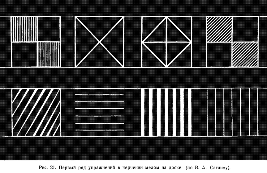
Перед выполнением этого упражнения доска разграфляется вертикальными и горизонтальными линиями на равные квадраты. Длина сторон квадратов 30 см.
Before performing this exercise, the board is graphed with vertical and horizontal lines into equal squares. The length of the sides of the squares is 30 cm.
При черчении фигур непрерывным движением руки отдельные штрихи должны проводиться уверенно, причем пишущий охватывает одним взглядом как начало, так и конец черты.
When drawing figures with a continuous hand movement, individual strokes should be made confidently, and the writer encompasses both the beginning and the end of the line in one glance.
Первый раз для правильного проведения черт можно пользоваться предварительной постановкой точек, обозначающих один и другой конец черт.
The first time, to draw lines correctly, you can use preliminary points that indicate both ends of the lines.
2. При письме криволинейных фигур в виде разного рода орнаментов, овалов и полуовалов (рис. 22) фигуры располагаются на доске в одну линию. Пишущий охватывает глазами всю фигуру. Он чертит ее плавным движением руки сперва в одном направлении — вправо, потом в другом направлении — влево, затем обводит фигуру второй, третий раз и т. д., пока движения не сделаются совсем свободными и точными, а фигура не приобретет совершенно правильную форму.
2. When writing curvilinear figures in the form of various kinds of ornaments, ovals and half-ovals (fig. 22), the figures are arranged on the board in one line. The writer looks at the whole figure. He traces it with a smooth hand movement first in one direction - to the right, then in the other direction - to the left, then outlines the figure a second, third time, etc., until the movements become completely free and precise, and the figure acquires a perfectly correct form.
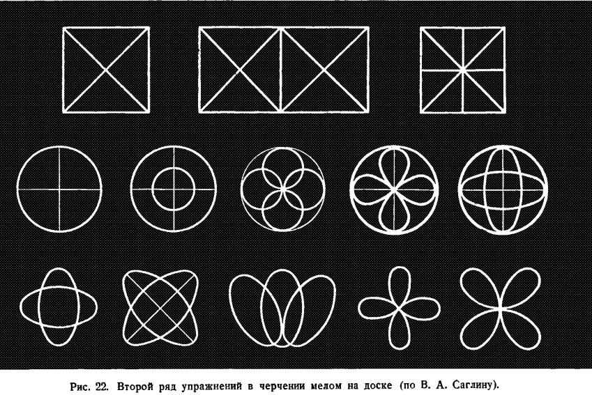
3. При письме бордюров, образованных сочетанием прямолинейных и криволинейных фигур, расположенных между двумя горизонтальными линиями с редкими наклонными (рис. 23), необходимо соблюдать правильные расстояния между параллельными штрихами и их одинаковый наклон.
3. When writing borders, formed by the combination of linear and curvilinear figures, located between two horizontal lines with occasional slants (fig. 23), it is necessary to maintain correct distances between parallel strokes and their equal inclination.
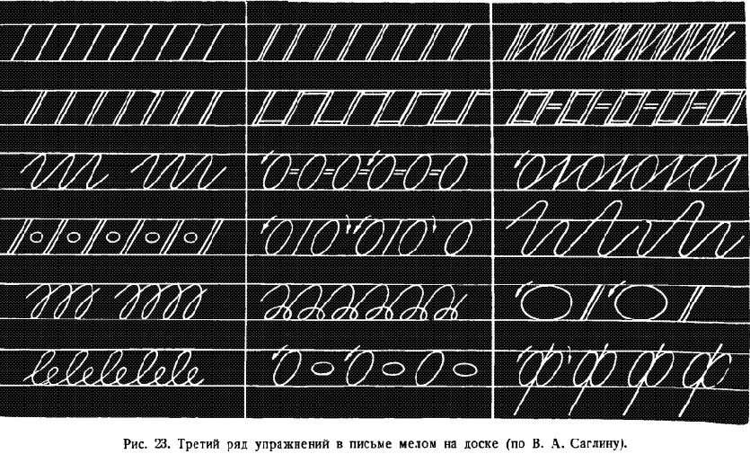
Все эти линии нужно обводить по нескольку раз в разных направлениях до тех пор, пока у пишущего не выработаются вполне уверенные движения руки.
All these lines need to be outlined several times in different directions until the writer develops completely confident hand movements.
4. При письме элементов букв как с нажимом, так и без нажима, прежде чем переходить к упражнениям в письме букв, нужно овладеть в совершенстве письмом элементов примерно в такой последовательности: прямые черты с разными закруглениями, овалы, левые и правые полуовалы и т. д. (рис. 24).
4. When writing elements of letters, both with and without pressure, before moving on to exercises in letter writing, it is necessary to master the writing of elements in roughly the following sequence: straight lines with various curves, ovals, left and right semi-ovals, etc. (fig. 24).
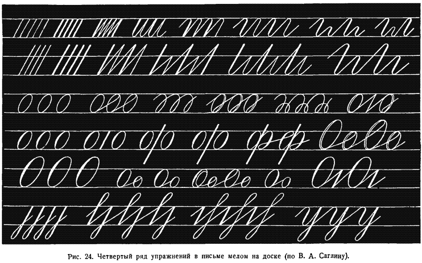
Прямую черту нужно писать ровно, с равномерным нажимом сверху донизу, при помощи поперечного ребра мела. Как правило, каждый элемент сперва пишется медленно, затем несколько быстрее, до тех пор пока не будет получаться ровная, правильная черта.
The straight line needs to be written evenly, with a uniform pressure from top to bottom, using the cross-edge of the chalk. As a rule, each element is first written slowly, then a little faster, until an even, correct line is achieved.
При письме прямой черты с закруглением внизу нужно провести прямую черту с равномерным нажимом до начала закругления. Затем надо сделать небольшое закругление шириной в половину клетки и от него провести тонкую ровную черту до угла, образуемого средней линией строки и наклонной.
When writing a straight line with rounding at the bottom, it is necessary to draw a straight line with uniform pressure to the beginning of the rounding. Then make a small rounding half a cell wide and from it draw a thin straight line to the corner formed by the middle line of the row and the slope.
Закругления в чертах с нажимом вверху и внизу должны иметь одинаковую ширину. Нажимные части этих черт пишутся без прогиба, а тонкие черты не должны иметь форму крючков. Если начертание элементов не будет доведено до полного совершенства, то трудно добиться правильной и красивой формы букв.
The rounding in lines with pressure at the top and bottom should have the same width. The pressure parts of these lines are written without bending, and the thin lines should not have the form of hooks. If the drawing of elements is not brought to perfection, it is difficult to achieve the correct and beautiful shape of letters.
Не меньшее внимание должно быть обращено на правильное начертание овала.
No less attention should be paid to the correct drawing of the oval.
Главный недостаток в форме овала — его расплывчатость, что нередко придает письму тяжеловесный характер.
The main defect in the shape of the oval is its blurriness, which often gives the handwriting a heavyweight character.
Для устранения этого недостатка нужно добиваться, чтобы овал был правильно и четко вписан в клетку, едва касаясь образующих ее линий. Кроме того, при написании овала необходимо стремиться, чтобы нажим в овале увеличивался постепенно до середины, а начиная с середины постепенно уменьшался, чтобы овал имел такой же наклон, как и элементы, состоящие из прямых черт.
To eliminate this deficiency, it is necessary to ensure that the oval is correctly and clearly inscribed in the cell, barely touching the lines forming it. In addition, when writing an oval, you should strive for the pressure in the oval to increase gradually to the middle, and starting from the middle it gradually decreases, so that the oval has the same inclination as the elements consisting of straight lines.
Вслед за овалом учитель переходит к усвоению начертания левого и правого полуовалов, которые отличаются от овалов меньшей кривизной черты и т. д.
Following the oval, the teacher moves on to mastering the drawing of the left and right semi-ovals, which differ from the ovals by a lesser curvature of the line, etc.
Учителю также необходимо тренироваться в письме дополнительных элементов в разных масштабах, чтобы показать ученикам, как образуются из черт элементы.
Teachers also need to practice writing additional elements at different scales to show students how elements are formed from lines.
При переходе к письму на доске букв и слов следует развивать главным образом плавность и безотрывность письма, которые достигаются путем правильного соединения элементов и букв. В этом ключ к развитию почерка учащихся.
When transitioning to writing letters and words on the board, it is important to primarily develop the smoothness and continuity of writing, which are achieved by properly connecting elements and letters. This is the key to developing students' handwriting.
К сожалению, на практике часто наблюдается, что сам учитель нарушает эти необходимые требования при письме мелом на доске.
Unfortunately, in practice it is often observed that the teacher himself violates these necessary requirements when writing with chalk on the board.
Нередко, увлекшись желанием красиво написать каждую букву, он забывает о другой ответственной задаче — выработать ритм письма. А вслед за учителем и ученик начинает при письме отрывать элемент от элемента, букву от буквы.
Often, carried away by the desire to beautifully write each letter, they forget about another responsible task - to develop the rhythm of writing. And following the teacher, the student also begins to detach element from element, letter from letter when writing.
Ритм письма очень часто нарушается тем, что элементы в буквах и словах пишутся то ближе, то дальше друг от друга.
The rhythm of writing is very often violated by the fact that elements in letters and words are written closer and further away from each other.
Правильное и красивое письмо заглавных букв на доске так же, как и строчных, достигается путем предварительных тренировок в написании отдельных элементов.
Correct and beautiful writing of capital letters on the board, like lowercase ones, is achieved through preliminary training in writing individual elements.
Особенно большой работы требует начальное закругление, овал, пламевидная черта и начальное закругление с волнистой чертой.
The initial rounding, the oval, the flame-like line, and the initial rounding with a wavy line require especially a lot of work.
Прежде чем писать элемент, нужно, во-первых, хорошо рассмотреть его начертание в прописи, его расположение в сетке; во-вторых, проследить все способы воспроизведения его в ученических тетрадях; в-третьих, определить, в чем выражаются типичные отклонения в письме указанного элемента.
Before writing an element, you need to, first, carefully examine its spelling in the workbook, its location in the grid; secondly, trace all the ways of reproducing it in student notebooks; thirdly, determine what typical deviations in writing the specified element are expressed in.
Как правило, заглавные буквы пишутся очень медленно, плавно, а не рывками. Затем постепенно ускоряется процесс письма до тех пор, пока темп его не будет доведен до нормального. Учитель только в результате продолжительной тренировки добивается свободного размаха и уверенности в движениях.
As a rule, capital letters are written very slowly, smoothly, not jerkily. Then the writing process is gradually accelerated until its pace is brought up to normal. Only as a result of prolonged training does the teacher achieve free swing and confidence in movements.
Таков путь выработки навыка правильного письма на доске.
This is the path to developing the skill of correct writing on the board.
Чтобы письмо учителя на доске лучше содействовало выработке высокого качества письма у учащихся, нужно соблюдать следующие правила.
For the teacher's handwriting on the board to better contribute to the development of high-quality handwriting among students, the following rules should be observed.
1. Никогда не забывать о классе. Поэтому учитель при письме стоит у доски вполоборота, чтобы ему было видно, все ли учащиеся следят внимательно за тем, как он пишет.
1. Never forget about the class. Therefore, the teacher stands at the board half-turned while writing so that he can see whether all students are carefully following how he writes.
Для того чтобы все движения пишущей руки учителя видели хорошо те ученики, которые сидят справа, ему следует вторично написать тот же элемент или букву, уже стоя ближе левым боком к доске.
In order for all the movements of the teacher's writing hand to be clearly seen by those students who are sitting on the right, he should re-write the same element or letter, standing closer to the left side of the board.
2. Нельзя писать на доске образцы букв и слов заранее, до урока, а надлежит это делать обязательно на глазах учеников. Только наблюдение за письмом учителя поможет ученикам понять, как им нужно начинать элемент, в каком направлении вести черту и т. д.
2. You should not write samples of letters and words on the board in advance, before the lesson, but should do it necessarily in front of the students. Only watching the teacher's writing will help students understand how they need to start an element, in which direction to lead a line, etc.
3. Во время письма не следует стирать неудачно написанное или заниматься подрисовыванием, так как это же будут делать и ученики в своих тетрадях.
3. During writing, you should not erase what was written unsuccessfully or engage in touch-ups, as this is what students will do in their notebooks.
Чистописание не допускает никаких исправлений. Поэтому совершенно недопустимо, чтобы дети на уроках чистописания пользовались резинкой.
Penmanship does not allow any corrections. Therefore, it is absolutely unacceptable for children to use an eraser during handwriting lessons.
4. Учитель обычно сопровождает письмо на доске подробными объяснениями, рассказывая ученикам, где он ставит мел, в каком направлении ведет черту, как делает соединение одного элемента с другим, где заканчивает букву. Этому методу следует придавать особенно важное значение, так как отсутствие объяснений при письме затрудняет мышление детей, органически связанное с речью. Этот метод практически разрешает вопрос обучения письму в свете трудов И. В. Сталина по языкознанию, раскрывающих нам глаза на многое неясное в части методов преподавания.
4. The teacher usually accompanies writing on the board with detailed explanations, telling students where he puts the chalk, in which direction he leads the line, how he connects one element with another, where he finishes the letter. This method should be given special importance, as the lack of explanations during writing hinders children's thinking, which is organically linked to speech. This method virtually resolves the issue of teaching writing in light of I.V. Stalin's works on linguistics, opening our eyes to much that is unclear in terms of teaching methods.
И. В. Сталин пишет: «Какие бы мысли ни возникли в голове человека и когда бы они ни возникли, они могут возникнуть и существовать лишь на базе языкового материала, на базе языковых терминов и фраз».
I.V. Stalin writes: "Whatever thoughts arise in a person's head and whenever they arise, they can arise and exist only on the basis of linguistic material, on the basis of linguistic terms and phrases."
5. Написанные на доске буквы должны превосходить по своей величине буквы, написанные в тетрадях, примерно в 10 раз. Если ученики I класса пишут в тетрадях строчную букву величиной в 8 мм, то на доске учитель пишет ее высотой в 8 см. Образцы письма по двум линейкам во 11 классе будут соответственно равняться на доске 5 см, а образцы письма в III классе по одной линейке — 3 см.
5. The letters written on the board should exceed in their size the letters written in notebooks approximately 10 times. If 1st grade students write a lowercase letter in their notebooks 8 mm high, then the teacher writes it on the board 8 cm high. Writing samples in two lines in the 11th grade will correspondingly equal 5 cm on the board, and writing samples in the 3rd grade in one line - 3 cm.
При снижении освещения класса размер букв на доске может быть увеличен.
If the lighting in the classroom is reduced, the size of the letters on the board can be increased.
6. Наконец, следует обратить внимание на правильное расположение букв и текста на доске. Нельзя, например, начинать письмо для показа в любом месте доски. Необходимо письмо начинать с верхней строки и от левого края доски. Для письма по одной линейке лучше установить один определенный размер букв, которого и следует придерживаться на всех занятиях с данным классом.
6. Finally, attention should be paid to the correct placement of letters and text on the board. For example, you cannot start writing to show in any place on the board. It is necessary to start writing from the top line and from the left edge of the board. For writing in one line, it is better to set one specific size of letters, which should be adhered to in all classes with this class.
Плакаты с образцами элементов и букв следует делать такого же размера, как и буквы, написанные на доске. На плакате должно быть отчетливо видно графление. Примерный размер плаката — 30 X 50 см (рис. 25).
Posters with samples of elements and letters should be the same size as the letters written on the board. The graphing should be clearly visible on the poster. The approximate size of the poster is 30 X 50 cm (fig. 25).
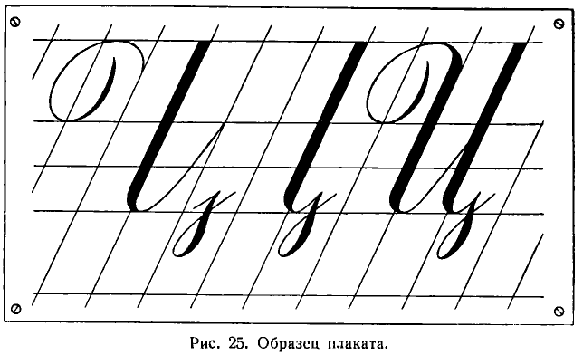
Лучшими прописями для учащихся I класса являются прописи А. И. Воскресенской и Н. И. Ткаченко, выпущенные в виде тетрадей, и прописи Н. А. Костина, оформленные в виде набора табличек в конвертах.
The best handwriting books for first grade students are the handwriting books of A.I. Voskresenskaya and N.I. Tkachenko, issued in the form of notebooks, and the handwriting books of N.A. Kostin, designed as a set of cards in envelopes.
Прописи А. И. Воскресенской и Н. И. Ткаченко для II класса нуждаются в существенных исправлениях. Прописи для III класса отсутствуют совершенно.
The handwriting books of A.I. Voskresenskaya and N.I. Tkachenko for the second grade need significant corrections. There are no handwriting books for the third grade at all.
Это вызывает большие затруднения в работе учителя.
This causes great difficulties in the teacher's work.
Предварительное письмо образцов элементов и букв в тетрадях учеников применяется учителем в следующих целях: во-первых, чтобы облегчить детям усвоение начертаний букв и элементов, во-вторых, чтобы приучить их к правильному ведению тетрадей.
The preliminary writing of samples of elements and letters in student notebooks is used by the teacher for the following purposes: firstly, to facilitate children's mastery of the spelling of letters and elements, and secondly, to accustom them to the correct management of notebooks.
К повторному показу учитель прибегает в тех случаях, когда он в процессе обучения замечает, что ученики не справляются с поставленной перед ними задачей. Ученики, следя глазами за рукой пишущего учителя, лучше воспринимают задание.
The teacher resorts to repeated demonstration in cases where, in the process of teaching, he notices that the students are not coping with the task set before them. Students, watching the teacher's writing hand, better understand the assignment.
Руководствуясь программными требованиями, можно рекомендовать проведение уроков чистописания по следующей схеме.
Guided by the program requirements, it can be recommended to conduct handwriting lessons according to the following scheme.
1. Сообщение ученикам оценок за предыдущую работу с выделением получивших 5 и 2, с раскрытием типичных недостатков всех работ и с показом лучших.
1. Informing students about the grades for the previous work, highlighting those who received 5 and 2, revealing typical deficiencies in all works, and showing the best ones.
2. Сообщение темы урока.
2. Announcing the topic of the lesson.
3. Разложение буквы на составные элементы.
3. Breaking down the letter into its constituent elements.
4. Письмо учителем на доске первого элемента изучаемой буквы с объяснением.
4. The teacher's writing of the first element of the studied letter on the board with an explanation.
5. Повторение правил посадки, положения тетради и держания ручки.
5. Repeating the rules for seating, notebook placement, and pen holding.
6. Упражнения для пальцев и кисти.
6. Finger and wrist exercises.
7. Письмо первого элемента в тетрадях сперва без счета, а потом под счет.
7. Writing the first element in notebooks first without counting, and then with counting.
8. Письмо второго элемента изучаемой буквы учителем на доске с объяснениями.
8. Writing of the second element of the studied letter by the teacher on the board with explanations.
9. Письмо учениками второго элемента в тетрадях сперва без счета, а потом под счет.
9. Writing the second element by students in their notebooks first without counting, and then with counting.
10. Письмо учителем на доске всей буквы с объяснениями.
10. Writing the entire letter on the board by the teacher with explanations.
11. Письмо всей буквы учениками в тетрадях.
11. Writing the entire letter by students in their notebooks.
12. Письмо учителем слова на доске, а затем учениками в тетрадях с выяснением способов соединения элементов.
12. Writing a word by the teacher on the board, followed by students in their notebooks, clarifying the ways of connecting elements.
13. Вывод об успехах, достигнутых классом в течение урока.
13. Conclusion about the progress made by the class during the lesson.
14. Домашнее задание.
14. Homework assignment.
Эту схему урока следует рассматривать как примерную.
This lesson plan should be considered as approximate.
Она будет варьироваться в зависимости от темы урока и от степени подготовленности учащихся.
It will vary depending on the topic of the lesson and the level of preparedness of the students.
К изложению того, в какой последовательности учителю нужно проводить свою работу на каждом году обучения, мы и перейдем.
Next, we will proceed to discuss the sequence in which the teacher should conduct their work in each year of teaching.
[4/10] Chapter 8: Handwriting in the Pre-alphabet Period
ПИСЬМО В ДОБУКВАРНЫЙ ПЕРИОД
[X]initial translation from https://chat.openai.com[X]html formatting[X]translate and insert footnotes[X]translate and insert illustrations[ ]check for missing text in the Russian text or the translation[ ]check for ascii characters in Russian text; cyrillic characters in English text[ ]check for font changes in the printed book to be implemented here: bold, italic, etc.[ ]typographical revisions: consistent punctuation, curly quotes, en- and em-dashes[ ]spot checks of the translation quality[ ]add links to web resources
В добукварный период, продолжающийся от двух до трех недель, учитель, занимаясь с учащимися письмом каждый день, располагает примерно 12 уроками.
In the pre-alphabet period, which lasts from two to three weeks, the teacher, working with students on handwriting every day, has about 12 lessons.
По существу, это не уроки письма, а, правильнее сказать, уроки подготовки к письму. Цель их — развить пальцы и руку ребенка, приучить ученика правильно сидеть за партой во время письма, уметь правильно положить тетрадь, пользоваться карандашом, ручкой, чернилами.
Essentially, these are not handwriting lessons, but, more accurately, lessons in preparation for handwriting. Their goal is to develop the child's fingers and hand, to accustom the student to sit correctly at the desk during writing, to be able to correctly place the notebook, to use a pencil, pen, ink.
Врачи-гигиенисты утверждают, что у ребенка семилетнего возраста очень слабо развиты мелкие мускулы пальцев и кисти руки, которые как раз необходимы для письма. Поэтому упражнения, содействующие развитию мускулов, будут очень полезны для подготовки к обучению письму.
Hygiene doctors assert that in a seven-year-old child, the fine muscles of the fingers and the hand, which are exactly necessary for writing, are very weakly developed. Therefore, exercises that promote the development of muscles will be very useful for preparing for handwriting instruction.
Первые 7—10 уроков учитель приучает учеников пользоваться карандашом, а потом ручкой и чернилами.
In the first 7-10 lessons, the teacher accustoms the students to use a pencil, and then a pen and ink.
Существовала на этот счет и другая точка зрения. Некоторые методисты настаивали на том, чтобы ученик писал карандашом по крайней мере весь первый месяц обучения в школе. Но такое разрешение вопроса нельзя считать правильным, потому что карандаш — совершенно особое, отличное от пера, орудие письма и требует участия других мускулов и иных движений. Продолжительное пользование карандашом мало подготовляет учащихся к письму чернилами.
There was another point of view on this matter. Some methodologists insisted that the student should write with a pencil for at least the entire first month of school education. But such a solution cannot be considered correct, because a pencil is a completely special, different from a pen, writing tool and requires the participation of other muscles and different movements. Prolonged use of a pencil poorly prepares students for ink writing.
Почему же все-таки в школах не сразу начинают с письма чернилами? Это объясняется необходимостью приучить детей к правильной посадке, к движению пальцев и кисти, к подготовительным упражнениям в вычерчивании параллельных штрихов, овалов, способствующим быстрейшему усвоению написания букв.
So why don't schools immediately start with ink writing? This is explained by the need to accustom children to the correct posture, to the movement of fingers and the hand, to preparatory exercises in drawing parallel strokes, ovals, which contribute to the fastest mastering of letter writing.
Порядок занятий в добукварный период может быть примерно следующий.
The order of lessons in the pre-alphabet period can be approximately as follows.
Первый урок. Учитель начинает его с беседы с детьми о том, что они должны делать, чтобы научиться правильно, грамотно и красиво писать.
First lesson. The teacher begins it with a conversation with the children about what they need to do to learn to write correctly, intelligently, and beautifully.
Учитель говорит детям о роли труда, о настойчивости, прилежании и внимании, рассказывает, как нужно садиться за парту, как ставить ноги и правильно класть руки, как держать голову и плечи, какими пальцами нужно держать карандаш.
The teacher tells the children about the role of labor, about perseverance, diligence, and attention, explains how to sit at the desk, how to position the legs and correctly place the hands, how to hold the head and shoulders, which fingers should be used to hold the pencil.
После этого учитель объясняет детям названия пальцев и что мы называем кистью руки.
After this, the teacher explains to the children the names of the fingers and what we call the palm of the hand.
Рассказ-беседа учителя сопровождается упражнениями. Учитель предлагает учащимся встать, сесть, убрать со стола руки.
The teacher's talk-conversation is accompanied by exercises. The teacher suggests the students stand, sit, remove their hands from the table.
«Положите руки на стол, чтобы локти выступали за край стола. Возьмите карандаши. Положите карандаши. Положите лист бумаги прямо перед собой. Рассмотрите, как он разлинован» и т. д.
"Put your hands on the table so that the elbows protrude beyond the edge of the table. Take your pencils. Put down your pencils. Place a sheet of paper directly in front of you. Look at how it's lined," and so on.
Учитель показывает детям, как надо рисовать на листах бумаги в клетку схематичные изображения предметов, состоящих из прямых линий — лестницу, стул, стол, домик.
The teacher shows the children how to draw on the grid sheets schematic images of objects consisting of straight lines — a staircase, a chair, a table, a little house.
В процессе рисования учитель внимательно наблюдает за посадкой ребят, не разрешает им касаться грудью парты, следит за тем, чтобы они не склоняли низко голову и т. д.
During the drawing process, the teacher carefully observes the posture of the guys, does not allow them to touch the desk with their chest, ensures that they do not lower their heads too much, etc.
Рисование прерывается упражнениями — движением предплечья в воздухе слева направо и справа налево, в то время как локоть остается неподвижным. Так производится до 6—7 движений в одну и в другую сторону.
The drawing is interrupted by exercises — moving the forearm in the air from left to right and from right to left, while the elbow remains stationary. This is done for 6-7 movements in each direction.
Второй урок. Повторение усвоенного о посадке и способе держания карандаша; о том, как следует держать голову и грудь. Упражнения в движении предплечья.
Second lesson. Review of what has been learned about posture and how to hold a pencil; about how to hold your head and chest. Exercises in moving the forearm.
Рисование на листочках бумаги в клетку схематических изображений предметов, напоминающих овалы: яблока, яйца, сливы, полумесяца, серпа. Заштриховывание их линиями сверху вниз (рис. 26).
Drawing on grid sheets schematic images of objects resembling ovals: apples, eggs, plums, crescents, sickles. Shading them with lines from top to bottom (Fig. 26).
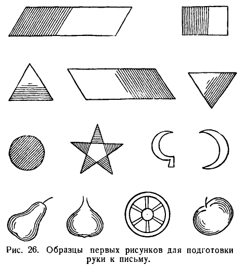
Упражнения во вращательном движении кисти правой руки, поставленной на локоть под счет раз-два — до 6 раз вправо и до 6 раз влево (рис. 27).
Exercises in the rotational movement of the right hand, placed on the elbow, counting one-two - up to 6 times to the right and up to 6 times to the left (Fig. 27).
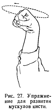
Упражнения в сгибании и разгибании пальцев при вытянутых вперед руках, под счет раз — вытянуть, два — согнуть (рис. 28).
Exercises in bending and straightening the fingers with the hands extended forward, counting one - extend, two - bend (Fig. 28).
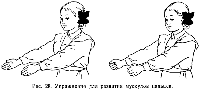
*# [X] initial translation
Третий урок. Повторение правил посадки. «Встаньте. Сядьте правильно. Поставьте ноги всей ступней на пол. Положите руки до локтей на стол. Сделайте это так: поставьте локти на край парты. Соедините пальцы. Опустите обе руки на стол, сдвинув локти за край стола» (см. рис. 19).
Third lesson.* Review of sitting rules. "Stand up. Sit correctly. Place your feet flat on the floor. Put your hands up to the elbows on the table. Do it this way: put your elbows on the edge of the desk. Connect your fingers. Lower both hands onto the table, moving your elbows beyond the edge of the table" (see Fig. 19).
«Сегодня мы будем не рисовать, а писать карандашом».
"Today we will not draw, but write with a pencil."
Раздача тетрадей с косой разлиновкой. «Откройте тетради, отвернув обложку тетради влево. Рассмотрите, как разлинована тетрадь. Три лежачих линии образуют строчку. Они пересекаются наискось наклонными линиями. Наклонные линии идут сверху вниз. Лежачие (горизонтальные линии) идут слева направо. Вот это верхняя лежачая линия, это средняя лежачая линия, а эта нижняя лежачая линия. Укажите эти линии на следующей странице».
Handing out notebooks with oblique lines. "Open the notebooks, turning the cover of the notebook to the left. Look at how the notebook is lined. Three horizontal lines form a line. They intersect obliquely with slanted lines. Slanted lines go from top to bottom. Horizontal lines go from left to right. This is the top horizontal line, this is the middle horizontal line, and this is the bottom horizontal line. Point to these lines on the next page."
Дети находят линии на второй и третьей страницах.
Children find the lines on the second and third pages.
Упражнения в постановке точек на пересечении линий и посередине клеток между наклонными линиями.
Exercises in placing dots at the intersection of lines and in the middle of cells between slanted lines.
Учитель объясняет, как нужно положить тетрадь при письме.
The teacher explains how to place the notebook when writing.
«Положите тетрадь так, чтобы левый нижний угол страницы, на которой будете писать, находился против середины груди. Посмотрите, как я положу». Учитель кладет лист бумаги в наклонном положении на стол перед собой. «Возьмем в руки карандаш и будем двигать рукою слева направо и справа налево. Кончик карандаша обязательно должен передвигаться как раз по той строчке, на которой мы должны писать».
"Place the notebook so that the bottom left corner of the page you are going to write on is opposite the middle of your chest. Look at how I will place it." The teacher places a sheet of paper in a slanted position on the table in front of him. "Let's take the pencil in our hands and move the hand from left to right and from right to left. The tip of the pencil must always move exactly along the line on which we should write."
Письмо дугообразных черт для упражнения в движении предплечья.
Writing arc-shaped lines to practice forearm movement.
«Поставьте точку на пересечении верхней лежачей линии и наклонной. Вправо от нее, на расстоянии 10 клеток, поставьте на пересечении наклонной и нижней лежачей вторую точку. От первой точки до второй проведите карандашом тонкую черту. Поставьте две точки выше первых двух. Соедините их тонкой чертой, ведя справа налево» и т. д.
"Put a dot at the intersection of the top horizontal line and the slanted line. To the right of it, at a distance of 10 cells, put a second dot at the intersection of the slanted and the bottom horizontal line. Draw a thin line with a pencil from the first point to the second. Place two points above the first two. Connect them with a thin line, going from right to left," and so on.
Затем дети пишут дугообразные черты под счет: раз (вправо), два (влево).
Then the children write arc-shaped lines to the count: one (to the right), two (to the left).
Письмо прямых черт (палочек) по косым линейкам.
Writing straight lines (sticks) along diagonal lines.
"Put a dot at the intersection of the diagonal and the top horizontal line. Place another dot at the intersection of the same diagonal with the bottom horizontal line. Lead from the first point to the second line down the diagonal, and next to it - another such line.
«Поставьте точку на пересечении наклонной и верхней лежачей линии. Другую точку поставьте на пересечении той же наклонной с нижней лежачей линией. Ведите от первой точки ко второй черту вниз по наклонной, а рядом с нею — другую такую же черту.
Четвертый урок. Письмо карандашом подготовительных упражнений.
Fourth lesson. Writing pencil preparatory exercises.
Повторение правил посадки, положения тетради и держания ручки.
Reviewing the rules of sitting, notebook placement and pen holding.
Гимнастические упражнения для пальцев. Сгибание и разгибание пальцев при вытянутых вперед руках: под счет раз — сгибание, под счет два — разгибание.
Finger gymnastic exercises. Bending and straightening fingers with extended arms forward: to the count of one - bending, to the count of two - straightening.
Вращательное движение кисти правой руки, поставленной на локоть, до 6—7 раз в одну и в другую сторону.
Rotational movement of the right hand placed on the elbow, up to 6-7 times in one and the other direction.
Письмо прямых черт (палочек) по наклонной, т. е. повторение того, что делали на предыдущем уроке.
Writing straight lines (sticks) on a slope, i.e., repeating what was done in the previous lesson.
Троекратное письмо таких же черт в одной клетке. «Поставьте на верхней лежачей линии три точки в одной клетке на одинаковом расстоянии одну от другой. Такие же три точки поставьте внизу. Ведите черту от первой верхней точки к первой нижней точке. Затем ведите прямую черту от второй верхней точки ко второй нижней» и т. д.
Triple writing of the same lines in one cell. "Put three dots in one cell at equal distance from each other on the top horizontal line. Put the same three dots at the bottom. Draw a line from the first top dot to the first bottom dot. Then draw a straight line from the second top dot to the second bottom dot" and so on.
Дети пишут первую строчку палочек.
Children write the first line of sticks.
Пятый урок. Повторение правил посадки, положения тетради и держания ручки.
Fifth lesson. Reviewing the rules of sitting, notebook placement, and pen holding.
«Как следует положить тетрадь? Положите ее так, чтобы левый нижний угол страницы был против середины груди. Тетрадь должна лежать наклонно».
"How should you place your notebook? Place it so that the bottom left corner of the page is against the middle of your chest. The notebook should lie at an angle."
Упражнения: движение предплечья при неподвижном локте; сгибание и разгибание пальцев при вытянутых руках; вращательное движение кисти правой руки, поставленной на локоть.
Exercises: forearm movement with the elbow stationary; bending and straightening fingers with outstretched arms; rotational movement of the right hand placed on the elbow.
Письмо зубчатых бордюров, состоящих из горизонтальных и наклонных черт.
Writing of zigzag borders consisting of horizontal and diagonal lines.
«Поставьте две точки: одну на пересечении верхней лежачей линии и наклонной и вторую при пересечении наклонной с нижней лежачей линией». Затем учитель рассказывает, как нужно вести карандашом черту вниз от первой до второй точки и от второй точки по нижней лежачей линии через две клетки влево до пересечения, а отсюда вверх по наклонной.
"Put two dots: one at the intersection of the top horizontal line and the diagonal, and the second at the intersection of the diagonal and the bottom horizontal line." Then the teacher explains how to lead the pencil line down from the first point to the second point, and from the second point along the bottom horizontal line two cells to the left until the intersection, and from there up along the diagonal.
Письмо прямых черт (палочек), соединяемых косыми чертами (рис. 29).
Writing straight lines (sticks) connected by diagonal lines (see figure 29).
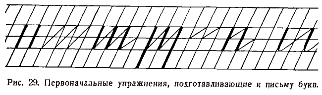
*# [X] initial translation
Шестой урок. Повторение усвоенного прежде. Правила посадки. Положение тетради. Упражнения для предплечья, пальцев и кисти. Письмо зубчатых бордюров.
Sixth lesson. Review of what was learned before. Seating rules. Notebook placement. Exercises for the forearm, fingers, and wrist. Writing zigzag borders.
Письмо прямых палочек, соединенных косыми чертами.
Writing straight sticks connected by diagonal lines.
Письмо прямой черты (палочки) с закруглением внизу.
Writing straight lines (sticks) with a rounding at the bottom.
Учитель показывает, как он ставит мел на пересечении верхней лежачей линии с наклонной и ведет вниз по этой наклонной прямую палочку. Немного не доведя (на 1/6 длины этой палочки) до нижней лежачей линии, он делает закругление вправо и ведет тонкую черту до середины клеточки.
The teacher shows how he places the chalk at the intersection of the top horizontal line with the diagonal and leads a straight stick down along this diagonal. Not quite reaching (about 1/6 of the length of this stick) to the lower horizontal line, he rounds it to the right and leads a thin line to the middle of the cell.
Дети пишут целую строчку таких палочек на расстоянии клетки одна от другой.
The children write a whole line of such sticks at a distance of a cell from each other.
Следующую строчку они пишут по две палочки вместе и третью строчку по три палочки.
In the next line, they write two sticks together, and in the third line, three sticks.
Правила посадки. Упражнения для предплечья, кисти и пальцев. Положение тетради. Повторное письмо палочек с закруглением внизу. Письмо больших овалов величиной в 16 мм. Повторение названий линий.
Seating rules. Exercises for the forearm, wrist, and fingers. Notebook placement. Rewriting sticks with rounding at the bottom. Writing large ovals 16 mm in size. Repeating the names of lines.
Ознакомление с промежуточной (надстрочной) линией.
Introduction to the intermediate (above the line) line.
Учитель рассказывает учащимся, как он ставит мел на верхней, надстрочной линии, немного правее наклонной, потом ведет вниз тонкую закругляющуюся черту вдоль наклонной. Немного касаясь этой наклонной, он доводит закругляющуюся черту почти до нижней лежачей, делает резкое закругление вправо, касается нижней лежачей линии и ведет тонкую закругляющуюся черту вверх, но не по наклонной, а между двумя наклонными. Вверху, не доведя чуть-чуть до того места, откуда начал, он ведет вниз вторую закругляющуюся черту рядом с первой и т. д. Обведя три раза первый овал, пишет второй и т. д.
The teacher tells the students how he places the chalk on the upper, superscript line, a little to the right of the diagonal, then leads down a thin rounded line along the diagonal. Slightly touching this diagonal, he brings the rounded line almost to the bottom line, makes a sharp rounding to the right, touches the bottom line and leads a thin rounded line up, but not along the diagonal, but between two diagonals. At the top, just before reaching the point where he started, he leads a second rounded line down next to the first one, and so on. After circling the first oval three times, he writes the second one, and so on.
Дети пишут овал с движением карандаша вправо одну строчку, потом вторую и т. д.
The children write an oval with the pencil moving to the right one line, then the second one, and so on.
Восьмой урок. Письмо овалов.
Eighth lesson. Writing ovals.
Правила посадки. Упражнения для предплечья, кисти и пальцев. Положение тетради. Повторное письмо палочек (одна строчка) и палочек с закруглением внизу. Повторное письмо овалов, образуемых движением руки влево. Письмо больших овалов с движением кисти вправо.
Seating rules. Exercises for the forearm, wrist, and fingers. Notebook placement. Rewriting sticks (one line) and sticks with rounding at the bottom. Repeated writing of ovals, formed by the movement of the hand to the left. Writing large ovals with the brush moving to the right.
Учитель рассказывает, как он ставит мел ниже надстрочной линии слева от наклонной, ведет вверх вправо закругляющуюся тонкую черту; касается надстрочной линии и ведет вдоль наклонной вниз закругляющуюся черту; касается нижней лежачей линии и ведет кверху закругляющуюся тонкую черту, которую заканчивает несколько правее, чем начал. После этого начинается новый овал, который почти сливается с уже написанным.
The teacher tells how he places the chalk below the superscript line to the left of the diagonal, leads a thin rounded line upwards to the right; touches the superscript line and leads a rounded line down along the diagonal; touches the lower line and leads a thin rounded line upwards, which he ends slightly to the right of where he started. After that, a new oval begins, which almost merges with the one already written.
Дети пишут овалы один за другим до конца строчки.
The children write ovals one after another until the end of the line.
Девятый урок. Рисование бордюра, состоящего из верхних и нижних петель (см. в приложении).
Ninth lesson. Drawing a border consisting of upper and lower loops (see in the appendix).
Правила посадки. Упражнения для предплечья, пальцев и кисти. Положение тетради.
Seating rules. Exercises for the forearm, fingers, and wrist. Notebook placement.
Письмо петель размером в 18 мм в виде буквы е с движением карандаша несколько раз по одному и тому же месту.
Writing loops of 18 mm in the form of the letter 'e' with the movement of the pencil several times over the same place.
Writing loops in reverse order with hand movement from left to right and several times over the same place.
Письмо петель в обратном порядке с движением руки слева направо и несколько раз по одному и тому же месту.
Десятый урок. Первый урок письма чернилами. Понятие о чернилах, пере, ручке, промокательной бумаге и перочистке.
Tenth lesson. The first lesson of writing with ink. Understanding of ink, pen, blotting paper, and pen cleaner.
Сравнение пера с карандашом и рукописей, написанных карандашом и чернилами.
Comparison of the pen with a pencil and manuscripts written with pencil and ink.
Объяснение ученикам устройства пера: раздвигание, расщепление кончика пера при движении пера книзу, смыкание его при движении кверху.
Explaining to the students the structure of the pen: spreading, splitting the tip of the pen when moving the pen downwards, closing it when moving upwards.
Как держать ручку в руке? Показ и рассматривание плаката. Упражнение с поднятием указательного пальца (см. рис. 20).
How to hold the pen in hand? Display and review of the poster. Exercise with raising the index finger (see Fig. 20).
Проведение прямых черт сухим пером.
Drawing straight lines with a dry pen.
Постановка точек на линии, на одинаковом расстоянии одной от другой и определенной толщины. Такое упражнение было впервые рекомендовано К. Д. Ушинским.
Placement of dots on the line, at equal distances from each other and of a certain thickness. Such an exercise was first recommended by K.D. Ushinsky.
Упражнение в постановке точки, особенно при наличии косых линеек, является простейшим, поэтому целесообразнее всего начинать письмо с этого упражнения. При выполнении его необходимо сосредоточить главное внимание на соблюдении правил посадки, держания ручки и положения тетради. С другой стороны, постановка точки не может считаться очень легкой задачей, потому что ученику нужно на глаз определять расстояние, соразмерять силу нажима на перо, не отступать ни кверху, ни книзу от строки.
The exercise in setting a dot, especially with slanted lines, is the simplest, so it is most expedient to start writing with this exercise. When performing it, the main attention should be paid to the observance of the rules of seating, holding the pen, and the position of the notebook. On the other hand, setting a point cannot be considered a very easy task, because the student needs to visually determine the distance, adjust the force of pressure on the pen, and not to deviate up or down from the line.
Письмо чернилами. Как пользоваться ручкой при письме чернилами. Обмакивание пера в чернила. Проведение прямой черты.
Writing with ink. How to use a pen when writing with ink. Dipping the pen in ink. Drawing a straight line.
Письмо прямой черты с нажимом. Сначала ученики пишут три палочки, потом, после просмотра учителем, все остальные до конца строки.
Writing a straight line with pressure. First, students write three lines, then, after being reviewed by the teacher, all the others to the end of the line.
Учитель снова просматривает работы, и ученики пишут вторую строчку. Затем пишутся палочки с нажимом и закруглением внизу и предварительно показывается на доске, как их следует писать. Это, как правило, делается и во всех последующих упражнениях.
The teacher reviews the work again, and the students write the second line. Then, lines with pressure and rounding at the bottom are written and previously shown on the board how they should be written. This is usually done in all subsequent exercises.
Задание на дом: изготовить перочистку. Повторение усвоенного о расположении линий в тетради.
Homework: make a pen cleaner. Repeat what you learned about the arrangement of lines in a notebook.
Повторение правил посадки, упражнений для предплечья, пальцев и кисти.
Repetition of seating rules, exercises for the forearm, fingers, and wrist.
Повторное письмо палочек с нажимом и палочек с нажимом и закруглением внизу, которые писались учащимися на предыдущем уроке. Письмо овалов в воздухе.
Repetition of writing lines with pressure and lines with pressure and rounding at the bottom, which were written by students in the previous lesson. Writing ovals in the air.
Письмо овала (буквы О) на доске и в тетрадях. При письме на доске учитель дает следующие объяснения: «Сегодня, дети, мы научимся писать овал. Пишется овал так». Учитель объясняет, что овал надо писать не с левой стороны к правой, а, наоборот, с правой стороны к левой. Он ставит мел немного выше средней лежачей линии на наклонной и ведет кверху закругляющуюся черту (тонкую). Срезает небольшой уголок, касается верхней лежачей линии. Срезает второй уголок и ведет книзу закругляющуюся черту с нажимом, который постепенно усиливается до середины. Начиная от середины, к низу овала, нажим постепенно уменьшается. Внизу срезает один уголок, касается нижней линии, срезает второй уголок внизу и ведет кверху тонкую черту до того места, откуда начал.
Writing an oval (letter O) on the board and in notebooks. When writing on the board, the teacher gives the following explanations: "Today, children, we will learn to write an oval. An oval is written like this". The teacher explains that the oval should be written not from left to right, but, on the contrary, from right to left. He places the chalk a little above the middle lying line on the inclined line and leads a rounding line (thin) upwards. He cuts off a small corner, touches the upper line. Cuts off the second corner and leads down a rounded line with pressure, which gradually increases to the middle. Starting from the middle, to the bottom of the oval, the pressure gradually decreases. At the bottom, he cuts off one corner, touches the bottom line, cuts off the second corner at the bottom, and leads a thin line up to the place where he started.
«Так пишите и вы, — говорит учитель, — нажим усиливайте при помощи указательного пальца».
"So you write as well," says the teacher, "increase the pressure using your index finger."
Двенадцатый урок. Письмо прямой удлиненной черты с петлей внизу. Повторение правил посадки. Упражнения для предплечья, пальцев и кисти.
Twelfth lesson. Writing a straight elongated line with a loop at the bottom. Reiteration of seating rules. Exercises for the forearm, fingers, and wrist.
Письмо прямой черты с нажимом и закруглением внизу группами по два, по три и четыре элемента вместе (пишется одна строчка).
Writing a straight line with pressure and rounding at the bottom in groups of two, three, and four elements together (one line is written).
Письмо овалов с нажимом с левой стороны с интервалами в одну клетку между ними. Письмо прямой черты с нажимом и петлей внизу, доходящей до промежуточной (подстрочной) линии.
Writing ovals with pressure from the left side with intervals of one cell between them. Writing a straight line with pressure and a loop at the bottom, reaching to the intermediate (subscript) line.
Проведя систему предварительных упражнений, учитель подготовит детей к письму букв в букварный период, он знакомит их с употреблением чернил, пера, промокательной бумаги, перочистки, воспитывает у них навыки правильной посадки, приучает, как держать ручку, как положить тетрадь, учит их писать элементы первых букв а, у.
After conducting a system of preliminary exercises, the teacher prepares the children for writing letters in the ABC period, he acquaints them with the use of ink, pen, blotting paper, pen cleaner, develops their skills of correct seating, teaches how to hold the pen, how to position the notebook, teaches them to write elements of the first letters a, u.
Предварительные упражнения желательно повторять и в дальнейшем, хотя бы перед письмом каждой новой группы букв.
It is desirable to repeat preliminary exercises in the future, at least before writing each new group of letters.
[4/10] Chapter 9: Letter Writing During Literacy Training
ПИСЬМО В ПЕРИОД ОБУЧЕНИЯ ГРАМОТЕ
[X]initial translation from https://chat.openai.com[X]html formatting[X]translate and insert footnotes[X]translate and insert illustrations[ ]check for missing text in the Russian text or the translation[ ]check for ascii characters in Russian text; cyrillic characters in English text[ ]check for font changes in the printed book to be implemented here: bold, italic, etc.[ ]typographical revisions: consistent punctuation, curly quotes, en- and em-dashes[ ]spot checks of the translation quality[ ]add links to web resources
Закончив предбукварный период, учитель переходит к письму букв, сознательно отступая от генетического метода, т. е. от порядка прохождения букв по мере возрастающей трудности написания их, и следует исключительно порядку букваря. Это вызывается установленной последовательностью в изучении букв, которые закрепляются на уроках чистописания в том же порядке.
Having finished the pre-alphabet period, the teacher moves on to writing letters, deliberately departing from the genetic method, i.e. from the order of passing the letters in order of increasing difficulty of writing them, and strictly follows the order of the alphabet. This is caused by the established sequence in learning letters, which are consolidated in handwriting lessons in the same order.
Поскольку нарушен принцип генетического метода, детям приходится начинать письмо с очень трудных букв, например с у, а. Одна из них относится к первой группе строчных (у), другая — к третьей (а). Затем детям приходится вперемежку учиться писать буквы первой и второй группы, как ш, м, н, р, л, включая иногда буквы четвертой группы с, в и даже пятой — х.
Since the principle of the genetic method is violated, children have to start writing with very difficult letters, for example with у, а. One of them belongs to the first group of lowercase letters (у), the other - to the third (а). Then the children have to alternate between learning to write letters of the first and second group, such as ш, м, н, р, л, sometimes including letters of the fourth group с, в and even the fifth - х.
Преодолевая трудности, учитель должен:
To overcome these difficulties, the teacher should:
1. стремиться, чтобы учащиеся писали буквы правильно;
1. strive to ensure that students write letters correctly;
2. больше останавливаться на повторении подготовительных упражнений, содействующих развитию кисти правой руки и пальцев;
2. focus more on repeating preparatory exercises that contribute to the development of the wrist of the right hand and fingers;
3. на уроке писать не слишком много, не более 3—4 строк, но с особенной тщательностью (это поможет повысить качество письма);
3. during the lesson, not write too much, no more than 3-4 lines, but with special care (this will help improve the quality of writing);
4. особенно тщательно готовиться к письму «трудных» букв: например, чаще следует тренироваться в письме таких «трудных» элементов, как овалы перед письмом букв а, о, д, б или полуовалы перед письмом букв е, с, в, з;
4. prepare especially carefully for writing "difficult" letters: for example, you should practice writing such "difficult" elements as ovals before writing the letters а, о, д, б or semi-ovals before writing the letters е, с, в, з;
5. отложить усвоение в букварный период начертания таких «трудных» заглавных букв, как Е, 3, Ж, К, Ф, В, Б (не следует писать в этот период фразы или имена, которые начинаются с вышеуказанных букв);
5. delay the mastering of such "difficult" capital letters as Е, З, Ж, К, Ф, В, Б during the alphabet period (you should not write phrases or names that begin with the above letters during this period);
6. тщательно наблюдать во время обучения письму за посадкой детей, за тем, как они держат ручки, как кладут тетрадь.
6. carefully observe the seating of children during writing lessons, how they hold the pens, how they place the notebook.
У детей при письме чаще всего наблюдаются следующие недостатки в посадке:
The following are the most common shortcomings in seating observed in children while writing:
1. Дети нередко подгибают ноги под сиденье, кладут одну ногу на другую или вытягивают их вперед вместо того, чтобы поставить всю ступню на пол.
1. Children often tuck their legs under the seat, put one leg on top of the other, or stretch them forward instead of placing the entire foot on the floor.
2. Часто дети надавливают всем корпусом на край крышки парты или стола, препятствуя тем самым свободному движению правой руки.
2. Children often lean their entire bodies on the edge of the desk or table, thereby preventing free movement of the right hand.
3. Многие из детей кладут оба предплечья на стол в одну линию, а не под прямым углом, как следовало бы. Локоть правой руки поэтому у них не выступает за край парты, а лежит на столе, препятствуя свободному движению предплечья.
3. Many children place both forearms on the table in a straight line, not at a right angle as they should. Therefore, the elbow of the right hand does not protrude beyond the edge of the desk but rests on the table, impeding free forearm movement.
4. Дети нередко чрезмерно наклоняют голову к тетради, уменьшая расстояние между глазами и поверхностью тетради и доводя его до 15 см (вместо 30).
4. Children often excessively tilt their heads towards the notebook, reducing the distance between their eyes and the surface of the notebook to 15 cm (instead of 30).
Теперь проследим ход занятий по обучению письму применительно к букварям.
Now let's follow the course of writing lessons applicable to the primer books.
Возьмем для примера букварь А. И. Воскресенской.
Let's take the primer of A.I. Voskresenskaya as an example.
1. Обучение письму по этому букварю начинается с письма элементов, которые подготовляют детей к усвоению первых букв: а и у. Но этим отнюдь не исключается выполнение всех подготовительных упражнений добукварного периода, обязательных для развития руки ребенка.
1. Writing training in this primer begins with the writing of elements that prepare children for mastering the first letters: а and у. But this by no means excludes the performance of all preparatory exercises of the pre-alphabet period, necessary for the development of the child's hand.
2. В букваре А. И. Воскресенской написание многих заглавных букв дается значительно позже того, как дети научатся писать строчные буквы. Например, написание первой заглавной буквы И дается детям только после того, как они усвоят написание 18 строчных букв.
2. In the primer of A.I. Voskresenskaya, the writing of many capital letters is given significantly later than children learn to write lowercase letters. For example, writing the first capital letter И is given to children only after they master the writing of 18 lowercase letters.
Письмо заглавных букв располагается в порядке, который более или менее соответствует генетическому методу. Несколько преждевременно дети пишут буквы Г и П. В самом конце первого полугодия им дается написание таких трудных букв, как Б, К, В, Р, Д.
The writing of capital letters is arranged in an order that more or less corresponds to the genetic method. The children write the letters Г and П somewhat prematurely. At the very end of the first semester, they are given the writing of such difficult letters as Б, К, В, Р, Д.
Лучше было бы изучение этих букв отложить до второго полугодия, когда дети будут больше подготовлены к их написанию.
It would be better to postpone the study of these letters until the second semester, when the children will be more prepared for their writing.
3. При письме строчных букв детям труднее всего будет справиться с письмом букв а, х, з, о, с, в, ж, ч.
3. When writing lowercase letters, children will find it most difficult to cope with writing the letters а, х, з, о, с, в, ж, ч.
Во-первых, эти буквы сами по себе являются наиболее трудными по написанию. Во-вторых, ученики приступят к письму их значительно раньше, чем будут подготовлены к этому всем ходом предшествующих занятий.
Firstly, these letters themselves are the most difficult to write. Secondly, students will start writing them much earlier than they will be prepared for it by the course of preceding lessons.
Трудность написания вышеназванных букв обязывает учителя серьезно и заблаговременно готовиться к письму их. С этой целью он на уроках чистописания задолго до прохождения этих букв должен отводить специальное время для тренировки в написании их элементов.
The difficulty of writing the above-mentioned letters obliges the teacher to seriously and timely prepare for their writing. For this purpose, in handwriting lessons, long before the passage of these letters, he should allocate special time for practicing their elements.
Возьмем, например, букву а. Она состоит из двух элементов: овала и прямой черты — палочки —с нажимом и с закруглением внизу. Овал дети должны научиться писать задолго до того, как учитель познакомит их с письмом этой буквы. В противном случае урок письма буквы а будет сорван.
Take the letter а for example. It consists of two elements: an oval and a straight line - a stick - with pressure and rounding at the bottom. Children should learn to write an oval long before the teacher introduces them to the writing of this letter. Otherwise, the lesson of writing the letter а will fail.
Готовясь к письму буквы х, учитель, по крайней мере за неделю, должен тренировать учеников в письме правого и левого полуовалов.
Preparing for the letter х, the teacher should train the students in writing the right and left half-ovals at least a week in advance.
То же можно сказать и относительно букв о, с, в, з, ж, ч.
The same can be said regarding the letters о, с, в, з, ж, ч.
4. В букваре А. И. Воскресенской не очень строго выдерживается второй принцип генетического метода: написание элементов дается в нем только перед письмом строчных букв, да и то далеко не всех. Но учитель на уроке чистописания обязан начинать с письма элементов и с изучения таких букв, которые даны в букваре без предварительной подготовки, как, например, строчные буквы ь, в, з, е, ч, э, я, ю, ц, щ.
4. The second principle of the genetic method is not very strictly adhered to in the primer by A.I. Voskresenskaya: the writing of elements is given in it only before the writing of lowercase letters, and not all of them. But in handwriting lessons, the teacher must start with writing elements and studying such letters, which are given in the primer without prior preparation, such as the lowercase letters ь, в, з, е, ч, э, я, ю, ц, щ.
Учителю также следует знать, что при обучении письму заглавных букв, за исключением О и С, нужно начинать с письма элементов, несмотря на то, что этот принцип нарушается в букваре. В этом случае следует руководствоваться таблицей (см. приложение), в которой дается разложение заглавных букв на элементы.
The teacher should also know that when teaching the writing of capital letters, with the exception of О and С, one must start with the writing of elements, despite the fact that this principle is violated in the primer. In this case, one should be guided by the table (see appendix) in which the decomposition of capital letters into elements is given.
Затем обращаем внимание учителя, обучающего по этому букварю, на то, что в нем строчная буква дается иногда вслед за заглавной, но это не следует понимать так, что заглавная буква пишется раньше строчной. На уроке из каждой пары букв Гг, Пп, Зз, Яя, Юю, Нн, Цц, Щщ, Бб, Кк дети пишут сперва строчную, а потом прописную (заглавную), и даже сначала не букву, а прежде всего элементы данной буквы.
Then we draw the attention of the teacher, teaching by this primer, to the fact that in it a lowercase letter is sometimes given after the capital one, but this should not be understood that the capital letter is written before the lowercase. In the lesson from each pair of letters Гг, Пп, Зз, Яя, Юю, Нн, Цц, Щщ, Бб, Кк children write the lowercase first, and then the uppercase (capital), and even first not the letter, but primarily the elements of this letter.
Детям, например, при всех условиях, никак не удается правильно написать букву ц, прежде чем они не усвоят способа написания опущенной петли. Формы букв, которые даются в букваре А. И. Воскресенской, соответствуют общепринятым образцам, установленным Министерством просвещения.
Children, for example, under all conditions, just cannot write the letter ц correctly before they master the method of writing a dropped loop. The forms of letters given in the primer of A.I. Voskresenskaya correspond to the generally accepted samples established by the Ministry of Education.
Исключение составляют строчные буквы ч и ъ. Согласно указаниям Министерства просвещения, они должны состоять из начального узелка и полуовала, а не из прямой черты с нажимом и закруглением внизу, как показано в букваре. Поэтому буква ч входит в состав букв не второй группы, как было раньше, а четвертой. То же следует сказать и о букве ъ, которая имеет основным элементом не прямую черту с нажимом, а полуовал с нажимом с левой стороны, как это видно из программы.
The exceptions are the lowercase letters ч and ъ. According to the instructions of the Ministry of Education, they should consist of an initial knot and a half-oval, not a straight line with pressure and rounding at the bottom, as shown in the primer. Therefore, the letter ч is included in the letters not of the second group, as it used to be, but the fourth. The same applies to the letter ъ, whose main element is not a straight line with pressure, but a half-oval with pressure on the left side, as can be seen from the program.
Ввиду того, что до сих пор имели место колебания в письме букв ч и ъ, учителю необходимо знать, почему эти буквы по издавна установившемуся правилу составляются из начального узелка и полуовала, а не из прямой черты с нажимом и закруглением внизу. Делается это для того, чтобы данные буквы при искажении их не совпадали с буквой г, как это довольно часто бывает на практике у тех, кто в буквах г и ч пишет одинаково прямую черту с нажимом.
In view of the fact that there have been fluctuations in the writing of the letters ч and ъ, the teacher needs to know why these letters, according to the long-established rule, are made up of an initial knot and a half-oval, not a straight line with pressure and rounding at the bottom. This is done so that these letters, when distorted, do not coincide with the letter г, as is quite often the case in practice for those who write the same straight line with pressure in the letters г and ч.
Нужно было также установить резкую грань в написании букв ь и ъ, которые играют очень важную роль в орфографии.
It was also necessary to establish a sharp edge in the writing of the letters ь and ъ, which play a very important role in spelling.
По этой причине изображение ъ без полуовала было заменено современным изображением этой буквы с полуовалом.
For this reason, the depiction of ъ without a half-oval was replaced with a modern depiction of this letter with a half-oval.
В букваре А. И. Воскресенской в строчной букве б волнистая черта почему-то не доводится до промежуточной (надстрочной) линии. Это нарушает правильный вид строки.
In the primer by A.I. Voskresenskaya, in the lowercase letter б, the wavy line is not brought to the intermediate (above the line) line for some reason. This disrupts the correct appearance of the line.
Букварный период очень труден для детей. Поэтому учитель должен особо тщательно готовиться к уроку, обдумывая каждую деталь, каждое движение.
The primer period is very difficult for children. Therefore, the teacher should prepare for the lesson very carefully, considering every detail, every movement.
Дети к этому периоду уже хорошо усвоили и различают, что называется чертой и линией. Они знают, что называется надстрочной, подстрочной, верхней, средней и нижней лежачими линиями, что называется наклонной линией.
By this period, children have already well mastered and distinguish what is called a line and a line. They know what is called above the line, below the line, top, middle, and bottom horizontal lines, what is called a diagonal line.
Они уже много практиковались в определении направлений «вверх» и «вниз», находили, где правый и левый угол клеточки, где ее середина. Поэтому они к этому времени уже понимают все указания учителя относительно линий, направлений и черт.
They have already practiced a lot in determining the directions "up" and "down", found where the right and left corner of the cell is, where its middle is. Therefore, by this time they already understand all the teacher's instructions regarding lines, directions, and strokes.
ПРИМЕРНЫЙ УРОК ПИСЬМА БУКВЫ В БУКВАРНЫЙ ПЕРИОД
SAMPLE LESSON ON WRITING THE LETTER IN THE PRIMER PERIOD
Тема урока: письмо буквы р.
Lesson Topic: Writing the letter р.
План урока
Lesson Plan
1. Повторение нового звука, усвоенного на уроке обучения грамоте.
1. Review of the new sound learned in the literacy lesson.
2. Сообщение темы урока.
2. Announcement of the lesson's theme.
3. Сравнение письменной буквы с печатной при помощи плаката и разрезной азбуки.
3. Comparison of the handwritten letter with the printed one using a poster and a cut-out alphabet.
4. Разложение буквы р на элементы (по плакату).
4. Decomposition of the letter р into elements (using a poster).
5. Письмо учителем на доске первого элемента с объяснением.
5. The teacher writes the first element on the board with explanation.
6. Подготовка детей к письму: повторение правил посадки, положения тетради и держания ручки.
6. Preparing the children for writing: repeating the rules for sitting, positioning the notebook, and holding the pen.
7. Гимнастические упражнения для развития предплечья, пальцев и кисти.
7. Gymnastic exercises for the development of the forearm, fingers, and wrist.
8. Письмо детьми в тетрадях первого элемента.
8. Children writing the first element in notebooks.
9. Письмо учителем на доске второго элемента с объяснением.
9. The teacher writes the second element on the board with explanation.
10. Письмо учащимися в тетрадях второго элемента.
10. The students write the second element in their notebooks.
11. Физкультминутка.
11. Physical activity break.
12. Письмо буквы в целом.
12. Writing the letter as a whole.
13. Письмо слов с буквой р.
13. Writing words with the letter р.
14. Подведение итогов работы.
14. Summing up the work.
Ход урока
Course of the Lesson
Учитель. Какой новый звук мы с вами изучали на прошлом уроке? Придумайте слова с этим звуком в начале, в середине и в конце слова. Найдите в разрезной азбуке букву р. Это печатная буква. А теперь мы научимся писать букву р.
Teacher: What new sound did we study in the last lesson? Come up with words that have this sound at the beginning, middle, and end. Find the letter р in the cut-out alphabet. This is the printed letter. Now we will learn to write the letter р.
Учитель пишет букву р.
The teacher writes the letter р.
Учитель. Рассмотрите, из каких элементов состоит буква р. (Дети рассматривают букву р на плакате.) Буква р состоит из длинной прямой черты (палочки) с нажимом и прямой черты (палочки) с закруглением вверху и внизу. Первая палочка начинается немного выше строки и доводится до подстрочной (промежуточной) линии. Смотрите, как я буду писать первый элемент буквы р. Ставлю мел немного выше верхней лежачей линии на наклонной и веду черту (палочку) с нажимом вниз по наклонной. Миную среднюю и нижнюю лежачие линии и довожу ее до промежуточной (подстрочной) линии. Прямую черту (палочку) нужно вести точно по наклонной, с одинаковым нажимом сверху донизу.
Teacher: Look at what elements the letter р is made up of. (The children examine the letter р on the poster.) The letter р consists of a long straight line (stick) with pressure and a straight line (stick) with a curve at the top and bottom. The first stick starts slightly above the line and reaches the bottom (intermediate) line. Watch how I write the first element of the letter р. I put the chalk slightly above the top horizontal line on the slanted line and draw the line (stick) with pressure down the slant. I bypass the middle and bottom horizontal lines and bring it to the intermediate (bottom) line. The straight line (stick) must be guided exactly along the slanted line, with the same pressure from top to bottom.
Прежде чем писать этот элемент в тетрадях, ответьте, как нужно сидеть при письме? Как нужно поставить ноги, положить руки, как нужно держать грудь, плечи и голову? (Учащиеся принимают правильное положение.)
Before writing this element in your notebooks, answer, how should you sit when writing? How should you put your legs, how should you put your hands, how should you hold your chest, shoulders, and head? (The students assume the correct position.)
Поставьте локти на край стола. Соедините пальцы обеих рук вместе. Положите обе руки на стол. Вот так они должны лежать во время письма. (Показывает.) Какими пальцами следует держать ручку? Как это делать? На каком расстоянии от пера должны находиться пальцы? Проверим, так ли вы держите ручку. На счет раз поднимите конец указательного пальца правой руки, на счет два опустите его.
Put your elbows on the edge of the table. Join the fingers of both hands together. Put both hands on the table. That's how they should lay during writing. (Shows.) Which fingers should hold the pen? How is this done? At what distance from the nib should the fingers be? Let's check if you hold the pen correctly. On the count of one raise the end of the index finger of your right hand, on the count of two lower it.
Ученики поднимают и опускают указательный палец. Ручки свободно удерживаются большим и средним пальцами, независимо от того, опущен или поднят указательный палец.
Students raise and lower the index finger. The pens are freely held by the thumb and middle fingers, regardless of whether the index finger is lowered or raised.
Учитель. Положите тетрадь наклонно, чтобы ее нижний левый угол был против середины груди. Обмакните перо в чернила и начинайте писать первый элемент буквы р — длинную черту. Ведите ее медленно, смотрите внимательно, куда ведете. Напишите так, как мною написано у вас в тетрадях. Через клеточку напишите вторую палочку, потом третью. Написав 3 палочки, остановитесь.
Teacher: Place the notebook obliquely, so that its bottom left corner is against the middle of your chest. Dip the nib in ink and start writing the first element of the letter р — a long line. Guide it slowly, carefully watch where you are guiding. Write as I have written in your notebooks. Write the second stick in the next square, then the third. After writing 3 sticks, stop.
Учитель бегло просматривает, как дети написали, и делает дополнительные указания в случае необходимости. После этого дети пишут элемент буквы до конца строки.
The teacher quickly checks how the children wrote and gives additional instructions if necessary. After that, the children write the element of the letter to the end of the line.
Дети пишут в тетрадях второй элемент.
Children write the second element in their notebooks.
При письме буквы р учитель еще раз повторяет объяснения, которые он давал при письме элементов. Кроме того, он добавляет, что после написания первого элемента нужно руку оторвать и ставить перо на пересечении наклонной и средней линии строки.
When writing the letter р, the teacher repeats the explanations he gave when writing the elements. In addition, he adds that after writing the first element, you need to lift your hand and place the pen at the intersection of the slanting and middle lines of the string.
Вторую строчку буквы р дети пишут под счет раз и, два. Предварительно учитель сам пишет ее на доске под счет.
The second line of the letter р is written by the children on the count of one and two. The teacher himself first writes it on the board to the count.
Затем учитель берет какое-либо слово с этой буквой, например, рана, нора, и, разложив его на звуки, пишет на доске.
Then the teacher takes a word with this letter, for example, рана, нора, and, breaking it down into sounds, writes it on the board.
Письмо сопровождается объяснениями способов соединения букв.
The writing is accompanied by explanations of ways to connect letters.
Учитель. Я написал букву н и, оторвав руку от доски, начинаю на следующей наклонной писать букву о. Написав о, делаю при окончании ее нажим и веду соединительную черту к следующей наклонной, с которой, не отрывая руки, начинаю букву р. Написав букву р, я отрываю руку от доски и начинаю на следующей наклонной писать букву а.
Teacher: I wrote the letter н and, lifting my hand from the board, I start writing the letter о on the next slant. Having written о, I apply pressure at the end of it and lead the connecting line to the next slant, from which, without lifting my hand, I start the letter р. Having written the letter р, I lift my hand from the board and start writing the letter а on the next slant.
После каждой написанной строчки занятия прерываются упражнениями для пальцев и кисти, восстанавливается правильная посадка, нарушенная под влиянием утомления.
After each written line, the lesson is interrupted by exercises for the fingers and wrist, the correct posture is restored, which was violated under the influence of fatigue.
Ничто так не помогает сохранению правильной посадки, как кратковременные, но частые минуты отдыха, которыми перемежается работа детей.
Nothing helps maintain the correct posture as much as short but frequent rest periods that alternate with children's work.
Заканчивается урок подведением итогов. Учитель отмечает учеников, давших наилучшие результаты, вскрывает типичные недостатки и дает задание на дом, которое может заключаться в письме буквы или слова с нею.
The lesson ends with a summary. The teacher notes the students who have achieved the best results, reveals typical shortcomings, and gives homework, which can consist of writing a letter or a word with it.
Указания о том, какие требования ставить и какие дидактические приемы необходимо применять при письме каждой буквы, даются в следующей главе, в которой излагается вопрос о постановке чистописания в I классе во втором полугодии.
Instructions on what requirements to set and what didactic techniques need to be applied when writing each letter are given in the following chapter, which discusses the issue of teaching handwriting in the first grade in the second semester.
[4/10] Chapter 10: Handwriting Lessons in the First Grade, Second Semester
Уроки чистописания в I классе (второе полугодие)
[X]initial translation from https://chat.openai.com[X]html formatting[X]translate and insert footnotes[X]translate and insert illustrations[ ]check for missing text in the Russian text or the translation[ ]check for ascii characters in Russian text; cyrillic characters in English text[ ]check for font changes in the printed book to be implemented here: bold, italic, etc.[ ]typographical revisions: consistent punctuation, curly quotes, en- and em-dashes[ ]spot checks of the translation quality[ ]add links to web resources
Систематическая работа по чистописанию начинается в I классе со второго полугодия.
Systematic work on penmanship begins in the first grade in the second semester.
Уроки чистописания становятся часовыми, а не получасовыми, как было в первом полугодии. Изучение правильного написания строчных и заглавных букв идет в системе, определяемой генетическим методом письма. Ученики при письме пользуются теми же тетрадями с косыми линейками и шириной строки для письма в 8 мм, как и в первом полугодии.
Penmanship lessons become one-hour lessons, not half-hour lessons as in the first semester. The study of the correct writing of lowercase and uppercase letters proceeds systematically, determined by the genetic method of writing. When writing, students use the same notebooks with slanted lines and a line width for writing of 8 mm, as in the first semester.
Во втором полугодии усиливается требовательность к учащимся и контроль учителя за посадкой, положением тетради, держанием ручки. Ученики должны отчетливо знать эти правила и неуклонно выполнять их.
In the second semester, demands on students and teacher control over posture, notebook position, and pen holding increase. Students must clearly know these rules and strictly follow them.
Правила теперь повторяются непосредственно перед письмом, а не в начале урока.
Now the rules are repeated directly before writing, not at the beginning of the lesson.
Учитель должен зорко следить, чтобы ни один ученик не отступал от них не только на уроках чистописания, но и на всех других занятиях, где практикуются письменные работы.
The teacher must vigilantly ensure that no student deviates from these rules not only in penmanship lessons but also in all other activities where written work is practiced.
Кроме основных программных требований, предъявляемых к качеству письма в I классе, учитель добивается также в некоторой степени его безотрывности. Это делается для того, чтобы создать предпосылки для перехода на скоропись.
In addition to the basic program requirements for the quality of writing in the first grade, the teacher also seeks to some extent its continuity. This is done to create the prerequisites for a transition to speed writing.
Письмо под счет начинает занимать больше времени на каждом уроке.
Writing to a count begins to take up more time in each lesson.
Устанавливается строгая ответственность ученика за оформление своей тетради: за соблюдение полей, за то, чтобы все строки начинались на одинаковом расстоянии от левого края страницы, чтобы между словами было равномерное расстояние. Необходимо также добиваться бережного хранения тетради учеником.
Strict responsibility of the student for the design of his notebook is established: for maintaining margins, for starting all lines at the same distance from the left edge of the page, for having an even distance between words. It is also necessary to ensure that the student takes good care of the notebook.
Правильное, успешное решение указанной задачи в большой степени зависит от того, насколько рационально учитель сумеет использовать время, отведенное для чистописания, насколько сумеет организовать и заинтересовать учащихся.
The correct, successful solution of the specified task largely depends on how rationally the teacher can use the time allocated for penmanship, how effectively he can organize and interest the students.
За второе полугодие он должен научить учеников I класса писать правильно и красиво 33 строчные, 30 заглавных букв и 9 цифр.
For the second semester, the teacher should teach first-grade students to correctly and beautifully write 33 lowercase, 30 uppercase letters, and 9 digits.
За этот же период учащиеся должны овладеть основными видами соединений букв и расположением слов во фразе.
During the same period, students should master the main types of letter connections and the arrangement of words in a sentence.
План работы по чистописанию в I классе на второе полугодие слагается из следующих моментов:
The penmanship work plan for the first grade in the second semester consists of the following points:
1. подготовительные упражнения — 2 часа;
1. preparatory exercises — 2 hours;
2. письмо строчных букв первой группы — 4 часа;
2. writing lowercase letters of the first group — 4 hours;
3. письмо цифр 1, 4, 7—1 час;
3. writing the numbers 1, 4, 7—1 hour;
4. письмо строчных букв второй группы — 3 часа;
4. writing lowercase letters of the second group — 3 hours;
5. письмо строчных букв третьей группы — 4 часа;
5. writing lowercase letters of the third group — 4 hours;
6. письмо строчных букв четвертой группы — 2 часа;
6. writing lowercase letters of the fourth group — 2 hours;
7. письмо цифр 6 и 9 — 1 час;
7. writing the numbers 6 and 9 — 1 hour;
8. письмо строчных букв пятой группы — 2 часа;
8. writing lowercase letters of the fifth group — 2 hours;
9. письмо цифр 3, 5, 2, 8, 0 — 2 часа;
9. writing the numbers 3, 5, 2, 8, 0 — 2 hours;
10. письмо заглавных букв первой группы — 3 часа;
10. writing uppercase letters of the first group — 3 hours;
11. письмо заглавных букв второй группы — 3 часа;
11. writing uppercase letters of the second group — 3 hours;
12. письмо заглавных букв третьей группы — 4 часа;
12. writing uppercase letters of the third group — 4 hours;
13. письмо заглавных букв четвертой группы — 3 часа;
13. writing uppercase letters of the fourth group — 3 hours;
14. письмо знаков препинания — 1 час.
14. writing punctuation marks — 1 hour.
Цель подготовительных упражнений — развить у детей свободные движения пальцев, кисти и предплечья. Такого рода тренировочные упражнения помогут учителю выработать у учащихся нужные для письма движения, правильный и красивый почерк.
The goal of preparatory exercises is to develop free movements of the fingers, wrist, and forearm in children. These types of training exercises will help the teacher to develop the necessary movements for writing and a correct, beautiful handwriting in students.
Первое, к чему учитель должен приучить ребенка, — это проводить все черты точно заданной длины, второе — совершать эти движения в строго определенном направлении, а не беспорядочно, третье — делать это, правильно сидя за столом.
The first thing a teacher should teach a child is to draw all the lines of exactly the specified length, the second is to perform these movements in a strictly defined direction, and not chaotically, the third is to do this while sitting correctly at the table.
Первый урок.
First lesson.
Упражнение 1. Заключается в выписывании длинных дугообразных штрихов движением предплечья слева направо и справа налево.10
Exercise 1. It involves drawing long arched strokes with the forearm movement from left to right and from right to left.10
Ученик, выполняя это упражнение, должен уложиться точно в 10 клеток и писать черты параллельно, возможно ближе одна к другой. Кроме того, каждая черта должна начинаться и оканчиваться в определенной точке.
The student, while doing this exercise, must precisely fit into 10 cells and write lines parallel, as close to each other as possible. In addition, each line must start and end at a specific point.
Перед выполнением этого упражнения в первый раз нужно поставить начальную и конечную точку для каждой черты.
Before performing this exercise for the first time, it is necessary to set the initial and final point for each line.
Упражнение 2. Состоит в письме прямых черт (палочек) без нажима, по одной на каждой наклонной линии. Затем по три и по пять в каждой клетке. В дополнение к этому очень хорошо дать письмо прямых палочек без нажима, соединенных косыми чертами.
Exercise 2. It consists of writing straight lines (sticks) without pressure, one on each sloping line. Then three and five in each cell. In addition to this, it is very good to write straight sticks without pressure, connected by oblique lines.
Упражнение 3. Письмо четырехугольника. Оно приучит ученика сочетать движения пальцев при письме наклонных черт с движением кисти при письме горизонтальных черт так, чтобы одна черта не отрывалась от другой. Давая образец четырехугольника на доске, учитель рассказывает детям, где он начинает четырехугольник, где ведет черту вдоль и рядом (параллельно) с предыдущей и в каком месте пересекает предыдущую черту.
Exercise 3. Writing a quadrangle. It will accustom the student to combine finger movements when writing sloping lines with wrist movements when writing horizontal lines so that one line does not break away from another. By giving a sample of a quadrangle on the board, the teacher tells the children where he begins the quadrangle, where he leads the line along and next to (parallel to) the previous one, and at what point he crosses the previous line.
Выполнением этих трех упражнений с перерывом для отдыха, — с напоминаниями о посадке, с упражнениями для предплечья, пальцев и кисти, проделываемыми в воздухе, — можно и ограничиться на первом уроке чистописания.
Doing these three exercises with a break for rest, with reminders about posture, with exercises for the forearm, fingers, and wrists performed in the air, can be limited to the first handwriting lesson.
Второй урок.
Second lesson.
Упражнение 4 выполняется на втором уроке и заключается в письме зубчатого бордюра, состоящего из наклонных и горизонтальных черт. Учитель, строго следуя разлиновке, чертит на доске отрезки наклонных и горизонтальных черт, соединяя один с другим без отрыва руки. Сделав это один раз, он ведет параллельно вторую ломаную черту, рассказывая учащимся, где она пересечет первую и где пойдет параллельно с нею.
Exercise 4 is performed on the second lesson and involves writing a serrated border consisting of sloping and horizontal lines. The teacher, strictly following the lineation, draws segments of sloping and horizontal lines on the board, connecting one to another without detaching the hand. Having done this once, he leads a second broken line parallel, telling the students where it will cross the first one and where it will run parallel to it.
Упражнение 5 заключается в выписывании овалов высотою в 18 мм, а шириною в 1,5 клетки, с движением пера несколько раз по одному и тому же месту. Прежде чем писать это упражнение, следует сначала объяснить детям размеры овала и рассказать, что в этом упражнении самое главное — приучить кисть правой руки к свободным вращательным движениям.
Exercise 5 consists of drawing ovals 18 mm high and 1.5 cells wide, moving the pen several times over the same spot. Before writing this exercise, it is necessary to first explain to the children the dimensions of the oval and tell them that the main thing in this exercise is to accustom the right hand's wrist to free rotational movements.
Письму овалов должны предшествовать упражнения, проделываемые в воздухе сперва одной кистью, потом вместе с ручкой. Обводку уже написанных овалов можно производить не больше трех раз, нанося черты, идущие сверху вниз и снизу вверх, параллельно одна другой. Вверху и внизу необходимо делать пересечение линий.
Writing ovals should be preceded by exercises performed in the air first with one brush, then together with the pen. The outlining of already written ovals can be done no more than three times, applying lines going from top to bottom and from bottom to top, parallel to each other. At the top and bottom, it is necessary to make a crossing of lines.
Упражнение 6. Отличается от предыдущего тем, что здесь овал чертится движением слева направо.
Exercise 6. It differs from the previous one in that here the oval is drawn with movement from left to right.
В подготовительные упражнения могут быть внесены и другие, развивающие руку ребенка.
Other exercises that develop a child's hand can also be incorporated into the preparatory exercises.
Такого рода упражнения обычно приурочиваются к началу обучения письму в добукварный период или при обучении чистописанию. Но они могут быть повторены и в дальнейшем, перед письмом каждой новой группы букв, особенно в том случае, если учитель замечает, что дети не вполне овладели плавными движениями правой руки.
Such exercises are usually timed to coincide with the beginning of learning to write in the pre-alphabet period or when teaching handwriting. But they can be repeated later, before writing each new group of letters, especially if the teacher notices that the children have not fully mastered the smooth movements of the right hand.
После подготовительных упражнений, на которые отводится обычно два первых урока, а иногда и больше, учитель переходит к письму строчных букв первой группы.
After the preparatory exercises, which usually take the first two lessons, and sometimes more, the teacher moves on to writing lowercase letters of the first group.
Numbers and lowercase letters
Group I lowercase letters: и, ш, г, п, т, н, р, у, й
I группа строчных букв и, ш, г, п, т, н, р, у, й
Особенность этой группы заключается в том, что все буквы, входящие в нее, состоят из прямых черт с нажимом. Это отличает их от остальных букв алфавита. Научить учеников хорошо писать буквы I группы, состоящие из прямых черт, — очень важное звено в формировании почерка.
The distinctive feature of this group is that all the letters in it consist of straight strokes with pressure. This sets them apart from the rest of the letters in the alphabet. Teaching students to write the letters of the first group, made up of straight lines, is a very important link in the formation of handwriting.
Известно, что все наши буквы представляют собою различные сочетания прямых и овальных черт. Чем отчетливее в почерке выделяется различие между прямой и овальной чертой, тем почерк красивее.
We know that all our letters represent different combinations of straight and oval lines. The clearer the difference between a straight line and an oval one is distinguished in handwriting, the more beautiful the handwriting.
Вторым важным моментом письма, придающим нашему почерку красоту и отчетливость, является сочетание черт с нажимом и черт тонких, волосных.
The second important aspect of writing, which gives our handwriting beauty and clarity, is the combination of strokes with pressure and thin, hair-like strokes.
Третий урок. Письмо строчных букв I группы учитель начинает обычно с прямой черты (палочки) с нажимом. Это очень простой элемент, но написать его красиво трудно даже взрослому человеку. Поэтому учитель, прежде чем приступить к письму, показывает учащимся, как движутся пальцы при письме элемента, как они сгибаются при движении пера вниз и как ручка выпрямляется, передвигаясь от третьего сустава указательного пальца ко второму.
Third Lesson. The teacher usually starts writing the lowercase letters of the first group with a straight stroke (stick) with pressure. This is a very simple element, but it is difficult to write it beautifully even for an adult. Therefore, the teacher, before starting to write, shows students how the fingers move when writing an element, how they bend when the pen moves down and how the pen straightens, moving from the third joint of the index finger to the second.
При письме элемента на доске учитель дает объяснение.
When writing an element on the board, the teacher gives an explanation.
Учитель. Ставлю мел на пересечении наклонной и верхней лежачей линии строки. Веду вниз по наклонной черту (палочку) с нажимом до пересечения нижней линии строки. Палочка должна быть совершенно ровная. Чтобы она была правильной, «окошечко» пера должно быть обращено кверху, а желобок книзу. Когда поведем черту книзу, у нас получится ровный нажим. Следите, чтобы черта имела одинаковую толщину сверху донизу, чтобы она не была заостренной. Тогда она будет красивой. Теперь сядьте правильно. Возьмите ручку. Поставьте локти на край парты. Опустите руки так, чтобы локти оказались за краем парты, левая рука придерживала тетрадь, а верхний конец ручки был направлен в правое плечо. Напишите палочку рядом с той, которую я уже написал в ваших тетрадях для образца. Начинайте. Теперь пропустите одну клеточку и напишите вторую такую же палочку рядом с первой. Остановитесь.
Teacher. I place the chalk at the intersection of the inclined and the top horizontal line of the row. I lead it down the inclined line (stick) with pressure to the intersection of the bottom line of the row. The stick should be absolutely straight. To be correct, the "window" of the pen should be turned up and the groove down. When we lead the line down, we will get an even pressure. Make sure that the line has the same thickness from top to bottom, that it is not pointed. Then it will be beautiful. Now sit correctly. Take the pen. Put your elbows on the edge of the desk. Lower your hands so that the elbows are behind the edge of the desk, the left hand holds the notebook, and the top of the pen is directed towards the right shoulder. Write a stick next to the one I've already written in your notebooks for the sample. Start. Now skip one cell and write the second stick next to the first one. Stop.
Учитель обходит класс и бегло просматривает, как дети написали; делает соответствующие указания; еще раз пишет черту в тетрадях наиболее слабых учеников, которые не справились с заданием.
The teacher walks around the class and quickly looks at how the children have written; makes appropriate instructions; writes the line again in the notebooks of the weakest students who failed to complete the task.
После этого дети пропускают две клеточки и пишут еще три палочки подряд. И так до конца строки.
After this, the children skip two cells and write three more sticks in a row. And so on until the end of the line.
Учитель снова просматривает написанное. Спрашивает детей, как они водили ручкой, когда писали палочку. Дети рассказывают и показывают. Потом, если в этом явится необходимость, учитель заставляет детей писать вторую строчку этого же элемента.
The teacher looks over the written work again. He asks the children how they guided the pen when they wrote the stick. The children explain and demonstrate. Then, if necessary, the teacher has the children write a second line of this element.
На этом же уроке учитель объясняет, как пишется прямая черта с нажимом и закруглением внизу; он пишет этот элемент на доске и сообщает детям его название — прямая палочка с нажимом и закруглением внизу.
In the same lesson, the teacher explains how to write a straight line with pressure and a curve at the bottom; he writes this element on the board and tells the children its name - a straight stick with pressure and a curve at the bottom.
Учитель. Смотрите, дети, я ставлю мел на пересечении верхней лежачей линии строки с наклонной и веду вниз черту (палочку) с нажимом. Не доведя немного до нижней строки,11 плавно закругляю вправо волосной чертой на нижней строке. Веду вправо вверх тонкую черту в уголок к средней лежачей строчной линии (рис. 30). Приготовьтесь к письму. Возьмите ручки. Обмакните перо в чернила, не ударяя кончиком о дно чернильницы. Поставьте перо на пересечении наклонной и верхней лежачей (строчной) линии и напишите черту (палочку) с закруглением внизу так, как я написал вам для образца в тетрадях. (Ученики пишут.) И еще одну.
Teacher. Watch, children, I put the chalk at the intersection of the upper horizontal line of the row with the inclined line and lead it down the line (stick) with pressure. Not reaching slightly to the bottom line,11 I smoothly round it to the right with a thin stroke on the lower line. I lead the thin line to the right upwards at an angle to the middle horizontal line (Fig. 30). Get ready for writing. Take your pens. Dip the nib in ink without tapping the tip on the bottom of the inkwell. Put the nib at the intersection of the inclined line and the top horizontal line and write the line (stick) with a curve at the bottom as I have written for you as a sample in the notebooks. (The students write.) And one more.
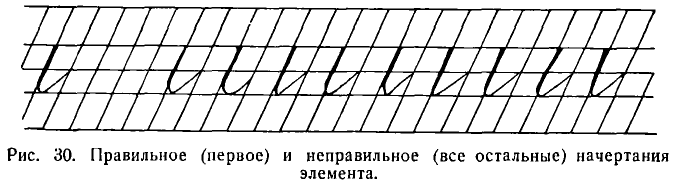
Учитель просматривает тетради, делает указания. Дети пишут строчку до конца.
The teacher looks through the notebooks, gives instructions. The children write the line to the end.
Убедившись в том, что ученики выполняют задание правильно, учитель показывает, как надо писать на доске букву и.
After ensuring that the students are completing the task correctly, the teacher shows how to write the letter и on the board.
Эта буква состоит из двух одинаковых элементов: палочек (черт) с закруглением внизу, соединяемых с отрывом руки при письме.12 Затем учитель объясняет, что оба элемента буквы и имеют совершенно одинаковый нажим, одинаковое закругление и обе тонкие черты, начинающиеся от закругления, идут рядом (параллельны одна другой).
This letter consists of two identical elements: sticks (lines) with a curve at the bottom, which are joined with the hand lifted off the page when writing.12 Then the teacher explains that both elements of the letter и have exactly the same pressure, the same rounding, and both thin lines, starting from the rounding, go side by side (parallel to each other).
Когда учитель убедится, что дети усвоили написание буквы и, он учит их писать ее под счет, т. е. применяет ритмический метод. Для этого он сперва сам пишет под счет на доске, а дети следят, как он это делает.
When the teacher is sure that the children have mastered the writing of the letter и, he teaches them to write it by count, i.e., he applies the rhythmic method. To do this, he first writes by count on the board himself, and the children watch how he does it.
Учитель. Смотрите и внимательно слушайте, дети. Я ставлю мел на пересечении верхней лежачей (строчной) линии и, говоря раз, сразу же веду книзу прямую черту с нажимом. Начиная после закругления тонкую черту, говорю и. На счет два пишу вторую черту (палочку) с нажимом. Так мы будем писать букву и под счет раз и, два.
Teacher. Watch and listen carefully, children. I place the chalk at the intersection of the upper horizontal line and, saying one, I immediately lead it down a straight line with pressure. Starting after the rounding, the thin line, I say and. On the count of two I write the second line (stick) with pressure. This is how we will write the letter и to the count of one and, two.
Учитель предлагает приготовиться. Дети берут ручки, обмакивают перья в чернила и ставят на то место, где следует начинать букву. Под счет раз они пишут прямую черту с нажимом и т. д. При письме под счет учитель должен сохранять определенный, неизменный ритм. Отстающие ученики соответственно ритму ускоряют темп письма, спешащие — замедляют его.
The teacher suggests getting ready. The children take their pens, dip the nibs in ink, and place them where the letter should start. On the count of one they write a straight line with pressure, etc. When writing by count, the teacher should maintain a certain, unchanging rhythm. The lagging students speed up the tempo of writing according to the rhythm, the rushing ones slow it down.
Четвертый урок. Письмо букв ш, г, п.
Fourth Lesson. Writing the letters ш, г, п.
Письмо буквы ш начинается с усвоения составляющих ее элементов-палочек (черт) с закруглением внизу. Дели пишут одну строчку. После письма на доске, сопровождающегося объяснением учителя, буква ш пишется учениками под счет раз и, два и, три.
Writing the letter ш starts with mastering its constituent elements - sticks (lines) with a curve at the bottom. The children write one line. After writing on the board, accompanied by the teacher's explanation, the letter ш is written by the students to the count of one and, two and, three.
При показе буквы г на доске и плакате учителю необходимо обратить внимание детей на то, что эта буква состоит из прямой черты (палочки) с закруглением вверху и внизу. Поэтому нажимная часть буквы должна быть, безусловно, прямая, без всякого изгиба, который дети иногда допускают при письме, изображая букву вроде вопросительного знака; оба закругления — верхнее и нижнее — должны быть одинаковы. Тонкие черты, соединяющие соседние буквы, должны быть ровными, а не изогнутыми, как крючки.
When demonstrating the letter г on the board and poster, the teacher needs to draw the children's attention to the fact that this letter consists of a straight line (stick) with rounding at the top and bottom. Therefore, the pressured part of the letter must be, without a doubt, straight, without any bends that children sometimes allow when writing, depicting the letter like a question mark; both roundings - the upper and lower - should be identical. The thin lines connecting adjacent letters should be straight, not curved like hooks.
Усвоив письмо буквы г, дети без особых затруднений перейдут к написанию буквы п. Оба элемента этой буквы должны быть ровными, без прогибов.
Having mastered the writing of the letter г, children will move on to writing the letter п without any particular difficulties. Both elements of this letter should be straight, without bends.
Написав три буквы п и получив одобрение учителя, ученики пишут ее под счет раз и, два с отрывом руки при соединении элементов.
After writing three letters п and receiving the teacher's approval, the students write it to the count of one and, two with the hand lifted off the page when connecting the elements.
Если дети не сумеют написать три буквы в течение одного урока, третью букву можно перенести на следующий урок.
If the children are unable to write three letters during one lesson, the third letter can be postponed to the next lesson.
Пятый урок. Письмо букв т, р и слов с ними.
Fifth Lesson. Writing the letters т, р and words with them.
Перед письмом буквы т дети пишут новый элемент, встречающийся только в этой букве, — палочку с нажимом и закруглением вверху. Требования такие же, как и к предыдущим элементам строчных букв I группы: прямизна нажимной части черты и закругление такое же, как и в букве г.
Before writing the letter т, the children write a new element, found only in this letter - a stick with pressure and rounding at the top. The requirements are the same as for the previous elements of lowercase letters in Group I: the straightness of the pressured part of the line and the rounding is the same as in the letter г.
К обычным ошибкам в начертании второго элемента буквы т, как и других элементов I группы, относятся следующие: 1) недостаточная прямизна (наличие прогибов) нажимных черт; 2) неравномерность нажима, выражающаяся в том, что нажимная черта бывает тоньше или вверху, или внизу; 3) крючкообразная форма закругления из-за несоблюдения прямизны тонких черт (рис. 31).
The common mistakes in writing the second element of the letter т, as well as other elements of Group I, include the following: 1) insufficient straightness (presence of bends) of pressured lines; 2) uneven pressure, expressed in the fact that the pressured line is thinner either at the top or at the bottom; 3) hook-like form of rounding due to non-compliance with the straightness of thin lines (fig. 31).
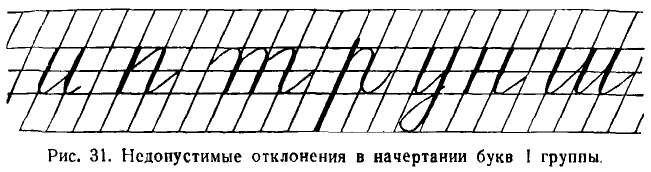
Написав две-три буквы т, ученики пишут ее под счет раз и, два и, три. Учитель следит за тем, чтобы учащиеся писали буквы в одном темпе.
After writing two or three 't' letters, students write them while counting one and, two and, three. The teacher ensures that the students write the letters at the same tempo.
Буква р состоит из двух элементов: прямой удлиненной черты с нажимом и прямой черты с нажимом и закруглением вверху и внизу.
The letter 'р' consists of two elements: a straight elongated stroke with pressure and a straight stroke with pressure and a roundness at the top and bottom.
Новым для учащихся будет первый элемент — совершенно прямая длинная черта, которая начинается выше верхней надстрочной линии на 1 мм и продолжается до нижней промежуточной (подстрочной) линии, имея одинаковую толщину с начала до конца.
What will be new for the students is the first element — a completely straight long line, which begins 1 mm above the upper superscript line and continues to the lower intermediate (subscript) line, maintaining the same thickness from beginning to end.
Первое время эти черты (палочки) удаются учащимся с трудом и пишутся неровно. Но это не может пугать учителя. Учитель должен настойчиво добиваться от детей правильного и уверенного написания прямой черты.
Initially, these lines (sticks) are difficult for students and are written unevenly. But this should not alarm the teacher. The teacher must persistently achieve from the children the correct and confident writing of the straight line.
Чтобы строка производила приятное впечатление, элементы лучше писать группами, делая после трех элементов промежуток в две клетки.
To make the line produce a pleasant impression, it is better to write the elements in groups, making a two-cell gap after every three elements.
В целом буква р пишется под счет раз и, два.
Overall, the letter 'р' is written while counting one and, two.
Ввиду большой длины первого элемента, букву р до изучения скорописи пишут с отрывом руки.
Due to the great length of the first element, the 'р' letter is written with a lifted hand until cursive writing is studied.
После письма этой буквы дети могут написать следующие слова: три, гири, тигр, пир.
After writing this letter, children can write the following words: три, гири, тигр, пир.
Учитель вырабатывает у учащихся навык письма слов под счет и без отрыва руки там, где это возможно (например, в сочетании иг). Счет должен быть медленным и равномерным.
The teacher develops students' skill of writing words by counting and without lifting the hand where possible (for example, in the combination иг). The count should be slow and even.
Шестой урок. Последними буквами первой группы являются буквы н, у, й.
Sixth lesson. The last letters of the first group are 'н', 'у', 'й'.
Буква н состоит из трех элементов: прямой палочки (черты) с нажимом, волнистой черты с нажимом посередине и прямой черты (палочки) с нажимом и закруглением внизу.
The letter 'н' consists of three elements: a straight stick (stroke) with pressure, a wavy stroke with pressure in the middle, and a straight stroke (stick) with pressure and a roundness at the bottom.
Новым для детей будет второй элемент буквы — волнистая черта с нажимом посередине. Именно волнистая, а не прямая черта является вполне рациональной для соединения первого и третьего элементов. Только при таком написании элемента предупреждается всякая возможность смешивания букв н и и.
New to the children will be the second element of the letter — a wavy stroke with pressure in the middle. It is precisely the wavy, not straight stroke that is quite rational for connecting the first and third elements. Only with such writing of the element is there prevention of any possibility of mixing the letters 'н' and 'и'.
Волнистая черта — очень трудный для письма элемент. Учитель при письме его на доске дает такие объяснения: «Ставлю мел на пересечении средней лежачей (строчной) линии. Веду тонкую черту до середины клеточки кверху. Делаю нажим книзу и снова веду тонкую черту кверху».
The wavy stroke — is a very difficult element for writing. The teacher, when writing it on the board, gives such explanations: "I place the chalk at the intersection of the middle horizontal (line) line. I draw a thin line upwards to the middle of the cell. I apply pressure downwards and again draw a thin line upwards."
Важно, чтобы нажим был сделан отчетливо, хотя и несколько слабее, чем в основных элементах, а изогнутость не была велика.
It is important that the pressure is made clearly, albeit slightly weaker than in the main elements, and the curvature is not large.
Учитель должен научить учащихся отличать волнистую черту от ломаной. Для сравнения он рисует ломаную черту на доске.
The teacher must teach students to distinguish the wavy line from the broken one. For comparison, he draws a broken line on the board.
Дети пишут целую строку этих элементов. Затем пишут букву сперва без счета, потом под счет: раз (прямая черта) и, два (волнистая) и, три (прямая закругленная внизу).
The children write a whole line of these elements. Then they write the letter first without counting, then while counting: one (straight line), and, two (wavy), and, three (straight rounded at the bottom).
С этой буквой можно написать под счет слова нить и пни.
With this letter, you can write the words нить and пни by counting.
Буква у состоит из двух элементов: прямой палочки (черты) с нажимом и закруглением внизу и прямой палочки (черты) с нажимом и петлей внизу.
The letter 'у' consists of two elements: a straight stick (stroke) with pressure and a rounding at the bottom, and a straight stick (stroke) with pressure and a loop at the bottom.
Учащиеся перед письмом этой буквы усваивают встречающийся им впервые второй элемент буквы у.
Before writing this letter, students learn the second element of the letter 'у', which they encounter for the first time.
Трудность написания этого элемента заключается в том, что на всем протяжении длинной черты нужно сохранить прямизну. Кроме того, эта длинная черта заканчивается петлею, которую ни в коем случае нельзя писать в виде лопатки. В ширину петля занимает полклетки. Тонкая черта, которой она заканчивается, пересекает нажимную черту точно на нижней лежачей (строчной) линии.
The difficulty of writing this element lies in the fact that the straightness needs to be maintained throughout the long stroke. In addition, this long stroke ends with a loop that should not be written like a blade under any circumstances. The loop takes up half a cell in width. The thin line, which it ends with, intersects the pressured stroke exactly at the lower line (line).
При письме прямой черты с нажимом и петлей внизу учитель дает указания.
When writing a straight stroke with pressure and a loop at the bottom, the teacher gives instructions.
Учитель. Смотрите, дети, я ставлю мел на пересечении верхней лежачей (строчной) линии и наклонной. Веду вниз черту (палочку) с нажимом. Немного не доведя до нижней подстрочной (промежуточной) линии, делаю влево тонкое закругление. Пересекаю идущей от закругления тонкой чертой нажимную черту на нижней лежачей (строчной) линии. Довожу затем тонкую черту до середины клеточки.
Teacher: Watch, children, I place the chalk at the intersection of the upper line (line) and the diagonal. I draw down a stroke (stick) with pressure. Just before reaching the lower subscript (intermediate) line, I make a thin rounding to the left. I cross the pressure stroke on the lower line (line) with the thin line coming from the rounding. Then I extend the thin line to the middle of the cell.
Букву у дети пишут сперва без счета, потом под счет: /раз и, два и.13
Children first write the letter 'у' without counting, then with counting: one and, two and.13
С этой буквой дети могут написать слова: уши, шнур, грунт, гурт и др.
With this letter, children can write words: уши, шнур, грунт, гурт and others.
Group I numbers: 1, 4, 7
Письмо цифр I группы (1, 4, 7)
Седьмой урок. Письмо цифр 1, 4, 7.
Seventh lesson. Writing the numbers 1, 4, 7.
Цифры нужно писать в тетрадях по клеткам. Пишутся они также наклонно, но размещать их по клеткам значительно труднее, чем буквы по косым линейкам. Каждая цифра занимает в высоту две клетки.
Numbers should be written in notebooks on cells. They are also written inclined, but it is significantly more difficult to place them on cells than letters on slanting lines. Each number takes up two cells in height.
При письме на доске цифры 1 учитель разъясняет учащимся, что она состоит из тонкой черты, которая начинается от нижнего левого уголка верхней клетки и идет наискось (по диагонали) вверх направо. От правого уголка клеточки начинается вторая (основная) прямая черта, заостренная сверху, с постепенно увеличивающимся книзу нажимом.
When writing the number 1 on the blackboard, the teacher explains to the students that it consists of a thin line, which starts from the lower left corner of the top cell and goes diagonally upwards to the right. The second (main) straight line, pointed at the top, with a gradually increasing pressure downwards, starts from the right corner of the cell.
Цифра 4 состоит из трех прямых черт. Первая из них — прямая — клинообразная черта с тупым верхним и острым нижним концом. Она ведется наклонно сверху вниз на протяжении полутора клеток. От нее без отрыва проводится тонкая горизонтальная черта вправо через всю клетку. Потом рука отрывается, и над второй чертой начинается и пересекает ее третья черта, короткая, клинообразная, с острым верхним и тупым нижним концом.
The number 4 consists of three straight lines. The first one is a straight, wedge-shaped line with a blunt top and a sharp bottom. It is conducted diagonally from top to bottom for one and a half cells. From it, without lifting the hand, a thin horizontal line is drawn to the right across the entire cell. Then the hand is lifted, and above the second line begins and crosses it the third line, short, wedge-shaped, with a sharp upper and blunt lower end.
Цифра 4 пишется под счет раз и, два.
The number 4 is written to the count one and, two.
Цифра 7 состоит из двух черт. Из волнистой черты с нажимом посередине и из клинообразной наклонной, расширяющейся книзу.
The number 7 consists of two lines. From a wavy line with pressure in the middle and from a wedge-shaped inclined line, widening downwards.
Цифра 7 пишется под счет и раз (волнистая черта), и два (прямая черта с наклоном).
The number 7 is written to the count and one (wavy line), and two (straight line with a tilt).
Не следует допускать, чтобы верхняя часть цифры начиналась таким же узелком, как буква ч. Она должна иметь такую же форму, как волнистая черта в букве н.
It should not be allowed for the upper part of the number to start with the same knot as the letter ч. It should have the same form as the wavy line in the letter н.
Написав на четырех-пяти строчках цифры 1, 4, 7, ученики на шестой строке пишут двузначные числа, составленные из этих цифр.
After writing the numbers 1, 4, 7 on four or five lines, students on the sixth line write two-digit numbers composed of these digits.
Group II lowercase letters: л, м, ц, щ, ь, ы
II группа строчных букв л, м, ц, щ, ь, ы
На письмо строчных букв II группы отводится три часа, т. е. на каждом уроке пишутся в среднем две буквы.
Three hours are allocated for writing the lowercase letters of Group II, which means that on average two letters are written at each lesson.
Восьмой урок. Письмо букв л и м.
Eighth lesson. Writing the letters л and м.
Буква л состоит из двух элементов: точки с волосной чертой и прямой черты с нажимом и закруглением внизу, которая уже входила в буквы I группы.
The letter л is composed of two elements: a dot with a hairline and a straight line with emphasis and a curve at the bottom, which was already included in the letters of Group I.
Точку с волосной чертой дети пишут так: ставят точку на наклонной немного (на 1/6 высоты буквы) выше нижней лежачей (строчной) линии и ведут от точки тонкую черту сперва влево и вниз, потом круто вверх направо. Затем доводят до места выше середины следующей наклонной линии. Точку нужно делать достаточно сильным нажимом пера, однако без вращения его на месте.
The dot with the hairline is written by the children as follows: they place a dot on the slant line slightly (1/6 of the letter's height) above the bottom line (base line), and lead from the dot a thin line first to the left and down, then sharply up to the right. Then they lead it to a place above the middle of the next slant line. The dot should be made with enough pen pressure, but without rotating it in place.
Написав этот элемент, дети пишут одну-две буквы медленно, затем, до конца строки, быстрее под счет раз и, два.
Having written this element, the children write one or two letters slowly, then, until the end of the line, faster under the count one and, two.
С буквой л дети пишут слова ил, нули.
With the letter л, children write the words ил, нули.
С буквой у и и буква л соединяется без отрыва пера. Перед письмом слова нули учитель объясняет детям, что буква у соединяется с буквой л внизу таким образом, что тонкая черта, которой заканчивается петля, идет не вверх, а прямо к точке, с которой начинается буква л.
The letter л is joined to the letters у and и without lifting the pen. Before writing the word нули, the teacher explains to the children that the letter у is joined to the letter л at the bottom in such a way that the thin line, which ends the loop, goes not upwards, but straight to the dot from which the letter л begins.
Потом дети переходят к букве м, которая состоит из трех элементов и пишется под счет: раз и, два и, три.
Then the children move on to the letter м, which consists of three elements and is written under the count: one and, two and, three.
С буквой м пишется слово шум.
With the letter м, the word шум is written.
Буква у с буквой м соединяется без отрыва пера.
The letter у is joined to the letter м without lifting the pen.
Девятый урок. Письмо букв ц и щ.
Ninth lesson. Writing the letters ц and щ.
Буква ц, состоит из трех элементов, а щ — из четырех. Последний элемент той и другой буквы — опущенная книзу петля.
The letter ц consists of three elements, and щ - of four. The last element of both letters is a loop dropped down.
Остальные элементы той и другой буквы — прямые черты с нажимом и закруглением внизу — не вызывают затруднений. Поэтому все внимание сосредоточивается на письме трудного элемента — петли.
The other elements of both letters - straight lines with pressure and rounding at the bottom - do not cause difficulties. Therefore, all attention is focused on writing the difficult element - the loop.
Опущенная петля в первый раз пишется учителем на доске в увеличенном размере, т. е. высотою в строчную букву и на строке, а вторично под строкой.14 При письме ее учителем даются такие объяснения.
The dropped loop is first written by the teacher on the board in an enlarged size, i.e. the height of a lowercase letter and on the line, and a second time under the line.14 When writing it, the teacher gives such explanations.
Учитель. Ставлю мел на наклонной при пересечении ее средней лежачей (строчной) линией и веду вверх тонкую черту. На верхней строчной (лежачей) линии делаю узелок и веду вниз изогнутую черту с нажимом в середине. Внизу делаю петлю шириной в полклетки и от закругления веду тонкую черту вверх, которая пересекает изогнутую черту на нижней линии строки.
Teacher: "I put the chalk on the slant line at the intersection with the middle base (line) and lead a thin line up. On the upper base (line) I make a knot and lead a curved line down with pressure in the middle. At the bottom, I make a loop half a cell wide and from the rounding I lead a thin line up, which crosses the curved line on the lower line of the string.
Самое основное при письме этого элемента — придать красивую изогнутость черте с нажимом.
The most important thing when writing this element is to give a beautiful curvature to the line with pressure.
Отступлений от правильной формы петли бывает очень много, и учителю все их надо иметь в виду (рис. 32).
There can be many deviations from the correct form of the loop, and the teacher needs to keep all of them in mind (figure 32).
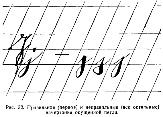
По указанию учителя дети пишут петлю на обычном месте под строкой в уменьшенном размере, т. е. величиной в полклетки. Затем, соединяя этот элемент с другими, пишут букву ц.
At the teacher's direction, the children write the loop in its usual place under the line in a reduced size, i.e. the size of half a cell. Then, connecting this element with others, they write the letter ц.
Буква ц пишется под счет раз и, два и, три и, а буква щ под счет раз и, два и, три и, четыре и.
The letter ц is written to the count one and, two and, three and, and the letter щ to the count one and, two and, three and, four and.
С буквой ц дети могут написать слово шпиц 15 а с буквой щ слово щит.
With the letter ц, children can write the word шпиц/,15 and with the letter щ the word щит.
Десятый урок. Письмо букв ь и ы.
Tenth lesson. Writing the letters ь and ы.
Буква ь имеет два начертания. Одно — с узелком, употребляется в середине слова; другое — с закруглением, закрытое, пишется в конце слов.
The letter ь has two styles. One - with a knot, is used in the middle of a word; the other - with rounding, closed, is written at the end of a word.
Буква ь состоит из двух элементов: основного — прямой черты (палочки) с нажимом и закруглением внизу, и дополнительного — т. е. узелка.
The letter ь consists of two elements: the main one - a straight line (stick) with pressure and rounding at the bottom, and an additional one - i.e. a knot.
Учащиеся сперва упражняются в написании дополнительного элемента — узелка.
Students first practice writing the additional element - the knot.
Начинается он на нижней лежачей (строчной) линии, на середине клеточки. Отсюда ведется кверху тонкая закругляющаяся черта. На середине клеточки образуется узелок, и от него идет к следующей наклонной линии тонкая дугообразная черта.
It starts on the bottom base (line), in the middle of the cell. From here, a thin rounded line is drawn upwards. In the middle of the cell, a knot is formed, and from it a thin arc-shaped line goes to the next slanted line.
При письме буквы ь необходимо соблюдать следующие требования: 1) не делать вместо узелка петлю; 2) узелок должен быть приближен к основному элементу, чтобы буква не расползалась; 3) закругление делать шириною в полклетки.
When writing the letter ь, the following requirements must be observed: 1) do not make a loop instead of a knot; 2) the knot should be close to the main element so that the letter does not spread; 3) the rounding should be half a cell wide.
Буква ь пишется под счет: раз и, два. На и приходится тонкая черта, идущая от закругления, а на два — узелок.
The letter ь is written to the count: one and, two. On and there is a thin line coming from the rounding, and on two - a knot.
Закрытая буква ь пишется не только на конце слова, но и перед буквами л, м и я. Очень важно, чтобы тонкая черта с маленьким закруглением, которым заканчивается буква, не сливалась с нажимной чертой, а образовывала бы с нажимной чертой небольшой просвет.
The closed letter ь is written not only at the end of a word but also before the letters л, м, and я. It's very important that the thin line with a small rounding at the end of the letter doesn't merge with the pressure line but forms a small gap with it.
С буквой ь пишутся слова линь (рыба), путь.
With the letter ь, the words линь (fish), путь are written.
Следующая буква ы. Она состоит из трех элементов: 1) прямой черты с нажимом и закруглением внизу; 2) узелка; 3) второй прямой черты с нажимом и закруглением внизу. Эту букву можно писать без предварительной подготовки, так как ее элементы уже знакомы учащимся.
The next letter is ы. It consists of three elements: 1) a straight line with pressure and rounding at the bottom; 2) a knot; 3) a second straight line with pressure and rounding at the bottom. This letter can be written without preliminary preparation, as its elements are already familiar to the students.
Элементы в букве ы соединяются без отрыва. Буква ы пишется под счет: раз и, два и, три. С этой буквой мы пишем слова щипцы, птицы, мышь, пыль.
The elements in the letter ы are connected without lifting the pen. The letter ы is written to the count: one and, two and, three. With this letter we write the words щипцы, птицы, мышь, пыль.
Group III lowercase letters: о, а, ю, д, б, я, ф
III группа строчных букв о, а, ю, д, б, я, ф
На эти буквы отводится 4 часа.
4 hours are allocated for these letters.
Буквы этой группы состоят из овалов, которых учащиеся еще не писали. Письмо овалов вызовет еще большие трудности, чем написание прямых черт (палочек).
The letters of this group consist of ovals, which the students have not written yet. Writing ovals will pose even more difficulties than writing straight lines (sticks).
Одиннадцатый урок. Письмо букв о и а.
Eleventh lesson. Writing letters o and a.
Буква о состоит из одного элемента — овала с нажимом с левой стороны.
The letter o consists of one element - an oval with a press on the left side.
При письме этой буквы учитель дает объяснения.
When writing this letter, the teacher gives explanations.
Учитель. Чтобы написать букву о, я ставлю мел на следующей наклонной линии, немного выше середины клетки. Веду вверх налево тонкую закругляющуюся черту. Едва касаюсь верхней лежачей (строчной) линии и продолжаю затем закругляющуюся черту с нажимом вниз. К середине клетки нажим постепенно увеличиваю, а начиная с середины, книзу — уменьшаю.
Teacher: To write the letter o, I place the chalk on the next inclined line, slightly above the middle of the cell. I lead upward to the left a thin rounding line. I barely touch the upper lying (line) line and then continue the rounding line with pressure down. By the middle of the cell, I gradually increase the pressure, and from the middle down, I decrease it.
Закруглив еще раз эту черту, внизу едва касаюсь нижней лежачей (строчной) линии. Затем веду ее вверх около наклонной.
Rounding this line once again, I barely touch the lower lying (line) line. Then I lead it up near the inclined one.
Едва коснувшись наклонной, провожу тонкую закругляющуюся черту до «того места, откуда начал писать.
Having barely touched the inclined one, I draw a thin rounding line to "the place where I started to write.
Основные требования, которые предъявляются к письму этой буквы, следующие: 1) кривая овальная черта нигде не должна переходить в прямую; 2) овал следует делать вписанным, т. е. он только касается четырех сторон клетки, нигде не пересекая их; 3) нажим в овале постепенно нарастает и постепенно же убывает, становясь самым большим в середине; 4) ось овала должна иметь такой же наклон, как и прямые черты (палочки), входящие в состав букв I группы.
The main requirements for writing this letter are as follows: 1) the curved oval line should never turn into a straight one; 2) the oval should be inscribed, i.e., it only touches the four sides of the cell, never crossing them; 3) the pressure in the oval gradually increases and gradually decreases, being the largest in the middle; 4) the axis of the oval should have the same inclination as the straight lines (sticks) that make up the letters of Group I.
Одной строчки для письма буквы о обычно бывает недостаточно. Дети пишут вторую и третью строчки овалов, но уже с соединительной чертой. Эта черта служит для соединения буквы о с буквами, начинающимися сверху.
One line is usually not enough for writing the letter o. Children write the second and third lines of ovals, but already with a connecting line. This line serves to connect the letter o with letters that start from the top.
Чтобы показать, как пользоваться этим соединением практически, учитель пишет слово он.
To show how to use this connection in practice, the teacher writes the word он (he).
Буква о без соединительной черты пишется под счет и раз, и; с соединительной чертой — под счет и раз, и два. Счет два дается на точке, которой начинается соединительная черта.
The letter o without a connecting line is written under the count и раз, и; with a connecting line - under the count и раз, и два. The count два is given at the point from which the connecting line begins.
Нижнее соединение буквы о с другими буквами, которые начинаются с точки, можно показать на слове лом.
The lower connection of the letter o with other letters that start from a point can be shown on the word лом (break).
Перед письмом учитель разъясняет, что это слово без отрыва написать нельзя.
Before writing, the teacher explains that it is impossible to write this word without lifting the pen.
Учитель. Написав букву о, мы отрываем руку, прочеркиваем внизу короткую тонкую наклонную черту от о до точки, с которой начинается буква м.
Teacher: Having written the letter o, we lift the hand, draw a short thin inclined line at the bottom from o to the point from which the letter m begins.
Можно делать эту соединительную черту или короткой в 1 мм, или в ширину клетки.
You can make this connecting line either short at 1 mm, or the width of the cell.
В дальнейшем, при обучении скорописи, эта черта соответственно укорачивается.
In the future, when teaching shorthand, this line is accordingly shortened.
Буква а представляет собой соединение овала с прямой чертой (палочкой), с нажимом и закруглением внизу. Поскольку оба элемента уже известны детям, можно сразу же приступить к письму всей буквы, соединяя первый и второй элементы без отрыва.
The letter а is a combination of an oval with a straight line (stick), with a press and rounding at the bottom. Since both elements are already known to the children, one can immediately start writing the whole letter, connecting the first and second elements without lifting the pen.
При письме буквы а нужно соблюдать главное требование, заключающееся в том, чтобы сохранить овальную форму и правильный наклон первого элемента. Из-за нарушения этого правила овал в букве а часто пишется слишком вытянутым и с большим наклоном, чем прямая черта с закруглением внизу.
When writing the letter а, it is necessary to observe the main requirement, which is to maintain the oval shape and correct inclination of the first element. Because of the violation of this rule, the oval in the letter а is often written too elongated and with a greater inclination than the straight line with rounding at the bottom.
Буква а пишется под счет и раз, и два.
The letter а is written under the count и раз, и два.
С буквой а можно написать слово рама. Оно дает учителю возможность показать, как а соединяется без отрыва со следующей буквой, начинающейся с точки.
With the letter а, you can write the word рама (frame). It gives the teacher the opportunity to show how а connects without lifting the pen with the following letter that starts from a point.
Двенадцатый урок. Письмо букв д и ю.
Twelfth lesson. Writing letters д and ю.
Буква д состоит из двух элементов: овала с нажимом с левой стороны и прямой черты с нажимом и петлею. Перед письмом буквы д необходимо повторить письмо прямой черты с нажимом и петлею. Дети давно ее уже не писали, а она их обычно очень затрудняет.
The letter д consists of two elements: an oval with pressure from the left side and a straight line with pressure and a loop. Before writing the letter д, it is necessary to repeat the writing of a straight line with pressure and a loop. Children haven't written it for a long time, and it usually causes them a lot of difficulties.
Буква д пишется под счет: и раз, и два, и. (Третье и дается для того, чтобы ученик не спеша пересек нажимную черту в строго определенном месте.)
The letter д is written under the count: и раз, и два, и. (The third и is given so that the student crosses the pressure line in a strictly defined place without rushing.)
С этой буквой пишутся слова дом и один.
With this letter, the words дом (home) and один (one) are written.
Буква ю состоит из трех элементов: прямой черты (палочки) с нажимом, волнистой черты с нажимом посередине и овала.
The letter ю consists of three elements: a straight line (stick) with pressure, a wavy line with pressure in the middle, and an oval.
Перед письмом этой буквы пишется второй элемент — волнистая черта с нажимом посередине; вся буква пишется под счет: раз и, два и, три и. (Третье и дается для того, чтобы ученик спокойно, без рывка, закрыл овал.)
Before writing this letter, the second element - the wavy line with pressure in the middle - is written; the entire letter is written under the count: раз и, два и, три и. (The third и is given so that the student calmly, without a jerk, closes the oval.)
С буквой ю можно написать слова юрта (с верхним соединением) и июль (с нижним соединением).
With the letter ю, you can write the words юрта (yurt - with upper connection) and июль (July - with lower connection).
Тринадцатый урок. Письмо букв б, я, ф.
Thirteenth lesson. Writing letters б, я, ф.
Буква б состоит из двух элементов: овала и тонкой волнистой черты.
The letter б consists of two elements: an oval and a thin wavy line.
Основные требования при письме этой буквы следующие: овал должен сохранять свою установленную форму и наклон; тонкая черта пишется без нажима.
The main requirements when writing this letter are as follows: the oval should maintain its established form and inclination; the thin line is written without pressure.
Волнистая черта пишется так: ставим перо на пересечении верхней лежачей (строчной) линии с наклонной линией и ведем вверх по наклонной тонкую черту. Не доведя до верхней надстрочной (промежуточной) линии, делаем закругление, как бы срезая угол, и ведем дальше тонкую черту вдоль надстрочной линии на протяжении полутора клеток, а кончик ее загибаем кверху.
The wavy line is written as follows: put the pen at the intersection of the upper lying (line) line with the oblique line and lead a thin line upwards along the oblique. Not bringing it to the upper above-line (intermediate) line, make a rounding, as if cutting off the corner, and continue the thin line along the above-line line for one and a half cells, and bend its tip upwards.
Буква б пишется под счет и раз, и два. Счет два учитель дает на волнистую черту, хотя она пишется без нажима (ср. у В. С. Гербача).
The letter б is written under the count и раз, и два. The count два the teacher gives on the wavy line, although it is written without pressure (see V. S. Gerbach).
С буквой б пишется слово борьба. Это слово полезно и для изучения способов соединений букв и для усвоения его орфографии.
With the letter б, the word борьба (fight) is written. This word is useful both for studying the ways of connecting letters and for mastering its spelling.
Основное требование при письме буквы я: три черты, образующие букву, должны сходиться в одной точке. Для изучения соединений буквы я с другими ученики пишут слова няня и ноябрь. Во втором слове соединительная черта проводится через целую клетку.
The main requirement when writing the letter я: the three lines that form the letter must converge at one point. To study the connections of the letter я with others, students write the words няня (nanny) and ноябрь (November). In the second word, the connecting line is drawn through the entire cell.
Буква я пишется под счет раз и, два и, три.
The letter я is written under the count раз и, два и, три.
Четырнадцатый урок. Письмо буквы ф.
Fourteenth lesson. Writing the letter ф.
Буква ф состоит из трех элементов: овала с нажимом с левой стороны, удлиненной прямой черты (палочки) с нажимом и овала с нажимом с правой стороны.
The letter ф consists of three elements: an oval with pressure from the left side, an elongated straight line (stick) with pressure, and an oval with pressure from the right side.
Перед письмом буквы повторяется второй элемент, а третий элемент пишется вновь.
Before writing the letter, the second element is repeated, and the third element is written again.
При письме овала с нажимом с правой стороны, входящего только в одну букву ф, учитель дает объяснение.
When writing an oval with emphasis from the right side, which is included only in one letter ф, the teacher gives an explanation.
Учитель. Чтобы написать этот элемент, ставлю мел немного выше средней лежачей (строчной) линии и веду тонкую закругляющуюся черту вверх направо. Затем едва касаюсь верхней линии строки и веду вправо вниз, постепенно усиливая нажим до середины клетки. Начиная с середины, постепенно уменьшаю, делаю внизу тонкое закругление и веду вверх вдоль наклонной тонкую закругляющуюся черту до того места, откуда начал писать.
Teacher: To write this element, I put the chalk a little above the middle lying (line) line and lead a thin rounded line upwards to the right. Then I barely touch the top line of the line and lead to the right downwards, gradually increasing the pressure to the middle of the cell. Starting from the middle, I gradually reduce it, make a thin rounding at the bottom and lead upwards along the inclined thin rounded line to the place from where I started writing.
Дети при письме буквы ф нередко искажают ее, ломая овал при соединении с прямой чертой.
Children often distort the letter ф when writing it, breaking the oval when connecting it with a straight line.
Основное требование при письме буквы ф — точное соответствие правого и левого овалов и удлинение прямой черты кверху на 1 мм над верхней лежачей линией.
The main requirement when writing the letter ф is the exact correspondence of the right and left ovals and the extension of the straight line upwards by 1 mm above the upper lying line.
Букву ф дети пишут под счет и раз, и два, и три.
Children write the letter ф under the count и раз, и два, и три.
С буквой ф дети пишут слова: фонарь, арфа.
With the letter ф, children write the words: фонарь, арфа (lantern, harp).
Group IV lowercase letters: с, е, ё, ч, ъ, в.
IV группа строчных букв с, е, ё, ч, ъ, в
Основным элементом букв четвертой группы является левый полуовал.
The main element of the fourth group of letters is the left semi-oval.
Этот элемент представляет собою не просто половину овала или незаконченный овал, как может показаться при рассматривании некоторых прописей. Полуовал — это совершенно особый элемент, отличающийся от овала. Его нажимная часть имеет меньшую закругленность по сравнению с обычным овалом и получается при письме по клеткам путем меньшего срезывания левых углов по сравнению с правыми (рис. 33).
This element is not just half an oval or an unfinished oval, as it may seem when looking at some handwriting samples. A semi-oval is a completely special element, different from an oval. Its pressure part has less rounding compared to a regular oval and is obtained when writing on cells by less cutting off the left corners compared to the right ones (fig. 33).
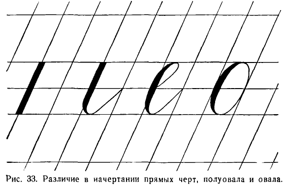
Пятнадцатый урок. Письмо букв с, е.
Fifteenth lesson. Writing letters с, е.
При письме полуовала учитель дает объяснения.
When writing a semi-oval, the teacher gives explanations.
Учитель. Чтобы написать левый полуовал, ставлю мел на верхней лежачей (строчной) линии правее наклонной. Веду книзу закругляющуюся черту с нажимом. Нажим этот постепенно усиливается к середине закругляющейся черты, а от середины книзу уменьшается. Внизу делаю закругление. Едва касаюсь нижней линии строки и веду тонкую закругляющуюся черту кверху до середины клеточки. Срезаю справа больший угол, чем был срезан слева.
Teacher: To write a left semi-oval, I place the chalk on the upper lying (line) line to the right of the inclined line. I lead a downwardly rounded line with pressure. This pressure gradually increases to the middle of the rounding line, and from the middle down it decreases. At the bottom I make a rounding. Barely touching the bottom line of the line, I lead a thin rounded line upwards to the middle of the cell. I cut off a larger angle on the right than was cut off on the left.
Написав строчку этого элемента, дети переходят к письму буквы с. Она отличается от полуовала только точкой, которая ставится немного (на 1/6 высоты буквы) ниже верхней лежачей (строчной) линии, точно на середине клетки, между двумя наклонными.
After writing a line of this element, children move on to writing the letter с. It differs from a semi-oval only in the dot, which is placed a little (1/6 of the letter height) below the upper lying (line) line, exactly in the middle of the cell, between two diagonals.
Буква с пишется под счет раз и, два. Счет раз дается на точку.
The letter с is written under the count раз и, два. The count раз is given on the dot.
С буквой с дети пишут слова сон и мост.
With the letter с, children write the words сон (sleep) and мост (bridge).
Перед письмом буквы е дети учатся писать входящую в нее петлю.
Before writing the letter е, children learn to write the loop included in it.
При письме буквы е учитель дает объяснения.
When writing the letter е, the teacher provides explanations.
Учитель. Смотрите внимательно, дети. Ставлю мел ниже средней строчной (лежачей) линии и веду вверх тонкую закругляющуюся черту. Касаюсь верхней лежачей (строчной) линии у середины клеточки и образую петлю. Затем веду книзу полуовал с нажимом с левой стороны. Внизу делаю тонкое закругление. Касаюсь нижней линии строки. Веду кверху закругляющуюся тонкую черту до середины клеточки. Срезаю справа больший угол, чем был срезан слева.
Teacher: "Watch carefully, children. I place the chalk below the middle line (lying) and draw an upward, thin, rounding line. I touch the top line (lying) at the center of the cell and form a loop. Then I draw a semi-oval down with a push from the left side. At the bottom, I make a thin rounding. I just touch the bottom line of the row. I lead a thin rounding line upward to the middle of the cell. I cut a larger angle on the right than was cut on the left.
Буква е пишется под счет и раз. С буквой е дети пишут слова осень, село. В слове село буква е соединяется с буквой с и л без отрыва; для этого тонкую (волосную) черту, которой заканчивается полуовал, дети ведут вдоль нижней лежачей (строчной) линии вправо до точки, где начинается буква л.
The letter е is written to the count of and once. With the letter е, children write the words осень, село. In the word село, the letter е is connected to the letters с and л without lifting the pen; for this, the thin (hairline) line that ends the semi-oval is led along the bottom line to the right to the point where the letter л begins.
Буква ч в некоторых руководствах, например, у Д. А. Писаревского, относилась к буквам II группы и имела вторым элементом прямую черту с нажимом и закруглением внизу. Но это было отступлением от классической формы. Буква ч состоит из двух элементов: начального узелка и левого полу овала.
The letter ч, in some manuals, for example, in D.A. Pisarevsky's, belonged to the letters of the II group and had a straight line with emphasis and rounding at the bottom as its second element. But this was a departure from the classic form. The letter ч consists of two elements: the initial knot and the left semi-oval.
Прежде всего дети учатся писать начальный узелок. Они ставят перо на середине клеточки, на пересечении средней лежачей (строчной) линии и наклонной. Ведут кверху вправо дугообразную черту до верхней лежачей (строчной) линии ближе к следующей наклонной. В этом месте образуют узелок путем соединения черты с вогнутой чертой, которая заходит немного (на 0,5 мм) за следующую наклонную линию. Отсюда начинается полуовал, который пишется обычно.
First of all, children learn to write the initial knot. They put the pen in the middle of the cell, at the intersection of the middle line (lying) and the diagonal. They draw an arc line upward to the right to the top line (lying) closer to the next diagonal. At this point, they form a knot by connecting the line with a concave line, which goes a little (0.5 mm) beyond the next diagonal line. From here, the semi-oval is usually written.
Буква ч пишется под счет и раз, и два.
The letter ч is written to the count of and once, and twice.
С этой буквой дети пишут слова речь, пчела, очень и учатся соединять букву без отрыва с предшествующими е и п, а букву о с ч при помощи узелка.
With this letter, children write the words речь, пчела, очень and learn to connect the letter without lifting the pen with the preceding е and п, and the letter о with ч using a knot.
Главное требование, которое должно быть учтено при письме этой буквы, заключается в том, чтобы вогнутая черта начального узелка была короткой, не длиннее 2 мм.
The main requirement that should be taken into account when writing this letter is that the concave line of the initial knot should be short, not longer than 2 mm.
Буква ъ отличается от ч третьим элементом — конечным узелком. Но ъ можно писать и без узелка, с тонким закруглением в тех случаях, когда после него стоит буква я.
The letter ъ differs from ч by the third element - the final knot. However, ъ can also be written without a knot, with a thin rounding, in cases when the letter я follows it.
Пишется ъ под счет и раз, и два, и три. С ъ можно написать слова объём, объяснение.
The letter ъ is written to the count of and once, and twice, and three times. With ъ, you can write the words объём, объяснение.
Букву в можно писать двумя способами: большого размера, высотою в заглавную букву, и малого размера, высотою в обычную строчную букву.
The letter в can be written in two ways: large, the height of a capital letter, and small, the height of a usual lowercase letter.
Буква в состоит из трех элементов: верхней петли, полуовала с нажимом с левой стороны и узелка.
The letter в consists of three elements: the upper loop, the semi-oval with emphasis on the left side, and the knot.
В тех случаях, когда за этой буквой следует другая, начинающаяся точкой внизу (л, м, я), буква в пишется закрытой, без узелка.
In those cases, when another letter follows this one, starting with a point at the bottom (л, м, я), the letter в is written closed, without a knot.
Малая буква в (с узелком) пишется перед или после буквы б для придания слову более красивого вида, а также и в других случаях, где ее удобнее соединить со смежными буквами.
The small letter в (with a knot) is written before or after the letter б to give the word a more beautiful appearance, as well as in other cases where it is more convenient to connect it with adjacent letters.
В методиках и прописях применялись до сего времени различные способы начертания буквы в.
Various methods of writing the letter в have been used in methodologies and handwriting worksheets until now.
Например, А. И. Воскресенская и Н. И. Ткаченко в своей прописи (1-е издание) писали эту букву в два приема, причем петля переходила в прямую черту с нажимом.
For example, A.I. Voskresenskaya and N.I. Tkachenko in their handwriting worksheets (1st edition) wrote this letter in two steps, while the loop transitioned into a straight line with emphasis.
В руководстве В. А. Саглина писались и петля, и полуовал сразу, за один прием.
In the guide by V.A. Saglin, both the loop and the semi-oval were written at once, in one step.
Д. А. Писаревский делит букву в на две части.
D.A. Pisarevsky divides the letter в into two parts.
Но целесообразность требует последовательного применения генетического метода при письме всех трех элементов буквы, так как она принадлежит к числу труднейших букв.
However, practicality requires the consistent application of the genetic method in writing all three elements of the letter, as it belongs to the most difficult letters.
Учитель пишет сначала первый элемент буквы  — петлю, сопровождая это объяснениями.
The teacher first writes the first element of the letter [image] - the loop, accompanying it with explanations.
Учитель. Чтобы написать петлю, ставлю мел немного ниже верхнего правого угла клеточки. Веду вверх направо через пересечение наклонной и верхней лежачей (строчной) линии тонкую выгнутую вправо черту, которая доводится до надстрочной линии и затем заканчивается тонким закруглением у левого угла близ надстрочной линии.
Teacher: To write the loop, I place the chalk a little below the upper right corner of the cell. I lead up to the right through the intersection of the slanted and the upper lying (line) with a thin line curved to the right, which is extended to the overline and then ends with a thin rounding at the left corner near the overline.
Когда дети напишут целую строчку первого элемента, учитель переходит к письму второго элемента — левого полуовала.
When the children write a whole line of the first element, the teacher proceeds to write the second element - the left semi-oval.
Учитель. Полуовал начинается от надстрочной линии и пишется вдоль наклонной линии. Он имеет меньшую округлость, чем овал, и не имеет на Своем протяжении такой прямизны, какая имеется в черте с нажимом и закруглением внизу.
Teacher: The semi-oval starts from the overline and is written along the slanted line. It has less roundness than the oval, and does not have on its length such straightness as is present in the line with emphasis and rounding at the bottom.
Третий элемент — закругление с узелком — начинается внизу, от нижней линии строки, занимает в ширину 2/3 клетки и заканчивается узелком выше средней строчной (лежачей) линии или закруглением без узелка.
The third element - rounding with a knot - begins at the bottom, from the lower line of the line, takes up 2/3 of the cell in width, and ends with a knot above the middle line (lying) or a rounding without a knot.
Нужно показать два способа написания буквы в (закрытое и с узелком), объяснить учащимся, что закрытое письмо применяется на конце слов или перед буквами, начинающимися точкой (л, м, я), а с узелком — в остальных случаях.
It is necessary to show two ways of writing the letter в (closed and with a knot), explain to the students that the closed writing is used at the end of words or before letters starting with a point (л, м, я), and with a knot - in all other cases.
Написав на одной строчке каждый из трех элементов, дети пишут всю букву один-два раза медленно, потом под счет и раз, и два, и три.
Having written each of the three elements on one line, the children write the whole letter one or two times slowly, then to the count of and once, and twice, and three times.
С буквой в дети пишут для изучения основных соединений слова весна и сливы.
With the letter в, children write the words весна and сливы for the study of the basic connections.
Наконец, дети практикуются в письме буквы в меньшего размера, величиной с букву е, от которой в отличается только присоединением конечного узелка, такого же, как в букве ь.
Finally, the children practice writing the letter в of a smaller size, the size of the letter е, from which it differs only by the addition of the final knot, the same as in the letter ь.
Group II numbers: 6, 9
Письмо цифр II группы (6, 9)
Семнадцатый урок. Письмо цифр 6 и 9.
Seventeenth lesson. Writing numbers 6 and 9.
Цифры пишутся высотою в две клетки на специальных листах бумаги в клетку.
The numbers are written two squares high on special squared paper.
Цифра 6 состоит из двух элементов, но писать их отдельно нецелесообразно. Первый элемент — левый полуовал с точкой — дети уже писали на предшествующих уроках; второй элемент — полуовал — представляет собою разновидность того закругления, которое ученики делали при письме закрытых букв ь и ъ.
The number 6 consists of two elements, but it is not advisable to write them separately. The first element - the left semi-oval with a point - the children have already written in previous lessons; the second element - the semi-oval - is a variation of the rounding that the students made when writing the closed letters ь and ъ.
Требования к написанию цифры 6: 1) писать ее следует наклонно, как и буквы, принимая во внимание направление оси полуовала; 2) второй части ее надо придать эллиптическую форму; 3) необходимо между первым и вторым элементами оставлять небольшой просвет.
Requirements for writing the number 6: 1) it should be written obliquely, like the letters, taking into account the direction of the axis of the semi-oval; 2) the second part should be given an elliptical shape; 3) it is necessary to leave a small gap between the first and second elements.
Цифра 6 пишется под счет раз и, два и. Счет раз дается на точку.
The number 6 is written to the count of once and, twice and. The count once is given to the point.
Цифра 9 состоит из левого полуовала без нажима и правого полуовала с нажимом и точкой.
The number 9 consists of the left semi-oval without emphasis and the right semi-oval with emphasis and a point.
При письме цифры 9 на доске учитель дает объяснения.
When writing the number 9 on the board, the teacher gives explanations.
Учитель. Чтобы написать цифру 9, я ставлю мел на боковой линии клетки. Веду тонкую закругляющуюся черту книзу до нижней лежачей линии верхней клетки. Потом делаю закругление вверх и вправо. Пишу правый полуовал с нажимом и заканчиваю его точкой.
Teacher: To write the number 9, I put the chalk on the side line of the cell. I lead a thin rounded line down to the lower lying line of the top cell. Then I make a rounding up and to the right. I write the right semi-oval with an emphasis and end it with a point.
Цифра 9 пишется под счет раз и, два и, три.
The number 9 is written to the count of once and, twice and, three.
После письма цифр 6 и 9 можно написать две строчки чисел: 61, 64, 67 и 91, 94, 96, 97.
After writing the numbers 6 and 9, you can write two lines of numbers: 61, 64, 67 and 91, 94, 96, 97.
Group V lowercase letters: э, х, ж, з, к
V группа строчных букв э, х, ж, з, к
Буква э состоит из правого полуовала с точкой и волнистой черты с нажимом посередине.
The letter э consists of a right semi-oval with a dot and a wavy line with pressure in the middle.
При письме полуовала даются следующие объяснения.
The following explanations are given when writing a semi-oval.
«Чтобы написать правый полуовал, нужно поставить перо на пересечении средней линии строки и наклонной, вести тонкую черту до верхней линии строки к середине клеточки. Потом вести вправо вниз закругляющуюся черту с нажимом. Срезать правый нижний угол клетки и вести тонкую закругляющуюся черту. Коснуться нижней лежачей (строчной) линии. Закончить точкой на середине клетки».
"To write the right semi-oval, you need to put the pen at the intersection of the middle line of the string and the oblique, lead a thin line to the top line of the string to the middle of the cell. Then lead the right downward rounding line with pressure. Cut off the right lower corner of the cell and lead a thin rounding line. Touch the lower lying (string) line. Finish with a point in the middle of the cell."
Ввиду того, что полуовал не представляет собою половину овала, правые углы клетки срезаются при письме его меньше, чем левые.
In view of the fact that the semi-oval is not half of the oval, the right corners of the cell are cut off less when writing it than the left ones.
Волнистая черта пишется так же, как в букве н, только немного короче.
The wavy line is written in the same way as in the letter н, only a little shorter.
Буква э пишется под счет и раз, и два, и три. Счет два дается на точку.
The letter э is written to the count of and once, and twice, and three. The count two is given to the point.
С буквой э дети пишут слово поэт или этот.
With the letter э children write the word poet or this.
Буква х состоит из двух полуовалов: правого и левого. Эти элементы дети уже писали. Поэтому букву х можно написать сразу полностью. Чтобы избегнуть кляксы при соединении двух полуовалов, необходимо второй, левый полуовал писать без всякого нажима.
The letter х consists of two semi-ovals: right and left. The children have already written these elements. Therefore, the letter х can be written at once completely. To avoid a blot when connecting two semi-ovals, it is necessary to write the second, left semi-oval without any pressure.
Буква х пишется под счет и раз, и два, и три, и четыре. Счет два и три дается на точки.
The letter х is written to the count of and once, and twice, and three, and four. The count two and three is given to the points.
Буква ж состоит из пяти элементов: правого полуовала, тонкой соединительной черты, прямой черты с нажимом, второй тонкой соединительной черты и левого полуовала.
The letter ж consists of five elements: a right semi-oval, a thin connecting line, a straight line with pressure, a second thin connecting line, and a left semi-oval.
Оба полуовала дети уже писали неоднократно.
The children have already written both semi-ovals multiple times.
Перед письмом буквы учащиеся пишут палочку с нажимом и двумя соединительными чертами. Пишутся эти три черты вместе так: перо ставится ниже средней лежачей (строчной) линии на наклонной, и от нее ведется тонкая черта вверх направо, до следующей наклонной. Без отрыва руки пишется затем прямая черта с нажимом и с тупыми концами. От нее ведется вторая соединительная черта до следующей наклонной.
Before writing the letter, the students write a stick with pressure and two connecting lines. These three lines are written together as follows: the pen is placed below the middle horizontal (string) line on the oblique, and from it a thin line is led upwards to the right, to the next oblique. Without lifting the hand, a straight line with pressure and blunt ends is then written. From it, the second connecting line is led to the next oblique.
Основные требования, которые учитель должен предъявить к ученику при написании буквы ж, заключаются в том, чтобы обе соединительные черты были параллельны одна другой, а прямая черта не была бы заострена ни сверху, ни снизу.
The main requirements that the teacher should make to the student when writing the letter ж are that both connecting lines should be parallel to each other, and the straight line should not be sharpened either at the top or at the bottom.
Буква ж пишется под счет и раз, и два, и три, и четыре, и пять. Счет два и четыре дается на точки.
The letter ж is written to the count of and once, and twice, and three, and four, and five. The count two and four is given to the points.
Буква ж при письме в четыре клетки получается некрасивой, широкой. Поэтому можно разрешить лучшим ученикам писать ее в трех клетках (рис. 34).
The letter ж, when written in four cells, turns out to be unattractive, wide. Therefore, it is possible to allow the best students to write it in three cells (fig. 34).
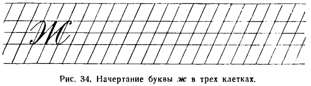
С буквой ж пишется слово сажа.
With the letter ж, the word soot is written.
Девятнадцатый урок. Письмо букв з и к.
Nineteenth lesson. Writing the letters з and к.
Буква з состоит из двух элементов: правого полуовала и второго правого полуовала с петлею.
The letter з consists of two elements: a right semi-oval and a second right semi-oval with a loop.
Сперва дети пишут первый элемент. При письме даются объяснения.
First, children write the first element. Explanations are given when writing.
Учитель. Ставлю мел выше пересечения средней лежачей линии и наклонной, затем веду вверх направо закругляющуюся черту. Касаюсь верхней лежачей линии и начинаю писать правый полуовал, но меньше обычного по длине. Этот полуовал я заканчиваю немного выше нижней лежачей линии. Второй элемент начинаю выше нижней лежачей (строчной) линии и веду закругляющуюся черту вниз. Образую полуовал с нажимом.
Teacher: I put the chalk above the intersection of the middle line and the oblique, then lead a rounded line upwards to the right. I touch the top line and start writing the right semi-oval, but shorter than usual. I finish this semi-oval a little above the bottom line. I start the second element above the lower line and lead a rounded line downwards. I form a semi-oval with pressure.
Довожу до нижней подстрочной линии. Делаю петлю шириною в полклетки и тонкой чертой, идущей кверху, пересекаю полуовал с нажимом на нижней лежачей (строчной) линии.
I bring it to the lower subscript line. I make a loop half a cell wide and with a thin line going upwards, I cross the semi-oval with pressure on the lower line.
Учащиеся часто искажают букву з и строят ее не из полуовалов, а из палочек с закруглением вверху.
Students often distort the letter з and build it not from semi-ovals, but from sticks with a rounding at the top.
Буква з пишется под счет и раз, и два. С нею можно написать слова железо и зверь.
The letter з is written to the count of and once, and twice. With it, you can write the words iron and beast.
На втором слове очень важно показать безотрывное соединение з и в, идущее по диагонали клетки.
On the second word, it is very important to show the seamless connection of з and в, going diagonally across the cell.
Буква к состоит из трех элементов: прямой черты (палочки с нажимом), тонкой (волосной) изогнутой (пламевидной) черты с точкой и прямой черты с нажимом и закруглением вверху и внизу.
The letter к consists of three elements: a straight line (stick with pressure), a thin (hair-like) curved (flame-like) line with a point, and a straight line with pressure and rounding at the top and bottom.
Перед письмом этой буквы пишутся второй и третий элементы.
Before writing this letter, the second and third elements are written.
Второй элемент пишется так: ставится точка на наклонной линии немного (на 1/6 высоты буквы) ниже верхней лежачей (строчной) линии. От нее левее наклонной ведется тонкая (волосная) черта, которая выше средней строчной (лежачей) линии загибается влево и доводится до предшествующей наклонной.
The second element is written as follows: a point is placed on the inclined line a little (1/6 of the height of the letter) below the top line. From it to the left of the inclined line, a thin (hair-like) line is led, which above the middle line (lying) bends to the left and is brought to the previous inclined line.
Третий элемент буквы — прямая черта с нажимом и закруглением вверху и внизу. От наклонной линии выше средней лежачей (строчной) линии ведется тонкая черта вправо. Около следующей наклонной она закругляется и затем по наклонной ведется вниз с нажимом. Не доходя до нижней линии (строчной), закругляется, и от закругления тонкая черта ведется кверху до середины клетки. Таким образом, этот элемент занимает в ширину две клетки, а в высоту полклетки.
The third element of the letter is a straight line with pressure and rounding at the top and bottom. From the inclined line above the middle line (lying), a thin line is led to the right. Near the next inclined line, it is rounded and then led down with pressure along the inclined line. Without reaching the bottom line (lying), it is rounded, and from the rounding, a thin line is led upwards to the middle of the cell. Thus, this element takes up two cells in width and half a cell in height.
Буква к пишется под счет раз, два и, три.
The letter к is written to the count of one, two and, three.
С этой буквой можно написать слова закон, краска, ключ.
With this letter, you can write the words law, paint, key.
Group II and III numbers: 3, 5, 0, 2, 8
Письмо цифр II и III группы (3, 5, 0, 2, 8)
Двадцатый урок. Письмо цифр 3 и 5.
Lesson Twenty. Writing numbers 3 and 5.
Цифра 3 может быть написана двояким способом: упрощенным — в два элемента и сложным — в три элемента. Нужно познакомить детей с тем и другим начертанием цифры, так как сложное начертание часто применяется в бухгалтерских книгах и документах.
The number 3 can be written in two ways: simplified - in two elements, and complex - in three elements. It's necessary to familiarize children with both forms of the number, as the complex form is often used in accounting books and documents.
Начинаем с простого начертания цифры 3, состоящей из двух элементов — двух правых полуовалов. Основное требование при письме цифры заключается в том, чтобы: 1) поставить ее наклонно, от правого угла верхней клеточки к левому углу нижней клеточки; 2) верхний полуовал был меньше нижнего на самую малую величину; 3) на каждом овале был сделан красивый нажим.
We start with the simple form of the number 3, consisting of two elements - two right semi-ovals. The main requirement when writing the number is to: 1) position it diagonally, from the top right corner of the cell to the bottom left corner; 2) the upper semi-oval should be slightly smaller than the lower one; 3) a beautiful emphasis should be made on each oval.
Перед письмом цифры 3 пишем составляющие ее элементы.
Before writing the number 3, we write its constituent elements.
Цифра 3 второго образца состоит из трех элементов: волнистой черты с нажимом посередине, тонкой наклонной черты и правого полуовала.
The number 3 of the second sample consists of three elements: a wavy line with pressure in the middle, a thin inclined line, and a right semi-oval.
Цифра 3 этого образца пишется под счет и раз, и два, и три. Счет три дается на точку.
The number 3 of this sample is written to the count of one, two, three. The count three is given to the point.
Цифра 5 состоит из трех элементов (элементы называются в порядке их написания): тонкой наклонной черты, правого полуовала с точкой и верхней «кавычки» с нажимом.
The number 5 consists of three elements (the elements are named in the order they are written): a thin inclined line, a right semi-oval with a point, and an upper "quotation mark" with pressure.
Все элементы, кроме кавычки, встречались уже раньше. Детям поэтому необходимо поупражняться только в письме кавычки.
All the elements, except for the quotation mark, have already been encountered earlier. Therefore, children need to practice only writing the quotation mark.
Кавычка пишется от середины верхней клеточки до ее верхнего левого уголка. Начинается она легким нажимом, который постепенно ослабляется и переходит в тонкую черту.
The quotation mark is written from the middle of the top cell to its top left corner. It starts with a light pressure, which gradually weakens and transitions into a thin line.
Цифра 5 должна быть написана с таким же наклоном, как буквы. Пишется она под счет раз и, два и, три и, четыре.
The number 5 should be written with the same inclination as the letters. It is written to the count one, two, three, four.
Двадцать первый урок. Письмо цифр 0, 2 и 8.
Twenty-first lesson. Writing numbers 0, 2 and 8.
Цифра 2 состоит из завитка, начинающегося тонкой чертой, переходящей в черту с нажимом, изогнутой черты с нажимом в первой части, волнистой черты с нажимом посередине.
The number 2 consists of a scroll starting with a thin line transitioning into a line with pressure, a curved line with pressure in the first part, and a wavy line with pressure in the middle.
Перед письмом цифры детям следует поупражняться в письме первого и второго элементов, сперва каждого в отдельности, потом того и другого вместе.
Before writing the number, children should practice writing the first and second elements, first each separately, then both together.
Цифра 2 пишется под счет раз и, два и, три.
The number 2 is written to the count one, two, three.
Цифра 8 состоит из двух элементов, взаимно пересекающихся: изогнутой черты, идущей вниз и представляющей сочетание двух противоположных полуовалов, и второй тонкой изогнутой черты, идущей вверх и представляющей сочетание двух таких же полуовалов без нажима.
The number 8 consists of two mutually intersecting elements: a curved line going down, representing a combination of two opposite semi-ovals, and a second thin curved line going up, representing a combination of two such semi-ovals without pressure.
Учитель. Первый элемент пишется в середине верхней клеточки. Отсюда ведем кверху тонкую закругляющуюся черту. Касаемся верхней линии верхней клеточки и ведем закругляющуюся черту с нажимом книзу. Закончив верхний полуовал несколько выше нижней линии верхней клеточки, начинаем левый нижний полуовал. Продолжая на нем начатый нажим, делаем внизу закругление и, коснувшись нижней линии нижней клеточки, заканчиваем его.
Teacher. The first element is written in the middle of the top cell. From here, we draw a thin curved line upwards. We touch the top line of the top cell and lead a curved line with pressure downwards. Having finished the upper semi-oval slightly above the bottom line of the top cell, we start the lower left semi-oval. Continuing the pressure on it, we make a rounding at the bottom and, having touched the bottom line of the bottom cell, we finish it.
Дети пишут одну-две строчки этого элемента.
Children write one or two lines of this element.
Учитель. Второй элемент пишется так: поставив перо на нижней линии нижней клетки, ведем тонкую черту, образующую правый полуовал кверху, и, переведя через верхнюю линию, делаем левый полуовал без нажима.
Teacher. The second element is written like this: placing the pen on the bottom line of the bottom cell, we lead a thin line forming the right semi-oval upwards, and, crossing over the top line, we make the left semi-oval without pressure.
Верхняя часть цифры 8 должна быть немного уже и короче нижней.
The upper part of the number 8 should be slightly narrower and shorter than the lower one.
Цифра 8 пишется с таким же наклоном, как и остальные. Она пишется под счет: и раз, и два.
The number 8 is written with the same inclination as the rest. It is written to the count one, two.
После написания этой цифры и нуля (то же, что 0) учитель знакомит учеников с начертанием знаков арифметических действий.
After writing this number and zero (the same as 0), the teacher introduces students to the drawing of arithmetic operation signs.
Capital letters
ПРОПИСНЫЕ, ИЛИ ЗАГЛАВНЫЕ, БУКВЫ
Заглавные буквы сложнее по начертанию, вдвое превосходят строчные по величине и в большинстве случаев значительно отличаются от строчных своею формой.
Capital letters are more complex in design, twice the size of lowercase letters, and in most cases significantly different in form from lowercase letters.
Заглавные буквы по трудности их написания распределяются на четыре группы.
Capital letters in terms of their writing difficulty are divided into four groups.
Group I capital letters: И, Ш, Ч, Ц, Щ, Л, М, А
I группа заглавных букв И, Ш, Ч, Ц, Щ, Л, М, А
К ней относятся буквы, состоящие из прямых черт с нажимом и закруглением внизу и различных других дополнительных элементов. Рассмотрим их письмо на отдельных уроках.
Group I includes letters consisting of straight lines with pressure and rounding at the bottom and various other additional elements. Let's consider their writing in separate lessons.
Двадцать второй урок. Письмо букв И и Ш.
Twenty-second lesson. Writing of letters И and Ш.
Буква И состоит из трех элементов: начального закругления и двух прямых черт с нажимом и закруглением внизу. Начальное закругление представляет собой овал, начинающийся нажимом. Он пишется с большим наклоном по сравнению с остальными элементами буквы (рис. 35).
The letter И consists of three elements: the initial rounding and two straight lines with pressure and rounding at the bottom. The initial rounding is an oval, starting with pressure. It is written with a greater inclination compared to the other elements of the letter (fig. 35).
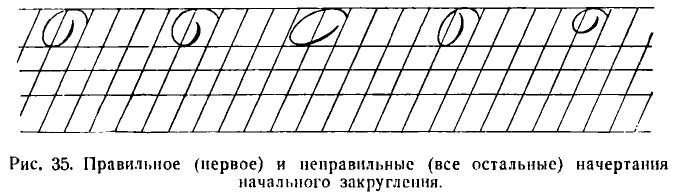
При письме начального закругления учитель дает объяснение.
During the initial rounding in writing, the teacher provides an explanation.
Учитель. Начальное закругление по длине располагается между верхней лежачей (строчной) и надстрочной (промежуточной) линиями, а по ширине занимает полторы клетки. Чтобы написать его, ставлю мел между двумя наклонными линиями, немного ниже надстрочной (промежуточной) линии и начинаю писать правый полуовал сперва без нажима, а потом с легким нажимом. Коснувшись верхней линии строки, закругляю овал кверху, захватываю часть (до половины) соседней (слева) клетки и веду кверху тонкую закругляющуюся черту вправо до наклонной. Такое закругление является началом многих заглавных букв.
Teacher: The initial rounding is positioned in length between the upper baseline and the ascender (intermediate) line, and in width, it occupies one and a half cells. To write it, I place the chalk between two sloping lines, a little below the ascender (intermediate) line and begin to write the right semi-oval first without pressure, and then with a light pressure. Touching the top line of the string, I round the oval upwards, capturing part (up to half) of the neighboring (left) cell and lead upwards a thin curving line to the right until the sloping line. Such rounding is the beginning of many capital letters.
Второй элемент буквы И—прямая черта с нажимом и закруглением внизу. Начинается она немного ниже верхней промежуточной (надстрочной) линии и ведется вниз по наклонной с нажимом. Внизу делается тонкое закругление, и от него идет вверх тонкая черта до верхней лежачей (строчной) линии.
The second element of the letter И is a straight line with pressure and rounding at the bottom. It starts a little below the upper ascender (intermediate) line and is led down the slope with pressure. At the bottom, a thin rounding is made, and from it goes up a thin line to the upper baseline.
Буква И пишется под счет: раз и, два и, три.
The letter И is written to the count of: one and, two and, three.
С этой буквой пишется слово Ира.
This letter is used in the word Ира.
Буква Ш пишется под счет: раз и, два и, три и, четыре.
The letter Ш is written to the count of: one and, two and, three and, four.
С этой буквой пишется слово Шура.
This letter is used in the word Шура.
Двадцать третий урок. Письмо букв Ц, Щ, Ч.
Lesson twenty-three. Writing the letters Ц, Щ, Ч.
Буква Ц состоит из четырех элементов: начального закругления, двух прямых черт с нажимом и закруглением внизу и опущенной петли.
The letter Ц consists of four elements: the initial rounding, two straight lines with pressure and rounding at the bottom, and a dropped loop.
Пишется она под счет раз и, два и, три и, четыре.
It is written to the count of one and, two and, three and, four.
Буква Щ состоит из пяти элементов и пишется под счет раз и, два и, три и, четыре и, пять.
The letter Щ consists of five elements and is written to the count of one and, two and, three and, four and, five.
Дети подготовляются к письму этих букв упражнениями в письме опущенной петли. Форма и расположение петли такие же, как в строчных буквах. Длина петли равняется половине высоты строчной буквы, т. е. 4 мм.
Children prepare to write these letters by practicing the dropped loop. The shape and position of the loop are the same as in lowercase letters. The length of the loop equals half the height of a lowercase letter, i.e., 4 mm.
С буквой Ц дети пишут слово Цна (река) и с буквой Щ слово Щорс.
With the letter Ц, children write the word Цна (a river), and with the letter Щ, the word Щорс.
Буква Ч состоит из трех элементов: начального закругления, прямой черты с нажимом и закруглением внизу и прямой (длинной) черты с нажимом и закруглением внизу.
The letter Ч consists of three elements: the initial rounding, a straight line with pressure and rounding at the bottom, and a straight (long) line with pressure and rounding at the bottom.
Эта буква состоит из элементов, хорошо известных детям, и они пишут ее сразу, без подготовки, а затем пишут слово Чкалов. Пишется буква Ч под счет: раз и, два и, три.
This letter consists of elements that are well known to children, and they write it immediately, without preparation, and then they write the word Чкалов. The letter Ч is written to the count of: one and, two and, three.
Двадцать четвертый урок. Письмо букв Л, М, А.
Lesson twenty-four. Writing the letters Л, М, А.
Буква Л состоит из двух элементов: тонкой изогнутой черты с точкой и прямой черты с нажимом и закруглением внизу.
The letter Л consists of two elements: a thin curved line with a dot, and a straight line with pressure and rounding at the bottom.
Письмо буквы Л начинается с элементов.
The writing of the letter Л begins with the elements.
При письме первого элемента учитель дает детям разъяснения.
When writing the first element, the teacher provides explanations to the children.
Учитель. В длину изогнутая черта с точкой занимает место от нижней лежачей линии до надстрочной линии, а-в ширину — две клетки. Начинается она точкой, которая делается простым нажимом пера на наклонной линии немного выше нижней строчной линии. От нее ведем тонкую черту сперва влево, потом сразу же вниз, касаемся нижней лежачей (строчной) линии, срезаем левый уголок клетки. Во второй клетке начинаем поднимать эту черту вверх, изгибая ее вправо.
Teacher: In length, the curved line with a point occupies the space from the lower baseline to the ascender line, and in width - two cells. It begins with a dot, which is made by a simple press of the pen on the sloping line a little above the lower baseline. From there, we lead a thin line first to the left, then immediately down, touching the lower baseline, cutting off the left corner of the cell. In the second cell, we begin to raise this line upward, bending it to the right.
Дети пишут этот элемент одиннадцать раз на одной строчке.
Children write this element eleven times in one line.
Учитель пишет второй элемент.
The teacher writes the second element.
Учитель. Второй элемент — это прямая черта с нажимом и закруглением внизу. Начинать ее нужно не сразу с нажима, а остро, для чего следует начинать эту черту немного правее и затем сразу же переводить на наклонную линию.
Teacher: The second element is a straight line with pressure and rounding at the bottom. It needs to be started not immediately with pressure, but sharply, for which this line should be started a little to the right and then immediately translated to the slanted line.
Написав одну строчку второго элемента, дети пишут всю букву под счет раз и, два.
Having written one line of the second element, the children write the entire letter to the count of one and, two.
Принимая во внимание, что многие дети при письме этой буквы начинают первый элемент не снизу, от точки, а с верхнего конца, нужно предупредить возможность появления этой ошибки в письме. Поэтому учитель должен следить за тем, как дети будут писать эту букву и буквы А и М.
Considering that many children start the first element of this letter not from the bottom, from the dot, but from the top end, it is necessary to anticipate the possibility of this mistake in writing. Therefore, the teacher should monitor how children will write this letter and the letters А and М.
С буквой Л дети пишут слово Ленин.
With the letter Л, children write the word Ленин.
Буква А отличается от Л только третьим дополнительным элементом. Этот элемент представляет собою волнистую тонкую черту, пересекающую первые два элемента между верхней и средней строчными линиями.
The letter А differs from Л only by the third additional element. This element is a wavy thin line that crosses the first two elements between the upper and middle baseline.
С буквой А дети пишут слово Аля.
With the letter А, children write the word Аля.
Буква М состоит из трех элементов и пишется под счет раз и, два и, три.
The letter М consists of three elements and is written to the count of one and, two and, three.
Первый элемент — тонкая изогнутая черта с точкой; второй и третий — прямая черта с нажимом и закруглением внизу.
The first element is a thin curved line with a dot; the second and third are straight lines with pressure and rounding at the bottom.
Второй элемент отличается от третьего тем, что тонкая черта, идущая от закругления вверх, круто направляется к надстрочной линии.
The second element differs from the third in that the thin line going upward from the rounding sharply directs itself to the ascender line.
Второй элемент нужно поучиться писать отдельно перед письмом всей буквы.
The second element needs to be learned separately before writing the entire letter.
С буквой М дети пишут слово Москва.
With the letter М, children write the word Москва.
Group II capital letters: С, О, Э, Х, Е, З, Я
II группа заглавных букв С, О, Э, X, Е, 3, Я
В эту группу входят буквы, состоящие из овалов, полуовалов и дополнительных элементов.
This group includes letters consisting of ovals, semi-ovals, and additional elements.
Двадцать пятый урок. Письмо букв С, О, Э.
Lesson twenty-five. Writing the letters С, О, Э.
Буква С состоит из точки и левого полуовала. Верх буквы занимает в ширину одну клетку, а низ — две. С буквой С дети пишут слово Сталин.
The letter С consists of a dot and a left semi-oval. The top of the letter occupies one cell in width, and the bottom - two. With the letter С, children write the word Сталин.
Буква О состоит из одного элемента — овала, имеющего два нажима. Занимает она в ширину полторы клетки.
The letter О consists of a single element - an oval that has two pressures. It occupies one and a half cells in width.
Перед письмом этой буквы желательно выполнить упражнения по вычерчиванию овалов величиною с заглавную букву, с проведением нескольких черт параллельно (рядом) одна другой.18
Before writing this letter, it is desirable to perform exercises on drawing ovals the size of a capital letter, with the drawing of several lines parallel (next) to each other.18
Основные требования при письме буквы О: 1) внешний нажим в овале должен быть больше внутреннего; 2) овал не следует расширять кверху; 3) расстояние между внешней и внутренней частями должно быть возможно меньше.
The main requirements when writing the letter О: 1) the external pressure in the oval should be greater than the internal one; 2) the oval should not be expanded upward; 3) the distance between the outer and inner parts should be as small as possible.
Заглавная буква О пишется под счет раз и, два.
The capital letter О is written to the count of one and, two.
Буква Э состоит из трех элементов: начального закругления, правого полуовала с точкой и волнистой черты с нажимом посередине.
The letter Э consists of three elements: the initial rounding, the right semi-oval with a dot, and a wavy line with pressure in the middle.
Прежде всего дети пишут полуовал. Начинают они его с надстрочной (промежуточной) линии, ведут закругляющуюся черту вниз, постепенно увеличивая нажим до середины полуовала.
First of all, children write a semi-oval. They start it from the ascender (intermediate) line, leading the rounding line down, gradually increasing the pressure to the middle of the semi-oval.
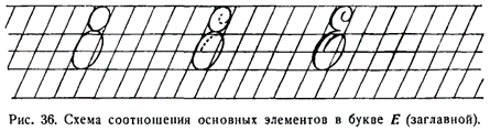
Потом постепенно уменьшают его, едва коснувшись нижней лежачей (строчной) линии и заканчивают точкой, которая ставится на наклонной линии немного выше нижнего левого уголка клеточки.
Then they gradually decrease it, barely touching the lower baseline, and end with a dot, which is placed on the slanting line slightly above the lower left corner of the cell.
Буква Э пишется под счет и раз, и два, и три, и четыре.
The letter Э is written to the count of and one, and two, and three, and four.
С буквой Э дети пишут слово Эмба (река).
With the letter Э, children write the word Эмба (river).
Двадцать шестой урок. Письмо букв X, Е.
Lesson twenty-six. Writing the letters X, Е.
Буква X состоит из трех элементов: начального закругления, правого полуовала с точкой, левого полуовала с точкой (без нажима).
The letter X consists of three elements: the initial rounding, the right semi-oval with a dot, the left semi-oval with a dot (without pressure).
Перед письмом буквы пишется полуовал без нажима, впервые встречающийся в практике учеников. Он отличается от обычного полуовала тем, что пишется легким движением пера.
Before writing the letter, a semi-oval without pressure is written, for the first time encountered in students' practice. It differs from the usual semi-oval in that it is written with a light movement of the pen.
Буква X пишется под счет раз и, два и, три, четыре и, пять. Счет три, четыре дается на точках. Между ними и опускается, потому что в этот момент ученик переносит перо с одной точки на другую, не касаясь бумаги.
The letter X is written to the count of one and, two and, three, four and, five. The count three, four is given to the points. It drops between them because at this moment the student transfers the pen from one point to another without touching the paper.
С буквой X дети пишут слово Харьков.
With the letter X, children write the word Харьков.
Буква Е состоит из двух овалов: верхнего, меньшего, и нижнего, превосходящего верхний в два раза.
The letter Е consists of two ovals: the upper, smaller one, and the lower one, which is twice as large as the upper one.
Для более точного определения формы буквы можно перед письмом ее элементов написать один под другим два закрытых овала, имеющих одинаковый наклон (рис. 36).
For a more precise definition of the letter's shape, you can write two closed ovals, one under the other, which have the same slant, before writing its elements (Fig. 36).
При письме верхнего овала нужно дать детям объяснения.
When writing the upper oval, it's necessary to explain to the children.
Учитель. Чтобы написать верхний элемент буквы Е, ставлю мел немного ниже надстрочной линии между двумя наклонными. Пишу тонкую закругляющуюся черту сперва вниз, потом вправо, наконец, вверх. Касаюсь надстрочной линии и вдоль наклонной веду вниз закругляющуюся черту с нажимом. Делаю резкое закругление вправо немного выше верхней лежачей линии и заканчиваю в этом месте овал.
Teacher: To write the upper element of the letter Е, I place the chalk slightly below the superscript line between the two slants. I write a thin rounded line first down, then to the right, and finally up. I touch the superscript line and lead a rounded line with pressure down along the slant. I make a sharp rounding to the right just above the upper baseline and finish the oval at this point.
Дети пишут одну строчку верхнего овала.
Children write one line of the upper oval.
Учитель. Теперь будем писать нижний овал. Ставим мел немного выше верхней лежачей (строчной) линии посередине между двумя наклонными. Ведем книзу закругляющуюся черту с нажимом. До середины клетки увеличиваем нажим, а от середины к концу уменьшаем его. Внизу делаем плавное закругление вправо. Касаемся нижней линии строки. Ведем затем закругляющуюся тонкую черту кверху. Захватываем половину следующей клетки. Доводим черту почти до верхней лежачей (строчной) линии. Делаем плавное закругление влево и ведем тонкую закругляющуюся черту вниз до средней лежачей линии.
Teacher: Now let's write the lower oval. We put the chalk slightly above the upper baseline in the middle between the two slants. We lead a rounded line with pressure down. We increase the pressure to the middle of the cell, and from the middle to the end we decrease it. At the bottom, we make a smooth rounding to the right. We touch the lower line of the line. Then we lead a rounded thin line upwards. We capture half of the next cell. We bring the line almost to the upper baseline. We make a smooth rounding to the left and lead a thin rounded line down to the middle baseline.
Дети пишут строчку второго овала. Потом всю букву Е. Сперва они пишут ее без счета, затем под счет раз и, два и, три и. Последнее и дается для того, чтобы ученик спокойно, не спеша, закончил второй овал коротким движением пера книзу.
Children write a line of the second oval. Then the whole letter Е. First, they write it without counting, then to the count of one and, two and, three and. The last and is given so that the student can calmly finish the second oval with a short pen movement downwards without rushing.
С буквой Е дети пишут слово Егор.
With the letter Е, children write the word Егор.
Двадцать седьмой урок. Письмо букв 3 и Я.
Lesson twenty-seven. Writing the letters З and Я.
Буква З состоит из трех элементов: начального закругления, верхнего правого полуовала и нижнего правого полуовала.
The letter З consists of three elements: the initial rounding, the upper right semi-oval, and the lower right semi-oval.
Соотношение между верхней и нижней частями в букве 3 несколько иное, чем в букве Е. Верхняя часть буквы 3 в ширину равняется нижней, а в длину занимает почти все пространство между надстрочной линией и верхней строчной линией.
The relationship between the upper and lower parts in the letter З is slightly different than in the letter Е. The upper part of the letter З equals the lower part in width, and in length it occupies almost all the space between the superscript line and the upper baseline.
При письме первого и второго элементов учитель дает объяснения.
When writing the first and second elements, the teacher provides explanations.
Учитель. Чтобы написать вместе два первые элемента буквы, ставим мел ниже надстрочной линии между двумя наклонными. Ведем книзу закругляющуюся черту с нажимом. Выше надстрочной линии делаем плавное закругление влево и ведем кверху закругляющуюся тонкую черту. При этом захватываем немного предыдущую клетку. Касаемся надстрочной линии. Ведем вдоль наклонной закругляющуюся черту с нажимом вниз и заканчиваем ее резким закруглением влево над верхней лежачей линией.
Teacher: To write the first two elements of the letter together, we place the chalk below the superscript line between two slants. We lead a rounded line with pressure down. Above the superscript line, we make a smooth rounding to the left and lead a rounded thin line upwards. At the same time, we capture a bit of the previous cell. We touch the superscript line. We lead a rounded line with pressure down along the slant and finish it with a sharp rounding to the left above the upper baseline.
Буква 3 пишется под счет раз и, два и, три и, четыре.
The letter З is written to the count of one and, two and, three and, four.
С буквой 3 дети пишут слово Зина.
With the letter З, children write the word Зина.
Буква Я состоит из трех элементов: точки с волосной чертой, овала с нажимом с левой стороны, прямой черты с нажимом и закруглением внизу.
The letter Я consists of three elements: a point with a hairline, an oval with pressure on the left side, a straight line with pressure and rounding at the bottom.
Основное требование при письме этой буквы заключается в том, чтобы все три черты, образующие эту букву, сходились в одной точке немного ниже верхнего левого уголка клеточки.
The main requirement when writing this letter is that all three lines forming this letter converge at one point slightly below the upper left corner of the cell.
Второй элемент буквы Я — овал — превосходит по своему размеру строчную букву о. Пишется он так: учитель ставит мел выше верхней лежачей линии на наклонной. Затем он ведет кверху тонкую закругляющуюся черту. Вверху у надстрочной линии учитель срезает уголок, делает резкое закругление влево, касается верхней надстрочной линии и ведет книзу вдоль наклонной закругляющуюся черту с нажимом. Заканчивается овал немного ниже верхней лежачей (строчной) линии. Учитель стремится к тому, чтобы черта с нажимом полностью покрывала наклонную и даже захватывала немного левую клетку.
The second element of the letter Я - the oval - surpasses the lowercase letter о in its size. It is written as follows: the teacher places the chalk above the upper baseline on the slant. Then he leads a thin rounded line upwards. At the top near the superscript line, the teacher cuts the corner, makes a sharp rounding to the left, touches the upper superscript line, and leads a rounded line with pressure down along the slant. The oval ends a little below the upper baseline. The teacher aims to ensure that the line with pressure completely covers the slant and even captures a bit of the left cell.
Буква Я пишется под счет раз и, два и, три. С этой буквой пишется слово Яша.
The letter Я is written to the count of one and, two and, three. With this letter, the word Яша is written.
Group III capital letters: Ж, У, Ю, Н, К, Р, В, Ф
III группа заглавных букв Ж, У, Ю, Н, К, Р, В, Ф
Двадцать восьмой урок. Письмо букв Ж и У.
Lesson twenty-eight. Writing letters Ж and У.
Основным элементом заглавных букв III группы является пламевидная черта. Поэтому, хотя буква Ж часто причисляется ко второй группе, правильнее будет относить ее к третьей группе, в которую входят буквы с пламевидной чертою.
The flame-like stroke is the main element of the capital letters of Group III. Therefore, although the letter Ж is often attributed to the second group, it is more correct to attribute it to the third group, which includes letters with a flame-like stroke.
Буква Ж состоит из четырех элементов: начального закругления, правого полуовала с точкой внизу; пламевидной черты с двумя тонкими соединительными чертами; левого полуовала с точкой вверху.
The letter Ж consists of four elements: the initial curve, the right semi-oval with a point downwards; the flame-like stroke with two thin connecting lines; the left semi-oval with a point upwards.
Новым элементом в этой букве является пламевидная черта.
The new element in this letter is the flame-like stroke.
Учитель. Черта эта называется пламевидной потому, что она напоминает язык пламени, вырывающегося из костра. (Учитель рисует на доске языки пламени.) Начинается она от надстрочной линии тонким штрихом немного левее наклонной, потом сразу же переводится на наклонную, по которой ведется вниз с равномерным нажимом. Не доведя немного до нижней линии строки, ослабляем нажим и отводим тонкий штрих (черту) влево от наклонной, заканчивая его на нижней лежачей линии (строчной).
Teacher. This stroke is called flame-like because it resembles a tongue of flame, bursting out from a bonfire. (The teacher draws tongues of flames on the blackboard.) It begins from the superscript line with a thin stroke a little to the left of the slanted line, then immediately translates into the slant, which is led downwards with even pressure. Not quite reaching the bottom line, we lighten the pressure and lead the thin stroke (line) to the left from the slant, ending it on the baseline.
При письме буквы Ж очень важно соблюдать полную симметрию элементов. Немаловажную роль играют тонкие соединительные черточки, которые должны, как правило, отстоять на одинаковом расстоянии от верха и низа буквы и быть параллельными между собой.
When writing the letter Ж, it is very important to maintain complete symmetry of the elements. The thin connecting lines, which should usually be at an equal distance from the top and bottom of the letter and parallel to each other, play a significant role.
Буква Ж пишется под счет раз и, два и, три и, четыре и, пять и, шесть.
The letter Ж is written to the count of one and, two and, three and, four and, five and, six.
С буквой Ж дети пишут слово Женя.
With the letter Ж, the children write the word Женя.
Буква У состоит из трех элементов: начального закругления, прямой черты с нажимом и закруглением вверху и внизу, пламевидной черты с точкой внизу.
The letter У consists of three elements: the initial curve, the straight stroke with a pressure point and rounding at the top and bottom, the flame-like stroke with a point downwards.
С первыми двумя элементами буквы У дети уже знакомы. Они их писали в букве Ч. Поэтому перед письмом буквы детям достаточно будет потренироваться в письме пламевидной черты с точкой.
The children are already familiar with the first two elements of the letter У. They wrote them in the letter Ч. Therefore, before writing the letter, it will be sufficient for the children to practice writing the flame-like stroke with a dot.
Она отличается от простой пламевидной черты только тем, что в конце будет поставлена точка. Точку нужно сделать немного выше нижней лежачей (строчной) линии на наклонной.
It differs from the simple flame-like stroke only in that a dot will be placed at the end. The dot should be made a little above the baseline on the slant.
Буква У пишется под счет раз и, два и, три и, четыре.
The letter У is written to the count of one and, two and, three and, four.
С буквой У дети пишут слово Уля.
With the letter У, the children write the word Уля.
Двадцать девятый урок. Письмо букв Ю и Н.
Lesson twenty-nine. Writing letters Ю and Н.
Буква Ю состоит из четырех элементов: волнистой черты с нажимом посередине; пламевидной черты с точкой, второй волнистой черты, овала.
The letter Ю consists of four elements: the wavy line with pressure in the middle; the flame-like stroke with a dot, the second wavy line, the oval.
Все элементы этой буквы известны детям. Предварительно пишется только овал, который, ввиду своей сложности, всегда вызывает большие затруднения при письме.
All elements of this letter are known to the children. Only the oval is written in advance, which, due to its complexity, always causes great difficulties when writing.
Буква Ю пишется под счет и раз, и два, и три, и четыре, и пять, и шесть.
The letter Ю is written to the count of and one, and two, and three, and four, and five, and six.
С этой буквой дети пишут слово Юля.
With this letter, the children write the word Юля.
Буква Н состоит из трех элементов: волнистой черты с нажимом посередине, пламевидной черты с точкой, левого полуовала, начинающегося петлей.
The letter Н consists of three elements: a wavy line with pressure in the middle, a flame-like stroke with a dot, the left semi-oval, starting with a loop.
При письме третьего элемента учитель объясняет.
When writing the third element, the teacher explains.
Учитель. Полуовал с петлей начинается между средней и верхней лежачими линиями левее наклонной линии. Эту черту мы ведем через левый верхний угол клетки вдоль верхней лежачей, потом поднимаем вверх к надстрочной линии. Здесь, образовав петлю, начинаем левый полуовал с постепенно увеличивающимся до середины нажимом, который к концу постепенно уменьшается. Внизу делаем закругление и от него ведем тонкую черту вверх до правого уголка клетки.
Teacher. The semi-oval with the loop starts between the middle and upper baseline lines, to the left of the slanted line. We lead this stroke through the upper left corner of the cell along the upper baseline, then lift it upwards to the superscript line. Here, having formed a loop, we start the left semi-oval with a gradually increasing pressure towards the middle, which gradually decreases towards the end. At the bottom, we make a curve and from it, we lead a thin line upward to the right corner of the cell.
Буква Н пишется под счет и раз, и два, и три, и четыре.
The letter Н is written to the count of and one, and two, and three, and four.
С буквой Н дети пишут слово Нина.
With the letter Н, the children write the word Нина.
Тридцатый урок. Письмо букв К и Р.
Lesson thirty. Writing letters К and Р.
Заглавная буква К состоит из четырех элементов: волнистой черты с нажимом посередине; пламевидной черты с точкой; малой пламевидной черты, начинающейся точкой; прямой черты с нажимом и закруглением вверху и внизу.
The capital letter К consists of four elements: the wavy line with pressure in the middle; the flame-like stroke with a dot; a small flame-like stroke that starts with a dot; the straight line with pressure and rounding at the top and bottom.
Все эти элементы, кроме малой пламевидной черты, уже не раз писались детьми.
All these elements, except for the small flame-like stroke, have been written by the children more than once.
При письме третьего элемента учитель дает объяснения.
When writing the third element, the teacher gives explanations.
Учитель. Ставлю точку на наклонной линии, немного (на 1/6 высоты клетки) ниже верхней надстрочной линии. От нее веду тонкую черту вверх; касаюсь верхней надстрочной линии и веду вдоль наклонной вниз малую пламевидную черту; не доводя до верхней лежачей (строчной) линии, круто поворачиваю влево и веду тонкую черту над верхней лежачей линией до наклонной.
Teacher. I place a dot on the slanted line, a little (1/6 of the height of the cell) below the upper superscript line. From there, I lead a thin line upwards; I touch the upper superscript line and lead the small flame-like stroke down along the slant; not reaching the upper baseline, I turn sharply to the left and lead a thin line above the upper baseline to the slant.
Написав одну строчку третьего элемента, дети пишут 3-й и 4-й элементы вместе. После этого пишут букву, сперва без счета, затем под счет и раз, и два, и три, четыре, и пять. Счет три дается на нижнюю точку, четыре — на верхнюю, поэтому и говорить не нужно.
Having written one line of the third element, the children write the 3rd and 4th elements together. After this, they write the letter, first without counting, then to the count of and one, and two, and three, four, and five. The count of three is given to the bottom dot, four — to the upper, so you don't need to say and.
С этой буквой дети пишут слова Катя и Коля.
With this letter, the children write the words Катя and Коля.
Буква Р состоит из трех элементов: пламевидной черты с точкой, начального закругления, правого полуовала.
The letter Р consists of three elements: a flame-like stroke with a dot, an initial rounding, a right semi-oval.
Второй и третий элементы впервые встречаются в таком сочетании. Поэтому перед письмом буквы дети упражняются в письме этих элементов вместе.
The second and third elements are encountered together for the first time. Therefore, before writing the letter, the children practice writing these elements together.
Учитель дает объяснения.
The teacher gives explanations.
Учитель. Ставлю мел между наклонными линиями ниже надстрочной линии. Веду книзу закругляющуюся черту с нажимом. Потом, коснувшись верхней линии строки, делаю плавное закругление влево и веду кверху тонкую черту. Касаюсь надстрочной линии и, перейдя на наклонную, пишу по другую (правую) сторону наклонной правый полуовал. Этот полуовал я делаю короче, чем начальное закругление, и заканчиваю его тонкой волосной чертой, идущей кверху.
Teacher. I place the chalk between the slanted lines below the superscript line. I lead downwards a rounded stroke with pressure. Then, touching the upper line of the string, I make a smooth rounding to the left and lead a thin line upwards. I touch the superscript line and, moving to the slant, I write the right semi-oval on the other (right) side of the slant. I make this semi-oval shorter than the initial rounding, and I finish it with a thin hairline stroke going upwards.
Эти элементы занимают в ширину две с половиной клетки, а в длину (только первая часть) — весь промежуток между надстрочной и верхней линиями строки. Полуовал будет несколько короче. Не следует допускать, чтобы дети писали полуовал шире начального закругления.
These elements take up two and a half cells in width, and in length (only the first part) - the entire space between the superscript and upper lines of the string. The semi-oval will be slightly shorter. It should not be allowed for children to write the semi-oval wider than the initial rounding.
После письма верхней части, дети пишут всю букву, потом слово Рома.
After writing the upper part, the children write the whole letter, then the word Рома.
Буква Р пишется под счет раз и, два, три и, четыре. За точкой непосредственно следует нажим, поэтому между два и три — и произносить не следует.
The letter Р is written to the count of one and, two, three and, four. Immediately following the dot is the pressure, therefore, between two and three — you don't need to say and.
Тридцать первый урок. Письмо букв В, Ф.
Lesson thirty-one. Writing letters В, Ф.
Буква В состоит из четырех элементов: пламевидной черты с точкой, начального закругления, верхнего правого полуовала, нижнего полуовала.
The letter В consists of four elements: a flame-like stroke with a dot, an initial rounding, an upper right semi-oval, a lower semi-oval.
Новым элементом для учащихся будет четвертый, т. е. полуовал. Пишется он так: учитель ставит мел на верхней линии строки между двумя наклонными и начинает писать полуовал, который займет пространство между верхней и нижней линией строки, коснется нижней линии строки и закончится тонкой чертой, проходящей кверху между наклонными линиями.
The new element for the students will be the fourth one, that is, the semi-oval. It is written like this: the teacher places the chalk on the upper line of the string between two slants and starts to write the semi-oval, which will take up the space between the upper and lower line of the string, touch the lower line of the string and end with a thin line going upwards between the slanted lines.
The letter В should be written to the count of one and, two, three and, four and, five.
When writing the letter В, the following condition must be observed: the semi-oval of the upper part of the letter should be slightly narrower than the lower semi-oval.
Букву В следует писать под счет раз и, два, три и, четыре и, пять.
При письме буквы В необходимо соблюдать следующее условие: полуовал верхней части буквы должен быть несколько уже нижнего полуовала.
С буквой В дети пишут слово Волга.
With the letter В, children write the word Волга.
Буква Ф состоит из четырех элементов: волнистой черты с нажимом посередине; пламевидной черты с точкой; овала с нажимом с левой стороны; овала с нажимом с правой стороны.
The letter Ф consists of four elements: a wavy stroke with pressure in the middle; a flame-like stroke with a dot; an oval with pressure on the left side; an oval with pressure on the right side.
Первый и второй элементы уже встречались в предыдущих буквах. Новыми являются третий и четвертый элементы.
The first and second elements have already been encountered in previous letters. The third and fourth elements are new.
Сперва ученики пишут каждый овал в отдельности, а потом оба вместе.
First, students write each oval separately, and then both together.
Овалы следует писать так, чтобы верхняя их часть наполовину выступала над верхней линией строки, а нижняя касалась средней лежачей (строчной) линии.
The ovals should be written so that their upper part protrudes halfway above the upper line of the string, and the lower one touches the middle lying (lowercase) line.
При письме обоих овалов учитель дает объяснения.
When writing both ovals, the teacher gives explanations.
Учитель. Чтобы написать оба овала вместе, нужно поставить перо на пересечении наклонной линии с верхней линией строки и вести кверху закругляющуюся черту. На середине верхней клеточки делается закругление влево и ведется вниз закругляющаяся черта с нажимом. Внизу она касается средней лежачей линии и ведется кверху до того места, откуда начали писать. Не отрывая руки, пишем второй овал, на такой же высоте закругляем его вправо. Ведем вниз закругляющуюся черту с нажимом. Внизу касаемся средней лежачей (строчной) линии и делаем закругление вверх до окончания овала. Гак у нас должны получиться два овала, соответствующие один другому настолько, что если бы мы положили их один на другой, они почти совпали бы.
Teacher. To write both ovals together, you need to place the pen at the intersection of the slant line with the upper line of the string and lead upwards a rounding line. In the middle of the top cell, a rounding is made to the left and a rounding line is led downwards with pressure. At the bottom it touches the middle lying line and leads upwards to the place from where we started to write. Without lifting the hand, we write the second oval, round it to the right at the same height. Lead downwards a rounding line with pressure. At the bottom, we touch the middle lying (lowercase) line and make a rounding upwards to the end of the oval. This is how we should get two ovals that correspond to each other so much that if we put them on top of each other, they would almost coincide.
Буква Ф пишется под счет и раз, и два, и три, четыре, а пять.
The letter Ф is written to the count of and one, and two, and three, four, and five.
С этой буквой дети пишут слово Федя.
With this letter, children write the word Федя.
Group IV capital letters: Г, П, Т, Б, Д
IV группа заглавных букв Г, П, Т, Б, Д
Отличительная особенность букв этой группы — наличие волнистой черты, которая завершает такие буквы, как Г, П, Т, Б, и входит в букву Д.
The distinctive feature of the letters in this group is the presence of a wavy line that completes such letters as Г, П, Т, Б, and is included in the letter Д.
Письмо букв IV группы должно начинаться с пламевидной черты и заканчиваться волнистой чертой без нажима.
Writing of the letters of the IV group should start with a flame-like line and end with a wavy line without pressure.
Особое место среди заглавных букв этой группы занимает буква Д, письму которой следует отвести специальный урок.
The letter Д occupies a special place among the capital letters of this group, to the writing of which a special lesson should be devoted.
Тридцать второй урок. Письмо букв Г, П.
Thirty-second lesson. Writing letters Г, П.
Буква Г состоит из трех элементов: пламевидной черты с точкой, начального закругления, волнистой черты.
The letter Г consists of three elements: a flame-like stroke with a dot, initial rounding, a wavy stroke.
Второй и третий элементы сливаются в одну верхнюю часть буквы, которую и нужно научиться писать перед письмом буквы Г.
The second and third elements merge into one upper part of the letter, which you need to learn to write before writing the letter Г.
При письме второго и третьего элементов вместе учитель дает объяснения.
When writing the second and third elements together, the teacher gives explanations.
Учитель. Верхняя часть буквы состоит из начального закругления и волнистой черты. Закончив письмо начального закругления у пересечения наклонной и верхней надстрочной линий, ведем вдоль по надстрочной линии тонкую волнистую черту, которая займет в длину полторы клетки и в конце несколько загнется вверх.
Teacher. The upper part of the letter consists of an initial rounding and a wavy line. Having finished writing the initial rounding at the intersection of the slanted and upper lines, we lead along the line a thin wavy line, which will take up one and a half cells in length and will bend slightly upwards at the end.
Буква Г пишется в три такта: раз и, два и, три и.
The letter Г is written in three beats: one and, two and, three and.
С нею дети могут написать слова Галя и Гриша.
With it, children can write words like Galya and Grisha.
Буква П состоит из четырех элементов: пламевидной черты с точкой, прямой черты с нажимом и закруглением внизу, начального закругления, волнистой черты.
The letter П consists of four elements: a flame-like stroke with a point, a straight line with pressure and rounding at the bottom, an initial rounding, a wavy line.
Прежде чем писать букву П, следует предварительно написать ее второй элемент — прямую черту с нажимом и закруглением внизу. Во-первых, это надо сделать потому, что данная черта встречалась только при письме букв первой группы, во-вторых, потому, что она пишется в буквах П и Т несколько иначе, чем в таких буквах I группы, как И, Ш, Ч и др.
Before writing the letter П, it is necessary to first write its second element — a straight line with pressure and rounding at the bottom. Firstly, this needs to be done because this stroke only appeared when writing letters of the first group, and secondly, because it is written in letters П and T slightly differently than in such letters of the first group as И, Ш, Ч, etc.
В буквах П и Т она имеет тонкое (острое) начало, несколько отогнутое вправо, как и в пламевидной черте. При письме этого элемента учитель ставит перо на 0,5 мм левее пересечения наклонной и верхней надстрочной линии, затем сразу же переходит на наклонную и ведет по ней почти до самого низа прямую черту с нажимом; внизу, не доводя немного (на 1/6 высоты клетки) до нижней линии строки, делает закругление и ведет от него тонкую (волосную) черту вправо, до верхнего уголка клеточки.
In letters П and T, it has a thin (sharp) beginning, slightly turned to the right, just like in the flame-like stroke. When writing this element, the teacher places the pen 0.5 mm to the left of the intersection of the inclined and upper superscript lines, then immediately moves to the inclined and leads a straight line with pressure almost to the very bottom; at the bottom, without quite reaching (by 1/6 of the cell height) the lower line of the line, makes a rounding and leads from it a thin (hair) line to the right, to the upper corner of the cell.
Буква П пишется в четыре такта, т. е. счет дается на три нажимные черты и точку, а волнистая черта идет под слово и.
The letter П is written in four beats, i.e. the count is given to the three pressure strokes and the point, and the wavy line goes under the word and.
С этой буквой дети могут написать слова Поля и Петя.
With this letter, children can write words like Polya and Petya.
Тридцать третий урок. Письмо букв Т и Б.
Thirty-third lesson. Writing letters T and B.
Буква Т состоит из пяти элементов: пламевидной черты с точкой, пламевидной черты, прямой черты с нажимом и закруглением внизу, начального закругления, волнистой черты.
The letter T consists of five elements: a flame-like stroke with a point, a flame-like stroke, a straight line with pressure and rounding at the bottom, initial rounding, a wavy line.
Буква Т пишется под счет раз и, два, три и, четыре и, пять и.
The letter T is written under the count one and, two, three and, four and, five and.
С буквой Т дети пишут слова Толя и Таня.
With the letter T, children write the words Tolya and Tanya.
Буква Б состоит из четырех элементов: пламевидной черты с точкой, правого полуовала, начального закругления, волнистой черты.
The letter B consists of four elements: a flame-like stroke with a point, a right half-oval, initial rounding, a wavy line.
Они все хорошо известны детям. Поэтому можно сразу писать букву Б. Сперва она пишется без счета, потом под счет раз и, два и, три и, четыре и. Последнее и дается на волнистую черту, хотя она пишется без нажима, для того чтобы ученик спокойно, без рывка, завершил плавным движением этот элемент.
All of these are well-known to children. Therefore, you can write the letter B immediately. First, it is written without counting, then under the count one and, two and, three and, four and. The last and is given to the wavy line, even though it is written without pressure, in order for the student to finish this element calmly, without jerking, with a smooth movement.
С буквой Б дети пишут слова: Боря, Белая (река).
With the letter B, children write the words: Borya, Belaya (river).
Тридцать четвертый урок. Письмо буквы Д.
Thirty-fourth lesson. Writing the letter D.
Буква Д состоит из трех элементов: пламевидной черты с петлею, правого полуовала без нажима, сливающегося при письме с левым полуовалом с нажимом и завитком (рис. 37).
The letter D consists of three elements: a flame-like stroke with a loop, a right half-oval without pressure, merging when writing with the left half-oval with pressure and a curl (fig. 37).
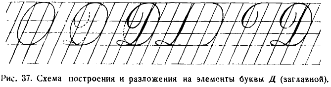
Перед письмом буквы нужно показать на чертеже соотношение ее элементов.
Before writing the letter, you need to show the relationship of its elements on a drawing.
Чтобы предупредить искажение, нужно написать карандашом овал шириной в 2,5 клетки и вписать букву в овал.
To prevent distortion, you should draw an oval with a pencil that is 2.5 squares wide and fit the letter into the oval.
При письме первого элемента учитель дает объяснения.
When writing the first element, the teacher gives explanations.
Учитель. Пламевидную черту начинаем, ставя мел немного (на 0,5 мм) правее пересечения наклонной и надстрочной линии. Ведем по наклонной пламевидную черту. Внизу сходим с наклонной немного выше обычного и движением пера влево пишем лежачую петлю, которая заходит влево за наклонную линию на полклетки. Заканчивая петлю, пересечем пламевидную черту внизу и заканчиваем тонкой чертой на нижней лежачей линии между наклонными.
Teacher: We start the flame-like stroke by placing the chalk slightly (0.5 mm) to the right of the intersection of the inclined and the superscript lines. We write a flame-like stroke along the slant. At the bottom, we leave the slant a little higher than usual and by moving the pen to the left we write a horizontal loop, which goes to the left of the slant by half a square. Finishing the loop, we cross the flame-like stroke at the bottom and finish with a thin line on the bottom horizontal line between the slants.
Второй элемент Д — правый полуовал без нажима. При письме его учитель дает учащимся объяснения.
The second element of D is the right half-oval without pressure. When writing it, the teacher gives explanations to the students.
Teacher: In order to write the right half-oval without pressure, I place the chalk on the lower line of the row between the slants and lead a thin rounding line upwards. Touching the right slant, I continue to round the line upwards, and then lead it to the left. I cut off the right upper corner of the square and finish at the intersection of the left slant and the superscript line.
Учитель. Для того чтобы написать правый полуовал без нажима, ставлю мел на нижней линии строки между наклонными и веду кверху тонкую закругляющуюся черту. Касаясь правой наклонной линии, продолжаю закруглять черту кверху, а затем веду влево. Срезаю правый верхний угол клетки и заканчиваю у пересечения левой наклонной и надстрочной линий.
Этот элемент имеет в ширину одну клетку, а по длине равняется высоте заглавной буквы. Часто дети ошибочно пишут данный элемент шире, заводя черту за правую наклонную, а нередко и до середины клетки.
This element is one square wide and its length is equal to the height of the capital letter. Often children mistakenly write this element wider, leading the line beyond the right slant, and often even to the middle of the square.
Третий элемент буквы пишется так; учитель ставит мел на пересечении наклонной и надстрочной линий и ведет влево закругляющуюся черту. Эта черта захватывает в ширину полторы клетки, а внизу опускается за верхнюю линию строки с постепенно усиливающимся нажимом. Нажим заканчивается тонкой закругляющейся чертой, идущей кверху.
The third element of the letter is written like this; the teacher places the chalk at the intersection of the slant and the superscript line and leads a rounding line to the left. This line captures a width of one and a half squares and descends below the top line of the row with gradually increasing pressure. The pressure ends with a thin rounding line going upwards.
После раздельного написания второго и третьего элементов они пишутся вместе. Затем дети пишут всю букву Д без счета и под счет.
After writing the second and third elements separately, they are written together. Then the children write the entire letter D without a count and with a count.
Буква Д пишется в три такта: раз и, два и, три.
The letter D is written in three beats: one and, two and, three.
С этой буквой дети пишут слова Дима и Дуня.
With this letter, children write the words Dima and Dunya.
Тридцать пятый урок. Письмо знаков препинания.
Lesson Thirty-five. Writing punctuation marks.
На этом уроке учитель знакомит детей с написанием знаков препинания.
In this lesson, the teacher introduces children to the writing of punctuation marks.
Вопросительный знак представляет собою полуовал с нажимом с правой стороны, который заканчивается тонкой чертой, отходящей вправо. По высоте он превосходит строчную букву, но меньше заглавной.
The question mark is a half-oval with pressure on the right side, which ends with a thin line going to the right. It is taller than a lowercase letter, but smaller than a capital one.
Гаков же по величине и восклицательный знак.
The exclamation mark is the same size.
Точка и запятая пишутся с нажимом, как и строчные буквы, и ставятся точно на линии строки. Точка с запятой и двоеточие занимают место выше нижней и средней лежачей линии.
The dot and comma are written with pressure, like lowercase letters, and are placed exactly on the line of the row. The semicolon and colon are positioned higher than the lower and middle base lines.
Остающиеся по учебному плану во втором полугодии два часа учитель отводит на проведение контрольных работ — по одной в каждой четверти.
The teacher allocates the remaining two hours in the second semester according to the curriculum for conducting control works - one in each quarter.
В итоге занятий по чистописанию в I классе дети должны усвоить правильное и красивое начертание всех строчных и заглавных букв, арабских цифр, арифметических знаков, знаков препинания и названия элементов букв.
As a result of the handwriting lessons in the first grade, children should master the correct and beautiful spelling of all lowercase and capital letters, Arabic numerals, arithmetic signs, punctuation marks, and names of letter elements.
Дети в I классе также изучают все основные соединения букв в словах. Правда, некоторые соединения в дальнейшем, при изучении скорописи, будут изменены, но это ни в какой степени не влияет на основные установки в работе.
First-grade children also study all the basic connections of letters in words. Admittedly, some connections will be changed in the future when studying shorthand, but this in no way affects the basic settings in the work.
В I классе учащимися должны быть усвоены следующие основные типы соединений букв в словах.19
In the first grade, students should master the following basic types of letter connections in words.19
1. Соединение с овалами и полуовалами букв, оканчивающихся прямыми чертами с закруглением внизу (то, но).
1. Connection with ovals and half-ovals of letters ending with straight lines rounded at the bottom (to, no).
2. Соединение букв г, ч, х через клетку (иг, ух, уч, ех).
2. Connecting letters г, ч, х across a cell (ig, ux, uch, ex).
3. Непосредственное соединение левых полуовалов с другими буквами (сп, ва, ъе, ся, хг).
3. Direct connection of the left semi-ovals with other letters (sp, va, hard sign+e, sya, xg).
4. Верхнее соединение овалов с другими буквами (он, ов, ющ, оч, ог).
4. The upper connection of ovals with other letters (on, ov, yu+shch, och, og).
5. Соединение букв, начинающихся с точки, с предшествующими буквами (ол, ум, оя, ил, бя, ъя).
5. Connecting letters that start with a point with the preceding letters (ol, um, oya, il, bya, hard sign+ya).
6. Соединение овалов и полуовалов (об, фе, юж).
6. Connecting ovals and half-ovals (ob, fe, yuzh).
7. Соединение двух букв по диагонали одной клетки (да, ут, зр).
7. Connecting two letters diagonally across one cell (da, ut, zr).
[4/10] Chapter 11: Handwriting Lessons in the Second Grade
УРОКИ ЧИСТОПИСАНИЯ ВО II КЛАССЕ
[X]initial translation from https://chat.openai.com[X]html formatting[X]translate and insert footnotes[X]translate and insert illustrations[ ]check for missing text in the Russian text or the translation[ ]check for ascii characters in Russian text; cyrillic characters in English text[ ]check for font changes in the printed book to be implemented here: bold, italic, etc.[ ]typographical revisions: consistent punctuation, curly quotes, en- and em-dashes[ ]spot checks of the translation quality[ ]add links to web resources
Часто учителя вторых классов недоумевают, что им делать на уроках чистописания, если они в I классе уже научили детей писать правильно строчные и заглавные буквы, слова и цифры.
Second-grade teachers often wonder what to do in handwriting lessons if they have already taught the children to write lowercase and uppercase letters, words, and numbers in the first grade.
Не находя ответа на свой вопрос, они или занимаются повторением того, что делали в I классе, т. е. письмом по косым линейкам с клетками крупного размера, или совсем прекращают занятия по чистописанию, используя эти уроки для других целей.
Failing to find an answer to their question, they either repeat what they did in the first grade, i.e., writing on slant lines in large-sized cells, or stop handwriting lessons altogether, using these lessons for other purposes.
Между тем, прекращение занятий по чистописанию или пренебрежительное к ним отношение влечет за собой печальные последствия для детей.
Meanwhile, cessation of handwriting lessons or neglecting them leads to unfortunate consequences for children.
Каждому учителю, обучающему детей чистописанию, надо знать, что во II классе имеются свои строго определенные задачи в области чистописания. Эти задачи заключаются не только в закреплении того, что усвоено в I классе, но и в приобретении учениками новых навыков.
Every teacher teaching handwriting needs to know that there are strictly defined tasks in handwriting in the second grade. These tasks are not only to consolidate what was learned in the first grade, but also for students to acquire new skills.
К чему учитель стремился в I классе?
What was the teacher striving for in the first grade?
К развитию у учащихся навыка письма строчных и прописных букв по косым линейкам сперва в медленном, а потом в ускоренном темпе.
To develop the students' skill of writing lowercase and uppercase letters on slant lines, first at a slow pace, then at an accelerated pace.
Перед учителем, а следовательно, и перед учащимися II класса стоят новые задачи, с достаточной ясностью определяемые программой. Задачи эти, очень большие и сложные, могут быть разрешены только при рациональном использовании 34 часов, отведенных на уроки чистописания по программе 1954/55 гг.
New tasks, clearly defined by the curriculum, face both the teacher and, consequently, the second-grade students. These tasks, very large and complex, can be resolved only by rational use of the 34 hours allotted for handwriting lessons according to the 1954/55 program.
Прежде всего, как указывается в программе II класса, необходимо у учащихся укрепить навыки правильной посадки при письме, правильного держания тетради и владения ручкой; затем, при помощи различных упражнений, укрепить пальцы руки и развить глазомер. Для этого программа рекомендует использовать письмо строчных и прописных букв средней величины в генетическом порядке по сетке, сначала с частыми, а потом с редкими наклонными линиями.
First of all, as indicated in the second grade program, it is necessary to strengthen students' skills of correct posture while writing, proper holding of the notebook and pen control; then, through various exercises, strengthen the fingers and develop eye measurement. For this, the program recommends writing lowercase and uppercase letters of medium size in a genetic order on a grid, first with frequent, then with rare slant lines.
Почему в программе еще раз акцентируется внимание на посадке и прочих условиях письма? Это делается потому, что соблюдение указанных условий имеет решающее значение.
Why does the program again emphasize the importance of posture and other conditions of writing? This is done because adherence to these conditions is crucial.
Эти требования настолько сложны и трудны, что они еще не могли быть усвоены всеми учащимися в первом классе.
These requirements are so complex and difficult that they could not yet be mastered by all students in the first grade.
До сих пор приходится часто видеть на уроках чистописания детей, низко склонившихся над своими столами, болтающих ногами во время письма, напряженно удерживающих ручку согнутыми пальцами и т. п.
To this day, we often see children in handwriting lessons who are hunched low over their desks, swinging their legs during writing, tensely holding the pen with bent fingers, and so on.
Для подготовки учеников II класса к скорописи следует перевести их с письма букв размером в 8 мм на буквы величиной в 5 мм с соответствующим уменьшением толщины нажимных черт. Для облегчения работы ученика надо дать ему возможность еще один год пользоваться тетрадями с косыми линиями, более частыми в первом полугодии и редкими во втором.
To prepare second-grade students for speed writing, they should be transitioned from writing 8 mm letters to 5 mm letters, with a corresponding decrease in the thickness of pressing strokes. To facilitate the student's work, they should be allowed to use notebooks with slant lines for another year, more frequent in the first half of the year and rare in the second.
Однако подготовка учеников II класса к скорописи осуществляется не только путем перевода на буквы меньшего размера. Во II классе учащиеся учатся правильному соединению букв в словах и слов в предложениях. Для этого необходимо:
However, the preparation of second-grade students for speed writing is not only achieved by transitioning to smaller-sized letters. In the second grade, students learn the correct connection of letters into words and words into sentences. This requires:
1. Усвоение всех способов соединения букв и особенно таких соединений, которые в случае их неправильности ведут к деформации букв, как это бывает с буквами, начинающимися точкой, например л, или состоящими из овалов, например а.
1. Mastering all ways of connecting letters and especially such connections that, if incorrect, lead to the deformation of letters, as happens with letters starting with a dot, for example, л, or consisting of ovals, for example, а.
2. Соединение букв в словах по возможности без отрыва пера от бумаги, так как этим обусловливается рациональность, а следовательно, и быстрота письма.
2. Connecting letters in words without lifting the pen from the paper as much as possible, as this promotes efficiency and, consequently, speed of writing.
3. Плавное соединение букв и ритмичное письмо с соблюдением правильных интервалов между элементами, буквами и словами для развития быстроты и разборчивости почерка.
3. Smoothly connecting letters and rhythmic writing while maintaining correct intervals between elements, letters, and words to develop speed and legibility of handwriting.
Все это недооценивается, а часто и совершенно игнорируется в практике преподавания чистописания.
All this is often underestimated, and sometimes completely ignored in the practice of teaching handwriting.
Перед учителем чистописания II класса стоят ответственные задачи, которые потребуют от него большого напряжения сил. Чтобы эти силы были использованы рационально, занятия по чистописанию должны протекать в строгой системе, определяемой последовательным применением генетического метода.
The second-grade handwriting teacher faces responsible tasks that will require a great deal of effort from him. For these efforts to be used efficiently, handwriting lessons should proceed in a strict system, determined by the consistent application of the genetic method.
Для развития плавности и ритмичности письма учителю придется при упражнениях в письме широко применять тактический метод. Темп счета ускоряется вдвое, потому что во II классе учитель дает его только на черте с нажимом и точке. Волосные черты ученики пишут мгновенно в интервалах между тактами.
To develop smooth and rhythmic writing, the teacher will have to widely apply the tactical method during writing exercises. The tempo of counting is doubled because in the second grade, the teacher only gives it on the pressing stroke and the dot. Hairline strokes are written instantly by students in the intervals between beats.
Ускорение счета во 2 классе мотивируется уменьшением размера букв почти вдвое и развитием у учащихся навыков правильного соединения букв.
The acceleration of the count in the second grade is motivated by reducing the size of the letters almost in half and developing the students' skills of correctly connecting the letters.
Наконец, в целях правильной расстановки элементов и букв следует всемерно использовать и развивать глазомер учащихся. Этой цели служит применение разлинованных тетрадей.
Finally, to correctly place elements and letters, one should make full use of and develop students' eye measurement. This purpose is served by the use of lined notebooks.
В русском рукописном шрифте уже издавна установлено определенное соотношение между высотой и шириной буквы, при котором высота каждого отдельного элемента вдвое превосходит его ширину.
In Russian manuscript font, there has long been a certain relationship between the height and width of a letter, where the height of each individual element is twice its width.
«Широта овала, — пишет в своем руководстве И. Е. Евсеев, — должна равняться половине его высоты».20
"The width of the oval," writes I.E. Evseev in his guide, "should equal half of its height."20
Д. А. Писаревский по этому вопросу говорит: «Как правило, расстояние между элементами в букве должно быть равно половине высоты букв».21
On this matter, D.A. Pisarevskiy says, "As a rule, the distance between elements in a letter should be equal to half the height of the letter."21
В прописях В. С. Гербача сохраняется именно это соотношение между высотой и шириной каждого элемента буквы.
In the handwriting guides of V.S. Gerbach, this exact relationship between the height and width of each letter element is maintained.
В руководстве В. А. Саглина по обучению письму соотношение между высотой и шириной элемента резко нарушается.
In V.A. Saglin's guide to teaching writing, the ratio between the height and width of an element is sharply violated.
Это же наблюдается и в некоторых других руководствах, например, у Ф. В. Грекова.
This is also observed in some other guides, for example, in F.V. Grekov's.
Нарушение пропорций при письме по косым линейкам с густой разлиновкой (№ 2) выражается в непомерном расширении элементов букв по сравнению с высотой (5:3,3 мм). Элементы букв приобретают ромбическую форму, овал по своей форме приближается к окружности, и весь почерк становится кругловатым.
Violation of proportions when writing along slanting lines with dense lining (No. 2) is expressed in an excessive expansion of the letter elements compared to the height (5:3.3 mm). The elements of the letters acquire a rhombic shape, the oval in its form approaches a circle, and the whole handwriting becomes roundish.
Таким образом, в корне изменяется классический русский рукописный шрифт.
Thus, the classic Russian manuscript font is fundamentally changed.
При отклонении от общепринятых правил написания букв учащиеся II класса в течение целого года не только не продвигаются вперед в деле подготовки к скорописи, изучаемой в III классе, но и утрачивают правильное понимание форм букв, приобретенное в I классе. Больше того, у детей разрушается представление о ритме письма.
By deviating from the generally accepted rules of letter writing, second-grade students do not only make no progress in preparing for fast handwriting, studied in the third grade, during the whole year, but they also lose the correct understanding of the letter forms, acquired in the first grade. Moreover, the children's perception of the rhythm of writing is destroyed.
Чтобы устранить эту непоследовательность в обучении, нужно или отказаться от тетрадей с густой косой разлиновкой, как это делал В. С. Гербач и другие, или применять эту разлиновку так, чтобы ученик при письме строчных букв пользовался наклонными линиями только для соблюдения одинакового наклона, но не для определения ширины элементов и букв, осуществляемого уже при помощи глазомера, что следует считать правильным и приемлемым.
To eliminate this inconsistency in teaching, it is necessary either to abandon notebooks with dense slanting lines, as was done by V.S. Gerbach and others, or to apply this lining in such a way that the student, when writing lowercase letters, uses the slanting lines only to maintain the same slope, but not to determine the width of the elements and letters, which is already done with the help of eye measurement, which is considered correct and acceptable.
При правильном использовании тетрадей с густой косой разлиновкой будет устранен и другой недостаток, культивирующийся отдельными методистами и заключающийся в том, что расстояния между буквами делаются равными расстояниям между элементами буквы, т. е. в 3,3 мм. Между тем, для соблюдения ритмичности и разборчивости письма расстояния между буквами должны быть несколько больше, чем расстояния между элементами.
With the correct use of notebooks with dense slanting lines, another disadvantage, cultivated by some methodologists, will also be eliminated, consisting in the fact that the distances between letters are made equal to the distances between the elements of the letter, i.e., 3.3 mm. However, to maintain rhythm and readability of writing, the distances between letters should be slightly larger than the distances between elements.
Каллиграфы нашей страны всегда соблюдали это правило, и это оказывало положительное влияние на грамотность учеников, пользовавшихся их прописями.
Calligraphers of our country have always adhered to this rule, and this had a positive impact on the literacy of students who used their handwriting guides.
У В. С. Гербача, например, в прописях по двум линейкам, а тем более по одной линейке, ясно различается удлинение соединительных черт между буквами. Его письмо производит впечатление подлинно красивого, а благодаря удлинению соединительных черт оно становится и плавным и разборчивым. По этой, может быть, причине В. С. Гербач не давал частой косой разлиновки при уменьшении размеров букв, а переходил после крупной косой разлиновки непосредственно к письму в тетрадях по двум линейкам с редкими косыми линиями, находящимися на расстоянии 25 мм одна от другой.
In V.S. Gerbach's handwriting guides, for example, in those for two lines, and even more so for one line, the elongation of the connecting strokes between letters is clearly distinguished. His writing gives the impression of being genuinely beautiful, and thanks to the elongation of the connecting strokes, it also becomes smooth and legible. Perhaps for this reason, V.S. Gerbach did not give frequent slanting lining when reducing the size of letters, but after large slanting lining, he immediately switched to writing in notebooks on two lines with rare slanting lines, located 25 mm apart from each other.
В образцах скорописи, данных известным каллиграфом А. Н. Ивановым,22 также отчетливо различаются удлиненные расстояния между буквами в противоположность более коротким промежуткам между элементами.
In the samples of fast handwriting, given by the famous calligrapher A.N. Ivanov,22 elongated distances between letters are also clearly distinguished in contrast to the shorter intervals between elements.
В целях сохранения правильной формы букв при письме в тетрадях с частыми косыми или наклонными линиями ученик может писать по ним только те основные элементы, которые совпадают с этими линиями. В определении же ширины элементов, а следовательно и букв, ученик II класса должен руководствоваться, в отличие от ученика I класса, пишущего точно по наклонным линиям, своим глазомером и не считаться с наклонными линиями. В основном они будут помогать ему только соблюдать одинаковый наклон.
In order to maintain the correct form of letters when writing in notebooks with frequent oblique or slant lines, the student can write along them only those basic elements that coincide with these lines. However, in determining the width of elements, and therefore letters, a second-grade student should be guided, unlike a first-grade student who writes precisely along the slanting lines, by their own eye measurement and not pay attention to the slanting lines. Mainly, they will only help the student maintain the same slope.
Ширина клетки будет служить ребенку точным размером для определения расстояния между буквами, а не для определения ширины элемента, например овала в букве о, который должен быть уже клетки.23
The width of the cell will serve the child as an exact size to determine the distance between letters, not to determine the width of the element, for example, the oval in the letter "o", which should be narrower than the cell.23
Если при письме слова пиши ученик провел второй элемент буквы п не по следующей наклонной, а ближе примерно на 0,8 мм, то первый элемент следующей буквы и должен отстоять от второго элемента и точно на ширину клетки; второй элемент буквы и будет опять-таки несколько ближе. Между буквами п и и обнаружится ясно различимый интервал шириной в одну клетку (3,3 мм), а между элементами одной и той же буквы — интервалы, равные половине высоты элемента, т. е. в 2,5 мм.
If, when writing the word "write", the student drew the second element of the letter "p" not along the next oblique line, but closer by about 0.8 mm, then the first element of the next letter "i" should be exactly the width of the cell away from the second element; the second element of the letter "i" will again be somewhat closer. Between the letters "p" and "i" there will be a clearly distinguishable interval the width of one cell (3.3 mm), and between the elements of the same letter — intervals equal to half the height of the element, i.e., 2.5 mm.
При таком условии почерк сохранит свою классическую форму, а ученик II класса уже в первом полугодии разовьет правильный глазомер и научится расставлять буквы в словах, не сближая и не разъединяя их между собою.
Under such conditions, handwriting will retain its classic form, and the second-grade student will already develop a correct eye measurement in the first semester and learn to place letters in words, without merging or separating them from each other.
Будет ли посильной эта задача для ученика II класса? Безусловно, да. Размер расстояния между буквами в виде ширины клетки (3,3 мм) у него будет всегда перед глазами, а элементы букв он начнет писать несколько уже ширины клетки, руководствуясь показом учителя на доске и в тетрадях (см. рис. 38).24
Will this task be manageable for a second-grade student? Definitely, yes. The size of the distance between letters in the form of a cell width (3.3 mm) will always be in front of his eyes, and he will start writing the elements of the letters slightly narrower than the cell width, guided by the teacher's demonstration on the board and in notebooks.24
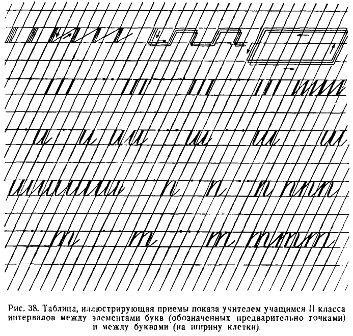
Во 2, 3 и 4-й четверти в процессе письма по 2 линейкам (№ 3) глазомер ученика получит дальнейшее развитие. Ученик будет определять на глаз уже не только расстояния между элементами, но и между буквами.
In the 2nd, 3rd, and 4th quarters during the writing process on 2 lines (No. 3), the student's eye measurement will receive further development. The student will determine by eye not only the distances between elements, but also between letters.
Для реализации этой задачи требуется проведение уроков в определенной системе, изложение существа которой и дается в дальнейшем.
To achieve this task, it is necessary to conduct lessons in a certain system, the essence of which is given later.
В 1-м полугодии II класса мы имели по учебному плану, действовавшему до 1954/1955 учебного года, 32 учебных часа для письма букв размером в 5 мм в тетрадях с густой сеткой.
In the first half of the second grade, we had, according to the curriculum in effect until the 1954/1955 school year, 32 academic hours for writing letters 5 mm in size in notebooks with a dense grid.
Распределялись эти часы для занятий примерно так:
These hours were distributed for classes approximately like this:
1. Подготовительные упражнения — 2 часа.
1. Preparatory exercises — 2 hours.
2. Письмо строчных букв I группы — 3 часа.
2. Writing of lowercase letters of the first group — 3 hours.
3. Строчные буквы II группы — 2 часа.
3. Lowercase letters of the second group — 2 hours.
4. Строчные буквы III « — 3 часа.
4. Lowercase letters of the third group — 3 hours.
5. Строчные буквы IV « — 2 часа.
5. Lowercase letters of the fourth group — 2 hours.
6. Lowercase letters of the fifth group — 2 hours.
6. Строчные буквы V « — 2 часа.
7. Заглавные буквы I « — 2 часа.
7. Capital letters of the first group — 2 hours.
8. Заглавные буквы И « — 4 часа.
8. Capital letters of the second group — 4 hours.
9. Заглавные буквы III « — 4 часа.
9. Capital letters of the third group — 4 hours.
10. Заглавные буквы IV группы — 3 часа
10. Capital letters of the fourth group — 3 hours
11. Арабские цифры — 2 часа.
11. Arabic numerals — 2 hours.
12. Римские цифры — 1 час
12. Roman numerals — 1 hour
13. Контрольные работы (по одной в каждой четверти) — 2 часа.
13. Control works (one in each quarter) — 2 hours.
По учебному плану 1954/1955 учебного года на этот раздел можно выделить не свыше 8 часов, ознакомив за эго время детей только с основными приемами письма по частой сетке строчных букв, а со второй четверти учащиеся переводятся учителем на письмо в тетрадях № 3 с редкими наклонными линиями.
According to the curriculum of the 1954/1955 school year, no more than 8 hours can be allocated for this section, familiarizing children only with the basic techniques of writing in a dense grid of lowercase letters, and from the second quarter, students are transferred by the teacher to write in notebooks No. 3 with rare oblique lines.
Обучение детей чистописанию во II классе начинается подготовительными упражнениями. Помимо упражнений, применявшихся в I классе, будут даны новые, содействующие развитию свободных движений кисти, пальцев и предплечья.
Teaching children calligraphy in the second grade begins with preparatory exercises. In addition to the exercises used in the first grade, new ones will be given, contributing to the development of free movements of the hand, fingers, and forearm.
Перед письмом упражнений дети усваивают названия всех линий в тетрадях: верхней и нижней строчных (лежачих), надстрочных линий, знакомятся с назначением наклонных линий, усваивают понятие о клетке, о ее верхних и нижних, правых и левых углах.
Before writing exercises, children learn the names of all lines in the notebooks: upper and lower case (lying), superscript lines, get acquainted with the purpose of oblique lines, understand the concept of a cell, about its upper and lower, right and left corners.
На каждом уроке следует проводить гимнастические упражнения для пальцев, кисти и предплечья, в частности сгибание и разгибание трех пальцев правой руки с правильно уложенной между ними ручкой.
Each lesson should include gymnastic exercises for fingers, hand, and forearm, in particular, bending and extending three fingers of the right hand with a correctly laid pen between them.
Изучение письма букв как по частой, так и по редкой сетке идет по генетической системе, т. е. в следующем порядке.
The study of letter writing, both in a dense and in a rare grid, proceeds according to the genetic system, i.e., in the following order.
The first group of lowercase letters а, ш, г, п, т, р, н, у, й
I группа строчных букв а, ш, г, п, т, р, н, у, й
Письмо всех строчных букв I группы производится при соблюдении правильной посадки и правильного положения тетради и держания ручки.
The writing of all lowercase letters of the first group is carried out while maintaining the correct posture and the correct position of the notebook and holding the pen.
Занятия начинаются письмом элементов, составляющих эти буквы. Перед буквой и дети пишут прямую черту с закруглением внизу; перед п — прямую черту с закруглением вверху; перед р — удлиненную прямую черту; перед н — волнистую черту; перед у — прямую черту с петлею и т. д.
Lessons begin with writing the elements that make up these letters. Before the letter i, children write a straight line with rounding at the bottom; before p - a straight line with rounding at the top; before r - an elongated straight line; before n - a wavy line; before u - a straight line with a loop, etc.
Письмо всех букв I группы, за исключением буквы р, производится без отрыва пера от бумаги.
All letters of the first group are written without lifting the pen from the paper, except for the letter r.
Учитель практически, на доске, показывает детям, что волосные черты, которыми заканчиваются прямые черты с закруглением внизу, следует вести уже не к середине клеточки, а выше середины, наклонно, затем вверх до верхней лежачей линии; тогда нажимная черта следующего элемента покроет верхнюю часть этой волосной черты, что очень важно при безотрывном письме.
The teacher practically shows the children on the board that the hairlines, which end the straight lines with rounding at the bottom, should now be led not to the middle of the cell, but above the middle, obliquely, then upwards to the top lying line; then the downstroke of the next element will cover the upper part of this hairline, which is very important when writing without lifting the pen.
Ширина каждого элемента буквы должна равняться половине его высоты, так что если первый элемент буквы и пойдет по наклонной линии, то второй уже будет написан на 0,8 мм левее следующей наклонной и т. д. Толщина нажимной черты не должна превышать 0,5 мм. Расстояние между буквами следует делать на 0,5 мм больше, чем расстояние между элементами букв.
The width of each element of the letter should be equal to half its height, so if the first element of the letter i follows the slanting line, then the second one will already be written 0.8 mm to the left of the next slanting line, etc. The thickness of the downstroke should not exceed 0.5 mm. The distance between letters should be made 0.5 mm larger than the distance between elements of letters.
Все эти размеры даются для учителя, а ученики определяют их на глаз, при помощи объяснений учителя.
All these dimensions are given for the teacher, and the students determine them by eye, with the help of the teacher's explanations.
Учитель. Дети, первую палочку я пишу по наклонной линии, а вторую палочку уже не по следующей наклонной (для того чтобы буква не была широкой), а около следующей наклонной линии, так что между палочкой и наклонной линией получится маленький промежуток, или просвет.
Teacher: Children, I write the first stick along the oblique line, and the second stick is no longer along the next oblique line (so that the letter is not wide), but near the next oblique line, so that there is a small gap, or clearance, between the stick and the oblique line.
При тренировке дети пишут буквы не отдельно одна от другой, как в I классе, а связно, удлиняя интервал между ними на 0,5 мм, по сравнению с интервалами между элементами букв.
During training, children write letters not separately from each other, as in the first grade, but in connection, lengthening the interval between them by 0.5 mm, compared to the intervals between elements of letters.
После усвоения начертания буквы дети учатся писать ее под счет, который дается быстрее, чем в I классе, без и между отдельными числами ряда.
After mastering the spelling of the letter, children learn to write it under a count, which is given faster than in the first grade, without and between separate numbers in the row.
Для развития навыков плавного и безотрывного письма учитель приучает учеников писать только что изученную букву в различных соединениях с другими буквами, а потом и в словах.
To develop skills of smooth and uninterrupted writing, the teacher accustoms the students to write the just-studied letter in various combinations with other letters, and then also in words.
Например, после написания двух первых букв и, ш дети пишут слоги иш, ши. В этих слогах должны быть отчетливо различимы обе буквы. Это достигается путем совершенно незначительного (до 0,5 мм), но заметного удлинения расстояний между ними.
For example, after writing the first two letters i, sh, children write the syllables ish, shi. In these syllables, both letters should be clearly distinguishable. This is achieved by a completely insignificant (up to 0.5 mm), but noticeable elongation of the distances between them.
Написав буквы ш, г, п, дети упражняются в письме слогов и буквенных соединений пи, ип, ги, иг, пш, шп под счет, без отрыва пера, с ясно различимыми интервалами между буквами.
Having written the letters sh, g, p, children practice writing the syllables and letter combinations pi, ip, gi, ig, psh, shp under the count, without lifting the pen, with clearly distinguishable intervals between letters.
Проведение соединительных черт потребует от учителя специальных разъяснений, так как эти черты пишутся быстрым, уверенным движением руки вверх направо.
The execution of connecting strokes will require special explanations from the teacher, as these strokes are written with a quick, confident movement of the hand upwards to the right.
Учитель точно определяет, сколько пар букв должно уместиться на одной строчке. Сочетания букв ши и иш даются в количестве семи на строчке длиною в 14 см с полями шириною в 3 см, при одинаковых интервалах между парами букв, определяемых на глаз. Слоги ги, иг уместятся на такой же строчке в количестве 10 пар.
The teacher accurately determines how many pairs of letters should fit on one line. The combinations of letters shi and ish are given in the amount of seven on a line 14 cm long with margins 3 cm wide, with equal intervals between pairs of letters, determined by eye. The syllables gi, ig will fit on the same line in the amount of 10 pairs.
Затем дети пишут с буквами и, ш, п первое слово — пиши. Из этого слова ясно видно, что небольшое удлинение расстояний между буквами делает слово отчетливым, а отдельные буквы ясно различимыми.25
Then the children write the first word with the letters i, sh, p - pishi (write). From this word, it is clear that a slight elongation of the distances between letters makes the word distinct, and individual letters clearly distinguishable25.
После этого дети пишут слово шип.
After this, the children write the word ship.
При письме сочетания букв ши очень важно припомнить правило правописания жи, ши. Таким путем учитель увяжет занятия по чистописанию с орфографией.
When writing the combination of letters shi, it is very important to remember the spelling rule for zhi, shi. In this way, the teacher links handwriting lessons with spelling.
После письма буквы р следует писать сочетания букв пр, тр, up, гр, а также ри, рт, рн, рг, соблюдая требование начинать первый элемент буквы р выше строки на 1 мм.
After writing the letter r, you should write combinations of letters pr, tr, up, gr, as well as ri, rt, rn, rg, starting the first element of the letter r 1 mm above the line.
С буквой р дети могут написать много слов: три, тир, пир, гири, тигр, грипп. Поэтому они эти слова пишут не по целой строчке, а по одному разу. Только слово, диктуемое под счет, пишется на протяжении целой строки.
With the letter r, children can write many words: tri, tir, pir, giri, tigr, gripp (three, tir, feast, kettlebells, tiger, flu). Therefore, they write these words not in a whole line, but once. Only the word, dictated under the count, is written throughout the whole line.
С усвоением буквы у дети пишут без отрыва руки сочетания иу, шу, гу, пу, ту, ру и обратные. (С отрывом пишется буква р в словах: уши, груши, прут, трут, угри, тушу, тур, шут.)
With the assimilation of the letter u, children write without lifting the hand combinations iu, shu, gu, pu, tu, ru and reverse. (The letter r is written with lifting the hand in the words: ushi, grushi, prut, trut, ugr, tushu, tur, shut (ears, pears, rod, they rub, sturgeons, I extinguish, tour, joker).
С буквой н пишутся сочетания ни, нш, нг, нп, нт, нр, ну и обратные, а также слова: шнур, грунт, нити, пни и др.
With the letter n, the combinations ni, nsh, ng, np, nt, nr, nu and reverse are written, as well as the words: shnur, grunt, niti, pni and others (cord, ground, threads, stumps).
Таким образом, во II классе для упражнений в плавном безотрывном письме под счет вводится большое количество двубуквенных сочетаний и слов, что приучает учащихся к определению ширины элементов, расстояний между буквами и интервалов между буквами и словами.
Thus, in the 2nd grade, a large number of two-letter combinations and words are introduced for exercises in smooth uninterrupted writing under the count, which accustoms students to determine the width of elements, distances between letters and intervals between letters and words.
При письме букв первой группы необходимо следить, чтобы все элементы в буквах имели одинаковый наклон, чтобы нажим был равномерный, а нажимные черты были тоньше, чем в I классе, чтобы нижние и верхние закругления были одинаковы, не остры и не тупы, чтобы все буквы этой группы, за исключением р, и все соединения между буквами, без исключения, дети писали без отрыва пера от бумаги, чтобы все прямые черты с нажимом, из которых состоят эти буквы, были совершенно ровные, чтобы тонкие соединительные черты были ровные, а не походили бы на крючки, чтобы все строки начинались на одинаковом расстоянии от края страницы.
When writing the letters of the first group, it is necessary to ensure that all elements in the letters have the same inclination, that the pressure is uniform, and the pressure lines are thinner than in the 1st grade, that the lower and upper curves are the same, not sharp and not blunt, that all letters of this group, except for r, and all connections between letters, without exception, children write without lifting the pen from the paper, that all straight lines with pressure, which these letters consist of, were perfectly straight, that thin connecting lines were straight, and did not look like hooks, that all lines started at the same distance from the edge of the page.
The 2nd group of lowercase letters л, м, ц, щ, ь, ы
II группа строчных букв л, м, ц, щ, ь, ы
Все буквы II группы состоят из прямых черт и пишутся без отрыва пера от бумаги.
All letters of the 2nd group consist of straight lines and are written without lifting the pen from the paper.
Все буквы II группы должны быть написаны с ровными чертами (без прогибов), с одинаковым наклоном и умеренным нажимом, без заострения или притупления нижних закруглений и с тонкими чертами, идущими ровно, а не в виде крючков.
All letters of the 2nd group must be written with straight lines (without bends), with the same slope and moderate pressure, without sharpening or blunting of the lower rounds, and with thin lines going straight, not in the form of hooks.
Перед письмом буквы л дети упражняются в письме первого элемента этой буквы — волосной черты с точкой; перед письмом ц — опущенной петли; перед письмом ь — узелка.
Before writing the letter l, children practice writing the first element of this letter - the hairline with a dot; before writing ts - a dropped loop; before writing the soft sign (ь) - a small loop or knot.
Элементы пишутся без счета, в отрыве один от другого, с точным соблюдением наклона, нажима и размера.
Elements are written without a count, separately from each other, with precise observance of inclination, pressure, and size.
При письме волосной черты с точкой необходимо добиваться того, чтобы точка равнялась по толщине черте с нажимом и делалась только одним нажимом пера, без вращения его на одном месте. Тонкие черты отточки, петли и узелка следует доводить до верхней линии строки (лежачей).
When writing the hairline with a dot, it is necessary to strive to make the dot equal in thickness to the pressure line and make it with only one pen pressure, without rotating it in one place. Thin lines of the end of a stroke, loops, and knots should be brought up to the upper line of the string (horizontal).
Ни в коем случае не следует допускать, чтобы дети писали букву л, начиная первый элемент сверху.
Under no circumstances should children be allowed to write the letter l, starting the first element from the top.
Опущенную петлю, написанную отдельно и в букве, необходимо показать детям на плакате в увеличенном размере, чтобы они отчетливо разобрались в сочетаниях черт ее образующих.
The dropped loop, written separately and in a letter, should be shown to children on a poster in an enlarged size, so that they clearly understand the combinations of the lines forming it.
Буква ь пишется двояким способом: с узелком и закрытою (в конце слова).
The soft sign (ь) is written in two ways: with a knot and closed (at the end of a word).
При письме букв под счет соединяем их одна с другой длинными (до 1 см) тонкими чертами, которые обозначаются при счете словом и. При письме буквы щ считаем так: раз, два, три, четыре и, буквы л — раз, два, и.
When writing letters under a count, connect them with long (up to 1 cm) thin lines, which are denoted when counting by the word "and". When writing the letter shch (щ), count as: "one, two, three, four, and", for the letter l: "one, two, and".
На строке должно располагаться строго определенное количество букв. Например 8—9 букв м, щ; 10 букв л, ц, ы; 12 букв ь.
A strictly defined number of letters should be located on the line. For example, 8-9 letters m, shch (щ); 10 letters l, ts (ц), y (ы); 12 letters of the soft sign (ь).
После усвоения букв дети пишут связно сочетания букв и слова, не отрывая пера от бумаги. При этом они строго соблюдают правильное присоединение букв, начинающихся точкой (л, м), не допуская оттягивания петель в буквах ц и щ.
After mastering the letters, children write in a connected way combinations of letters and words, without lifting the pen from the paper. At the same time, they strictly observe the correct joining of letters that begin with a dot (l, m), without allowing the loops in the letters ts (ц) and shch (щ) to be pulled out.
Например, после написания буквы л пишутся ил, пл, тл, гл, рл, шл, нл, ул. При письме этих сочетаний дети привыкают вести тонкую черту, которой заканчивается первая буква, не кверху, а вправо к точке, с которой начинается буква л.
For example, after writing the letter l, they write il, pl, tl, gl, rl, shl, nl, ul. When writing these combinations, children get used to leading the thin line, which ends the first letter, not upwards, but to the right to the point from which the letter l begins.
Вслед за сочетаниями букв дети под руководством учителя переходят к письму без отрыва руки, без счета и под счет, в зависимости от задания, следующих слов: пули, угли, нули, пилили, плуг, лишний, ушли, тулуп и др.
Following the combinations of letters, children under the guidance of a teacher move on to writing without lifting their hand, without counting and counting, depending on the task, the following words: "bullets, coal, zeros, sawed, plow, extra, left, sheepskin coat" and others.
Одни из них пишутся один-два раза, другие — под счет целыми строчками.
Some of them are written once or twice, others are written by the count in whole lines.
После усвоения буквы м и письма сочетаний им, шм, тм, нм дети пишут слова шум, мил, ум, тмин, гимн, мир.
After mastering the letter m and writing the combinations im, shm, tm, nm, children write the words "noise, dear, mind, cumin, hymn, world".
С буквой ц, пишутся сочетания ци, иц, рц, нц, пц, и слова шпиц, шприц (медицинский инструмент).
With the letter ts (ц), they write combinations of tsi, its, rts, nts, pts, and the words "spitz, syringe" (medical instrument).
С буквой щ пишутся сочетания пщ, мщ, ущ и слова: щи, щит, нищий, пищи, лущу, прищурил и др.
With the letter shch (щ), they write combinations of pshch, mshch, ushch and words: "cabbage soup, shield, beggar, food, peel off, squinted" and others.
После усвоения ь дети пишут сочетания ьи, ть, нь, ль и слова линь (рыба), тишь, руль, глушь, тушь, ульи, путь, лить, шить.
After mastering the soft sign (ь), children write combinations ьi, t', n', l' and words "lin'" (fish), "quiet, steering wheel, wilderness, ink, beehives, path, pour, sew".
С буквой ы пишутся сочетания мы, ым, ый, цы и слова: липы, плиты, умный, глупый, щипцы, углы, пилы, птицы, мыши, улицы, мыть и др.
With the letter y (ы), they write combinations of my, ym, yy, tsy and words: "linden, plates, smart, stupid, pliers, corners, saws, birds, mice, streets, wash" and others.
В целях подготовки учащихся к письму овалов учитель приучает учащихся пользоваться при сочетаниях букв не только тонкими соединительными чертами, но и тонкими овальными соединениями.26
In preparation for the writing of ovals, the teacher trains students to use not only thin connecting lines, but also thin oval connections when combining letters.26
Group III lowercase letters: о, а, ю, д, б, я, ф
III группа строчных букв о, а, ю, д, б, я, ф
Письмо строчных букв о, а подготовлялось предшествующими занятиями, на которых писались овальные соединительные черты.
The writing of lowercase letters o, a was prepared by preceding lessons in which oval connecting lines were written.
Перед письмом буквы о необходимо ознакомить детей с изображенной на плакате формой овала в увеличенном размере, показать учащимся различие между прямой чертой с закруглением внизу и овалом, обратить внимание на особенности нажима и наклонное положение его на строке.
Before writing the letter o, it is necessary to familiarize children with the form of an oval depicted on a poster in an enlarged size, to show students the difference between a straight line with a rounding at the bottom and an oval, to draw attention to the peculiarities of pressure and its inclined position on the line.
Длина овала относится к его ширине, как 2:1, так что при высоте буквы в 5 мм ее ширина будет равняться 2,5 мм.
The length of the oval is related to its width as 2:1, so if the height of the letter is 5 mm, its width will be 2.5 mm.
Написав одну-две строчки овалов с интервалами между ними размером в 5 мм, учитель показывает общепринятый способ соединения овала со следующей буквой в виде точки с тонкой дугообразной чертой.27
Having written one or two lines of ovals with intervals between them of 5 mm, the teacher shows the generally accepted way of connecting the oval with the next letter in the form of a dot with a thin arcuate line.27
Такие соединения употребляются при безотрывном письме в сочетаниях буквы о с буквами, начинающимися прямыми чертами сверху: oп, от, ор, он, ог.
Such connections are used in cursive writing in combinations of the letter o with letters that start with straight lines from above: op, ot, or, on, og.
В обратных сочетаниях букв по, то, ро, но, го до III класса буква о пишется детьми с предварительным отрывом пера, причем соединительную черту от предыдущей буквы учащиеся не ведут к верхней лежачей линии, а заканчивают на середине строки.
In the reverse combinations of letters po, to, ro, no, go, until the third grade, the letter o is written by children with a preliminary lifting of the pen, and students do not lead the connecting line from the previous letter to the upper lying line, but end it in the middle of the line.
При прохождении сочетаний ол, ом учитель знакомит детей со способом нижнего соединения буквы о с помощью тонкой горизонтальной черточки длиной в 1 мм. Сочетание букв ло дети пишут с отрывом пера.
When going through combinations ol, om, the teacher acquaints children with the method of lower connection of the letter o using a thin horizontal line 1 mm long. The combination of letters lo children write with lifting of the pen.
С буквой о пишутся слова: рог, лом, порог, гром, плот, огонь, тропы, рощи, топот, лимон и др.
With the letter o, words are written: "horn, crowbar, threshold, thunder, raft, fire, paths, groves, trampling, lemon" and others.
Букву а дети пишут без отрыва пера от бумаги. Написав ее первый элемент — овал, они ведут перо к верхней лежачей линии и сразу же пишут прямую черту с нажимом и закруглением внизу.
The letter a is written by children without lifting the pen from the paper. Having written its first element - an oval, they lead the pen to the top line and immediately write a straight line with pressure and rounding at the bottom.
При письме сочетаний букв га, па, на, уа, ла, ша дети отрывают руку перед а.
When writing combinations of letters ga, pa, na, ua, la, sha, children lift their hand before a.
Обратные сочетания букв аг, ап, аш, ау пишутся без отрыва пера от бумаги.
The reverse combinations of letters ag, ap, ash, au are written without lifting the pen from the paper.
При письме сочетаний ал, ам учащиеся ведут тонкую соединительную черту от а не кверху, а к точке в буквах л и м.
When writing combinations al, am, students lead a thin connecting line from a not upwards, but to the point in the letters l and m.
Сочетания с буквами о и а, в отличие от сочетаний со строчными буквами I и II групп, пишутся отдельно одно от другого, без соединения их.
Combinations with the letters o and a, unlike combinations with lowercase letters of groups I and II, are written separately from each other, without connecting them.
С буквой а дети пишут слова: рама, нога, плащ, шалаш, туман, лапа, гуща, лампа, лань, патриот.
With the letter a, children write words: "frame, leg, cloak, hut, fog, paw, broth, lamp, deer, patriot".
Одна из важнейших задач учителя при прохождении букв ю, д, б, я, ф заключается в том, чтобы дети не искажали овалы, а сохраняли неизменной их эллиптическую форму.
One of the most important tasks of the teacher when going through the letters ю, д, б, я, ф is to ensure that children do not distort the ovals, but maintain their elliptical shape.
Перед письмом букв дети, как правило, сначала пишут элементы. Перед письмом буквы д они пишут прямую черту с петлей внизу; перед буквой б — волнистую черту без нажима; перед я — волосную черту с точкой и овал; перед буквой ф — овал с нажимом с правой стороны.
Before writing letters, children usually first write elements. Before writing the letter д they write a straight line with a loop at the bottom; before the letter б - a wavy line without pressure; before я - a hairline with a dot and an oval; before the letter ф - an oval with pressure on the right side.
Буквы д, б, я пишутся без отрыва. Буквы ю,ф — с отрывом.
The letters д, б, я are written without lifting the pen. The letters ю,ф - with lifting the pen.
После усвоения буквы д дети пишут без отрыва пера от бумаги сочетания дг, др, дл, дц. Сочетания букв ид, уд, ад пишутся с отрывом пера перед д. При письме сочетания од букву о к букве д присоединяют при помощи тонкой черты.
After mastering the letter д, children write without lifting the pen from the paper the combinations дг, др, дл, дц. The combinations of letters ид, уд, ад are written with a pen lift before д. When writing the combination од, the letter о is connected to the letter д with a thin line.
После усвоения буквы ю сочетания ющ и ою, а также слова юг, юн пишутся без отрыва пера.
After mastering the letter ю, combinations ющ and ою, as well as words юг, юн are written without lifting the pen.
После усвоения учащимися буквы б пишутся сочетания бш, бу, бы, об, ба. Все они пишутся с отрывом руки.
After students have mastered the letter б, they write the combinations бш, бу, бы, об, ба. All of them are written with a hand lift.
После усвоения буквы я пишутся сочетания ят, ящ, мя, дя. Пишутся они без отрыва пера, причем два последних сочетания букв мя и дя пишутся с применением нижнего соединения.
After mastering the letter я, they write the combinations ят, ящ, мя, дя. They are written without lifting the pen, with the last two combinations of letters мя and дя written using the lower connection.
После усвоения буквы ф пишутся сочетания букв фр, фл, фа, а затем и слова. Слова для письма подбираются, во-первых, такие, в которых изучаемая буква находится в разнообразных сочетаниях с другими буквами, во-вторых, такие, которые были бы полезны для обучения детей правописанию.
After mastering the letter ф, they write the combinations фр, фл, фа, and then words. The words for writing are selected, firstly, in which the studied letter is in various combinations with other letters, and secondly, those that would be useful for teaching children spelling.
Например, с буквой ю можно писать слова с ь разделительным (пью, шью, лью, бью); при письме буквы д — давать примеры на сопоставление д и т (пруд —пруды, прут — прутья); при письме б полезными будут примеры на безударные гласные (добро — добрый, борьба — борются); глухие и звонкие согласные (боб — бобы, гриб —грибы); при письме буквы ф — письмо трудных слов с гласными, не проверяемыми ударением, и пр. (фотограф, фонарь, футбол).
For example, with the letter ю you can write words with ь separating (пью, шью, лью, бью); when writing the letter д - give examples for comparing д and т (пруд —пруды, прут — прутья); when writing the letter б, examples on unstressed vowels will be useful (добро — добрый, борьба — борются); deaf and sonorous consonants (боб — бобы, гриб —грибы); when writing the letter ф - writing difficult words with vowels that are not checked by stress, etc. (фотограф, фонарь, футбол).
Каждое слово учителем предварительно пишется на доске. При этом подробно объясняется детям, какими способами следует соединять буквы между собою, в каких случаях и почему одни буквы в словах пишутся без отрыва, а другие с отрывом.
Each word is first written on the board by the teacher. At the same time, children are detailedly explained how to connect letters together, in which cases and why some letters in words are written without a break, and others with a break.
Учитель также приучает учащихся точно определять количество слов, помещаемых на строке. Это содействует развитию глазомера.
The teacher also teaches students to accurately determine the number of words placed on the line. This contributes to the development of estimation skills.
Наконец, написание слов под счет организует детей, приучает их к ритму.
Finally, writing words by counting organizes children and accustoms them to rhythm.
Group IV lowercase letters: с, е, ё, ч, ъ, в
IV группа строчных букв: с, е, ё, ч, ъ, в
Прежде чем писать строчные буквы IV группы, нужно усвоить письмо левых полуовалов, которые отличаются от овалов меньшей кривизной.
Before writing lowercase letters of the IV group, it's necessary to master the writing of left semi-ovals, which have less curvature than full ovals.
Полуовалы должны быть написаны с таким же наклоном, как и прямые черты. Так же, как и в овале, нажим в полуовале постепенно увеличивается при движении пера сверху к середине и так же постепенно уменьшается при движении пера от середины книзу. Заканчивается полуовал тонкой чертой, которая доводится до следующей наклонной, немного не достигая верхней (лежачей) линии строки.
Semi-ovals should be written with the same slant as straight lines. Just like in an oval, the pressure in a semi-oval gradually increases as the pen moves from the top to the middle and likewise gradually decreases as the pen moves from the middle to the bottom. The semi-oval ends with a thin line that is extended to the next slanted line, slightly not reaching the upper (horizontal) line of the string.
Перед письмом букв IV группы дети пишут дополнительные элементы: перед буквами е и в — петли; перед ч и ъ — начальный и конечный узелки.
Before writing the letters of the IV group, children write additional elements: before the letters е and в - loops; before ч and ъ - initial and final knots.
Все буквы IV группы соединяются с рядом стоящими буквами без отрыва пера от бумаги. Исключение составляет буква с, перед письмом которой (до III кл.) обязательно производится отрыв руки.
All letters of the IV group are connected to neighboring letters without lifting the pen from the paper. The exception is the letter с, before writing which (up to grade III) it is mandatory to lift the hand.
Для развития плавных движений при письме букв IV группы (в тетрадях № 3) нужно все буквы, кроме буквы с, писать на расстоянии примерно в 10 мм одна от другой, соединяя их тонкими чертами и не отрывая руки на протяжении целой строчки (цепочкой). Можно это письмо проводить под счет, обозначая длинные соединительные черты словом и.
To develop smooth movements when writing letters of the IV group (in notebooks No. 3), all letters, except for the letter с, should be written at a distance of about 10 mm from each other, connecting them with thin lines and not lifting the hand throughout the entire line (chain). This writing can be done to the count, marking long connecting lines with the word "и".
После письма каждой буквы дети тренируются в письме характерных сочетаний букв, усваивая таким путем способы соединения букв IV группы с другими буквами в словах.
After writing each letter, children practice writing characteristic combinations of letters, thereby mastering the ways of connecting letters of the IV group with other letters in words.
После написания буквы с, например, пишутся сочетания cт, сг, се, се, сл — без отрыва пера; сочетания ус, ос, сб пишутся с отрывом пера.
After writing the letter с, for example, the combinations ст, сг, се, се, сл are written without lifting the pen; the combinations ус, ос, сб are written with a pen lift.
После усвоения буквы е пишутся — ае, ер, ем, ец, це, ег, ех, еч.
After mastering the letter е, they write - ае, ер, ем, ец, це, ег, ех, еч.
После усвоения буквы ч пишутся — ич, уч, чу, оч, яч, чл. Эти сочетания букв пишутся без отрыва, чо, ча — с отрывом.
After mastering the letter ч, they write - ич, уч, чу, оч, яч, чл. These letter combinations are written without lifting, чо, ча - with lifting.
После усвоения буквы ъ пишутся ъю, ъя, ъе, а после в — вн, ел, ов, вд, вя, ве, вз и т. п.
After mastering the letter ъ, they write ъю, ъя, ъе, and after в - вн, ел, ов, вд, вя, ве, вз and so on.
При подборе слов с этими буквами важно предусмотреть, во-первых, разнообразные способы соединения их с другими буквами, во-вторых, требования орфографии. В частности, в этом случае можно учесть упражнения в правописании безударных гласных (осина, мебель, месяц, огурец, отец, пионер, портрет, стебель, пенал, деревня, соловей, четверг, ветер, медведь и др.), а также правописание ь и ъ разделительных (сесть — съесть, сели — съели, подъём).
When selecting words with these letters, it's important to provide, firstly, various ways of connecting them with other letters, and secondly, the requirements of spelling. In particular, in this case, you can take into account exercises in the spelling of unstressed vowels (осина, мебель, месяц, огурец, отец, пионер, портрет, стебель, пенал, деревня, соловей, четверг, ветер, медведь and others), as well as the spelling of the separating ь and ъ (сесть - съесть, сели - съели, подъём).
Group V lowercase letters: э, х, ж, з, к
V группа строчных букв э, х, ж, з, к
Изучение букв V группы начинается с письма основного и наиболее трудного элемента — правого полуовала.
Studying the letters of the fifth group begins with writing the main and most difficult element - the right semi-oval.
При письме этого элемента учитель должен особое внимание учащихся обратить на то, что правый полуовал пишется с таким же наклоном, как и другие элементы, что нажим в этом элементе усиливается сверху до середины и постепенно ослабевает книзу. Наконец, учитель должен обратить внимание учащихся на правильное отношение между высотой и шириной полуовала (2: 1).
When writing this element, the teacher should draw the students' attention to the fact that the right semi-oval is written with the same slant as the other elements, that the pressure in this element increases from the top to the middle and gradually decreases downwards. Finally, the teacher should draw the students' attention to the correct relationship between the height and width of the semi-oval (2: 1).
Перед письмом каждой буквы учителем даются упражнения в письме дополнительных элементов: перед письмом э — волнистой черты с нажимом посередине; перед х — левого полуовала без нажима; перед ж — прямой черты с тонкими соединительными черточками; перед з — нижнего полуовала с петлею; перед к — точки с изогнутой чертой.
Before writing each letter, the teacher gives exercises in writing additional elements: before writing 'э' - a wavy line with pressure in the middle; before 'х' - a left semi-oval without pressure; before 'ж' - a straight line with thin connecting dashes; before 'з' - a lower semi-oval with a loop; before 'к' - a point with a curved line.
При письме букв следует давать детям подробные объяснения о том, какими способами нужно соединять элементы в буквах.
When writing letters, children should be given detailed explanations of how to connect elements in letters.
Буквы э, х, ж, к пишутся с отрывом и только буква з без отрыва.
The letters 'э', 'х', 'ж', 'к' are written with a lift, and only the letter 'з' is written without lifting the pen.
После усвоения правильного написания букв идет изучение всякого рода соединений этих букв с другими, производится письмо различных сочетаний.
After mastering the correct writing of letters, the study of all kinds of connections of these letters with others is carried out, and writing of various combinations takes place.
Так, например, с буквой э дети пишут сочетания оэ, аэ, эт; с буквой х — сочетания хр, хл, ех, эх (без отрыва пера) и ха (с отрывом); с буквой ж пишутся сочетания жа, сж, же, жм (без отрыва пера) и жд (с отрывом); с буквой з пишутся сочетания зн, зл, зе, зв (без отрыва) и за, зб (с отрывом); с буквой к пишутся сочетания ик, кт, кл, ке, чк, ок (без отрыва пера) и ке (с отрывом).
For example, with the letter 'э', children write combinations 'оэ', 'аэ', 'эт'; with the letter 'х' - combinations 'хр', 'хл', 'ех', 'эх' (without lifting the pen) and 'ха' (with a lift); with 'ж' they write combinations 'жа', 'сж', 'же', 'жм' (without lifting the pen) and 'жд' (with a lift); with 'з' they write combinations 'зн', 'зл', 'зе', 'зв' (without lifting the pen) and 'за', 'зб' (with a lift); with 'к' they write combinations 'ик', 'кт', 'кл', 'ке', 'чк', 'ок' (without lifting the pen) and 'ке' (with a lift).
При письме слов с этими буквами следует учитывать и задачи обучения правописанию.
When writing words with these letters, spelling teaching tasks should be taken into account.
Ученики могут закрепить правописание сочетаний жи (жилище, животное), удвоенных согласных (вожжи, жужжит, класс), безударных гласных (лазурь, колхоз, закон, фабрика, республика), глухих и звонких согласных (груз — грузить, нож — ножи, воз — возить).
Students can reinforce the spelling of combinations like 'жи' (жилище, животное), doubled consonants (вожжи, жужжит, класс), unstressed vowels (лазурь, колхоз, закон, фабрика, республика), voiced and voiceless consonants (груз — грузить, нож — ножи, воз — возить).
Group I capital letters: И, Ш, Ч, Ц, Щ, Л, М, А
I группа заглавных букв И, Ш, Ч, Ц, Щ, Л, М, А
Приступая к письму заглавных букв, учитель должен объяснить, что они, в отличие от строчных букв, пишутся между нижней строчной и верхней надстрочной (промежуточной) линиями. Таким образом, заглавные буквы превосходят строчные высотою больше чем в два раза. В соответствии с этим увеличивается и их ширина.
When starting to teach the writing of uppercase letters, the teacher should explain that unlike lowercase letters, they are written between the lower line and the upper extra line. Thus, uppercase letters exceed the lowercase letters in height more than twice. Accordingly, their width also increases.
Несколько толще, чем в строчных буквах, становятся и нажимные черты.
The pressure lines become slightly thicker than in lowercase letters.
Перед письмом букв дети упражняются в письме элементов: начального закругления, прямой черты с нажимом и закруглением внизу, опущенной петли и изогнутой черты с точкой.
Before writing the letters, children practice writing elements: the initial rounding, a straight line with pressure and rounding at the bottom, a lowered loop, and a curved line with a point.
При письме начального закругления учитель обращает внимание детей на то, что этот элемент должен быть поднят над верхней линией строки (на 2,5 мм), а не может быть опущен на нее.
When teaching the initial rounding, the teacher draws the children's attention to the fact that this element should be raised above the upper line (by 2.5 mm), and cannot be lowered onto it.
Перед письмом буквы И учащиеся пишут начальное закругление и прямую черту с нажимом и закруглением внизу; перед Ц — опущенную петлю, перед Л — изогнутую черту с точкой (начиная с точки).
Before writing the letter И, students write the initial rounding and a straight line with pressure and rounding at the bottom; before Ц - a lowered loop, before Л - a curved line with a point (starting from the point).
Все заглавные буквы I группы, кроме А, пишутся без отрыва пера от бумаги.
All uppercase letters of the first group, except for А, are written without lifting the pen from the paper.
При написании букв учитель подробно объясняет детям, как нужно соединять элементы.
When writing letters, the teacher thoroughly explains to children how to connect the elements.
При письме буквы И тонкая черта, которой заканчивается второй элемент, идет направо кверху. Она ведется сперва полого, потом круто доводится до верхней надстрочной (промежуточной) линии, и третий элемент (прямая черта с закруглением внизу) покрывает своей верхней частью конец этой тонкой черты.
When writing the letter И, the thin line that completes the second element goes up to the right. It is first drawn gently, then sharply to the upper extra line, and the third element (a straight line with rounding at the bottom) covers the end of this thin line with its upper part.
При письме букв Л, М, А первый элемент соединяется со вторым точно на верхней надстрочной линии, и в этих буквах получается заостренный верх.
When writing the letters Л, М, А, the first element is connected to the second exactly on the upper extra line, and these letters have a sharp top.
Все заглавные буквы сначала пишутся детьми свободно, без счета, затем под счет.
All uppercase letters are first written by children freely, without counting, then under count.
С усвоенными буквами дети пишут фразы.
With the letters they have learned, children write phrases.
При письме текстов следует приучать учеников к соблюдению одинаковых промежутков между словами величиной в рукописную букву т.
When writing texts, students should be accustomed to maintaining equal spaces between words, the size of a handwritten letter 'т'.
Но самая главная задача учителя состоит в том, чтобы развить у учащихся навыки плавного безотрывного письма. Плавность достигается сохранением одинаковых расстояний между буквами, больших, чем расстояния между элементами строчных букв, которые должны быть уже клеточки. Безотрывность письма достигается путем использования рациональных способов соединения букв в словах.
But the teacher's main task is to develop students' skills in smooth, uninterrupted writing. Smoothness is achieved by maintaining equal distances between letters, larger than the distances between the elements of lowercase letters, which should be already smaller than a cell. The continuity of writing is achieved through the use of rational ways of connecting letters in words.
Group II capital letters: С, О, Э, X, Е, 3, Я
II группа заглавных букв С, О, Э, X, Е, 3, Я
Перед письмом букв II группы, состоящих из полуовалов и овалов, учащимся необходимо поупражняться в написании этих элементов.
Before writing the letters of the second group, consisting of semi-ovals and ovals, students need to practice writing these elements.
Каждое упражнение выполняется под такт, связно, на протяжении целой строки. Чтобы внести некоторое разнообразие в работу, можно письмо овалов чередовать с письмом слогов и слов со строчными буквами.
Each exercise is performed in rhythm, consistently, across the entire line. To introduce some variety into the work, writing ovals can be alternated with writing syllables and words with lowercase letters.
Перед письмом букв О и С проводится упражнение в письме овалов с вращательным движением кисти влево; перед письмом буквы Э — упражнение в письме овалов с вращательным движением кисти вправо, а перед письмом буквы X— соединение овалов, выполняемых движением кисти руки влево и вправо.
Before writing the letters О and С, there is an exercise in writing ovals with a rotational movement of the brush to the left; before writing the letter Э - an exercise in writing ovals with a rotational movement of the brush to the right, and before writing the letter Х - a combination of ovals, performed with a movement of the hand brush to the left and to the right.
Перед письмом буквы Е ученики пишут малые овалы над большими с движением кисти влево; перед письмом буквы 3 дети пишут малый овал с движением кисти вправо.
Before writing the letter Е, students write small ovals over large ones with a brush movement to the left; before writing the letter З, children write a small oval with a brush movement to the right.
Упражнения помогут учащимся в координации двигательных и зрительных ощущений благодаря чему у них развивается зрительный и двигательный (проприоцептивный) контроль над своими движениями.28
The exercises help students in the coordination of motor and visual sensations, as a result of which they develop visual and motor (proprioceptive) control over their movements.28
При письме букв II группы учащимся придется встретиться не только с овалами и полуовалами, но и с другими элементами. Поэтому им необходимо упражняться в письме этих элементов, прежде чем писать самые буквы.
When writing the letters of the second group, students will have to encounter not only ovals and semi-ovals but also other elements. Therefore, they need to practice writing these elements before writing the letters themselves.
Перед письмом буквы Э дети упражняются в письме волнистой черты с нажимом посередине; перед письмом Я —точки с волосной чертой и малого овала и т. д.
Before writing the letter Э, children practice writing a wavy line with pressure in the middle; before writing Я - a point with a thin line and a small oval, and so on.
По мере того как элементы усваиваются учащимися, учитель переходит к написанию букв.
As students learn the elements, the teacher moves on to writing letters.
При письме буквы С нужно следить за тем, чтобы нижняя часть буквы была шире верхней, а точка была поставлена отчетливо, чтобы нажим в букве возрастал при движении пера к середине и уменьшался книзу.
When writing the letter С, it is necessary to ensure that the lower part of the letter is wider than the upper part, and the point is clearly placed, so that the pressure in the letter increases as the pen moves towards the middle and decreases downwards.
Буква С пишется под счет раз, два.
The letter С is written in a two-count rhythm ('one, two').
С буквой С дети пишут слово Сталин.
Children write the word 'Stalin' with the letter С.
Заглавная буква О должна иметь правильную эллиптическую форму, расстояние между первой и второй нажимными чертами в овале должно быть минимальным.
The uppercase letter О should have a correct elliptical shape, and the distance between the first and second pressured lines in the oval should be minimal.
Буква О пишется под счет раз, два. С буквой О дети пишут слова Ока, Ольга, Обь.
The letter О is written in a two-count rhythm. With the letter О, children write the words 'Oka', 'Olga', 'Ob'.
Учитель также показывает учащимся, как следует соединять заглавную букву О со следующими буквами.
The teacher also shows the students how to connect the uppercase letter О with the following letters.
При письме буквы X, помимо правильной формы полуовалов, важное значение имеет отчетливость точек.
When writing the letter Х, besides the correct form of semi-ovals, the distinctness of points is of significant importance.
Во избежание клякс второй полуовал следует писать без нажима.
To avoid ink blots, the second semi-oval should be written without pressure.
Буква X пишется под счет в 5 тактов.
The letter Х is written in five counts.
С буквой X дети пишут слова Харьков, Холм (город).
Children write the words 'Kharkov', 'Kholm' (city) with the letter Х.
В букве Е верхний овал должен быть в два раза меньше нижнего, пишутся они с одинаковым наклоном.
In the letter Е, the upper oval should be twice as small as the lower one, and they are written with the same tilt.
Буква Е пишется в 3 такта.
The letter Е is written in three counts.
С буквой Е дети пишут слово Енисей.
Children write the word 'Yenisei' with the letter Е.
В букве 3 верхний полуовал по размеру своему меньше нижнего. Заканчивается буква отчетливой точкой.
In the letter З, the upper semi-oval is smaller than the lower one. The letter ends with a clear point.
Буква 3 пишется в 4 такта.
The letter З is written in four counts.
С буквой 3 дети пишут слова Зоя, Захар.
Children write the words 'Zoya', 'Zakhar' with the letter З.
В букве Я все три черты должны сходиться в одной точке. Начинается эта буква отчетливо поставленной выше нижней линии строки точкой. Овал заглавной буквы, по сравнению со строчной, несколько более вытянут в длину.
In the letter Я, all three lines should converge at one point. This letter starts with a clear point placed above the bottom line. The oval of the uppercase letter, compared to the lowercase one, is slightly elongated in length.
Буква Я пишется под счет раз, два, три.
The letter Я is written in a three-count rhythm.
С нею можно написать слова Ялта, Ярославль.
With it, you can write the words 'Yalta', 'Yaroslavl'.
Group III capital letters: Ж, У, Ю, Н, К, Р, В, Ф
III группа заглавных букв Ж, У, Ю, Н, К, Р, В, Ф
Перед письмом этих букв дается упражнение в письме пламевидной черты, состоящей из соединения правого и левого полуовалов. Для развития плавных движений руки пламевидные черты даются с соединениями внизу, благодаря чему их можно писать без отрыва на протяжении целой строки.29
Before writing these letters, an exercise is given in writing the flame-like line, which consists of connecting the right and left semi-ovals. To develop smooth hand movements, flame-like lines are given with connections at the bottom, which allows them to be written without lifting the pen for an entire line.29
К письму каждой буквы III группы дети, кроме того, подготовляются путем письма дополнительных элементов: пламевидной черты с двумя тонкими концами — к букве Ж волнистой черты с нажимом посередине — к букве Ю; полуовала с петлею — к букве Н малой пламевидной черты и прямой черты с закруглениями вверху и внизу — к букве К покрышки — к букве Р и овалов — к букве Ф.
In preparation for writing each letter of the III group, children also prepare by writing additional elements: a flame-like line with two thin ends - for the letter Ж, a wavy line with pressure in the middle - for the letter Ю; semi-oval with a loop - for the letter Н; a small flame-like line and a straight line with curves at the top and bottom - for the letter К; a tire (rounded stroke) - for the letter Р and ovals - for the letter Ф.
При письме буквы Ж очень важно правильное, симметричное расположение тех пяти черт, из которых она состоит, в особенности — тонких черточек, соединяющих полуовалы с пламевидной чертой. Они должны быть написаны абсолютно точно.
When writing the letter Ж, it is very important to correctly, symmetrically place the five strokes from which it consists, especially the thin strokes connecting the semi-ovals with the flame-like line. They must be written absolutely accurately.
При письме под счет буква Ж пишется в шесть тактов.
When writing under count, the letter Ж is written in six beats.
Точки в букве должны быть сделаны отчетливо.
The dots in the letter must be made clearly.
С буквой Ж дети пишут слова Жданов, Женя.
With the letter Ж, children write the words Жданов, Женя.
Перед письмом буквы У следует сперва поупражнять детей в написании пламевидной черты с точкой. Буква У пишется в четыре такта.
Before writing the letter У, children should first practice writing a flame-like line with a dot. The letter У is written in four beats.
При письме буквы Ю очень важное значение имеют все составляющие ее черты и их взаимное расположение. Пояс, или волнистую черту, следует располагать на середине высоты буквы.
When writing the letter Ю, all its constituent strokes and their mutual arrangement are of great importance. The belt, or wavy line, should be placed in the middle of the letter's height.
Чтобы не допускать сужения или расширения буквы, учитель точно определяет, сколько раз эта буква должна быть написана на строке. Так, на строке длиною в 14 см можно расположить восемь букв Ю при 5 мм расстояния между буквами. Буква Ю пишется под счет раз, два, три, четыре, пять, шесть.
To prevent narrowing or widening of the letter, the teacher accurately determines how many times this letter should be written on the line. Thus, on a line 14 cm long, you can place eight Ю letters with a 5 mm distance between letters. The letter Ю is written under count one, two, three, four, five, six.
Перед тем как писать букву К, сперва нужно написать по отдельности третий и четвертый элементы, потом оба вместе.
Before writing the letter К, first write the third and fourth elements separately, then both together.
Буква К пишется под счет раз, два, три, четыре, пять.
The letter К is written under count one, two, three, four, five.
С буквой К дети пишут слова Киров, Калинин.
With the letter К, children write the words Киров, Калинин.
Перед письмом буквы Р ученики пишут вместе второй и третий элементы, образующие верхнюю часть (покрышку) буквы. Учитель должен добиться, чтобы дети писали «покрышку», начиная с левой ее части.
Before writing the letter Р, students write the second and third elements together, forming the top part (tire) of the letter. The teacher should ensure that the children write the "tire" starting from its left part.
Буква Р пишется под счет раз, два, три, четыре.
The letter Р is written under count one, two, three, four.
При письме слов с этой буквой необходимо показать детям, как она соединяется с последующими буквами с отрывом пера от бумаги. Строчные буквы обычно соединяются с буквой Р длинными черточками, и начинать их в непосредственной близости к пламевидной черте не следует.
When writing words with this letter, it is necessary to show the children how it connects with the following letters with the pen lifted from the paper. Lowercase letters usually connect with the letter Р by long strokes, and they should not be started in close proximity to the flame-like line.
С буквой Р дети пишут слова Рига, Роман, Ряжск.
With the letter Р, children write the words Рига, Роман, Ряжск.
В букве В верхний правый полуовал должен быть короче и уже нижнего.
In the letter В, the upper right semi-oval should be shorter and narrower than the bottom one.
Буква В пишется под счет раз, два, три, четыре, пять.
The letter В is written under count one, two, three, four, five.
С буквой В дети пишут слова Вера, Вязьма, Воронеж. При письме этих слов учитель показывает учащимся способы соединения буквы В с последующими буквами.
With the letter В, children write the words Вера, Вязьма, Воронеж. When writing these words, the teacher shows the students ways to connect the letter В with the following letters.
Прежде чем писать букву Ф, дети пишут правый овал, затем два овала вместе, стремясь соблюсти полную симметрию в начертании этих элементов. Высота овалов 5 мм. Малая часть каждого овала располагается ниже верхней лежачей линии, а большая часть — выше.
Before writing the letter Ф, children write the right oval, then two ovals together, striving to maintain complete symmetry in drawing these elements. The height of the ovals is 5 mm. The small part of each oval is located below the top baseline, and the large part is above.
Буква Ф пишется под счет раз, два, три, четыре, пять. С этой буквой дети пишут слово Фёдор.
The letter Ф is written under count one, two, three, four, five. With this letter, children write the word Фёдор.
Group IV capital letters: Г, П, Т, Б, Д
IV группа заглавных букв Г, П, Т, Б, Д
Все буквы IV группы состоят из пламевидной черты и волнистой черты без нажима вверху (Г и др.) или внизу, как в букве Д.
All letters of the IV group consist of a flame-like line and a wavy line without pressure at the top (Г and others) or at the bottom, as in the letter Д.
Волнистая черта обычно одна не пишется. Перед письмом букв этой группы дети упражняются в письме начального закругления вместе с волнистой чертой.
The wavy line is usually not written alone. Before writing the letters of this group, children practice writing the initial rounding together with the wavy line.
Начальное закругление по своей длине равняется строчной букве; волнистая черта пишется по надстрочной линии и концом своим немного загибается кверху.
The initial rounding in its length equals the lowercase letter; the wavy line is written along the overline and its end slightly bends upward.
Буква Г пишется под счет раз, два, три.
The letter Г is written under count one, two, three.
С нею пишутся слова Гори (родина И. В. Сталина), Горький.
With it, children write the words Гори (homeland of I. V. Stalin), Горький.
Учитель показывает детям, как следует соединять при помощи особой соединительной черты букву Г с последующими буквами.
The teacher shows the children how to connect the letter Г with the following letters using a special connecting line.
В букве П второй элемент — прямая черта с нажимом и закруглением внизу — имеет тонкое начало.
In the letter П, the second element - a straight line with pressure and a rounding at the bottom - has a thin start.
Пишется буква П под счет раз, два, три, четыре.
The letter П is written under count one, two, three, four.
То же следует сказать и о букве Т, в которой третий элемент также начинается тонким штрихом.
The same should be said about the letter Т, in which the third element also begins with a thin stroke.
Буква Т пишется в пять тактов.
The letter Т is written in five beats.
Букву Б следует писать в такой последовательности: сперва пишется пламевидная черта с точкой, потом правый полуовал, который немного возвышается над верхней строчной линией и, наконец, начальное закругление с волнистой чертой.
The letter Б should be written in this order: first, the flame-like line with a dot is written, then the right semi-oval, which slightly rises above the upper line, and finally, the initial rounding with a wavy line.
Не следует допускать, чтобы в буквах IV группы, в том числе и в букве Б, дети оставляли промежутки между верхними концами пламевидной, прямой и волнистой черты.
Children should not leave gaps between the upper ends of the flame-like, straight, and wavy lines in the letters of the IV group, including the letter Б.
Буква Б пишется под счет раз, два, три, четыре. С буквой Б дети могут написать слово Баку. С последующими буквами в слове буква Б соединяется при помощи тонкой соединительной черты.
The letter Б is written under count one, two, three, four. With the letter Б, children can write the word Баку. The letter Б connects with the following letters in the word using a thin connecting line.
Буква Д пишется в три приема: прежде всего пишем пламевидную черту с петлею, потом правый полуовал без нажима и, наконец, левый полуовал с нажимом.
The letter Д is written in three steps: first, write the flame-like line with a loop, then the right semi-oval without pressure, and finally, the left semi-oval with pressure.
Первая и третья части пишутся при помощи движения пера вниз, а вторая — при помощи движения пера вверх. При соединении этих частей в букве необходимо вторую часть делать в полтора раза уже, чем третью, а 3-й полуовал опускать ниже верхней линии строки.
The first and third parts are written using a downward pen movement, and the second one - using an upward movement. When combining these parts in a letter, it is necessary to make the second part one and a half times narrower than the third, and the 3rd semi-oval should be dropped below the top line of the string.
Буква Д пишется под счет раз, два, три.
The letter Д is written under count one, two, three.
С буквой Д дети пишут слово Дон и Днепр. Они пишутся без счета и под счет. Помимо слов, после изучения каждой заглавной буквы пишутся фразы, при составлении которых учитываются определяемые программой правила правописания.
With the letter Д, children write the word Дон and Днепр. They are written without counting and under count. In addition to words, after studying each capital letter, phrases are written, the composition of which takes into account the spelling rules determined by the program.
Следующие уроки учитель посвящает письму арабских цифр.
The teacher dedicates the following lessons to writing Arabic numerals.
Теперь цифры пишутся высотою не в две клетки, как в I классе, а в одну клетку, и пишутся они, как и буквы, сперва по элементам, а потом целиком под счет с таким же наклоном, как и буквы. Для сохранения наклона нужно цифры писать не с угла на угол клетки, а отступя влево от верхнего угла и вправо от нижнего угла той клетки, в которую вписывается цифра.
Now the numbers are written not two squares high, as in the 1st grade, but one square high, and they are written, like letters, first by elements, and then completely under count with the same tilt as the letters. To maintain the inclination, it is necessary to write numbers not from corner to corner of the square, but retreating to the left from the upper corner and to the right from the lower corner of the square in which the number is inscribed.
Ознакомив детей с письмом цифр, учитель учит их правильному начертанию арифметических знаков: сложения, вычитания, умножения, деления, скобок простых, квадратных и фигурных.
Having acquainted the children with writing numbers, the teacher teaches them the correct drawing of arithmetic signs: addition, subtraction, multiplication, division, parentheses - simple, square, and curly.
Помимо цифр арабских, дети усваивают начертание римских цифр.
In addition to Arabic numbers, children learn the drawing of Roman numerals.
Working Order on Penmanship in Notebooks with Rare Oblique Lines (№ 3)
ПОРЯДОК РАБОТЫ ПО ЧИСТОПИСАНИЮ В ТЕТРАДЯХ С РЕДКИМИ НАКЛОННЫМИ ЛИНИЯМИ (№ 3)
Начиная со 2-й четверти, ученики II класса пишут на уроках чистописания в тетрадях № 3 по двум линейкам. Разлиновка тетради остается с той же шириной строки в 5 мм или в 4 мм, но с редкими наклонными линиями, отстоящими на 25 мм одна от другой.
Starting from the 2nd quarter, 2nd-grade students write in penmanship lessons in notebooks № 3 on two lines. The lining of the notebook remains the same with a line width of 5 mm or 4 mm, but with rare oblique lines, 25 mm apart from each other.
Это является подготовкой к скорописи, которую учащимся предстоит усвоить в III классе.
This is a preparation for speedwriting, which students will have to master in the 3rd grade.
При косой густой разлиновке были довольно часты случаи совпадения нажимных элементов букв с наклонными линиями тетради. Теперь, с переходом к письму по двум линейкам, ученик, чтобы писать правильно и красиво, должен в большей мере опираться на те навыки, которые он получил раньше.
With dense oblique lining, there were quite frequent cases of matching the pressing elements of letters with the oblique lines of the notebook. Now, with the transition to writing on two lines, a student, in order to write correctly and beautifully, must rely more on the skills he acquired earlier.
К таким навыкам относятся правильное положение и передвижение тетради при письме, правильная посадка и правильное движение руки.
Such skills include the correct position and movement of the notebook when writing, the correct seating, and the correct movement of the hand.
Если ученик уже овладел этими навыками, то сохранить однообразный наклон при письме ему будет нетрудно.
If the student has already mastered these skills, it will not be difficult for him to maintain a uniform inclination when writing.
Соблюдение правильного соотношения между высотой и шириной букв, одинаковых расстояний между буквами и между словами достигается при помощи развития глазомера учащихся.
Observance of the correct ratio between the height and width of the letters, equal distances between letters and between words are achieved by developing the student's eye estimation.
Помочь ученику в развитии его глазомера можно, во-первых, нормированием длины слов и предложений, во-вторых, постоянным и неослабным контролем учителя за письмом ученика.
It is possible to help the student develop his eye estimation by, first, standardizing the length of words and sentences, and second, constant and undiminished control by the teacher over the student's writing.
Сущность нормирования заключается в том, что учитель точно указывает, сколько раз слово поместится на строке ученической тетради и какое место займет продиктованное им предложение. Это можно будет сделать путем предварительного размещения текстов на листах тетради или при помощи простого арифметического расчета.
The essence of standardization is that the teacher precisely indicates how many times a word will fit on the line of a student's notebook and what place the dictated sentence will take. This can be done by preliminarily placing texts on the sheets of the notebook or by simple arithmetic calculation.
Предположим, нам нужно будет написать на уроке целую строчку слова конь. Определив ширину каждого из семи элементов букв слова в 2,5 мм с удлинением расстояний между буквами на 1 мм, учитель определяет длину всего слова конь в 20,5 мм. Далее, определяя сумму расстояний между словами в 7,5 мм, он устанавливает, что слово конь должно быть написано на строке 5 раз.
Let's assume we will need to write the word "horse" (in Russian, "конь") in a whole line at the lesson. Having determined the width of each of the seven elements of the letters of the word as 2.5 mm with an extension of the distances between the letters by 1 mm, the teacher determines the entire length of the word "horse" as 20.5 mm. Next, determining the sum of the distances between the words as 7.5 mm, he establishes that the word "horse" should be written on the line 5 times.
Так же следует поступать и при расчете того, сколько места должно занимать предложение.
The same should be done when calculating how much space a sentence should occupy.
Это и будет служить для учеников нормой, при помощи которой они могут прокорректировать правильность своего глазомера.
This will serve as a standard for the students, with which they can correct the accuracy of their eye estimation.
Помимо глазомера, учитель продолжает развивать у учеников навык плавного безотрывного письма, обращая особое внимание на координацию движений пальцев, кисти и предплечья, на развитие пронационных движений предплечья.
In addition to eye estimation, the teacher continues to develop the skill of smooth uninterrupted writing in students, paying special attention to the coordination of the movements of the fingers, wrist, and forearm, and to the development of pronation movements of the forearm.
Сущность координации заключается в одновременном и согласованном движении пальцев, кисти и предплечья.
The essence of coordination is the simultaneous and coordinated movement of the fingers, hand, and forearm.
Для усвоения правильной координации движений можно делать следующие упражнения для пальцев, держащих ручку: 1) производить сгибание и разгибание пальцев руки с одновременным движением предплечья слева направо; 2) производить вращательные движения кисти одновременно с движением предплечья слева направо.
To master the correct coordination of movements, you can do the following exercises for the fingers holding the pen: 1) perform flexion and extension of the fingers of the hand with simultaneous movement of the forearm from left to right; 2) make rotational movements of the wrist simultaneously with the movement of the forearm from left to right.
«Кроме движений пальцев, кисти, предплечья и плечевой части руки, существенное значение, — пишет Е. И. Гурьянов, — имеет так называемая пронация, или вращательные движения предплечья, внутрь в сторону корпуса. Внешним выражением пронации является постепенное изменение положения кисти и направления пера и вставки30 во время движения руки вдоль строки».31
"In addition to the movements of the fingers, wrist, forearm, and shoulder part of the hand, a significant role," writes E. I. Gurianov, "is played by so-called pronation, or rotational movements of the forearm, inward towards the body. The external expression of pronation is the gradual change in the position of the hand and the direction of the pen and insert30 during the movement of the hand along the line".31
При отсутствии пронации движения руки к концу строки несколько затрудняются, и ученик изменяет наклон букв, увеличивая его по сравнению с началом.
In the absence of pronation, the movement of the hand towards the end of the line becomes somewhat difficult, and the student changes the tilt of the letters, increasing it compared to the beginning.
Если за полугодие ученики овладеют координацией движений пишущих органов и пронационным движением предплечья, то это будет большим достижением в деле развития и усовершенствования почерка и подготовки к скорописи.
If within half a year students master the coordination of movements of the writing organs and the pronation movement of the forearm, this will be a great achievement in the development and improvement of handwriting and preparation for speedwriting.
Учитель на этой ступени обучения делает упор не на письме букв, как было раньше, а на письме сочетаний букв, слов и целых предложений с применением различных соединений между ними. Это все содействует развитию плавного безотрывного письма и вводит ученика в круг специальных упражнений в скорописи, которые самое широкое применение найдут уже в III классе.
At this stage of education, the teacher focuses not on writing letters, as before, but on writing combinations of letters, words and whole sentences with the use of various connections between them. This all contributes to the development of smooth uninterrupted writing and introduces the student to the circle of special exercises in shorthand, which will find the widest application in grade III.
Развивая навык безотрывного скорого письма, нельзя забывать о правильности, красоте и четкости почерка.
When developing the skill of uninterrupted fast writing, one should not forget about the correctness, beauty and clarity of handwriting.
Безотрывность и скорость письма должны строго сочетаться с улучшением его внешнего вида.
The continuity and speed of writing should be strictly combined with the improvement of its appearance.
Приводим примерный план занятий с учащимися II класса, начиная со 2-й четверти (26 часов).
Here is an approximate plan for lessons with grade II students, starting from the 2nd quarter (26 hours).
1. Предварительные упражнения — 1 час.
1. Preliminary exercises - 1 hour.
2. Упражнения в письме сочетаний из букв I Группы с применением овальных соединений; письмо слов и предложений по закреплению правописания гласных после шипящих — 3 часа.
2. Exercises in writing combinations of Group I letters with the application of oval connections; writing words and sentences to reinforce the spelling of vowels after hissing sounds - 3 hours.
3. Упражнения в письме сочетаний из букв II группы с применением петлевидных и овальных соединений; письмо примеров на правописание слов с ь – 2 час
3. Exercises in writing combinations of Group II letters using loop and oval connections; writing examples for spelling words with 'ь' - 2 hours.
4. Упражнения в письме сочетаний из букв III группы с применением горизонтальных, петлевидных и овальных соединений; письмо слов и предложений по усвоению правописания безударных о и а, глухих и звонких согласных (б, д, п, т) — 3 часа.
4. Exercises in writing combinations of Group III letters using horizontal, loop, and oval connections; writing words and sentences to master the spelling of unstressed 'o' and 'a', and voiced and voiceless consonants (б, д, п, т) - 3 hours.
5. Упражнения в письме сочетаний из букв IV группы с применением спиралевидных, горизонтальных, петлевидных и овальных соединений; письмо слов и предложений на правописание ъ разделительного знака, безударной буквы е и сочетаний букв ча, ща, чу, щу — 3 часа.
5. Exercises in writing combinations of Group IV letters using spiral, horizontal, loop, and oval connections; writing words and sentences for spelling the separating sign 'ъ', the unstressed letter 'e', and the combinations of letters 'ча', 'ща', 'чу', 'щу' - 3 hours.
6. Упражнения в письме сочетаний из строчных букв V группы с применением спиралевидных, горизонтальных, петлевидных, овальных и иных соединений; письмо слов и предложений на правописание звонких з, ж, глухого согласного к и буквы э — 3 часа.
6. Exercises in writing combinations of lowercase Group V letters with the application of spiral, horizontal, loop, oval, and other connections; writing words and sentences for spelling the voiced 'з', 'ж', the voiceless consonant 'к', and the letter 'э' - 3 hours.
7. Упражнения в письме цифр и арифметических знаков — 2 часа.
7. Exercises in writing numbers and arithmetic signs - 2 hours.
8. Упражнения в письме заглавных букв, развитие четкости и безотрывности письма на связных текстах, диктуемых учителем — 8 часов,
8. Exercises in writing capital letters, developing clarity and continuity of writing on coherent texts dictated by the teacher - 8 hours.
9. Контрольная работа — 1 час.
9. Control work - 1 hour.
С усовершенствованием навыков письма круг подготовительных упражнений расширяется, центр тяжести переносится с букв на сочетания букв, на слова. Теперь дети учатся соединять буквы самым рациональным способом и отделять их одну от другой строго размеренными интервалами.
As writing skills improve, the circle of preparatory exercises expands, the center of gravity shifts from letters to combinations of letters, to words. Now children are learning to connect letters in the most rational way and separate them from each other with strictly measured intervals.
В отличие от первого полугодия, количество изучаемых сочетаний увеличивается: ученики пишут по возможности все сочетания букв, за исключением тех, которые практически не употребляются, как, например, щч, ьы, эю.
Unlike the first half-year, the number of combinations studied increases: students write as many combinations of letters as possible, except for those that are rarely used, such as 'щч', 'ьы', 'эю'.
Construction of a Lesson when Transitioning to Writing on Two Lines with Rare Oblique Lines (Notebook № 3)
ПОСТРОЕНИЕ УРОКА ПРИ ПЕРЕХОДЕ НА ПИСЬМО ПО ДВУМ ЛИНЕЙКАМ С РЕДКИМИ НАКЛОННЫМИ ЛИНИЯМИ (ТЕТРАДЬ № 3)
План урока.
Lesson Plan.
1. Оценка предыдущей работы учащихся.
1. Assessment of the previous work of students.
2. Сообщение темы урока.
2. Announcement of the lesson topic.
3. Объяснение особенностей в разлиновке тетрадей.
3. Explanation of the peculiarities in the lining of notebooks.
4. Письмо учителем на доске прямых черт, соединяемых волосными продольными (горизонтальными) чертами (безотрывное письмо).
4. Teacher's writing on the board of straight lines, connected by hairline longitudinal (horizontal) lines (uninterrupted writing).
5. Повторение правил посадки, положения тетради, держания ручки.
5. Repetition of the rules for seating, notebook position, pen holding.
6. Безотрывное письмо детьми прямой черты с нажимом, затем прямой черты с нажимом и закруглением внизу с предварительным показом на доске.
6. Uninterrupted writing by children of a straight line with pressure, then a straight line with pressure and rounding at the bottom with a preliminary demonstration on the board.
7. Безотрывное письмо учителем на доске, а учениками в тетрадях букв п, ш, г, с применением горизонтальных и петлевидных соединений.
7. Uninterrupted writing by the teacher on the board, and by the students in their notebooks, of the letters п, ш, г, using horizontal and loop connections.
8. Подведение итогов урока.
8. Summing up the lesson.
9. Задание на дом.
9. Homework assignment.
Ход урока.
Course of the lesson.
1. Учитель, просмотрев накануне последние работы детей по чистописанию и оценив их отметками, сообщает им эти отметки и раздает тетради, особо выделяя одобрением получивших 5 или 4 и останавливаясь с порицанием на худших работах, оцененных плохими отметками.
1. The teacher, having reviewed the previous day's neat handwriting work and graded them, informs the students of their grades and distributes their notebooks, particularly praising those who received a 5 or 4 and criticizing the worst work that received poor grades.
Затем он отмечает типические ошибки в ученических работах (разрывы линий, неправильный наклон, нажим и пр.) (5 мин.)
Then he notes typical mistakes in student work (line breaks, incorrect tilt, pressure, etc.) (5 min.)
2. После этого учитель сообщает детям, что, начиная с этого урока, они переходят на письмо букв по двум линейкам в тетрадях с новой разлиновкой. Дети открывают новые тетради, в которых они уже выполняли предварительные упражнения, и рассматривают еще раз разлиновку.
2. After that, the teacher informs the children that starting from this lesson, they are transitioning to writing letters on two lines in notebooks with a new layout. The children open their new notebooks, in which they have already performed preliminary exercises, and once again look at the lining.
Учитель предлагает найти в тетради и указать верхнюю и нижнюю линии строки, промежуточные линии, наклонные линии.
The teacher suggests finding in the notebook and indicating the top and bottom lines of the line, intermediate lines, oblique lines.
Учитель. Дети, теперь вы будете соблюдать наклон на глаз, применяясь к наклонным линиям, которые изредка встречаются на строке. Соблюдению правильного наклона будет помогать и правильное положение тетради (идет проверка положения тетради). Прежде всего мы научимся писать прямую черту с нажимом и самые простые маленькие буквы, в которые входит эта черта.
Teacher: "Children, now you will maintain the slope visually, getting used to the oblique lines that are occasionally found on the line. The correct position of the notebook will also help to maintain the correct inclination (a check of the notebook's position is taking place). First of all, we will learn how to write a straight line with pressure and the simplest lowercase letters that include this line."
Дети называют буквы первой группы (п, т, н).
The children name the letters of the first group (п, т, н).
Учитель. Прямую черту следует писать наклонно от верхней до нижней линии строки. Написать на строке следует 12 черт (палочек) на одинаковом расстоянии одну от другой и без отрыва, соединяя их тонкими продольными чертами.
Teacher: "The straight line should be written slanted from the top to the bottom line of the string. Write 12 lines (sticks) on the line at equal distances from each other and without lifting the pen, connecting them with thin longitudinal lines."
3. Учитель не спеша пишет на доске 12 черт с нажимом, соединенных длинными волосными чертами.
3. The teacher leisurely writes 12 pressure lines on the board, connected by long hairline lines.
Учитель. Сделать это сразу вам, дети, будет трудно, и поэтому вы расставьте на строке 12 точек на одинаковом расстоянии одну от другой.
Teacher: "Doing this immediately will be difficult for you, children, and therefore you should place 12 points on the line at equal distances from each other."
Учитель расставляет точки на доске. Дети расставляют пером по 12 точек на строке на одинаковом расстоянии одну от другой, делая это на глаз.
The teacher places points on the board. The children use a pen to place 12 points on the line at equal distances from each other, doing this visually.
Если это не удается им сделать на 1-й строке, они повторяют это упражнение на 2, 3-й. Учитель следит за их работой и дает указания.
If they can't do it on the 1st line, they repeat the exercise on the 2nd, 3rd. The teacher monitors their work and gives instructions.
4. Повторение правил посадки идет в форме беседы по вопросам:
4. The repetition of seating rules is conducted in the form of a conversation on the following topics:
Как поставить ноги?
How to place the feet?
How to position the hands?
Как положить руки?
В каком положении должно быть туловище?
What should be the posture of the torso?
Как следует наклонить голову?
How should the head be tilted?
Как держать ручку?
How to hold the pen?
5. Учитель показывает, как написать по двенадцати расставленным точкам 12 прямых черт на строке, соединяемых волосными продольными чертами. Учитель показывает и объясняет детям, что прямая черта пишется одним движением пальцев, без участия кисти. (Показ дается движением трех пальцев, держащих ручку в воздухе.)
5. The teacher demonstrates how to write 12 straight lines along the twelve arranged points on the line, connected by hairline longitudinal lines. The teacher shows and explains to the children that a straight line is written in one motion of the fingers, without the participation of the wrist. (The demonstration is given by moving the three fingers holding the pen in the air.)
6. Ученики выполняют это упражнение на протяжении одной строки при неослабном наблюдении учителя как за ходом работы, так и за их посадкой.
6. The students perform this exercise for one line under the teacher's constant observation, both of their work progress and their posture.
Особенно внимательно следит он за сохранением безотрывности письма, за правильным скольжением мизинца по бумаге и плавным движением вправо всего предплечья при начертании волосных продольных черт.
The teacher pays special attention to the continuity of writing, the correct sliding of the little finger on the paper, and the smooth movement to the right of the entire forearm when drawing hairline longitudinal lines.
7. Учитель пишет мелом на доске, а дети вслед за этим в тетрадях прямую черту с нажимом и закруглением внизу в количестве 12 на строке с безотрывным соединением этих черт
7. The teacher writes with chalk on the board, and the children follow in their notebooks, drawing a straight line with pressure and rounding at the bottom in a number of 12 per line, connecting these lines without lifting the pen.
волосными продольными чертами по возможности на протяжении всей строки, отрывая руку только для обмакивания пера в чернильницу.
With hairline longitudinal lines, if possible, throughout the line, only lifting the hand to dip the pen in the inkwell.
Это упражнение дети могут уже выполнить под счет раз и … причем раз говорится для письма нажимной черты, а и для письма волосной.
The children can already perform this exercise on a count one and … where one is said for writing the pressed line, and and for writing the hairline.
Учитель. Приготовьтесь к письму под счет.
Teacher: "Prepare to write on count."
Дети обмакивают перья в чернильницы и ставят их на начало строки.
The children dip their pens in the inkwell and place them at the beginning of the line.
— Раз … (дети пишут черту).
— "One …" (the children write the line).
И … (дети ведут соединительную волосную).
"And …" (the children lead the connecting hairline).
— Раз … (дети пишут следующую прямую черту с нажимом … и т. д. до конца строки).
— "One …" (the children write the next pressed straight line … and so on until the end of the line).
Учитель, не сходя со своего места у стола, следит за работой всего класса и после окончания делает замечания детям, нарушившим какое-либо правило или его требование.
The teacher, without leaving his seat at the table, monitors the work of the entire class and, after the end, makes remarks to the children who violated any rule or his requirement.
8. Затем учитель обходит столы и бегло просматривает результаты работы учеников. Упражнение может быть повторено, если многими учениками произведены нарушения в наклоне или интервале.
8. Then the teacher walks around the tables and quickly looks through the results of the students' work. The exercise may be repeated if many students have violated the inclination or interval.
Учитель пишет на доске букву и.
The teacher writes the letter "и" on the board.
Учитель. Дети, я пишу букву и под счет раз, два в количестве 9 на строке, соединяю их, не отрывая мела от доски, волосными продольными чертами. Смотрите: все они расположены на одинаковом расстоянии одна от другой, имеют все одинаковый наклон. Приготовьтесь к письму их под счет.
Teacher: "Children, I am writing the letter 'и' to the count one, two in the amount of 9 per line, connecting them without taking the chalk off the board with hairline longitudinal lines. Look: they are all located at an equal distance from each other, all have the same inclination. Prepare to write them on the count."
Дети пишут букву и под счет раз, два и …. И говорится при письме волосной продольной черты, соединяющей буквы.
The children write the letter 'и' to the count one, two and …. And is said when writing a hairline longitudinal line connecting the letters.
Физкультминутка.
Physical culture minute.
Учитель, бегло просмотрев работы учащихся, пишет на доске букву ш.
Having quickly reviewed the students' work, the teacher writes the letter 'ш' on the board.
Учитель. Дети, буква ш состоит из трех черт с нажимом и закруглением внизу. Все три палочки имеют одинаковый наклон (пишет), одинаковый нажим и находятся на одинаковом расстоянии одна от другой (пишет вторую букву). Буква пишется полностью без отрыва пера от бумаги. На строке должно быть написано 6 букв, соединяемых безотрывно тонкими соединительными чертами в виде буквы е (петлевидные соединения). Все буквы должны быть написаны без отрыва пера на протяжении строки.
Teacher: "Children, the letter 'ш' consists of three lines with pressure and rounding at the bottom. All three sticks have the same slope (writes), the same pressure and are at the same distance from each other (writes the second letter). The letter is written completely without lifting the pen from the paper. There should be 6 letters written on the line, connected continuously by thin connecting lines in the form of the letter 'е' (loop connections). All letters should be written without lifting the pen throughout the line."
Дети пишут, а учитель обходит столы и помогает детям указаниями, а в некоторых случаях пишет в тетрадях тех, кто плохо справляется с упражнением.
The children write, and the teacher walks around the tables and helps the children with instructions, and in some cases writes in the notebooks of those who are struggling with the exercise.
Затем учитель пишет на доске букву г с петлевидными же соединениями без отрыва пера на протяжении строки.
Then the teacher writes the letter 'г' on the board with the same loop connections without lifting the pen throughout the line.
Учитель. Дети, буква г состоит из одного элемента (дети отвечают, из какого). Начинаем тонкой чертой, делаем закругление, пишем ровно нажимную черту, внизу делаем тонкое закругление, затем пишем тонкую черту в виде буквы е, которая немного не доходит до верхней промежуточной линии, и затем пишем вторую букву г и т.д., всего 7 букв на строке. Возьмите правильно ручку и выполните упражнение; соблюдайте при этом одинаковый наклон, а для этого проверьте посадку, положение тетради.
Teacher: "Children, the letter 'г' consists of one element (children answer, from which one). We start with a thin line, make a rounding, write an even pressed line, make a thin rounding at the bottom, then write a thin line in the form of the letter 'е', which does not quite reach the upper intermediate line, and then we write the second letter 'г' and so on, a total of 7 letters per line. Take the pen correctly and do the exercise; maintain the same slope, for this, check the landing, the position of the notebook."
9. Затем учитель спрашивает: Чему же мы научились, дети, на этом уроке?
9. Then the teacher asks: "So what did we learn, children, in this lesson?"
Получив ответ учеников, он дает домашнее задание — повторить упражнение в безотрывном письме букв и, ш, г.
Having received the students' answer, he gives homework - to repeat the exercise in continuous writing of the letters 'и', 'ш', 'г'.
[4/10] Chapter 12: Handwriting Lessons in the Third Grade
УРОКИ ЧИСТОПИСАНИЯ В III КЛАССЕ
[X]initial translation from https://chat.openai.com[X]html formatting[X]translate and insert footnotes[X]translate and insert illustrations[ ]check for missing text in the Russian text or the translation[ ]check for ascii characters in Russian text; cyrillic characters in English text[ ]check for font changes in the printed book to be implemented here: bold, italic, etc.[ ]typographical revisions: consistent punctuation, curly quotes, en- and em-dashes[ ]spot checks of the translation quality[ ]add links to web resources
В существующих методических руководствах вопрос о преподавании чистописания в III классе освещен очень бегло и поверхностно. Поэтому учителя III классов испытывают большие затруднения, и нередко часы, отводимые программой на чистописание, используются ими не по назначению.
In existing methodological guides, the question of teaching handwriting in the third grade is covered very superficially. Therefore, third-grade teachers often encounter significant difficulties, and often, the hours allocated by the program for handwriting are not used for their intended purpose.
А между тем, в III классе ученик совершает новый значительный шаг вперед в развитии своего почерка.
And yet, in the third grade, a student makes a significant new step forward in the development of their handwriting.
Почерк ученика III класса приобретает все черты, свойственные почерку взрослого человека. Буквы в его письме получают нормальный размер.
The handwriting of a third-grade student acquires all the features characteristic of an adult's handwriting. The letters in his writing attain a normal size.
Письмо его становится совершенно свободным. Теперь он пишет уже без наклонных линий и даже без верхней строчной линии. Наконец, ученик начинает писать быстро, потому что к этому времени его мышление и речь достигли более высокого уровня развития и медленное письмо уже тормозит темпы как письменного изложения мыслей, так и всякого рода записей.
His writing becomes entirely free. Now he writes without slanted lines and even without the top line. Finally, the student begins to write quickly, because by this time his thinking and speech have reached a higher level of development, and slow writing already slows down the pace of both written expression of thoughts and any kind of note-taking.
Но сами по себе эти качества письма развиваться не могут.
But these qualities of writing cannot develop on their own.
Их помогает развивать и совершенствовать учитель.
They are helped to develop and improve by the teacher.
Министерством просвещения установлена следующая программа по чистописанию в III классе.
The Ministry of Education has established the following program for handwriting in the third grade:
1. Закрепление правильной посадки, выработка навыка держания ручки, тетради.
1. Consolidation of correct posture, developing the skill of holding the pen, notebook.
2. Более ускоренное письмо предварительных упражнений, букв и слов в тетрадях по двум линейкам без наклонной или по одной линейке более мелким почерком, чем во II классе.
2. More accelerated writing of preliminary exercises, letters, and words in notebooks along two lines without a slant or along one line in a smaller handwriting than in the second grade.
3. Письмо по одной строчной линии для приучения к сохранению одинакового размера букв, их наклона и правильного размещения букв и слов на строке.
3. Writing along a single line to accustom to maintaining the same size of letters, their inclination, and correct placement of letters and words on the line.
4. Упражнения в скорописи.
4. Exercises in speedwriting.
5. Ознакомление с упрощенными начертаниями букв, которые более удобны для скорописи.
5. Familiarization with simplified lettering, which is more convenient for speedwriting.
6. Письмо под скорый такт и под диктовку.
6. Writing to a quick rhythm and dictation.
Исходя из программных требований, учителю III класса в начале учебного года следует наметить точный план занятий по чистописанию.
Based on the program requirements, at the beginning of the school year, the third-grade teacher should set a precise plan for handwriting lessons.
При письме букв следует закрепить уже усвоенное детьми безотрывное письмо, познакомить учащихся с безотрывным начертанием таких букв, как р, ф, х, ж, которые они раньше писали с отрывом.
When writing letters, it is necessary to reinforce the continuous writing already learned by the children, acquaint the students with the continuous lettering of such letters as р, ф, х, ж, which they previously wrote separately.
Учащиеся должны знать два способа безотрывного письма этих букв: посредством петель и посредством загибов (рис. 39). Но поскольку написание букв ф, х, ж при помощи петель делает эти буквы неотчетливыми, следует отдать предпочтение соединению их с другими буквами при помощи загибов.
Students should know two methods of continuous writing of these letters: using loops and using bends (Fig. 39). But since writing the letters ф, х, ж with loops makes these letters indistinct, preference should be given to connecting them with other letters using bends.
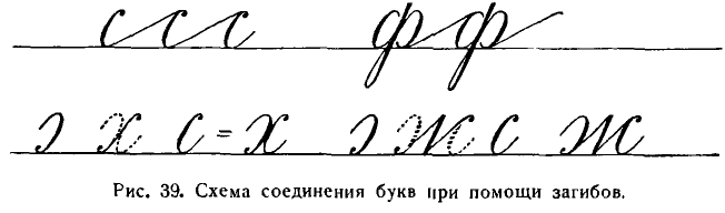
После этого останутся только три буквы (к, б, э), которые придется писать с отрывом пера. Правда, некоторые каллиграфы пытаются писать и букву к без отрыва пера, наподобие латинского k, но такой способ не может быть принят потому, что влечет за собой искажение буквы.
After this, there will only be three letters (к, б, э) left, which will have to be written with the pen lifted. Indeed, some calligraphers try to write the letter к without lifting the pen, similar to the Latin k, but such a method cannot be accepted because it leads to the distortion of the letter.
Необходимо также познакомить детей с двойным начертанием букв в и з, объяснив им, что букву в большого размера мы применяем при соединении с овалом или полуовалом (ее), а букву з малого размера — когда рядом с нею в слове стоят буквы р, д, ф.
It is also necessary to acquaint children with the double spelling of the letters в and з, explaining to them that we use the large-sized letter в when it connects with an oval or semi-oval (ее), and the small-sized letter з — when the letters р, д, ф stand next to it in a word.
К числу особо трудных для письма строчных букв принадлежат буквы в и з.
The letters в and з are among the particularly difficult lowercase letters to write.
Для того чтобы научить детей писать эти буквы красиво и быстро, необходимо проделать ряд упражнений.
In order to teach children to write these letters beautifully and quickly, it is necessary to perform a series of exercises.
Упражнения в письме сочетаний букв без отрыва пера на протяжении целой страницы так же важны для плавного безотрывного письма слов, как слоговое чтение важно для выработки плавности чтения в период обучения грамоте.
Exercises in writing combinations of letters without lifting the pen throughout an entire page are as important for the smooth continuous writing of words as syllable reading is important for developing smooth reading during the literacy learning period.
При письме слов учитель вновь останавливает внимание учеников на рациональном, безотрывном соединении букв между собою.
When writing words, the teacher again draws the students' attention to the rational, continuous connection of letters with each other.
Самыми трудными сочетаниями букв являются:
The most difficult combinations of letters are:
1. соединения букв, заканчивающихся волосными чертами с буквами, начинающимися точкой: ил, ум, ия;
1. connections of letters ending in hairlines with letters starting with a dot: ил, ум, ия;
2. соединения овалов со следующими буквами, начинающимися точкой: юл, ая, ом;
2. connections of ovals with the following letters starting with a dot: юл, ая, ом;
3. соединения овалов со следующими буквами, начинающимися прямой чертой с нажимом: он, юг, фт;
3. connections of ovals with the following letters starting with a straight line with a press: он, юг, фт;
4. соединения букв, состоящих из овалов: об, од, юб.
4. connections of letters consisting of ovals: об, од, юб.
5. соединения букв из полуовалов с такими же буквами: ев, се;
5. connections of letters from semiovals with the same letters: ев, се;
6. соединения букв, заканчивающихся прямыми чертами с нажимом и закруглением внизу, с буквой г (иг);
6. connections of letters ending in straight lines with pressure and rounding at the bottom, with the letter г (иг);
7. соединения левых полуовалов с правыми: вз, ех, сж;
7. connections of left semiovals with rights: вз, ех, сж;
8. соединения ъ и ь со следующими буквами, начинающимися с точки: ья и ъя;
8. connections of ъ and ь with the following letters, starting with a dot: ья and ъя;
9. соединения левых полуовалов с буквами, начинающимися точкой: ел, ся.
9. connections of left semiovals with letters starting with a dot: ел, ся.
В первой четверти учитель приступает к обучению учащихся III класса письму по одной линейке, или скорописи, которая представляет собою завершающий этап в обучении детей чистописанию.
In the first quarter, the teacher begins to teach the 3rd grade students to write on one line, or shorthand, which is the final stage in teaching children handwriting.
Основными чертами русской скорописи, окончательно оформившейся в советскую эпоху, являются:
The main features of Russian shorthand, which finally took shape in the Soviet era, are:
- безотрывность письма; 2) плавность письма, т. е. отсутствие резких неожиданных остановок в процессе письма при переходе от одного элемента к другому или при соединении одной буквы с другою; 3) ровность письма, выражающаяся в однообразном наклоне, нажиме и высоте букв; 4) простота письма, исключающая всякого рода крючки и завитки, не предусмотренные прописями; 5) сохранение классической формы букв не только строчных, но и прописных, которые по своей высоте превышают строчные в 2,5 раза; 6) ритмичность письма, достигаемая правильной разбивкой букв в слове, при соединении их более длинными чертами, по сравнению с чертами между элементами буквы (рис. 40 и 41).
- continuity of writing; 2) smoothness of writing, i.e. absence of sharp unexpected stops in the process of writing when moving from one element to another or when connecting one letter with another; 3) uniformity of writing, expressed in the uniform inclination, pressure and height of letters; 4) simplicity of writing, excluding all kinds of hooks and curls not provided for by the handwriting exercises; 5) preservation of the classical form of letters not only lowercase, but also uppercase, which in their height exceed the lowercase by 2.5 times; 6) rhythmicity of writing, achieved by correctly breaking down letters in a word, when connecting them with longer lines, compared to the lines between the elements of a letter (fig. 40 and 41).
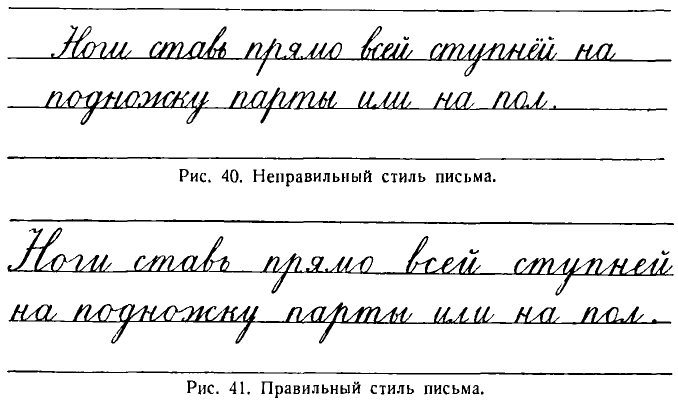
Спланировать работу по чистописанию в соответствии с учебным планом 1954/55 учебного года учитель III класса может примерно так:
The 3rd grade teacher can plan the work on handwriting in accordance with the curriculum of the 1954/55 academic year roughly as follows:
1. Подготовительные упражнения — 3 часа.
1. Preparatory exercises — 3 hours.
2. Письмо строчных букв первой группы — 3 часа.
2. Writing lowercase letters of the first group — 3 hours.
3. Письмо строчных букв второй группы — 5 часов.
3. Writing lowercase letters of the second group — 5 hours.
4. Письмо строчных букв третьей группы — 4 часа.
4. Writing lowercase letters of the third group — 4 hours.
5. Письмо строчных букв четвертой группы — 3 часа.
5. Writing lowercase letters of the fourth group — 3 hours.
6. Письмо строчных букв пятой группы — 3 часа.
6. Writing lowercase letters of the fifth group — 3 hours.
7. Письмо арабских цифр — 1 час.
7. Writing Arabic numerals — 1 hour.
8. Письмо заглавных букв первой группы — 4 часа.
8. Writing uppercase letters of the first group — 4 hours.
9. Письмо заглавных букв второй группы — 4 «
9. Writing uppercase letters of the second group — 4 hours.
10. Письмо заглавных букв третьей группы — 2 «
10. Writing uppercase letters of the third group — 2 hours.
11. Письмо заглавных букв четвертой группы — 3 часа.
11. Writing uppercase letters of the fourth group — 3 hours.
12. Письмо знаков препинания и римских цифр — 1 час.
12. Writing punctuation marks and Roman numerals — 1 hour.
Shorthand
СКОРОПИСЬ
На трех первых уроках, отводимых на подготовительные упражнения, учитель дает детям последовательно 20 отдельных упражнений, состоящих в письме наклонных и овальных черт высотой в 9 мм (чему равняется расстояние между линейками).32 В этот период учитель особенно внимательно следит за правильной посадкой учащихся.
In the first three lessons, allocated for preparatory exercises, the teacher gives the children a sequence of 20 separate exercises, which consist of writing inclined and oval lines 9 mm high (which is the distance between the lines). During this period, the teacher pays special attention to the correct posture of the students.
Все упражнения выполняются под счет после предварительного показа учителем на доске.
All exercises are performed to the count after the teacher's preliminary demonstration on the board.
Приступая к письму букв, учитель прежде всего ставит перед учениками задачу — писать строчные буквы меньшего размера, а именно высотою в 3—2,5 мм.
When starting to write letters, the teacher first of all sets a task for the students - to write lowercase letters of a smaller size, namely 3-2.5 mm high.
Каждый ученик должен по транспортиру начертить стандарт в виде наклонной линии под углом в 65°, на которой отметить высоту строки в 3 мм. После этого учитель разъясняет ученикам, что впредь им необходимо соблюдать при письме строго определенный размер букв уже без помощи линейки, а только на глаз.
Each student must draw a standard in the form of an inclined line at an angle of 65° using a drawing tool, marking a line height of 3 mm on it. After that, the teacher explains to the students that they will need to strictly adhere to the specified letter size in the future without the aid of a ruler, but just by eye.
Group I lowercase letters и, ш, г, я, т, п, р, у, й33
I группа строчных букв и, ш, г, я, т, п, р, у, й33
Четвертый урок. Перед письмом строчных букв I группы дети 1) упражняются в постановке точек в количестве 12 на строке на одинаковом (примерно в 1 см) расстоянии одной от другой, 2) затем пишут длинные наклонные от одной горизонтальной линии, данной в тетради, до другой, 3) делят эти наклонные на три равные части, находя опытным путем высоту строчных букв, которую в дальнейшем они будут соблюдать уже на глаз (3 мм).
Fourth lesson. Before writing the lowercase letters of Group I, the children 1) practice placing 12 dots on the line at an equal (approximately 1 cm) distance from each other, 2) then write long inclined lines from one horizontal line given in the notebook to another, 3) divide these inclined lines into three equal parts, finding the height of the lowercase letters by trial, which they will keep in mind in the future (3 mm).
Потом они пишут элементы букв, соединяя их без отрыва тонкими (волосными) чертами длиною в 10—12 мм, так что на строке в 140 мм будет написано всего 12 прямых черт с нажимом.
Then they write the elements of the letters, connecting them without lifting the pen with thin (hairline) lines 10-12 mm long, so that a total of 12 straight lines with pressure will be written on a line of 140 mm.
Такие упражнения, во-первых, развивают глазомер и дают возможность детям сохранить одинаковую высоту элементов до конца строки, во-вторых, при письме длинных соединительных черт ученик будет приучаться к координации движений пальцев, кисти, предплечья и к так называемым пронационным движениям, т. е. к колебательным движениям предплечья, которые обеспечивают плавность, а значит, и ритмичность письма.
These exercises, firstly, develop a good eye and give children the opportunity to maintain the same height of elements to the end of the line, secondly, when writing long connecting lines, the student will get used to coordinating the movements of fingers, wrist, forearm, and so-called pronation movements, i.e., oscillatory movements of the forearm, which ensure smoothness, and therefore rhythmicality, of writing.
Написав одну строчку элементов без счета, ученики на второй строчке пишут их под счет раз и, давая и на соединительную черту. Затем учитель пишет эту же прямую палочку по вертикали на шести строках доски, приучая учеников к правильному передвижению тетради снизу вверх по мере написания нижних строк и добиваясь сохранения учащимися одинакового наклона букв на всех строках страницы.
Having written one line of elements without counting, the students on the second line write them to the count one and, giving and to the connecting line. Then the teacher writes this same vertical line on six lines of the board, getting the students accustomed to moving the notebook up as they write the lower lines and achieving the same inclination of the letters on all lines of the page by the students.
Прямые черты с нажимом соединяются по вертикали тонкими изогнутыми и спиралевидными чертами и пишутся точно одна под другой (рис. 42).
The straight lines with pressure are connected vertically by thin curved and spiral lines and are written exactly one under the other (fig. 42).
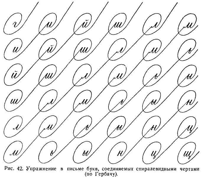
После этого дети пишут следующие элементы: прямую палочку с нажимом и закруглением внизу, с закруглением вверху, с закруглением вверху и внизу.
After this, children write the following elements: a straight line with pressure and a round off at the bottom, a round off at the top, a round off at both the top and bottom.
Перед письмом данных упражнений очень важно предостеречь учеников от самой распространенной ошибки — писать прямые нажимные черты с прогибом, так как в этих случаях они по форме приближаются к полуовалу и письмо становится неразборчивым.
Before writing these exercises, it is very important to warn students about the most common mistake - writing straight lines with pressure and a bend, because in these cases they approach the shape of a semicircle and the writing becomes illegible.
Писать эти элементы нужно так: сперва пишется одна строчка без счета, потом вторая под счет: раз (черта с нажимом) и (волосная соединительная черта) и т. д.
These elements should be written as follows: first, one line is written without counting, then the second one to the count: one (line with pressure) and (hairline connecting line) and so on.
На этом же уроке дети пишут под счет буквы и, ш, п, т с тонкими соединительными чертами без отрыва руки на протяжении всей строки. На буквы и и п дается счет раз, два и (на соединительную черту), а на буквы ш и т счет раз, два, три и (на соединительную черту).
In the same lesson, children write to the count the letters i, sh, p, t with thin connecting lines without lifting the hand for the entire line. The letters i and p are given the count one, two and (on the connecting line), and the letters sh and t the count one, two, three and (on the connecting line).
Овладев безотрывным письмом этих букв, ученики переходят к письму сочетаний ши, иг, ип, иш, шг, шп, ги, гт, ти, тш. Буква от буквы пишется на расстоянии 2 мм элементы в букве — на расстоянии 1,5 мм.
Having mastered the continuous writing of these letters, students move on to writing combinations shi, ig, ip, ish, shg, sp, gi, gt, ti, tsh. Each letter is written at a distance of 2 mm, elements in the letter - at a distance of 1.5 mm.
В заключение урока можно написать слова: пиши, шип, разъяснив предварительно учащимся, что удлинение соединительных черт между буквами имеет большое значение в выработке четкого, красивого, разборчивого почерка.
At the end of the lesson, you can write the words: write, ship, having previously explained to students that elongating the connecting lines between letters plays a major role in developing a clear, beautiful, legible handwriting.
Пятый урок. Письмо букв н, р, у, сочетаний этих букв с другими буквами и слов.
Fifth lesson. Writing the letters n, r, u, combinations of these letters with other letters, and words.
Начинать урок следует с письма буквы н. Учитель объясняет ученикам, чем отличается буква н от буквы и. Во избежание смешения этих букв следует писать букву н, применяя волнистую черту с нажимом в качестве второго ее элемента.
The lesson should start with writing the letter n. The teacher explains to the students how the letter n differs from the letter i. To avoid confusion between these letters, the letter n should be written using a wavy line with pressure as the second element.
Буква н пишется без отрыва. Движением пера сверху вниз проводится прямая черта (первый элемент); затем совершается обратное движение пером кверху по той же линии до середины черты, после чего пишется с отчетливым нажимом в середине волнистая черта; от волнистой черты движением пера кверху пишется тонкая черта до верха строки, а затем вторично по тому же следу пишется книзу прямая черта с нажимом и закруглением внизу.
The letter n is written without lifting the pen. A straight line is drawn from top to bottom (first element); then the pen makes a reverse movement upwards along the same line to the middle of the line, after which a wavy line is written with a distinct pressure in the middle; from the wavy line, a thin line is written upwards to the top of the line, and then a straight line with pressure and a round off at the bottom is written downwards along the same track.
Буква н пишется под счет раз, два, три, и (на соединительную черту) с горизонтальными и петлевидными соединениями в количестве 10 букв на строке.
The letter n is written to the count one, two, three, and (on the connecting line) with horizontal and looped connections in the amount of 10 letters per line.
Петли в соединениях букв пишутся без нажима. Верхняя возвышается на 3 мм над буквой, а нижняя опускается на 3 мм ниже строки.
Loops in the letter connections are written without pressure. The upper one rises 3 mm above the letter, and the lower one drops 3 mm below the line.
Такого рода упражнения являются подготовкой к написанию последующих букв р и у.
These exercises serve as a preparation for writing the subsequent letters r and u.
С буквой н пишутся сочетания ин, шн, тн, гн и слово нити. Все они пишутся под счет.
With the letter n, the combinations in, shn, tn, gn and the word thread are written. All of them are written to the count.
Буква р. Первый элемент ее — прямая удлиненная черта — при безотрывном письме преобразуется в прямую черту с петлею, с которою непосредственно соединяется второй элемент.
Letter r. Its first element - a straight elongated line - in continuous writing transforms into a straight line with a loop, which directly connects with the second element.
Невыполнение этого условия приводит к письму с отрывом или к применению других видов начертаний букв р — менее отчетливых и вызывающих затруднения при письме.
Failure to comply with this condition leads to writing with lifting or to the use of other types of lettering for the letter r - less clear and causing difficulties in writing.
Букву р, как и предыдущие буквы, дети пишут без отрыва под счет раз, два и, причем и приходится на горизонтальные или петлевидные соединения между буквами.
Children write the letter r, like the previous letters, without lifting to the count one, two and, with and falling on the horizontal or looped connections between the letters.
Под счет и без счета дети пишут затем слова: три, тигр, гири, грипп, пир.
Children then write the words: three, tiger, weights, flu, pear to the count and without counting.
Буква у пишется с длинными тонкими петлевидными и горизонтальными соединительными чертами под счет раз, два и (и дается на соединительные черты).
The letter u is written with long thin looped and horizontal connecting lines to the count one, two and (and is given on the connecting lines).
После этого ученики упражняются в письме сочетаний букв ру, ур, ну и слов: шнур, грунт, прут, шут.
After that, students practice writing the combinations of letters ru, ur, nu and words: cord, ground, rod, joker.
Шестой урок. Этот урок носит тренировочный характер: ученики упражняются в письме всех пройденных букв не в строчку, а по вертикали, соединяя их без отрыва изогнутыми и спиралевидными чертами (см. рис. 42).
Sixth lesson. This lesson is of a training nature: students practice writing all the covered letters not in a row, but vertically, connecting them without lifting with curved and spiral lines (see fig. 42).
Дети при помощи этих упражнений приучаются к сохранению одинакового наклона на всех строках страницы.
Through these exercises, children get used to maintaining the same slope on all lines of the page.
Затем повторяется письмо под счет сочетаний шн, иш, ги, пт, тр, ур, уг, ни, ин, ну.
Then, the writing of combinations shn, ish, gi, pt, tr, ur, ug, ni, in, nu to the count is repeated.
При письме этих сочетаний учитель наблюдает за прямизной черт, правильностью закруглений и петель, безотрывностью письма на протяжении всей строки и раздельностью в начертаниях букв, не допуская сближения или уплотнения.
When writing these combinations, the teacher observes the straightness of the lines, the correctness of the roundings and loops, the continuity of writing throughout the entire line and the separation in the lettering of letters, not allowing convergence or compaction.
Учитель также добивается постепенного нарастания темпа письма. Это делается путем едва заметного ускорения счета, но не в ущерб качеству письма.
The teacher also strives for a gradual increase in the pace of writing. This is done by a barely noticeable acceleration of the count, but not at the expense of the quality of writing.
В это же время учитель внимательно следит, чтобы учащиеся не допускали искажения букв, изменения величины и наклона их.
At the same time, the teacher carefully monitors that students do not distort letters, change their size and inclination.
II group of lowercase letters: л, м, и, щ, ь, ы
II группа строчных букв л, м, и, щ, ь, ы
Седьмой урок. Письмо букв л, н, м, сочетаний букв и слов с ними с введением новых соединительных спиралевидных черт.
Seventh lesson. Writing letters l, n, m, combinations of letters and words with them with the introduction of new spiral connecting lines.
Письмо этих букв можно проводить в таком порядке:
The writing of these letters can be done in the following order:
- письмо буквы л с горизонтальными соединительными чертами; 2) письмо этой буквы с петлевидными соединениями, 3) письмо этой же буквы с овальными соединениями34; 4) безотрывное письмо буквы м со всеми тремя соединениями под счет раз, два, три и, т. е. со счетом раз на точку, со счетом два, три на следующие две черты с нажимом и с и на горизонтальные и фигурные черты.
- writing the letter l with horizontal connecting lines; 2) writing this letter with loop connections; 3) writing the same letter with oval connections; 4) continuous writing of the letter m with all three connections to the count one, two, three and, i.e. with the count one on the dot, with the count two, three on the next two pressure lines and and on horizontal and figured lines.
Спиралевидное соединение поднимается над строкой и опускается под строку на 4,5 мм; пишется оно без нажима.
The spiral connection rises above the line and drops below the line by 4.5 mm; it is written without pressure.
Точка ставится четким нажимом пера, но так, чтобы не сделать ее похожей на «клюшку».
The dot is placed with a clear pen pressure, but so as not to make it look like a "hook".
После усвоения букв пишутся безотрывно сочетания пл, ил, ми, мл, им, ум. Согласно установившейся традиции и в интересах плавности письма, следует укоротить до 1 мм соединительную черту, идущую от предыдущей буквы к буквам, начинающимся точкой (л, м, я).
After mastering the letters, the combinations pl, il, mi, ml, im, um are written without interruption. According to established tradition and in the interests of smooth writing, it is recommended to shorten the connecting line going from the previous letter to the letters starting with a dot (l, m, ya) to 1 mm.
Наконец дети пишут слова пули, шум, тмин (пахучее растение) без отрыва пера, под счет.
Finally, children write the words bullets, noise, black cumin (a fragrant plant) without lifting the pen, to the count.
Восьмой урок. Письмо букв ц, щ, сочетаний букв и слов с ними.
Eighth lesson. Writing letters ts, shch, combinations of letters and words with them.
Опущенная петля, являясь по существу дополнительным элементом, обычно вызывает наибольшие затруднения при письме и часто деформируется в процессе скорописи. Поэтому рекомендуется начинать урок с письма этого элемента.
The lowered loop, being essentially an additional element, usually causes the greatest difficulties in writing and often deforms in the process of shorthand. Therefore, it is recommended to start the lesson with the writing of this element.
Дети пишут 12 петель вдоль строки, без отрыва, присоединяя их одну к другой тонкими горизонтальными чертами.
Children write 12 loops along the line, without lifting, connecting them to each other with thin horizontal lines.
После этого пишется буква ц, с такими же соединениями, как и предыдущие буквы, в три такта. Затем буква щ с теми же соединениями без отрыва пишется в четыре такта.
After this, the letter ts is written, with the same connections as the previous letters, in three beats. Then the letter shch with the same connections is written without lifting the pen in four beats.
Затем пишутся сочетания букв: иц, ущ, мщ, ру, ци и слова: шпиц (порода собак), щит, пищит.
Then combinations of letters are written: its, ushch, mshch, ru, tsi and words: spitz (breed of dogs), shield, chirps.
Опущенную петлю не следует отставлять от предыдущего элемента букв ц и щ дальше, чем на 1 мм, или ставить под прямым углом к строчке.
The lowered loop should not be set further than 1 mm from the previous element of the letters ts and shch, or placed at a right angle to the line.
Девятый урок. Письмо без отрыва букв ь и ы, сочетаний букв и слов с ними.
Ninth lesson. Writing without lifting letters soft sign (ь) and y (ы), combinations of letters and words with them.
Буква ь пишется в двух начертаниях: 1) для письма в середине слов (с узелком) под счет раз, два и (на соединительные черты); 2) для письма в конце слов (закрытая) под счет раз… без соединительных черт.
The soft sign (ь) is written in two scripts: 1) for writing in the middle of words (with a knot) to the count one, two and (on the connecting lines); 2) for writing at the end of words (closed) to the count one… without connecting lines.
Буква ы пишется в три такта со всеми уже известными соединениями.
The letter y (ы) is written in three beats with all already known connections.
Затем дети пишут буквы ь и ы в сочетаниях ль, щь, нь, ть, к, мы, ый.
Then children write the letters soft sign (ь) and y (ы) in combinations l' (ль), shch' (щь), n' (нь), t' (ть), k, my (мы), yy (ый).
Десятый урок. Письмо буквы й и тренировочные упражнения в письме всех букв II группы.
Tenth lesson. Writing the letter y (й) and training exercises in writing all the letters of the II group.
Дети пишут букву й под счёт раз, два, три с отрывом руки после написания каждой буквы. Затем они пишут на шести строках по вертикали одну под другой все буквы второй группы, соединяя их без отрыва пера изогнутыми и спиральными чертами. Потом пишутся без отрыва, под счет (и без счета), с постепенным ускорением темпа письма сочетания букв: мы, ты, ый и слова: линь, мышь, щипцы, птицы, умный, ульи, ртуть, пыльный.
Children write the letter y (й) to the count one, two, three with lifting the hand after writing each letter. Then they write on six lines vertically one under the other all the letters of the second group, connecting them without lifting the pen with curved and spiral lines. Then they write without lifting, to the count (and without counting), with a gradual acceleration of the writing tempo combinations of letters: my (мы), you (ты), yyy (ый) and words: shedding, mouse, tongs, birds, smart, beehives, mercury, dusty.
Одиннадцатый урок. Дети пишут под счет те же подготовительные упражнения, которые они писали, приступая к скорописи.
Eleventh lesson. Children write to the count the same preparatory exercises that they wrote when starting shorthand.
Особенно важное значение имеют упражнения в письме овальных черт, которые способствуют переходу к письму букв III группы.
Particularly important are exercises in writing oval lines, which contribute to the transition to writing letters of the III group.
Письмо производится при соблюдении правил посадки, положения тетради и держания ручки.
Writing is done while observing the rules of seating, notebook position and pen holding.
III group of lowercase letters: о, а, ю, д, б, я, ф.
III группа строчных букв о, а, ю, д, б, я, ф
Двенадцатый урок. Письмо букв о, а.
Twelfth lesson. Writing letters o, a.
Перед письмом буквы о учитель разъясняет учащимся, что:
Before writing the letter o, the teacher explains to the students that:
- в овале не должно быть никакой «прямизны»; 2) пишется овал движением пера справа вверх налево, а затем вниз; 3) овал пишется под таким же наклоном, как и прямая черта с нажимом, т. е. ось овала располагается так же наклонно, как и прямые черты.
- there should be no "straightness" in the oval; 2) the oval is written by moving the pen from right upwards to the left, and then downwards; 3) the oval is written at the same tilt as the straight line with pressure, i.e., the axis of the oval is positioned as tilted as the straight lines.
Одновременно с объяснением учитель пишет овал на доске, а ученики пишут в тетрадях, чередуя овалы с наклонными чертами.
At the same time as the explanation, the teacher writes the oval on the board, and the students write in their notebooks, alternating ovals with oblique lines.
Затем пишется строчка овалов, соединяемых горизонтальными чертами и без отрыва руки.
Then a line of ovals is written, connected by horizontal lines and without lifting the hand.
В целях соблюдения безотрывности письма каждая новая буква начинается или петлею или, что еще лучше, загибом, при котором буква получается более отчетливой.
In order to observe the continuity of writing, each new letter starts either with a loop or, even better, with a bend, in which the letter becomes more distinct.
Буква о пишется под счет раз, два … и. Счет два дается на точку, которой начинается соединительная черта.
The letter o is written to the count one, two … and. The count two is given to the point, which starts the connecting line.
Потом пишутся овалы, соединяемые петлевидными и спиралевидными тонкими чертами.
Then ovals are written, connected by loop-like and spiral thin lines.
С буквой о дети пишут сочетания он, от, ом и слова лом, топор.
With the letter o, children write combinations on, ot, om and words lom, topor.
При соединении овала с буквой, начинающейся точкой, делается тонкая соединительная черточка.
When connecting an oval with a letter that begins with a point, a thin connecting line is made.
В таком же порядке и с соблюдением тех же требований пишется буква а со всеми соединениями в сочетаниях букв па, та, ца, ща и в словах плата, лампа, лиана (тропическое растение).
In the same order and with the same requirements, the letter "a" is written with all connections in combinations of letters "pa", "ta", "ca", "щa" and in the words плата, лампа, лиана (a tropical plant).
При письме буквы а не следует допускать, чтобы она была открыта сверху или чтобы второй элемент присоединялся к первому только внизу.
When writing the letter "a", it should not be left open at the top or the second element should not be attached to the first only at the bottom.
Тринадцатый урок. Письмо букв д, ю, б. Буквы д и ю пишутся без отрыва со всеми соединительными чертами.
Thirteenth lesson. Writing letters "д", "ю", "б". The letters "д" and "ю" are written without detachment with all connecting lines.
Буква б пишется под счет раз, два с отрывом и без соединений.
The letter "б" is written to the count раз, два with a detachment and without connections.
Буква д пишется под счет раз, два; буква ю — под счет раз, два, три, а при наличии соединительной черты —под счет четыре.
The letter "д" is written to the count раз, два; the letter "ю" - to the count раз, два, три, and if there is a connecting line - to the count четыре.
С этими буквами дети пишут сочетания ид, гд, од, да, ою, юл, юг, би, бл и следующие слова, трудные в орфографическом отношении: громада, дощатый, ладонь, долото, люди, июль.
With these letters, children write combinations "ид", "гд", "од", "да", "ою", "юл", "юг", "би", "бл" and the following words, difficult in terms of spelling: громада, дощатый, ладонь, долото, люди, июль.
В букве ю не следует удлинять волнистую черту, соединяющую прямую черту с овалом.
In the letter "ю", you should not lengthen the wavy line connecting the straight line with the oval.
Четырнадцатый урок. Письмо букв я и ф. Буква я пишется под счет раз, два, три со всеми соединительными чертами, так что все три черты (элементы), образующие букву, соединяются в одной точке.
Fourteenth lesson. Writing letters "я" and "ф". The letter "я" is written to the count раз, два, три with all connecting lines, so that all three lines (elements) that make up the letter connect at one point.
Помимо уже известных детям четырех типов соединительных черт, буквы я и ф соединяются спиралевидными чертами.
In addition to the four types of connecting lines already known to the children, the letters "я" and "ф" are connected with spiral lines.
Затем дети пишут сочетания букв: пя, ят, дя, ял, ья, яд, бя.
Then children write combinations of letters: "пя", "ят", "дя", "ял", "ья", "яд", "бя".
При соединении буквы я с предшествующими буквами, оканчивающимися закруглением внизу, точка буквы я ставится не дальше, чем на 1 мм от нажимной черты.
When connecting the letter "я" with the preceding letters, ending with a rounding at the bottom, the point of the letter "я" is placed no further than 1 mm from the pressing line.
При соединении буквы я с буквой, заканчивающейся овалом, после овала делается короткий росчерк в виде тонкой соединительной черты (оя, юл).
When connecting the letter "я" with a letter ending with an oval, a short dash is made after the oval in the form of a thin connecting line ("оя", "юл").
С буквой я дети пишут слова цапля, ноябрь, пламя.
With the letter "я", children write the words цапля, ноябрь, пламя.
Научиться писать букву ф без отрыва пера — сложная задача.
Learning to write the letter "ф" without lifting the pen is a difficult task.
Существует два способа начертания этой буквы в скорописи:
There are two ways to write this letter in stenography:
- при помощи трех петель; 2) при помощи двух загибов — при первом и третьем элементах и петли при втором элементе.
- using three loops; 2) using two bends - at the first and third elements and a loop at the second element.
Целесообразнее применять второй способ письма, при котором буква ф сохраняет наиболее отчетливую форму.
It is more expedient to use the second method of writing, in which the letter "ф" retains the most distinct form.
Средняя черта в букве ф должна возвышаться над овалом.
The middle line in the letter "ф" should rise above the oval.
Буква ф пишется в три такта.
The letter "ф" is written in three beats.
Для упражнения в безотрывном письме буквы ф следует давать ее со всеми пятью известными уже детям соединениями, а также в сочетаниях букв фа, оф, фл и в словах: туфли, фонарь, флаг.
To practice continuous writing of the letter "ф", it should be given with all five connections already known to the children, as well as in combinations of letters "фа", "оф", "фл" and in the words: туфли, фонарь, флаг.
Пятнадцатый урок. Письмо букв III группы в разных сочетаниях букв и в словах.
Fifteenth lesson. Writing letters of group III in different combinations of letters and words.
Прежде всего дети пишут все буквы III группы одну под другой на 5—6 строках, соединяя их по вертикали изогнутыми, спиралевидными и комбинированными чертами. После этого они упражняются в письме под счет основных сочетаний: об, цо, ца, фа, уд, дл, ду, дц, ью, би, вя, ъя, и пишут слова: фитиль, форма, фонарь, борьба, яблоня, ноябрь, юрта, бью и др.
First of all, children write all the letters of group III one under the other on 5-6 lines, connecting them vertically with curved, spiral and combined lines. After this, they practice writing the main combinations to the count: "об", "цо", "ца", "фа", "уд", "дл", "ду", "дц", "ью", "би", "вя", "ъя", and write the words: фитиль, форма, фонарь, борьба, яблоня, ноябрь, юрта, бью and others.
Group IV lowercase letters: с, е, ё, ч, ъ, в
IV группа строчных букв с, е, ё, ч, ъ, в
Шестнадцатый урок. Письмо букв с, е, сочетаний букв и слов с ними.
Sixteenth lesson. Writing the letters с, е, combinations of letters and words with them.
Переход к буквам IV группы составляет очень ответственный момент в развитии навыка скорописи. Именно буквы IV группы, состоящие из полуовалов (с, е, ё, ч, ъ и в), при соединении с другими буквами чаще всего деформируются, нарушая четкость и разборчивость письма.
The transition to group IV letters is a very responsible moment in the development of shorthand skills. Specifically, group IV letters, consisting of semi-ovals (с, е, ё, ч, ъ and в), when combined with other letters, are often deformed, compromising the clarity and legibility of the handwriting.
Чаще всего нечеткими оказываются сочетания букв си, сн, сп, а также ле, се, те, ет, ме.
The combinations of letters си, сн, сп, as well as ле, се, те, ет, ме are often blurry.
Первые сочетания смешиваются с буквой м или ет, а вторые — с сочетанием ип.
The first combinations are confused with the letter м or ет, and the second ones - with the combination ип.
Чтобы предотвратить деформацию этих букв, необходимо прежде всего выработать у учеников навык четкого письма букв, а затем их сочетаний.
To prevent the deformation of these letters, it is necessary first of all to develop the skill of clear writing of letters in students, and then their combinations.
Буква с пишется в два такта и в таком же порядке, как и все предыдущие буквы, со всеми пятью соединениями, т. е. горизонтальными, петлевидными, спиралевидными, комбинированными из спиралей и петель, а также из спиралей, петель и узлов.
The letter с is written in two beats and in the same order as all the previous letters, with all five connections, i.e. horizontal, looped, spiral, combined from spirals and loops, as well as from spirals, loops and knots.
Чтобы достигнуть безотрывности письма буквы с, учащиеся должны, соединяя эту букву с предыдущей, делать не петлю, а загиб (см. рис. 39).
To achieve continuous writing of the letter с, students should make not a loop, but a bend when connecting this letter with the previous one (see fig. 39).
С буквой с дети пишут сочетания: сг, cш, сб, сл, ся.
With the letter с, children write combinations: сг, сш, сб, сл, ся.
При написании сочетаний букв сл, ся учащиеся ставят точку на расстоянии примерно в 1 мм от полуовала.
When writing combinations of the letters сл, ся, students place a dot approximately 1 mm from the semicircle.
Так же дети поступают и при соединении буквы е с л и я.
Children do the same when connecting the letter е with л and я.
Буква е пишется в один такт со всеми соединительными чертами, а также в сочетаниях: те, не, уе, ые, бе ив словах: сестра, смелость, тепло, шея.
The letter е is written in one beat with all the connecting lines, as well as in combinations: те, не, уе, ые, бе and in words: сестра, смелость, тепло, шея.
Семнадцатый урок. Письмо букв ч и ъ. Буква ч пишется в два такта, а ъ — в три, со всеми прежними соединениями и с добавлением новых, состоящих из одних верхних петель, т. е. напоминающих буквы е большого размера.
Seventeenth lesson. Writing the letters ч and ъ. The letter ч is written in two beats, and ъ - in three, with all the previous connections and with the addition of new ones, consisting of only upper loops, i.e. resembling large-sized е letters.
С буквой ч дети пишут сочетания чи, чу (повторяя соответствующие правила правописания), а также сочетания чл, че, уч, еч и слова: честь, число.
With the letter ч, children write combinations чи, чу (repeating the corresponding spelling rules), as well as combinations чл, че, уч, еч and words: честь, число.
С ъ пишутся сочетания ъе, ъя и слова: объятья, подъём.
With ъ, combinations ъе, ъя and words are written: объятья, подъём.
Буквы ч и ъ получаются более красивыми, если первый узелок пишется при помощи сильного нажима, а следующая за узелком изогнутая черта коротка.
The letters ч and ъ look more beautiful if the first knot is written with a strong press, and the curved line following the knot is short.
Восемнадцатый урок. Письмо буквы в, сочетаний букв и слов с буквами IV группы. Букву в дети учатся писать двух видов: 1) двойного размера с петлей, поднимающейся над строкой на 3 мм и 2) малого размера, в высоту обычной буквы.
Eighteenth lesson. Writing the letter в, combinations of letters, and words with group IV letters. Children learn to write the letter в in two types: 1) double size with a loop rising above the line by 3 mm and 2) small size, the height of a regular letter.
К ранее известным соединениям добавляется соединительная черта, состоящая из обратной спирали.
The previously known connections are supplemented by a connector consisting of a reverse spiral.
Буква в малого размера дается в сочетаниях ев и бв, а в остальных случаях преимущественно употребляется буква в большого размера, которая благодаря этому не смешивается с е.
The small-sized letter в is given in the combinations ев and бв, and in other cases, the large-sized letter в is predominantly used, which, as a result, does not mix with е.
Буква в пишется в два такта и дается в сочетаниях: ве, вл, ви, бв и в словах: власть, весна, ветви, объявление, январь, овраг.
The letter в is written in two beats and is given in combinations: ве, вл, ви, бв and in words: власть, весна, ветви, объявление, январь, овраг.
После написания буквы в дети упражняются в письме сочетаний и слов с буквами IV группы.
After writing the letter в, children practice writing combinations and words with group IV letters.
Group V lowercase letters: э, х, ж, з, к
V группа строчных букв э, х, ж, з, к
Девятнадцатый урок. Письмо букв э, х. Буква э пишется в три такта с отрывом пера перед волнистой чертой, которая, пересекая полуовал, переходит непосредственно в черту, соединяющуюся с первым элементом следующей буквы.
Nineteenth lesson. Writing the letters э, х. The letter э is written in three beats with the pen being lifted before the wavy line, which, crossing the semi-oval, transitions directly into the line that connects with the first element of the next letter.
В отличие от буквы б, букву э следует писать не только со всеми уже известными ранее соединениями, но и с добавлением нового соединения, состоящего из верхней петли и нижней спирали.
Unlike the letter б, the letter э should be written not only with all the previously known connections but also with the addition of a new connection consisting of the upper loop and the lower spiral.
С буквой э дети пишут сочетания оэ, эт и слова это, поэт.
With the letter э, children write combinations оэ, эт, and words это, поэт.
Букву х без отрыва можно писать двумя способами: заменяя точки петлями; применяя загибы при переходе к первой и ко второй точкам (см. рис. 39).
The letter х can be written without lifting in two ways: replacing the points with loops; using bends when transitioning to the first and second points (see fig. 39).
При первом способе письмо не теряет своей плавности, а при втором выигрывает еще и в отчетливости.
With the first method, the writing does not lose its fluidity, and with the second, it also gains clarity.
Буква х пишется в четыре такта. С буквой х пишутся сочетания ух, хр, ех, хл и слова хата, тихий, хлеб, эхо.
The letter х is written in four beats. The letter х is used in combinations ух, хр, ех, хл, and words хата, тихий, хлеб, эхо.
Двадцатый урок. Письмо букв ж, з. Буква ж пишется в пять тактов, а иногда в три. Это зависит от каллиграфического или скорописного способа начертания. В отличие от прочих букв, букву ж можно писать без отрыва пера тремя способами: 1) заменяя обе точки при полуовалах петлями; 2) употребляя для соединения с точками элементов загибы; 3) начиная писать букву не сверху, а снизу от точки, придавая ей несколько иную форму, однако, совершенно характерную, отличную от других букв.
Twentieth lesson. Writing the letters ж, з. The letter ж is written in five beats, and sometimes in three. It depends on the calligraphic or stenographic way of writing. Unlike other letters, the letter ж can be written without lifting the pen in three ways: 1) by replacing both dots at the semi-ovals with loops; 2) by using bends for connecting with the dots of elements; 3) by starting to write the letter not from the top but from the bottom of the dot, giving it a slightly different form, however, completely characteristic, different from other letters.
Букву ж дети пишут со всеми соединениями, а также в сочетаниях жи (повторяя при этом правило правописания) и словах: жар, жёлтый.
Children write the letter ж with all connections, as well as in combinations жи (repeating the spelling rule) and words: жар, жёлтый.
Буква з пишется двумя способами: 1) большого размера, с петлей выходящей под строку; 2) малого размера, такой же высоты, как и прочие строчные буквы.
The letter з is written in two ways: 1) large size, with a loop going under the line; 2) small size, the same height as other lowercase letters.
Буква з пишется в два такта со всеми соединениями, в сочетаниях зв, зл и в словах: железо, зелень, золото, зима.
The letter з is written in two beats with all connections, in combinations зв, зл, and words: железо, зелень, золото, зима.
Двадцать первый урок. Письмо буквы к, сочетаний и слов со всеми буквами V группы. Буква к пишется в три такта, с отрывом пера перед точкой.
Twenty-first lesson. Writing the letter к, combinations and words with all the letters of group V. The letter к is written in three beats, with the pen lifted before the dot.
Затем пишутся на разных строках, одна под другой, все буквы V группы, соединяясь по вертикали изогнутыми и спиралевидными чертами.
Then, all the letters of group V are written on different lines, one under another, connecting vertically with curved and spiral lines.
После этого дети пишут слова: казак, класс, керосин, океан, климат, хижина, краска, квитанция.
After this, the children write the words: казак, класс, керосин, океан, климат, хижина, краска, квитанция.
—
Двадцать второй урок. Письмо арабских цифр (каждой в отдельности, без связи их между собой.)
Twenty-second lesson. Writing Arabic numerals (each separately, without connection between them.)
Практически связь цифр совершенно неприемлема, но в некоторых руководствах она ошибочно допускается. Помимо цифр, дети усваивают на этом уроке начертание знаков № и § и учатся каллиграфической записи арифметических действий.
In practice, linking numbers is completely unacceptable, but in some manuals it is erroneously allowed. In addition to numbers, on this lesson, children learn how to draw the signs № and §, and learn to write arithmetic operations in a calligraphic way.
Все это делается на бумаге по клеткам в порядке закрепления уже усвоенного детьми.
All this is done on grid paper to reinforce what the children have already learned.
Capital letters
ЗАГЛАВНЫЕ БУКВЫ
Двадцать третий урок. На этом уроке дети выполняют подготовительные упражнения. Они их пишут под счет, в том же порядке, как и в начале обучения скорописи.
Twenty-third lesson. On this lesson, children perform preparatory exercises. They write them by counting, in the same order as at the beginning of the shorthand training.
Потом учащиеся переходят к усвоению скорописи заглавных букв.
Then the students move on to mastering shorthand of capital letters.
Перед началом письма учителю необходимо еще раз подчеркнуть различие в начертании каллиграфических и скорописных заглавных букв.
Before starting to write, the teacher needs to once again emphasize the difference in writing calligraphic and shorthand capital letters.
Каллиграфическим начертанием букв дети обычно пользуются при письме всякого рода документов, статей в стенных газетах и т. д. Скорописью — повседневно.
Children usually use calligraphic lettering when writing all kinds of documents, articles in wall newspapers, etc. Shorthand is used on a daily basis.
Двадцать четвертый урок. Письмо заглавных букв И, Ш, Ч.
Twenty-fourth lesson. Writing capital letters И, Ш, Ч.
Заглавные буквы по высоте в 2,5 раза превосходят строчные буквы, т. е. высота их равна 7,5 мм. В соответствии с этим удлиняются и расстояния между основными элементами заглавных букв — они равняются примерно 2,5 мм. Несколько увеличивается толщина и нажимных черт.
Capital letters are 2.5 times taller than lowercase letters, i.e., their height equals 7.5 mm. Accordingly, the distances between the main elements of capital letters are also extended - they are about 2.5 mm. The thickness and pressure of the lines are slightly increased.
Дети пишут одну строчку буквы И; на строчке размещается примерно девять букв. Каждая буква пишется без отрыва пера от бумаги. Потом дети упражняются под счет в безотрывном письме собственных имен: Иркутск, Иван, Ира, отводя на каждое слово особую строчку. Пишут фразу: Иртыш — многоводная река.
Children write one line of the letter И; about nine letters are placed on one line. Each letter is written without lifting the pen from the paper. Then the children practice continuous writing of their own names by counting: Иркутск, Иван, Ира, allotting a separate line for each word. They write the phrase: Иртыш — многоводная река.
При письме слов дети должны соблюдать основное правило — писать буквы в словах не сжато, а в разрядку.
When writing words, children should observe the main rule - to write letters in words not tightly, but with spacing.
Чтобы приучить детей к правильному размещению букв, учитель заранее, перед письмом, определяет количество слов, которое может быть написано на строке, разъясняет учащимся, как нужно делать переносы, если в них есть необходимость.
To accustom children to the correct placement of letters, the teacher beforehand, before writing, determines the number of words that can be written on a line, explains to the students how to make hyphenations if they are necessary.
При письме фразы дается объяснение, что слова должны отстоять друг от друга на расстоянии, равном строчной букве т, т. е. примерно 5,5—6 мм. Подсчитывается, на скольких строках разместится вся фраза.
When writing a phrase, it is explained that words should be spaced apart by a distance equal to the lowercase letter t, i.e., approximately 5.5-6 mm. The number of lines on which the entire phrase will be placed is calculated.
Букву Ш дети пишут без отрыва пера в четыре такта. Каждая буква пишется в отдельности. Затем учащиеся упражняются в письме слов: Шура, Шексна, Шахты (город). Пишут предложение: Широка страна моя родная.
Children write the letter Ш without lifting the pen in four beats. Each letter is written separately. Then the students practice writing the words: Шура, Шексна, Шахты (city). They write the sentence: Широка страна моя родная.
Буква Ч пишется без отрыва пера, в три такта. После усвоения ее дети пишут слова Чапаев, Чита, Чусовая и пословицу: Что написано пером, того не вырубишь топором.
The letter Ч is written without lifting the pen, in three beats. After mastering it, children write the words Чапаев, Чита, Чусовая and the proverb: Что написано пером, того не вырубишь топором.
Двадцать пятый урок. Буквы Ц и Щ отличаются от предыдущих букв наличием петли. Учитель останавливает внимание учеников не только на форме этого элемента, но и на том, что величина его должна равняться 1/3 высоты надстрочной части буквы, т. е. 2,5 мм.
Twenty-fifth lesson. The letters Ц and Щ differ from the previous letters in having a loop. The teacher focuses the students' attention not only on the shape of this element but also on the fact that its size should be equal to 1/3 of the height of the superscript part of the letter, i.e., 2.5 mm.
Обычно дети склонны писать этот элемент очень малого размера, нарушая пропорциональность частей буквы. Поэтому надо следить, чтобы дети научились писать петлю установленной величины.
Children usually tend to write this element very small, disturbing the proportionality of the parts of the letter. Therefore, it is necessary to ensure that children learn to write the loop of the established size.
Буква Ц пишется в четыре такта, а буква Щ — в пять тактов. Обе буквы пишутся без отрыва руки.
The letter Ц is written in four beats, and the letter Щ - in five beats. Both letters are written without lifting the hand.
С буквой Ц дети пишут слово Цна (река) и предложение: Цвети, расти и силу множь, страны советской молодёжь.
With the letter Ц, children write the word Цна (river) and the sentence: Цвети, расти и силу множь, страны советской молодёжь.
С буквой Щ пишутся слова Щербаков, Щукино и предложение: Щорс — народный герой.
With the letter Щ, the words Щербаков, Щукино and the sentence: Щорс — народный герой are written.
Двадцать шестой урок. Письмо букв Л, М, А. Все эти буквы пишутся и соединяются с другими буквами без отрыва пера. При письме их могут быть использованы соединительные черты, обусловливающие плавность письма. Например, можно писать с горизонтальными и петлевидными соединениями, а также с соединениями комбинированными, состоящими из верхних петель и спиралей.
Twenty-sixth lesson. Writing the letters Л, М, А. All these letters are written and connected with other letters without lifting the pen. When writing them, connective lines can be used, ensuring smooth writing. For example, you can write with horizontal and loop-like connections, as well as with combined connections consisting of upper loops and spirals.
Буква Л пишется в два такта. С нею дети пишут слова Лена, Львов и предложение: Ленин — основатель Советского государства.
The letter Л is written in two beats. With it, children write the words Лена, Львов and the sentence: Ленин — основатель Советского государства.
Буква М пишется в три такта с теми же соединениями, что и буква Л.
The letter 'М' is written in three movements, with the same connections as the letter 'Л'.
С буквой М дети пишут слова: Москва, Молотов, Матросов, Мценск и предложение: Мы наш, мы новый мир построим.
With the letter 'М', children write the words: Moskva, Molotov, Matrosov, Mtsensk and the sentence: We are ours, we will build a new world.
Букву А можно употреблять в скорописи, только немного изменив ее форму. Поэтому сначала надо показать детям ее каллиграфическое начертание (дети тут же пишут одну строчку), а затем они упражняются в скорописном ее начертании, без отрыва пера.
The letter 'А' can be used in cursive, only slightly changing its form. Therefore, first you need to show children its calligraphic form (children immediately write one line), and then they practice its cursive form, without lifting the pen.
Буква А пишется в три такта. С ней пишутся слова: Ася, Алтай и пословица: Апрель с водою, май с травою.
The letter 'А' is written in three movements. With it, children write the words: Asya, Altai and the proverb: April with water, May with grass.
Двадцать седьмой урок. Повторное письмо подготовительных упражнений для обеспечения лучшего перехода к заглавным буквам II группы. Все упражнения пишутся под счет при соблюдении безукоризненной посадки.
Lesson twenty-seven. Repeated writing of preparatory exercises to ensure a better transition to the capital letters of the II group. All exercises are written to the count, while maintaining a flawless posture.
Двадцать восьмой урок. Письмо заглавных букв С, О, 3.
Lesson twenty-eight. Writing capital letters 'С', 'О', '3'.
Буква С начинается с точки. Поэтому ее можно дать в безотрывном письме в соединении с другими буквами при помощи горизонтальных, спиралевидных и некоторых комбинированных черт.
The letter 'С' begins with a point. Therefore, it can be given in continuous writing in combination with other letters using horizontal, spiral, and some combined strokes.
Пишется буква С в два такта. С ней пишутся слова: Свердловск, Смоленск, Сож (река) и предложение: Сталин — наша слава боевая.
The letter 'С' is written in two movements. With it, children write the words: Sverdlovsk, Smolensk, Sozh (river) and the sentence: Stalin — our battle glory.
Букву О следует показать в двух видах: в каллиграфическом и скорописном начертании. При скорописном начертании конец овала буквы О соединяется посредством тонкой черты со следующей буквой.
The letter 'О' should be shown in two forms: in calligraphic and cursive writing. In cursive writing, the end of the oval of the letter 'О' is connected by means of a thin line to the next letter.
Буква О пишется в два такта. С нею дети пишут слова: Омск, Ока, Островский и предложение: Обь — одна из величайших рек Сибири.
The letter 'О' is written in two movements. With it, children write the words: Omsk, Oka, Ostrovsky and the sentence: Ob' — one of the greatest rivers of Siberia.
Буква Э пишется в четыре такта с отрывом руки перед четвертым элементом. Но в соединении с другими буквами, начинающимися сверху, например, с буквой н, она может быть написана без отрыва.
The letter 'Э' is written in four movements, lifting the hand before the fourth element. But when connected with other letters that start from the top, like the letter 'н', it can be written without lifting the hand.
С буквой Э пишутся слова: Эмба (река), Эльтон, Эльбрус и предложение: Энгельс родился в 1820 г. и умер в 1895 г.
With the letter 'Э', children write the words: Emba (a river), Elton, Elbrus and the sentence: Engels was born in 1820 and died in 1895.
Двадцать девятый урок. Письмо букв X, 3, Е. В каллиграфическом начертании буква X в безотрывном письме и в соединении с другими буквами и словами (Харьков, Хибины) пишется в пять тактов; в скорописном виде — в три такта с применением петель вместо точек.
Lesson twenty-nine. Writing the letters 'Х', '3', 'Е'. In calligraphic writing, the letter 'Х' in continuous writing and in combination with other letters and words (Kharkov, Khibiny) is written in five movements; in cursive form — in three movements using loops instead of dots.
С буквой X дети пишут пословицу: Храбрость города берёт.
With the letter 'Х', children write the proverb: Bravery takes cities.
Буква Е сперва пишется в каллиграфическом начертании в четыре такта. Заканчивается она отрывом пера.
The letter 'Е' is first written in a calligraphic form in four movements. It ends with the lifting of the pen.
В скорописном начертании буква Е пишется в три такта и без разрыва с последующими буквами.
In cursive writing, the letter 'Е' is written in three movements and without breaking off from the following letters.
С буквой Е учащиеся пишут слова: Ереван, Егор, Елена и предложение: Ель — дерево смолистое.
With the letter 'Е', students write the words: Yerevan, Egor, Elena and the sentence: Spruce — a resinous tree.
В каллиграфическом начертании, с точкой внизу, 3 пишется в четыре такта, а в скорописном — в три такта, с петлей вместо точки.
In calligraphic writing, with the point at the bottom, '3' is written in four movements, and in cursive — in three movements, with a loop instead of a dot.
С буквой 3 можно написать слова: Зея (река), Звенигород, Зина и пословицу: За работой время быстро летит.
With the letter '3', you can write the words: Zeya (a river), Zvenigorod, Zina and the proverb: Time flies when you're working.
Тридцатый урок. Письмо букв Я, Ж. Буква Я имеет единообразное начертание и начинается с точки. С соединительными чертами, горизонтальными, петлевидными и комбинированными, состоящими из верхних петель и тонких спиралей, ее можно писать без отрыва на протяжении целой строки.
Lesson thirty. Writing the letters 'Я', 'Ж'. The letter 'Я' has a uniform form and begins with a dot. With connective strokes, horizontal, loop-like and combined, consisting of upper loops and thin spirals, it can be written without lifting the hand throughout the entire line.
Буква Я пишется в три такта. С ней дети пишут слова: Яков, Ядвига, Яна (река) и пословицу: Язык до Киева доведёт.
The letter 'Я' is written in three movements. With it, children write the words: Yakov, Jadwiga, Yana (a river) and the proverb: The tongue will take you all the way to Kiev.
Перед написанием буквы Ж дети упражняются под счет в безотрывном письме пламевидных черт.
Before writing the letter 'Ж', children practice in continuous writing of flame-like strokes.
Буква Ж пишется каллиграфически в шесть тактов и скорописью в четыре такта с заменой точек петлями.
The letter 'Ж' is written in calligraphy in six movements and in cursive in four movements, replacing dots with loops.
С буквой Ж дети пишут слова: Жданов, Женя, Житомир и предложение: Жизнь Ленина — неустанная кипучая работа.
With the letter 'Ж', children write the words: Zhdanov, Zhenya, Zhytomyr and the sentence: Lenin's life — relentless, vigorous work.
Тридцать первый урок. Письмо букв У, Н, К. Буква У пишется сперва каллиграфически в четыре такта, а потом скорописью в три такта. С буквой У ребятами пишутся без отрыва слова: Ульяновск, Уфа, Уржум и предложение: Ученье — свет, а неученье — тьма.
Lesson thirty-one. Writing the letters 'У', 'Н', 'К'. The letter 'У' is first written in calligraphy in four movements, and then in cursive in three movements. With the letter 'У', children write the words without lifting the pen: Ulyanovsk, Ufa, Urzhum and the sentence: Education is light, ignorance is darkness.
Буква Н пишется каллиграфически в четыре такта и скорописью в три такта, с заменой точки петлею.
The letter 'Н' is written in calligraphy in four movements and in cursive in three movements, replacing the dot with a loop.
С буквой Н дети пишут без отрыва слова: Нева, Новгород, Некрасов и пословицу: Не только штык — и колос врага колет.
With the letter 'Н', children write words without lifting the pen: Neva, Novgorod, Nekrasov and the proverb: Not only a bayonet, a spike also pierces the enemy.
Буква К пишется каллиграфически в пять тактов и скорописью в четыре такта. При скорописи верхняя и нижняя точки заменяются петлями.
The letter 'К' is written in calligraphy in five movements and in cursive in four movements. In cursive writing, the upper and lower dots are replaced by loops.
Эта буква пишется с отрывом пера. Безотрывно дети соединяют ее с последующими буквами в словах: Каров, Кама, Калинин и пишут предложение: Киров — любимый сын советского народа.
This letter is written with a lift of the pen. Without lifting the pen, children connect it with the following letters in the words: Karov, Kama, Kalinin and write the sentence: Kirov — the beloved son of the Soviet people.
Тридцать второй урок. Письмо букв Ю, Р, В. Буква Ю пишется каллиграфически в шесть тактов, а скорописью в пять тактов. Она может быть соединена без отрыва пера с последующими буквами, начинающимися сверху.
Lesson thirty-two. Writing the letters 'Ю', 'Р', 'В'. The letter 'Ю' is written in calligraphy in six movements, and in cursive in five movements. It can be connected without lifting the pen with the following letters that start from the top.
С буквой Ю дети пишут слова: Юлия, Юрий и фразу: Южный ветер приносит тепло.
With the letter 'Ю', children write the words: Julia, Yuri and the phrase: The south wind brings warmth.
Буква Р пишется во всех случаях одинаково, в четыре такта.
The letter 'Р' is written in all cases the same way, in four movements.
С этой буквой можно написать слова: Роман, Рига и предложение: Рожь две недели колосится, две недели наливается, две недели поспевает.
With this letter, you can write the words: Roman, Riga and the sentence: Rye spikes for two weeks, gains weight for two weeks, and ripens for two weeks.
Буква В пишется каллиграфически в пять тактов, а скорописью в три такта.
The letter 'В' is written in calligraphy in five movements, and in cursive in three movements.
Для письма можно взять слова: Ватутин, Вязьма, Волга и пословицу: Век живи — век учись.
For writing, you can take the words: Vatutin, Vyazma, Volga and the proverb: Live for a century, learn for a century.
Тридцать третий урок. Письмо букв Ф, Г. Каллиграфически буква Ф пишется в пять тактов.
Lesson thirty-three. Writing the letters 'Ф', 'Г'. The letter 'Ф' is written in calligraphy in five movements.
С буквой Ф дети пишут слова: Фрунзе, Фёдор, Феня и предложение: Фрунзе — замечательный советский полководец.
With the letter 'Ф', children write the words: Frunze, Fyodor, Fenya and the sentence: Frunze is an outstanding Soviet commander.
Буква Г пишется единообразно в три такта.
The letter 'Г' is written uniformly in three movements.
С буквой Г дети пишут слова: Гриша, Гори, Глинка и пословицу: Голову отдай, а тайну никогда.
With the letter 'Г', children write the words: Grisha, Gori, Glinka and the proverb: Give your head, but never your secret.
Тридцать четвертый урок. Письмо букв П, Т. Буква П пишется каллиграфически в четыре такта. С буквой П пишутся слова: Пушкин, Полтава, Петя и предложение: Правда — светлее солнца.
Lesson thirty-four. Writing the letters 'П', 'Т'. The letter 'П' is written in calligraphy in four movements. With the letter 'П', the words Pushkin, Poltava, Petya and the sentence The truth is brighter than the sun are written.
Буква Т пишется каллиграфически в пять тактов.
The letter 'Т' is written in calligraphy in five movements.
С этой буквой дети пишут слова: Тула, Толстой, Тихон и пословицу: Труд кормит, а лень портит.
With this letter, children write the words: Tula, Tolstoy, Tikhon and the proverb: Work feeds, laziness spoils.
Тридцать пятый урок. Письмо букв Б, Д. Буква Б пишется каллиграфически в четыре такта, а скорописью, при замене точки петлею, в три такта.
Lesson thirty-five. Writing the letters 'Б', 'Д'. The letter 'Б' is written in calligraphy in four movements, and in cursive, when the dot is replaced with a loop, in three movements.
С буквой Б дети пишут слова: Баку, Березина, Брянск и предложение: Берегите зрение, не наклоняйтесь близко к столу во время письма.
With the letter 'Б', children write the words: Baku, Berezina, Bryansk and the sentence: Protect your eyesight, do not lean close to the table while writing.
Буква Д пишется каллиграфически в три такта.
The letter 'Д' is written in calligraphy in three movements.
Для примера можно взять слова: Днестр, Дон, Дмитрий и предложение: Да здравствует наша великая Родина!
For example, you can take the words: Dniester, Don, Dmitry and the sentence: Long live our great Motherland!
Тридцать шестой урок. Письмо знаков препинания и римских цифр. При письме знаков препинания: точки, точки с запятой, двоеточия, восклицательного знака, вопросительного знака и римских цифр I, II, III, IV, V, VI, VII, VIII, IX, X —нужно добиваться такой же четкости в их начертании, какой учитель добивался при обучении письму букв.
Lesson thirty-six. Writing punctuation marks and Roman numerals. When writing punctuation marks: periods, semicolons, colons, exclamation marks, question marks and Roman numerals I, II, III, IV, V, VI, VII, VIII, IX, X - the same clarity should be achieved in their handwriting, which the teacher achieved when teaching letter writing.
Sample Lesson on Teaching Speedwriting in the 3rd Grade of Primary School
ПРИМЕРНЫЙ УРОК ПО ОБУЧЕНИЮ СКОРОПИСИ В III КЛАССЕ НАЧАЛЬНОЙ ШКОЛЫ
Тема урока: письмо строчных букв я и ф и слов с ними.
Lesson theme: writing the lowercase letters 'я' and 'ф' and words with them.
Цель урока: научить детей писать четко, скоро и красиво буквы я и ф отдельно и в словах при соблюдении правильной посадки.
Lesson objective: teach children to write letters 'я' and 'ф' clearly, quickly, and beautifully, both separately and in words, while maintaining a correct posture.
Подготовка к уроку: изготовление плакатов с образцами букв, разлиновка доски, очинка мела, проверка качества чернил, наличия у учеников ручек, перьев, промокательной бумаги и перочисток.
Preparation for the lesson: making posters with letter samples, lining the board, sharpening the chalk, checking the quality of the ink, checking if the students have pens, nibs, blotting paper, and nib cleaners.
Ход урока. Учитель сообщает ученикам отметки, полученные ими за предыдущую работу. Особо останавливается на работах, оцененных на 5 и 2.
Course of the lesson. The teacher gives the students their grades from the previous work. He/she particularly focuses on the works that were graded 5 and 2.
Отмечает типичные ошибки, обнаруженные при просмотре тетрадей. Указывает, как их исправить в процессе дальнейших занятий.
He/she notes the typical mistakes found when reviewing the notebooks. He/she indicates how to correct them in the course of further classes.
После раздачи тетрадей учителем сообщается тема урока и пишутся на доске буквы я и ф.
After the teacher distributes the notebooks, the theme of the lesson is announced, and the letters 'я' and 'ф' are written on the board.
Приступая к изучению буквы я, ученики по плакату рассказывают, из каких элементов состоит эта буква и как можно писать ее скоро и красиво.
As they begin studying the letter 'я', students describe, using the poster, what elements this letter consists of and how it can be written quickly and beautifully.
Учитель обращает внимание учащихся на точку, на то, что ее следует ставить отчетливо, не заменяя «клюшкой».
The teacher draws the students' attention to the dot, emphasizing that it should be placed clearly, without being replaced by a "hook".
После этого учитель предлагает детям вспомнить, как полагается сидеть при письме. Один из учащихся подходит к плакату «Правильно сиди при письме» и рассказывает, как следует поставить ноги, в каком положении нужно держать туловище (корпус), голову, как положить руки.
After this, the teacher encourages the children to recall how one should sit when writing. One of the students goes up to the poster titled "Sit Correctly When Writing" and describes how to position the legs, the stance of the torso (body), the head, and how to place the hands.
Уместно будет поставить вопрос, почему так следует делать.
It would be appropriate to ask why one should do so.
Другой ученик рассказывает, как нужно держать ручку: объясняет, в каком положении должен находиться каждый палец правой руки, какие движения будут ею совершаться при письме, какую роль при письме играет, левая рука.
Another student describes how to hold the pen: explaining the position each finger of the right hand should be in, what movements will be made when writing, and what role the left hand plays in writing.
Затем учитель обращает внимание детей на положение тетрадей, предлагает положить их правильно и сохранить это положение на протяжении всего урока. Дальше учитель объясняет детям, как нужно писать букву я.
Then, the teacher draws the children's attention to the positioning of the notebooks, advises them to place them correctly and to maintain this position throughout the lesson. Next, the teacher explains to the children how to write the letter я.
Прежде всего он обращает внимание детей на отчетливую постановку точки (и ставит ее мелом на доске), потом медленно выписывает малый овал и третий элемент буквы — прямую черту с нажимом и закруглением внизу и соединяет все три элемента в одной точке.
First of all, he draws the children's attention to the clear placement of the dot (and chalks it on the board), then slowly outlines the small oval and the third element of the letter - the straight line with pressure and rounding at the bottom, connecting all three elements at one point.
Написав первую букву, он соединяет ее со следующей буквой я без отрыва мела тонкой горизонтальной чертой длиной в 10 см. Написав таким способом две-три буквы, учитель предлагает детям сделать то же у себя в тетрадях, разместив на строке 10 букв.
Having written the first letter, he connects it to the next letter я without lifting the chalk with a thin horizontal line of 10 cm in length. Having written two or three letters this way, the teacher suggests the children do the same in their notebooks, placing 10 letters on a line.
Дети пишут букву я с соединительными чертами под счет раз, два, три и; слово и произносится в момент письма соединительной черты. Учитель внимательно следит за посадкой детей, предупреждая отрывы пера и исправляя движения руки при письме.
The children write the letter я with connecting lines to the count one, two, three, and; the word and is pronounced at the moment of writing the connecting line. The teacher carefully monitors the children's posture, preventing pen lifts and correcting hand movements when writing.
После написания учащимися целой строчки буквы я учитель обходит столы, быстро просматривает тетради и делает замечания, в чем есть недочеты и как их исправить.
After the students have written a full line of the letter я, the teacher walks around the desks, quickly reviews the notebooks, and makes comments, pointing out deficiencies and how to correct them.
После этого учитель пишет букву я на доске с петлевидными соединениями, а дети пишут то же в тетрадях.
After this, the teacher writes the letter я on the board with looped connections, and the children do the same in their notebooks.
Буква я дается последовательно, со всеми уже усвоенными детьми соединениями, правильное выполнение которых сообщает письму плавность и ритмичность.
The letter я is taught sequentially, with all the connections already mastered by the children, the correct execution of which provides smoothness and rhythm to the handwriting.
В заключение дети пишут несколько сочетаний с буквой я, например: ня, яй, дя, ья, яд.
In conclusion, the children write several combinations with the letter я, for example: ня, яй, дя, ья, яд.
В целях сохранения ритмичности письма при этих сочетаниях точка в букве я ставится ближе к последнему основному элементу — полуовалу предыдущей буквы.
In order to preserve the rhythm of the handwriting with these combinations, the dot in the letter я is placed closer to the last main element - the semi-oval of the previous letter.
Сочетания букв пишутся без отрыва пера, под счет, при соединении тонкими горизонтальными чертами на протяжении целой строки. Учитель точно устанавливает, какое количество сочетаний может быть помещено на строке.
The combinations of letters are written without lifting the pen, to the count, connecting them with thin horizontal lines throughout the entire line. The teacher accurately determines how many combinations can be placed on a line.
После этого дети переходят к письму буквы ф. Учитель, используя для наглядности плакат, рассказывает, что буква ф состоит из овала с нажимом с левой стороны, прямой длинной черты с нажимом и овала с нажимом с правой стороны; показывает детям два способа начертания буквы ф: каллиграфический, уже известный им ранее, и второй — скорописный.
After this, the children move on to writing the letter ф. The teacher, using a poster for clarity, explains that the letter ф consists of an oval with pressure on the left side, a straight long line with pressure, and an oval with pressure on the right side; shows the children two ways of writing the letter ф: the calligraphic one, which they already know, and the second one - the rapid-writing method.
Ученики знакомятся со скорописным начертанием буквы ф; делая загибы на овалах и петлю на прямой черте, учащиеся должны понимать, что таким путем достигается безотрывность письма.
The students familiarize themselves with the rapid-writing method of the letter ф; making bends on the ovals and a loop on the straight line, students should understand that this is how continuous writing is achieved.
Учитель предварительно пишет букву ф на доске, сопровождая письмо объяснениями, только после этого дети пишут букву в тетрадях. Они ее пишут без отрыва, под счет, последовательно с любыми соединениями (горизонтальными, петлевидными, спиралевидными, комбинированными), следя за тем, чтобы средняя черта буквы могла выдвигаться над строкой кверху примерно на 1 мм.
The teacher writes the letter ф on the board beforehand, accompanying the writing with explanations, only after this do the children write the letter in their notebooks. They write it without lifting the pen, to the count, consistently with any connections (horizontal, looped, spiral, combined), making sure that the middle line of the letter can protrude above the line upwards by about 1 mm.
Затем учитель пишет на доске сочетания букв фл, фо, фи и слово фотография. Дети пишут их у себя в тетрадях.
Then, the teacher writes the letter combinations фл, фо, фи, and the word фотография on the board. The children write them in their notebooks.
Учитель следит за письмом учащихся, вносит необходимые поправки и дает в тетрадях образцы правильного начертания букв.
The teacher monitors the students' writing, makes necessary corrections, and provides examples of correct lettering in the notebooks.
В заключение урока учитель подводит итоги выполненных упражнений, демонстрирует лучшие работы учащихся класса и, наконец, дает задание на дом.
At the end of the lesson, the teacher summarizes the exercises performed, showcases the best works of the students in the class, and finally gives homework.
Домашнее задание (на полстраницы, не больше) выполняется учащимися в особых домашних тетрадях.
The homework (half a page, no more) is carried out by the students in special home notebooks.
Домашние задания могут заключаться в письме основных элементов на протяжении целой строчки без отрыва пера, букв с разными соединениями, сочетаний букв с теми же соединениями, фраз, взятых из литературных источников и фольклора (пословицы, поговорки).
Homework can consist of writing basic elements along the entire line without lifting the pen, letters with different connections, combinations of letters with the same connections, phrases taken from literary sources and folklore (proverbs, sayings).
Не следует учащимся разрешать писать одно и то же упражнение больше строчки, потому что многократное повторение притупляет интерес пишущего и ведет к ухудшению качества работы.
Students should not be allowed to write the same exercise more than one line, because repeated repetition dulls the writer's interest and leads to a decrease in the quality of work.
[4/10] Chapter 13: Consolidation of Skills
ЗАКРЕПЛЕНИЕ НАВЫКА
[X]initial translation from https://chat.openai.com[X]html formatting[X]translate and insert footnotes[X]translate and insert illustrations[ ]check for missing text in the Russian text or the translation[ ]check for ascii characters in Russian text; cyrillic characters in English text[ ]check for font changes in the printed book to be implemented here: bold, italic, etc.[ ]typographical revisions: consistent punctuation, curly quotes, en- and em-dashes[ ]spot checks of the translation quality[ ]add links to web resources
В заключение необходимо остановиться на тех общих условиях, которые способствуют сохранению и закреплению навыка правильного, четкого, скорого и красивого письма у учащихся.
In conclusion, it is necessary to focus on the general conditions that contribute to the preservation and consolidation of the skill of correct, clear, fast, and beautiful writing in students.
Если работа по чистописанию в школе поставлена правильно, то навыки четкого письма у учащихся остаются на всю жизнь. Однако для того, чтобы сохранились эти навыки, учителю чистописания, а затем учителю русского языка IV—X классов необходимо их всемерно поддерживать и закреплять. В противном случае навыки чистописания, на которые затрачен огромный труд, постепенно и незаметно ослабнут.
If the handwriting work in school is set up correctly, then the skills of clear writing in students remain for life. However, in order for these skills to be preserved, the handwriting teacher, and then the Russian language teacher from IV to X grades, need to support and consolidate them in every possible way. Otherwise, the handwriting skills, which a lot of effort has been spent on, will gradually and imperceptibly weaken.
Под закреплением навыков по чистописанию учитель должен понимать: 1) сохранение правильной посадки при письме, правильного положения тетради, держания ручки; 2) соблюдение рациональных координированных движений кисти, пальцев и предплечья; 3) соблюдение общеустановленных начертаний букв и способов их соединения; 4) дальнейшее развитие основных качеств письма, придающих всему почерку цельный, законченный характер.
By consolidation of handwriting skills, the teacher should understand: 1) maintaining the correct posture while writing, the correct position of the notebook, holding the pen; 2) observance of rational coordinated movements of the wrist, fingers, and forearm; 3) adherence to the generally established spelling of letters and methods of their connection; 4) further development of the main qualities of writing, giving the entire handwriting a complete, finished character.
Главная причина ухудшения почерка заключается в том, что учащиеся, нередко по собственной инициативе, а чаще по заданиям учителя, выполняют письменные работы в очень короткие сроки. Естественным следствием этого бывает быстрое утомление и ослабление мышечной деятельности, выражающееся главным образом в измененной посадке учащегося. Ученик сгибается и ищет опоры в руках, раздвигает их и в конечном счете почти полулежит на столе, склонив низко голову. Вместе с тем предплечье, придавливаемое корпусом, утрачивает всякую подвижность, пальцы теряют гибкость, движения руки становятся недостаточно ритмичными. Все это ведет к деформации букв, письмо получается небрежное.
The main reason for the deterioration of handwriting is that students, often on their own initiative, but more often at the request of the teacher, perform written work in a very short time. The natural consequence of this is quick fatigue and weakening of muscle activity, expressed mainly in the changed posture of the student. The student bends over and looks for support in his hands, spreads them out, and in the end, he almost lies half on the table, with his head bowed low. At the same time, the forearm, pressed by the body, loses all mobility, the fingers lose flexibility, the movements of the hand become insufficiently rhythmic. All this leads to deformation of the letters, the writing becomes sloppy.
При повторении подобных случаев небрежность письма становится привычным явлением; первоначальная четкость и красота почерка с течением времени утрачиваются.
With the repetition of such cases, sloppiness in writing becomes a habitual phenomenon; the initial clarity and beauty of handwriting are lost over time.
В связи с этим возникает естественный вопрос о размерах письменных работ. Исходя из грубого подсчета количества слов, а не букв, нужно считать предельной нормой для I класса — 25—30 слов; для II класса — 50—60 слов; для III класса 70—80 слов; для IV класса — 90—100 слов за учебный час.
In this regard, a natural question arises about the sizes of written works. Based on a rough count of the number of words, not letters, the upper limit for the 1st grade should be considered 25-30 words; for the 2nd grade - 50-60 words; for the 3rd grade - 70-80 words; for the 4th grade - 90-100 words per academic hour.
Учитель должен всегда требовать от учащихся правильной посадки, добиваться правильного начертания букв, так как всякое отклонение от норм ведет к неразборчивости почерка.
The teacher should always require students to have a correct posture, strive for the correct spelling of letters, as any deviation from the norm leads to the illegibility of handwriting.
Для примера остановимся на отклонениях при написании строчных букв I группы.
Let's take, for example, the deviations when writing lowercase letters of the 1st group.
Смешение букв т и ш получается обычно в «острых» почерках при неотчетливо выведенных закруглениях. Пишущий эти буквы одинаково прибегает для их различения при чтении к подчеркиванию буквы ш и проведению черты над буквой т. Для предупреждения этого учитель должен требовать от учеников отчетливого закругления этих букв вверху и внизу, одобряя хотя бы и некрасивые, но более широкие закругления и бракуя заостренные черты в верхних и нижних закруглениях.
Mixing of the letters t and sh usually occurs in "sharp" handwritings with indistinctly drawn roundings. The person writing these letters equally resorts to underlining the letter sh and drawing a line above the letter t to distinguish them when reading. To prevent this, the teacher should require the students to round these letters clearly at the top and bottom, approving even ugly but wider roundings and rejecting sharpened lines in the upper and lower roundings.
Смешение букв и, п, н доходит до того, что все три буквы многими пишутся одинаково. Во избежание этого следует требовать от учеников правильного письма черты с закруглением вверху в букве п, двух черт с закруглением внизу в букве и и в особенности четкого написания второго элемента буквы н — волнистой черты с нажимом посередине.
Let's take, for example, the deviations when writing lowercase letters of the 1st group.
В письме буквы р на практике установился отрыв пера после первого элемента — удлиненной черты с нажимом. Настаивать на безотрывном письме этой буквы не следует. Зато нужно пресекать письмо второго элемента в виде полуовала, так как это только вызывает замедление темпа письма.
In writing the letter р, it has become common practice to lift the pen after the first element — the elongated stroke with a push. It is not necessary to insist on a continuous writing of this letter. However, the writing of the second element in the form of a semi-oval should be stopped as this only slows down the writing speed.
Наибольшие недостатки в письме строчных букв II группы происходят оттого, что точка в буквах л и м ставится неотчетливо и высоко, и они, в конечном итоге, сближаются по форме с буквами и и ш. Это объясняется тем, что учитель при изучении букв л и м не показал учащимся, как делать точку, а при письме под такт пропускал счет на нее.
The most significant deficiencies in writing the lowercase letters of Group II occur because the dot in the letters л and м is not clearly and high enough placed, and they ultimately come close in shape to the letters и and ш. This is due to the fact that the teacher, when studying the letters л and м, did not show the students how to make a dot, and when writing in rhythm, skipped counting it.
Буква ц, при неотчетливом изображении петли, часто в почерках превращается в у, а щ — в слог гу. Это обусловлено неправильным усвоением написания петли в период обучения. Нужно учить писать этот элемент отдельно от предшествующего, начинать его не над линией строки, а на нижней линии строки, чтобы учащиеся умели четко выписывать узелок тремя последовательными движениями: вверх, вниз и снова вверх.
The letter ц, when the loop is not clearly depicted, often turns into у in handwriting, and щ — into the syllable гу. This is due to incorrect mastering of writing the loop during the learning period. This element should be taught separately from the preceding one, starting not above the line, but on the bottom line, so that students can clearly write the knot with three consecutive movements: up, down, and up again.
Буква ы нередко пишется с таким слабо выраженным узелком, что ее легко можно принять за и и слово «быть» становится похожим на «бить».
The letter ы is often written with such a weakly expressed knot that it can easily be taken for и and the word "быть" begins to look like "бить".
Буквы III группы искажаются преимущественно в соединениях. Особенно распространено непосредственное соединение буквы, начинающейся точкой внизу (л, м, я) с предшествующими овалами (о, ю, б), так что нередко буква о превращается в букву а.
The letters of Group III are mostly distorted in connections. Particularly common is the direct connection of a letter starting with a dot at the bottom (л, м, я) with the preceding ovals (о, ю, б), so that often the letter о turns into the letter а.
Для предотвращения таких искажений нужно добиваться, чтобы ученики присоединяли к букве о буквы л, м и я при помощи короткой соединительной черточки.
To prevent such distortions, efforts should be made to ensure that students connect the letters л, м, and я to the letter о using a short connecting line.
Буква ю из-за того, что не выписывается как следует волнистая линия с нажимом посередине, превращается в слог го.
The letter ю often turns into the syllable го because the wavy line with a push in the middle is not properly written out.
Во многих почерках наблюдается крайняя беспомощность пишущего в соединении букв о, ю, б с последующими буквами. Часто пишущий просто оставляет пустое пространство (разрыв), изредка прибегает к помощи точки с вогнутой чертой и почти никогда не пользуется нижним соединением. В почерке с подобными недостатками отсутствует связность. Это замедляет темп письма.
Many handwriting samples show the writer's extreme helplessness when connecting the letters о, ю, б with the following letters. Often, the writer simply leaves a blank space (break), occasionally resorts to the help of a point with a concave line, and almost never uses the lower connection. Handwriting with such deficiencies lacks cohesiveness. This slows down the writing speed.
Буква д искажается разными способами, но чаще всего так, что от второго элемента остается одна петля, которая непосредственно выходит из нижней части овала.
The letter д is distorted in various ways, but most often in such a way that only one loop remains from the second element, which directly comes out of the lower part of the oval.
Буква я в процессе деформации изменяется в е и даже в и. Это объясняется неотчетливым изображением точки или пропуском ее.
The letter я in the process of deformation changes into е and even и. This is explained by an unclear depiction of the dot or its omission.
При письме букв IV группы наблюдаются следующие искажения: буква с с неотчетливой точкой превращается в е, а е из полуовала изменяется в прямую с закруглением внизу.
When writing Group IV letters, the following distortions are observed: the letter с with an unclear dot turns into е, and е made from a semi-oval turns into a straight line with a rounding at the bottom.
Буква ч деформируется в г; букву ъ иногда невозможно отличить от ь ввиду неясного начертания начального узелка.
The letter ч deforms into г; the letter ъ is sometimes indistinguishable from ь due to the unclear design of the initial knot.
Букву в чаще всего пишут изолированно, не связывая ни с предыдущими, ни с последующими буквами того же слова. Во многих почерках это вызывает перерыв письма. Поэтому учителю нужно сосредоточить внимание на соединениях буквы в с другими буквами. Писать ее закрытой следует только в конце слов и перед буквами, начинающимися точкой; в остальных случаях нужно применять узелок с соединительной чертой.
The letter в is most often written isolated, not connected either with the previous or with the subsequent letters of the same word. In many handwritings, this causes a break in writing. Therefore, the teacher needs to focus on the connections of the letter в with other letters. It should be written closed only at the end of words and before letters that start with a dot; in all other cases, a knot with a connecting line should be used.
Письмо букв V группы (э, з, х, ж, к) также требует тщательного контроля со стороны учителя.
The writing of Group V letters (э, з, х, ж, к) also requires careful control from the teacher.
Буквы э и з ввиду их редкого употребления в большинстве почерков сохраняют свой устойчивый, определенный вид и не смешиваются с другими буквами.
The letters э and з, due to their rare use, maintain their stable, defined appearance in most handwritings and do not mix with other letters.
Совсем иное происходит с буквой ж. В почерках многих людей она превращается в ш.
The letter ж is a completely different case. In many people's handwriting, it turns into ш.
Из вышесказанного видно, что одна из основных причин деформации букв заключается в неправильном письме дополнительных элементов и соединительных черт.
From the above, it is clear that one of the main reasons for the deformation of letters lies in incorrect writing of additional elements and connecting lines.
Главный недостаток при письме заглавных букв заключается, во-первых, в упрощении их написаний до того, что они перестают отличаться от строчных, и, во-вторых, в таком уменьшении их размера, что они уже не выполняют своего назначения в графике и не организуют текста.
The main flaw in writing capital letters is, firstly, in simplifying their writing to the point that they cease to differ from lowercase letters, and secondly, in such a reduction in their size that they no longer fulfill their role in graphics and do not organize the text.
Чаще всего ученики разучиваются писать заглавные буквы Г, Ч, О, а буквы Л, М, А пишут, начиная не снизу, а сверху, — т. е. нерационально; буквы X, Э, У дети пишут часто без начальных закруглений (завитков). Нередко средний элемент букв в почерках учащихся превращается из пламевидной в прямую черту. А второй элемент в букве П и третий в букве Т пишутся часто короче первого (пламевидной черты) почти вдвое. Этим искажается начертание букв.
Students often forget how to write capital letters Г, Ч, О, and the letters Л, М, А are written starting not from the bottom, but from the top — i.e., irrationally; the letters Х, Э, У are often written by children without initial roundings (twirls). Often, the middle element of the letters in student's handwriting turns from a flame-like line into a straight one. The second element in the letter П and the third in the letter Т are often written almost half as short as the first one (flame-like stroke). This distorts the design of the letters.
Вопрос о том, как бороться с отклонениями от норм в почерке детей, в практике советской школы разрешается следующим образом. Учитель при оценке любой работы, будь это диктант, сочинение или какой-либо другой вид письменной работы, требует от учеников аккуратного ее выполнения и снижает учащемуся отметку за неряшливость или искажение букв (например, за написание вместо т). Затем, при выдаче тетрадей и при анализе письменных работ учитель останавливается на их каллиграфии и указывает конкретно, какие буквы написаны отдельными учащимися неправильно и какие соединения сделаны неверно.
The question of how to deal with deviations from the norm in children's handwriting is resolved in the practice of the Soviet school as follows. When assessing any work, be it a dictation, an essay, or any other type of written work, the teacher requires students to execute it neatly and lowers the grade for sloppiness or distortion of letters (for example, for writing instead of т). Then, when handing out notebooks and analyzing written works, the teacher focuses on their calligraphy and points out specifically which letters are written incorrectly by individual students and which connections are made incorrectly.
Наряду с этим, учитель выписывает в ученической тетради букву или соединение букв в их правильной форме, а на дальнейших работах ученика проверяет выполнение своих указаний.
In addition to this, the teacher writes in the student's notebook the letter or connection of letters in their correct form, and in the student's subsequent works checks the implementation of his instructions.
К общешкольным мероприятиям, улучшающим качество почерков и приучающим детей к аккуратному ведению тетрадей, относятся:
School-wide measures that improve the quality of handwriting and accustom children to neat notebook maintenance include:
- установление каллиграфического режима в школе;
- the establishment of a calligraphic regime in the school;
- проведение в году одного-двух конкурсов на лучшую тетрадь с выставлением для всеобщего обозрения лучших по каллиграфии тетрадей;
- conducting one to two competitions a year for the best notebook, with the display of the best notebooks in calligraphy for general review;
- выпуск школьных стенгазет и всякого рода объявлений, написанных не печатным шрифтом (от руки), а красивым, каллиграфическим почерком.
- the release of school wall newspapers and all kinds of announcements, written not in printed font (by hand), but in a beautiful, calligraphic handwriting.
Но, без сомнения, главным фактором, обеспечивающим выработку хорошего почерка учениками и оберегающим его от дальнейшей порчи, является четкое, красивое письмо самого учителя прежде всего на доске, а затем и во всех других записях, например, в извещениях родителей, в рецензиях на ученические работы и проч. Известно, что многие ученики настолько привыкают к манере письма своего учителя, что их почерки становятся похожими на его почерк. Дети очень наблюдательны и восприимчивы к графике, и следует использовать этот фактор, чтобы добиться лучших результатов в чистописании. Успех дела зависит от самого учителя.
But, undoubtedly, the main factor ensuring the development of good handwriting by students and protecting it from further spoilage, is the clear, beautiful handwriting of the teacher himself, first of all on the blackboard, and then in all other records, for example, in parent notifications, reviews of student work, and so on. It is known that many students become so accustomed to their teacher's handwriting style that their handwriting becomes similar to his. Children are very observant and receptive to graphics, and this factor should be used to achieve the best results in penmanship. The success of the matter depends on the teacher himself.
Примерный каллиграфический режим школы может быть установлен в таком виде.
A sample calligraphic regime of the school can be established as follows.
1. Письменные работы по всем предметам выполняются учащимися в тетрадях, за исключением контрольных работ, которые проводятся со специальными целями (например, по предложению РОНО, ГорОНО, на экзаменах; эти работы выполняются на отдельных листах).
1. Written work in all subjects is done by students in notebooks, with the exception of control works, which are conducted for special purposes (for example, on the proposal of RONO, GorONO, at exams; these works are done on separate sheets).
2. Тетради по всем предметам оформляются одинаково: каждая тетрадь должна быть надписана, иметь поля шириною в два пальца (3 см) и содержать установленное по стандарту количество листов.
2. Notebooks for all subjects are designed identically: each notebook should be labeled, have margins two fingers wide (3 cm), and contain the standard number of sheets.
Надпись на тетради должна быть такова.
The inscription on the notebook should be as follows.
Тетрадь
Notebook
по … (название предмета) ученика (-цы)
for… (name of the subject) student
… класса … школы такого-то
… class of… school of such
3. Как классные, так и домашние работы выполняются чернилами одного цвета, предпочтительнее черными.
3. Both class and homework are done in ink of one color, preferably black.
4. Пишут ученики ручками установленного образца: длиною в 15 см и толщиною в 0,8 см. Употребление коротких, цельнометаллических или утолщенных ручек воспрещается.
4. Students write with pens of the established model: 15 cm long and 0.8 cm thick. The use of short, all-metal or thickened pens is prohibited.
5. При письме учащиеся должны соблюдать установленную посадку, т. е. сидеть, не наклоняя низко голову, правильно держа ручку и положив наклонно тетрадь.
5. When writing, students should observe the established posture, i.e., sit without lowering their heads too low, hold the pen correctly, and position the notebook at an angle.
6. Письмо должно быть наклонным, с углом наклона в 60—65° с нажимом, с правильной постановкой пера. Пользоваться при письме можно только острым пером, лучше № 86, и ни в коем случае не применять пера «рондо» и вообще перьев с тупым концом.
6. The writing should be slanted, with an angle of inclination of 60-65°, with pressure, and with the correct setting of the nib. Only a sharp nib can be used when writing, preferably No. 86, and under no circumstances should a "rondo" nib or any nib with a blunt end be used.
7. Начертание всех букв должно соответствовать установленным Министерством просвещения образцам.
7. The lettering of all letters must correspond to the standards set by the Ministry of Education.
8. При письме не допускаются подчистки, применение резинки.
8. When writing, corrections are not allowed, the use of an eraser is prohibited.
Следует просто зачеркнуть неправильно написанное и аккуратно надписать сверху.
Just cross out what was written incorrectly and neatly overwrite it on top.
9. Применение черновиков допускается только при решении контрольных задач и при письме сочинений, причем и черновики должны быть написаны четко.
9. The use of drafts is allowed only when solving control tasks and when writing essays, and even drafts must be written clearly.
10. Каждую работу следует соответствующим образом оформить, т. е. в начале работы указать дату, написать заглавие, расположив его в середине особой строки.
10. Each work should be appropriately decorated, i.e., at the beginning of the work indicate the date, write the title, placing it in the middle of a separate line.
11. При письме нельзя допускать никаких сокращений слов; например, нельзя писать т. к. вместо так как, уч-цы вместо ученицы и т. п.
11. When writing, no abbreviations of words should be allowed; for example, you can't write т. к. instead of так как, уч-цы instead of ученицы and so on.
12. Все строки должны начинаться на одинаковом расстоянии от края страницы и заканчиваться у границы поля.
12. All lines should start at the same distance from the edge of the page and end at the boundary of the field.
13. Для исправления ученических письменных работ учитель пользуется только красными чернилами.
13. To correct student written work, the teacher uses only red ink.
Все исправления делаются четко и разборчиво; цифры отметок пишутся в точном соответствии с установленными образцами.
All corrections are made clearly and legibly; the numbers of marks are written in exact accordance with the established samples.
14. Все записи на доске во время урока производятся четко, ровными строчками и буквами установленного образца. Преподаватель следит не только за качеством написания слов и чисел, но и за расположением материала на доске.
14. All entries on the board during the lesson are made clearly, with even lines and letters of the established sample. The teacher monitors not only the quality of writing words and numbers but also the arrangement of material on the board.
15. Всякого рода объявления, вывешиваемые в школе, а также заметки и статьи в стенгазетах должны оформляться с соблюдением основных требований каллиграфии.
15. All kinds of announcements, hung up in the school, as well as notes and articles in wall newspapers must be designed in compliance with the basic requirements of calligraphy.
[4/10] Chapter 14: Correction of Bad Handwriting
ИСПРАВЛЕНИЕ ПЛОХИХ ПОЧЕРКОВ
[X]initial translation from https://chat.openai.com[X]html formatting[X]translate and insert footnotes[X]translate and insert illustrations[ ]check for missing text in the Russian text or the translation[ ]check for ascii characters in Russian text; cyrillic characters in English text[ ]check for font changes in the printed book to be implemented here: bold, italic, etc.[ ]typographical revisions: consistent punctuation, curly quotes, en- and em-dashes[ ]spot checks of the translation quality[ ]add links to web resources
Правильное, методически обоснованное преподавание, высокое качество письма самого учителя обеспечивают выполнение программы по чистописанию Министерства просвещения, и учащиеся к концу III класса приобретают навыки правильного, красивого скорописного почерка.
Proper, methodically justified teaching, and high quality of the teacher's own writing ensure the fulfillment of the penmanship program of the Ministry of Education, and by the end of the third grade, students acquire the skills of correct, beautiful, quick handwriting.
Но, к сожалению, на практике учитель нередко встречает плохие, запущенные почерки, которые являются серьезной помехой для дальнейшего обучения детей. А исправление запущенных почерков принадлежит к одному из труднейших вопросов в методике чистописания, и к разрешению его надо подходить чрезвычайно осмотрительно.
However, unfortunately, in practice, the teacher often encounters bad, neglected handwriting, which is a serious obstacle for further teaching of children. And the correction of neglected handwriting is one of the most difficult issues in the methodology of penmanship, and it must be approached with extreme caution.
Прежде чем приниматься за исправление почерка, учителю нужно подробно выяснить его недостатки.
Before starting to correct handwriting, the teacher needs to thoroughly find out its deficiencies.
К наиболее распространенным недостаткам почерков учащихся надо отнести неразборчивость почерка, которая связана с искажением отдельных букв; однако наблюдаются случаи, когда деформация касается не одной-двух букв, а распространяется на большинство букв рукописного алфавита, т. е. захватывает почерк в целом.
Among the most common deficiencies of students' handwriting, one should include illegibility, which is associated with distortion of individual letters; however, there are cases when deformation does not affect one or two letters, but extends to the majority of letters of the manuscript alphabet, i.e., affects the handwriting as a whole.
В почерке отдельных учащихся буквы имеют неодинаковую высоту и разный наклон (рис. 43). Это нарушает ритм письма, затрудняет чтение и понимание написанного.
In the handwriting of some students, letters have different heights and different inclinations (Fig. 43). This disrupts the rhythm of writing, complicates reading and understanding of what is written.
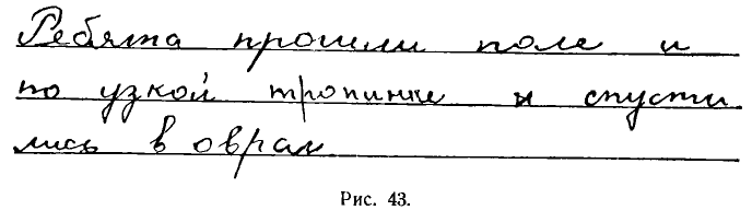
В почерке других учащихся иногда совершенно отсутствует нажим или он неравномерно распределяется по прямым чертам и овалам. Как следствие этого, почерк в целом становится нечетким (рис. 44).
In the handwriting of other students, there is sometimes a complete lack of pressure, or it is unevenly distributed along straight lines and ovals. As a result, the handwriting as a whole becomes blurry (Fig. 44).
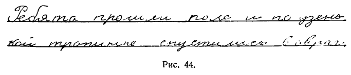
Типичный недостаток почерка — мелкий размер букв, иногда до 1 мм. Чтение столь мелкого письма затрудняет не только близорукого, но и человека, обладающего нормальным зрением. Подобный почерк нередко служит причиной порчи зрения самого пишущего.
A typical handwriting deficiency is the small size of letters, sometimes up to 1 mm. Reading such small writing not only complicates nearsighted people, but also a person with normal vision. Such handwriting often serves as a reason for the deterioration of the writer's own vision.
Наконец, организованность и четкость почерка может нарушаться чрезмерной сгущенностью букв (рис. 45).
Finally, the organization and clarity of handwriting can be disrupted by excessive letter density (Fig. 45).
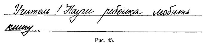
К сожалению, этот недостаток иногда культивируется самой системой обучения скорописи, применяемой некоторыми учителями.
Unfortunately, this shortcoming is sometimes cultivated by the speed writing teaching system used by some teachers.
Таковы основные нарушения четкости и разборчивости почерка.
These are the main violations of the clarity and legibility of handwriting.
Нерациональность, а следовательно и медленность письма обусловливаются:
Irrationality, and hence slowness of writing, are caused by:
1. чрезмерно крупным размером букв, нередко достигающих 6 мм в высоту. Это приводит к удлинению пути движения пера, к затрате лишнего времени
1. Excessive size of letters, often reaching 6 mm in height. This leads to the extension of the path of pen movement, to the expenditure of extra time.
2. наличием разрывов между буквами. Иногда этот недостаток становится настолько значительным, что письмо в конце концов превращается в рисование букв. Такой почерк представляет собой нарушение самого принципа скорописи, а исправление его является делом крайне трудным (рис. 46);
2. The presence of breaks between letters. Sometimes this flaw becomes so significant that the writing eventually turns into drawing letters. Such handwriting is a violation of the very principle of speed writing, and its correction is a very difficult task (Fig. 46);
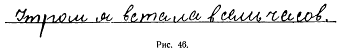
3. слишком сильным и неравномерным нажимом, который также приводит к нарушению и искажению почерка;
3. Too strong and uneven pressure, which also leads to violation and distortion of handwriting;
4. наличием в почерках отдельных учащихся изломов в нижних закруглениях прямых черт, что приводит к нарушению стиля письма (рис. 47).
4. The presence in the handwriting of some students of fractures in the lower curves of straight lines, which leads to a violation of the style of writing (Fig. 47).
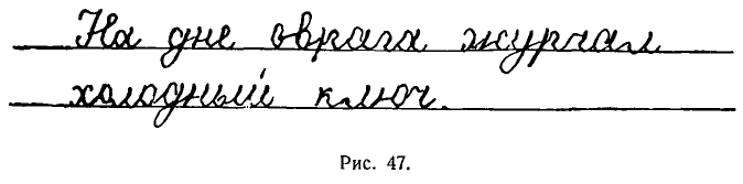
Красоту почерка нарушают неправильное начертание заглавных букв, широкие закругления в прямых чертах, наличие углов вместо закруглений (рис. 48).
The beauty of handwriting is disrupted by incorrect drawing of capital letters, wide curves in straight lines, the presence of angles instead of curves (Fig. 48).
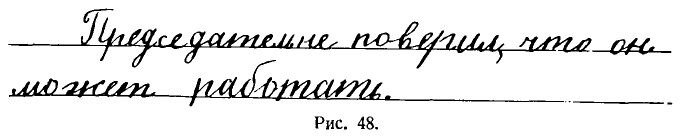
Очень часто причины плохого почерка заключаются в неправильной посадке, в неумении держать перо или сохранять наклонное положение тетради при письме.
Very often, the causes of poor handwriting lie in incorrect posture, inability to hold the pen, or maintain a tilted position of the notebook when writing.
Например, часто встречаются почерки с отсутствием нажима или с нажимом на закруглениях. Это зависит от того, что пишущий ставит перо не прямо, а боком. Нередко в почерке отсутствует одинаковый наклон букв только потому, что пальцы приближаются к кончику пера. Наконец, при неустойчивости посадки и почерк отличается неустойчивостью и колебаниями в наклоне и высоте букв.
For example, handwriting often lacks pressure or pressure on curves. This depends on the fact that the person writing does not hold the pen straight, but sideways. Often, the handwriting lacks a consistent slant of letters just because the fingers are close to the tip of the pen. Finally, with an unstable posture, the handwriting is also unstable with fluctuations in the slope and height of the letters.
На почерк также оказывают неблагоприятное влияние как очень толстая, так и короткая ручка, применяемая при письме, а также тупое перо.
The handwriting is also negatively affected by both a very thick and short pen used for writing, as well as a blunt nib.
Следует отметить, что изменение условий письма отражается на улучшении почерка не сразу. Наоборот, на первых порах, после исправления посадки, замены ручки и т. д. учащийся будет испытывать некоторую неловкость, и только в дальнейшем, привыкнув, он заметит, что писать ему стало легче, удобнее и письмо его приобрело свободу, непринужденность.
It should be noted that changes in writing conditions are not immediately reflected in handwriting improvement. On the contrary, at first, after correcting the posture, replacing the pen, etc., the student will experience some awkwardness, and only later, having got used to it, will they notice that writing has become easier and more comfortable, and their writing has become more relaxed and spontaneous.
Нередко ухудшение почерка обусловливается плохим зрением ученика, его близорукостью. В этом случае ребенка необходимо направить к врачу-окулисту.
Often, the deterioration of handwriting is caused by the student's poor vision or myopia. In this case, the child needs to be referred to an ophthalmologist.
Выяснив причины плохого почерка у учащегося, учитель должен продумать методы его исправления.
Having identified the reasons for the student's poor handwriting, the teacher must think through the methods of its correction.
В старое время выдвигались различные способы исправления почерков.
In the old times, various methods of handwriting correction were proposed.
А. Шмидт, например, считал, что исправлять почерки учащихся надо копировальным методом, путем многократной обводки каллиграфически исполненных текстов в прописях особыми чернилами, легко смываемыми смоченной губкой. Методист С. Флоринский считал, что для исправления почерка нужно воспроизвести весь школьный курс чистописания и т. д.
A. Schmidt, for example, believed that students' handwriting should be corrected by the copying method, by repeatedly tracing calligraphically executed texts in copybooks with special ink, easily wiped off with a damp sponge. The methodologist S. Florinsky believed that to correct handwriting, it is necessary to reproduce the entire school course of handwriting, etc.
В практике советской школы применяются различные методы исправления почерков. Эти методы зависят от того, чем вызвана порча почерка и насколько она глубока.
In the practice of Soviet schools, various methods of handwriting correction are used. These methods depend on what caused the spoilage of handwriting and how deep it is.
Главная причина плохого почерка — беспорядочность занятий учащегося по чистописанию. Поэтому исправление почерка нужно вести путем организации систематических занятий.
The main reason for poor handwriting is the disorderliness of the student's handwriting lessons. Therefore, handwriting correction should be carried out by organizing systematic lessons.
Если почерк совершенно искажен и в нем отсутствуют правильное начертание букв, стандартный наклон и нажим, ученику необходимо пройти заново весь курс чистописания, начиная с подготовительных упражнений и письма в тетрадях № 1 всех строчных и прописных букв в генетическом порядке.
If the handwriting is completely distorted and it lacks the correct lettering, standard slant and pressure, the student needs to go through the entire handwriting course again, starting with preparatory exercises and writing in notebooks No. 1 of all lowercase and uppercase letters in genetic order.
При тренировочных упражнениях учитель естественно обращает особое внимание на письмо тех букв, которые подверглись большему искажению.
During training exercises, the teacher naturally pays special attention to the writing of those letters that have been most distorted.
Исправление почерков, в которых отсутствует правильный нажим и искажены начертания прямых черт и овалов, необходимо начинать с письма букв и слов (см. гл. IX. Письмо в период обучения грамоте и гл. X. Уроки чистописания в I классе (второе полугодие).
Correction of handwriting, in which the correct pressure is missing and the outlines of straight lines and ovals are distorted, should be started with the writing of letters and words (see Ch. IX. Writing during literacy training and Ch. X. Handwriting lessons in Grade 1 (second semester)).
Если в почерке, подлежащем исправлению, начертание всех букв делается правильно, можно не повторять первый этап обучения, а следует начинать с письма по двум линейкам с частыми косыми линиями. Таким путем исправляются неправильный наклон букв, неодинаковая высота букв и неправильные соединения в словах (см. гл. XI. Уроки чистописания во II классе).
If in the handwriting subject to correction, the spelling of all letters is done correctly, it is not necessary to repeat the first stage of training, and you should start with writing on two lines with frequent slanting lines. This way, incorrect letter slant, uneven letter height, and incorrect connections in words are corrected (see Ch. XI. Handwriting lessons in Grade 2).
При исправлении почерка с разрывом между буквами главное внимание нужно сосредоточить на соединениях букв, которые должны изучаться и применяться в той же последовательности, как это делается при обучении чистописанию во II классе.
When correcting handwriting with a break between letters, the main attention should be focused on the connections of letters, which should be studied and applied in the same sequence as is done in teaching handwriting in Grade 2.
В целях быстрейшего усвоения правильных способов связи букв нужно последовательно повторить все типы соединений строчных и заглавных букв в.
For the fastest possible assimilation of the correct ways of connecting letters, it is necessary to consistently repeat all types of connections of lowercase and uppercase letters.
Одновременно нужно воспитывать у учащихся с запущенным почерком чувство глазомера и ритма, требовать от них соблюдения установленных промежутков между элементами, буквами и словами.
At the same time, it is necessary to cultivate a sense of measurement and rhythm in students with neglected handwriting, to require them to observe established intervals between elements, letters and words.
Для закрепления стандартного, единообразного наклона при письме очень большое значение имеют упражнения, развивающие правильные координированные движения пальцев, кисти и предплечья.
Exercises that develop the correct coordinated movements of the fingers, hand, and forearm are of great importance for reinforcing the standard, uniform slope in writing.
Воспитание ритма достигается при помощи систематических упражнений и легче всего путем письма в тетрадях № 3.
The development of rhythm is achieved through systematic exercises and is most easily done by writing in notebooks No. 3.
Упражнения необходимо проводить небольшими дозами, обязательно под контролем учителя, который должен организовать не только свободное письмо, но и письмо под такт.
Exercises should be carried out in small doses, necessarily under the control of a teacher who should organize not only free writing, but also rhythmic writing.
На этом этапе обучения одинаковая высота букв гарантируется горизонтальными линиями; однообразный наклон корректируется при помощи редких наклонных линий, а равномерность интервалов будет подготовлена предшествующей ступенью обучения.
At this stage of learning, the uniform height of letters is guaranteed by horizontal lines; a uniform slant is corrected with the help of sparse slant lines, and the uniformity of intervals will be prepared by the previous stage of learning.
В результате одновременного соблюдения всех этих требований почерк ученика будет выправляться.
As a result of simultaneously adhering to all these requirements, the student's handwriting will improve.
Перейдя к тетради № 4 по двум линейкам без наклонных, учитель проверяет прочность выработанных навыков у учащихся. Письмо проводится под более быстрый счет. Этим самым ученик подготовляется к переходу на скоропись.
Moving on to notebook No. 4 on two lines without slants, the teacher checks the durability of the skills developed by the students. Writing is conducted at a faster pace. This prepares the student for the transition to shorthand writing.
Упражнения в скорописи (см. гл. XII. Уроки чистописания в III классе) будут содействовать выработке быстрого темпа письма.
Exercises in shorthand writing (see Ch. XII. Handwriting lessons in Grade 3) will help develop a fast pace of writing.
Этот этап особо важен для исправления таких почерков, в которых существенным недостатком является или крупный размер букв, или отсутствие связей между буквами или неодинаковые интервалы между буквами. Из-за этих недостатков развивается неравномерный, неправильный нажим и появляются изломы в закруглениях, которые характерны для крупных почерков.
This stage is particularly important for correcting those handwriting styles in which a significant deficiency is either large letter size, lack of connections between letters, or unequal intervals between letters. Due to these deficiencies, uneven, incorrect pressure develops and there are breaks in rounding, which are characteristic of large handwriting.
Курс скорописи лучше всего проводить не в виде заданий, выполняемых учащимися дома, а в форме контролируемого учителем письма под счет, с ускорением его по мере прохождения отдельных групп букв.
The shorthand course is best conducted not as tasks performed by students at home, but in the form of teacher-controlled writing to the count, speeding it up as individual groups of letters are passed.
Очень часто ставится вопрос о продолжительности занятий по исправлению почерка. Но ответить на этот вопрос очень трудно, потому что продолжительность работы будет зависеть и от степени испорченности почерка, и от способностей и прилежания учащегося, и, наконец, от активности и интенсивности работы учителя.
The question often arises about the duration of handwriting correction classes. But it is very difficult to answer this question, because the duration of work will depend on the degree of handwriting damage, the abilities and diligence of the student, and, finally, on the activity and intensity of the teacher's work.
Очень важным условием при исправлении почерка является контроль учителя за всеми письменными работами учащегося.
A very important condition for handwriting correction is the teacher's control over all written work of the student.
В качестве пособия для самостоятельных упражнений могут быть использованы школьные прописи, но с обязательной дозировкой и проверкой всех выполняемых учеником работ.
School handwriting books can be used as a tool for independent exercises, but with mandatory dosage and checking of all student's work.
[3/10] Appendix: handwriting practice sheets, illustrating the content and order of classes in grades 1, 2, and 3
Прописи по чистописанию, иллюстрирующие содержание и порядок занятий в I, II и III классах
[X]initial translation from https://chat.openai.com[X]html formatting[X]translate and insert footnotes[ ][todo: translate] and insert illustrations[ ]check for missing text in the Russian text or the translation[ ]check for ascii characters in Russian text; cyrillic characters in English text[ ]check for font changes in the printed book to be implemented here: bold, italic, etc.[ ]typographical revisions: consistent punctuation, curly quotes, en- and em-dashes[ ]spot checks of the translation quality[ ]add links to web resources
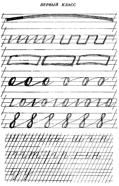
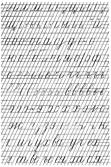
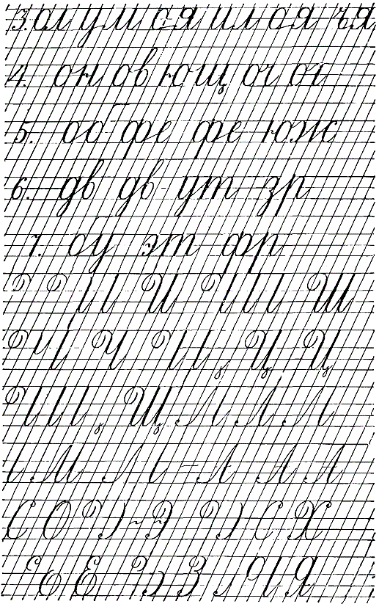
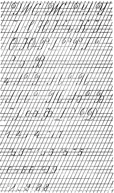
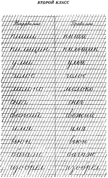
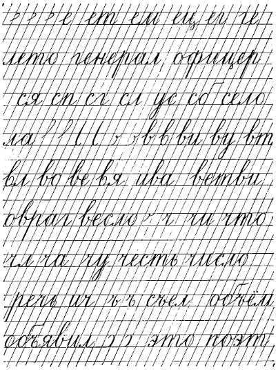
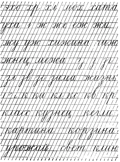
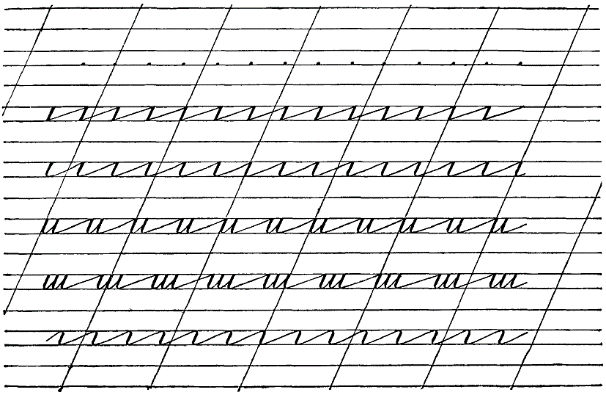
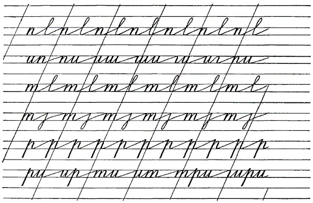
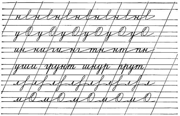
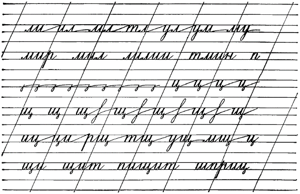
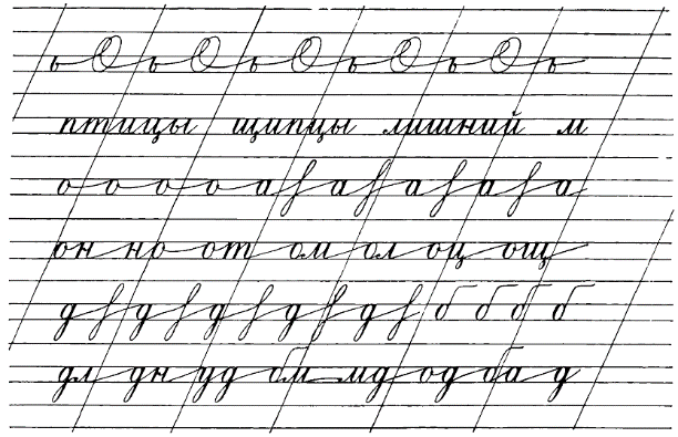
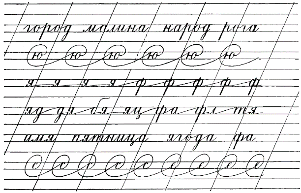
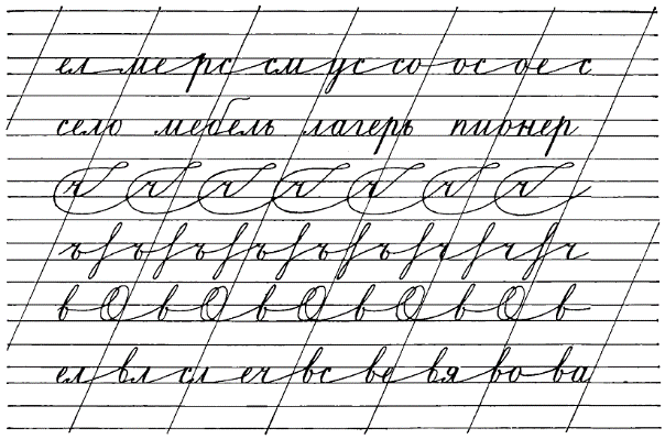
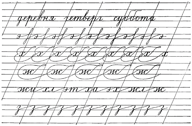
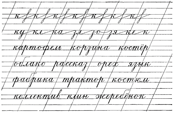
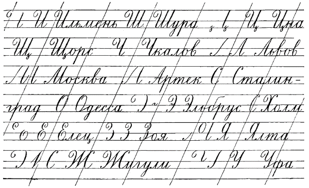
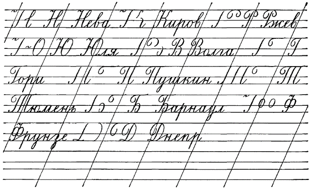
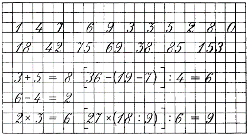
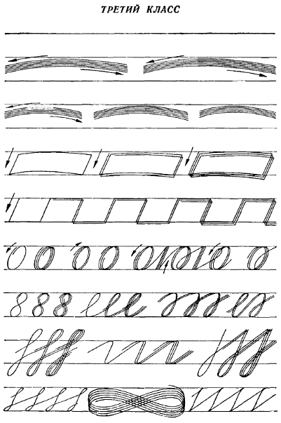
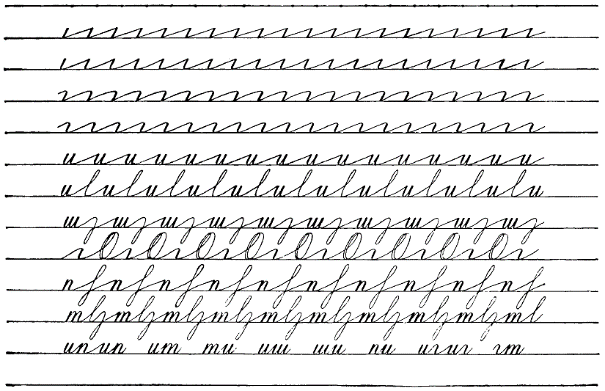
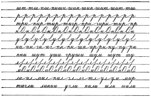
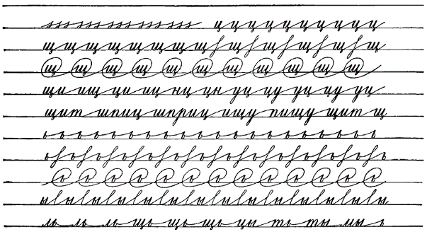
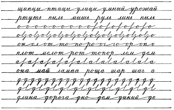
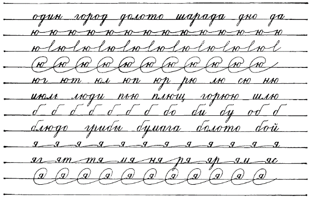
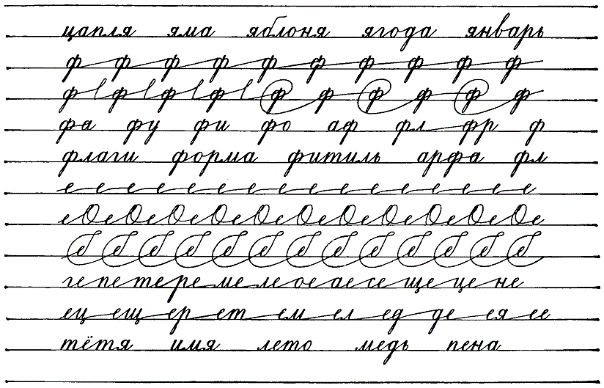
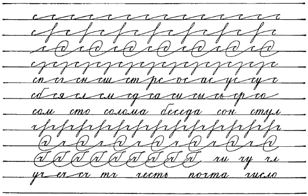
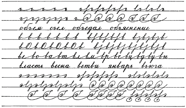
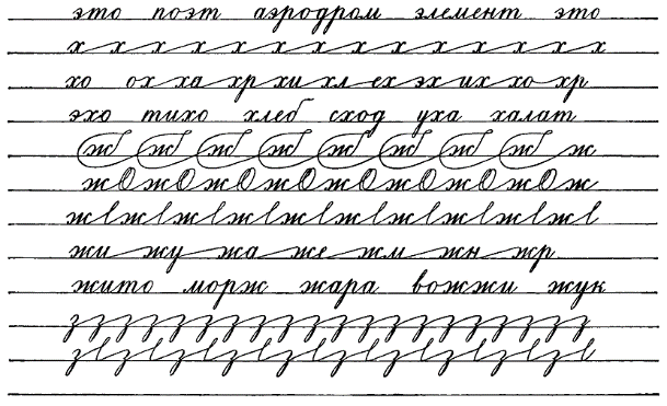
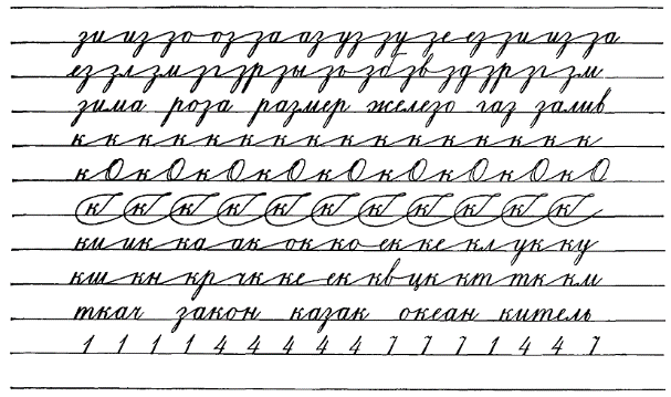
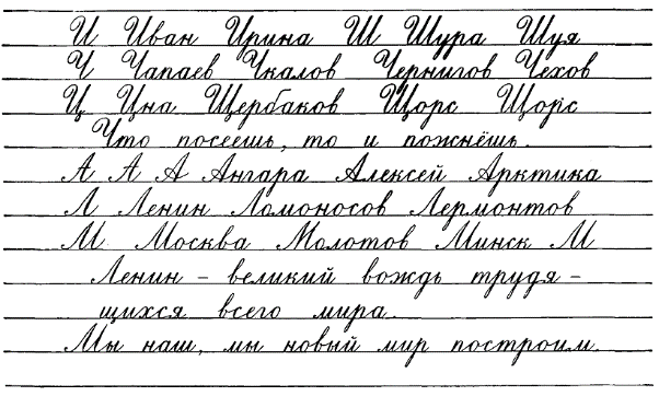
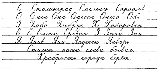
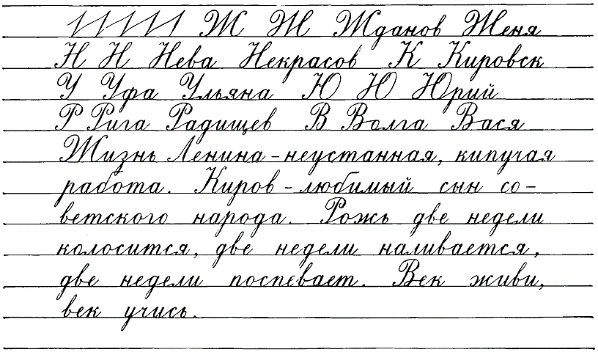
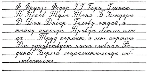
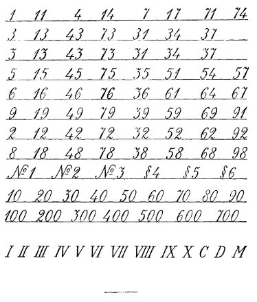
[4/10] References
ЛИТЕРАТУРА
[X]initial translation from https://chat.openai.com[X]html formatting[X]translate and insert footnotes[X]translate and insert illustrations[ ]check for missing text in the Russian text or the translation[ ]check for ascii characters in Russian text; cyrillic characters in English text[ ]check for font changes in the printed book to be implemented here: bold, italic, etc.[ ]typographical revisions: consistent punctuation, curly quotes, en- and em-dashes[ ]spot checks of the translation quality[ ]add links to web resources
1. А. К. Гортов. Систематические русские прописи. Москва, 1888.
1. A. K. Gortov. Systematic Russian Writing Exercises. Moscow, 1888.
2. 2. В. С. Гербач. Русская скоропись. Упражнения для развития свободного движения руки и приобретения четкой скорописи, СПб., 1899.
2. V. S. Gerbach. Russian Speedwriting. Exercises for the Development of Free Hand Movement and Acquisition of Clear Speedwriting. St. Petersburg, 1899.
3. В. С. Гербач. Методическое руководство к обучению письму. СПб., 1906.
3. V. S. Gerbach. Methodical Guide to Teaching Writing. St. Petersburg, 1906.
4. 4. И. Е. Евсеев. Методика обучения чистописанию. М., 1911.
4. I. E. Evseev. Methodology of Teaching Handwriting. Moscow, 1911.
5. Ф. Греков. Методика обучения письму (чистописанию). М., 1911.
5. F. Grekov. Methodology of Teaching Writing (Handwriting). Moscow, 1911.
6. Д. А. Писаревский. Обучение письму. Методическое пособие для учителей начальных школ, Учпедгиз, 1938.
6. D. A. Pisarevsky. Teaching Writing. Methodical Manual for Teachers of Primary Schools. Uchpedgiz, 1938.
7. Обучение грамоте по звуковому методу. Из опыта работы школ Ленинградской области, изученного и обобщенного Н. А. Костиным, Л., 1939.
7. Teaching Literacy by the Sound Method. From the Experience of Leningrad Region Schools, Studied and Summarized by N. A. Kostin. Leningrad, 1939.
8. А. И. Воскресенская и Н. И. Ткаченко. Прописи для учащихся 1 класса начальной школы. Учпедгиз, 1947.
8. A. I. Voskresenskaya and N. I. Tkachenko. Writing Exercises for 1st Grade Primary School Students. Uchpedgiz, 1947.
9. Л. А. Горбушина. Чистописание и методика чистописания. Программа и методические указания для заочников педагогических училищ, 1948.
9. L. A. Gorbushina. Handwriting and Handwriting Methodology. Program and Methodological Guidelines for Correspondence Pedagogical Schools. 1948.
10. В. А. Саглин. Обучение письму в начальной школе. Учпедгиз, 1948.
10. V. A. Saglin. Teaching Writing in Primary School. Uchpedgiz, 1948.
11. Е. В. Гурьянов. Психологические основы упражнений при обучении письму. М. — Л., 1948.
11. E. V. Guryanov. Psychological Basics of Exercises in Teaching Writing. Moscow - Leningrad, 1948.
12. Е. В. Гурьянов и М. К. Щербак. Психология и методика обучения письму в букварный период. М., 1950.
12. E. V. Guryanov and M. K. Shcherbak. Psychology and Methodology of Teaching Writing in the Primer Period. Moscow, 1950.
13. А. И. Воскресенская и М. Л. Закожурникова. Практическое руководство к преподаванию русского языка в начальной школе. Учпедгиз, 1950.
13. A. I. Voskresenskaya and M. L. Zakozhurnikova. Practical Guide to Teaching the Russian Language in Primary School. Uchpedgiz, 1950.
14. Н. А. Костин. Методика русского языка в начальной школе. Учпедгиз, 1949.
14. N. A. Kostin. Methodology of the Russian Language in Primary School. Uchpedgiz, 1949.
15. Н. П. Каноныкин и Н. А. Щербакова. Методика русского языка в начальной школе. Учпедгиз, 1950.
15. N. P. Kanonykin and N. A. Shcherbakova. Methodology of the Russian Language in Primary School. Uchpedgiz, 1950.
16. С. П. Редозубов. Методика русского языка в начальной школе. Учпедгиз, 1950.
16. S. P. Redozubov. Methodology of the Russian Language in Primary School. Uchpedgiz, 1950.
17. А. Ф. Листов. Парта и другая школьная мебель. Учпедгиз, 1950.
17. A. F. Listov. Desk and Other School Furniture. Uchpedgiz, 1950.
18. Методическое письмо Министерства просвещения о преподавании чистописания в нач. школе 1952 г.
18. Methodical Letter of the Ministry of Education on Teaching Handwriting in Primary School. 1952.
[4/10] Footnotes
[X]initial translation from https://chat.openai.com[X]html formatting[X]translate and insert footnotes[X]translate and insert illustrations[ ]check for missing text in the Russian text or the translation[ ]check for ascii characters in Russian text; cyrillic characters in English text[ ]check for font changes in the printed book to be implemented here: bold, italic, etc.[ ]typographical revisions: consistent punctuation, curly quotes, en- and em-dashes[ ]spot checks of the translation quality[ ]add links to web resources
Footnotes:
1
И. Сталин. Марксизм и вопросы языкознания. Госполитиздат, 1952, стр. 23.
I. Stalin. Marxism and Questions of Linguistics. State Publishing House, 1952, p. 23.
2
Там же, стр. 26–27.
Ibid., pp. 26–27.
3
Методическое письмо „Единый школьный режим грамотного письма и культуры речи“. Учпедгиз, 1952, стр. 12.
Methodical letter "Unified school system of literate writing and speech culture". Uchpedgiz, 1952, p. 12.
4
С. П. Редозубов. Методика русского языка в начальной школе. Учпедгиз, 1950, стр. 177.
S. P. Redozubov. Methodology of Russian Language in Elementary School. Uchpedgiz, 1950, p. 177.
5
О преподавании русского языка в начальной школе. Методическое письмо Управления школ Министерства просвещения РСФСР. Учпедгиз, 1951.
On teaching the Russian language in primary school. Methodical letter of the School Administration of the Ministry of Education of the RSFSR. Uchpedgiz, 1951.
6
В интересах большей ясности в изложении автор в дальнейшем употребляет термин «линия» в применении к линиям, образующим сетку, а все линии (элементы), входящие в начертания и соединения букв, называет чертами.
For greater clarity in presentation, the author will henceforth use the term "line" to refer to the lines that form a grid, and refers to all lines (elements) involved in drawing and connecting letters as strokes.
7
См. об этом подробно в главе XI. Уроки чистописания во II классе.
See more details about this in Chapter XI: Penmanship lessons in Grade II.
8
Слово «овал» образовано от латинского слова ovum — яйцо.
The word "oval" is derived from the Latin word ovum - egg.
9
См. таблицу в приложении.
See the table in the appendix.
10
См. таблицы на стр. 147.
See the table on page 147. [TODO: link to that section]
11
На 1/6 длины всего отрезка наклонной между верхней и нижней линиями строки.
At 1/6 the length of the entire segment of the slope between the top and bottom lines of the line.
12
Без отрыва букву и дети пишут только во II классе.
The letter is written without lifting the pen off the paper, and children only do this in the second grade.
13
«и» дается на окончании этой буквы для того, чтобы ученик медленно и аккуратно пересекал нажимную черту волосною в определенной точке, находящейся на нижней линии строки.
The 'и' is given at the end of this letter so that the student slowly and carefully crosses the pressure line hair-thin at a specific point located on the bottom line of the string.
14
Такой прием изучения петли введен Д. А. Писаревским и вполне оправдал себя на практике, так как дает возможность детям усвоить форму этого очень трудного для письма элемента сперва в увеличенном виде, т. е. когда он яснее различим.
This method of learning loops was introduced by D. A. Pisarevsky and has fully justified itself in practice, as it allows children to grasp the form of this very difficult element for writing first in an enlarged form, i.e., when it is more clearly distinguishable.
15
Порода собак.
Breed of dogs.
16
Если учащимся будет трудно усвоить написание этих сложных букв, можно отвести не один, а два урока за счет некоторого ускорения темпа дальнейшей работы.
If students find it difficult to learn how to write these complex letters, it is possible to devote not one, but two lessons by slightly accelerating the pace of subsequent work.
17
В случае затруднительности выполнения этой задачи за 1 час, можно отвести на прохождение этих букв 2 часа за счет ускорения темпа дальнейшей работы.
In case it is difficult to complete this task in 1 hour, you can allocate 2 hours to go through these letters by accelerating the pace of subsequent work.
18
См. прописи на стр. 149.
See handwriting exercises on page 149.
19
См. образцы в приложении.
See examples in the appendix.
20
И. Е. Евсеев. Методика обучения чистописанию. 1910, стр. 69.
I. E. Evseev. Methodology of Teaching Penmanship. 1910, p. 69.
21
Д. А. Писаревский. Обучение письму. Учпедгиз, 1938, стр. 13.
D. A. Pisarevsky. Teaching Writing. Uchpedgiz, 1938, p. 13.
22
А. Н. Иванов. Пособие при исправлении почерков, обучении чистописанию и конторской скорописи. М., 1903.
A. N. Ivanov. Manual for Correcting Handwriting, Teaching Penmanship, and Office Shorthand. Moscow, 1903.
23
См. прописи для II класса на стр. 151—157.
See handwriting exercises for grade II on pages 151-157.
24
О миллиметровых расчетах должен знать только учитель, а ученик будет различать расстояния на глаз.
Only the teacher should know about millimeter calculations, while the student will distinguish distances visually.
25
См. таблицу для II класса в приложении.
See the table for the II grade in the appendix.
26
См. таблицы для II класса в приложении.
See the tables for the II grade in the appendix.
27
о в словах, оканчивающихся этой буквой (но, то и др.), пишется без узелка.
In words ending with this letter (но, то, etc.), it is written without a loop.
28
См. Е. В. Гурьянов. Психологические основы упражнений при обучении письму. М. — Л., 1948, стр. 58
See E. V. Guryanov. Psychological Foundations of Exercises in Teaching Writing. Moscow - Leningrad, 1948, p. 58.
29
См. таблицу в приложении.
See the table in the appendix.
30
т. е. ручки.
i.e., pens.
31
Е. И. Гурьянов. Развитие навыка письма учеников. Учпедгиз, 1940, стр. 57.
E. I. Guryanov. Development of Pupils' Writing Skills. Uchpedgiz, 1940, p. 57.
32
См. эти упражнения в приложении.
See these exercises in the appendix.
33
См. прописи в приложении.
See the handwriting exercises in the appendix.
34
См. таблицы в приложении.
See the tables in the appendix.